


LOCATION 地址 | SHANGHAI 上海
CATEGORY 类型 | F&B 餐饮
INTERIOR 室内设计
FEE 软装设计
VISUAL IDENTITY 视觉识别设计
AREA 219 m²
READ MORE 更多
INKWOOD RESTAURANT & BAR
SYMBIOSIS BETWEEN INK AND WOOD
INKWOOD Restaurant & Bar is the first restaurant opened by young chef Yang Beichuan, located in Shanghai Columbia Circle. Despite his youth, Beichuan is already a well-known professional who received his training as cook in Canada, where he worked together with some of the most renowned chefs of Montreal. Beichuan is a mixture of Eastern and Western cultures, who has spent half of his life running through Beijing Hutong, and other half switched to the kitchen of western restaurants in North America. He likes to use local ingredients to cook innovative international cuisine.
STUDIO8 has been commissioned for the brand visual identity, interior design and soft decoration of this new landmark in the city’s cuisine scene. When Beichuan found STUDIO8, he said he was attracted by the simplicity and playfulness of the caozitou bench designed by them. When beichuan described the restaurant he wanted to open to the designers Andrea and Shirley, the concept was not so clear and vivid for them, until Beichuan has decided to name the restaurant INKWOOD – “Wood represents nature, and ink represents constant daily routine. On the other hand, wood represents the ingredients and ink represents a sauce that makes the ingredients more tasty.”
Studio8 was challenged to reflect the chef’s mindset, and to build up a branding image able to translate into visual Beichuan’s ideas. During the design process, STUDIO8 has spent a big amount of time with the founder team of INKWOOD discussing brand concept. In Shirley’s words, “the design process is like a long brain-washing experience between our clients and us.” Eventually, STUDIO8 has decided to concentrate on the connection between “ink” and “wood” instead of either of the two elements, which they believe is the key of concept – the unexpected juxtaposition of two elements: ink and wood. It consists in a series of complex and fascinating associations that Beichuan applies to his cuisine. At INKWOOD restaurant, the chef wishes to provide the customers with an experience that breaks the daily routine. Both the space and the menu are set up in order to bring people together, since for Beichuan food is also about socialising, and for this reason, all the dishes are thought to be shared.
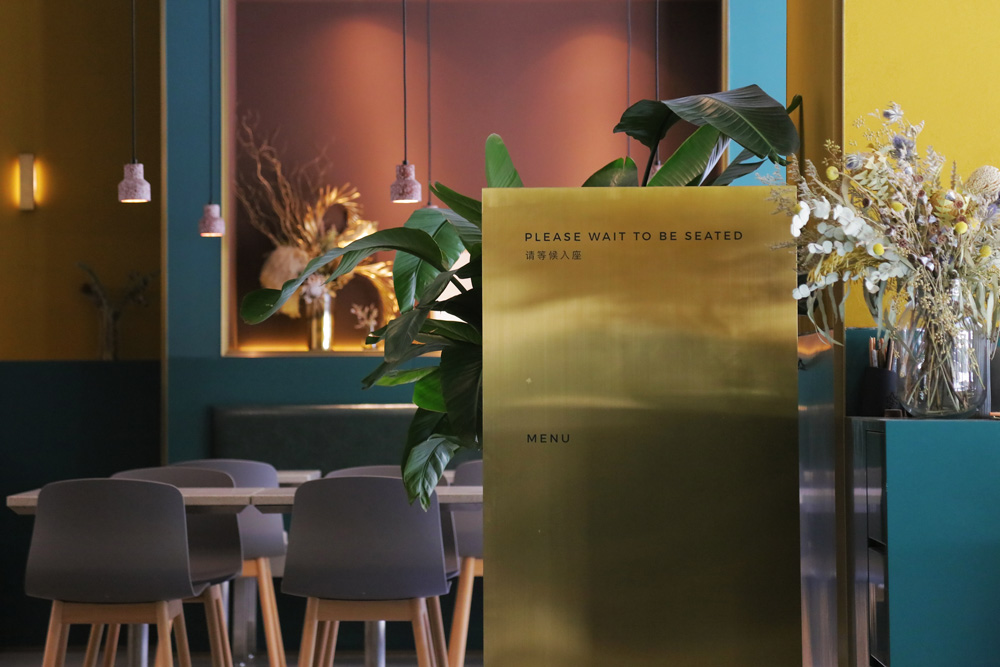
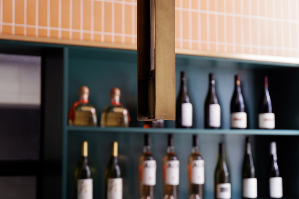
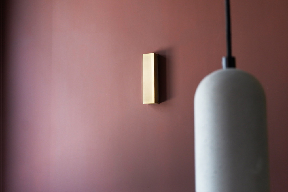
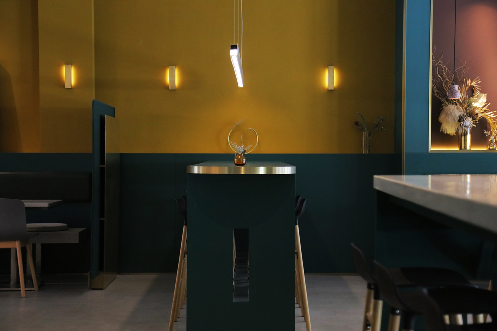
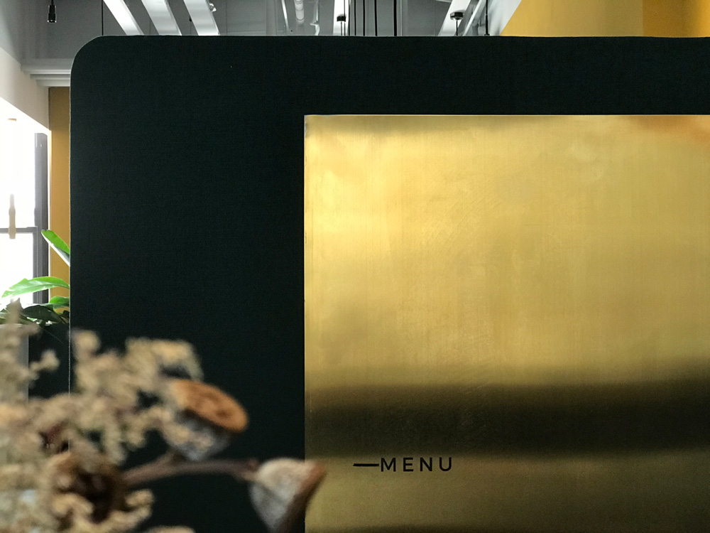
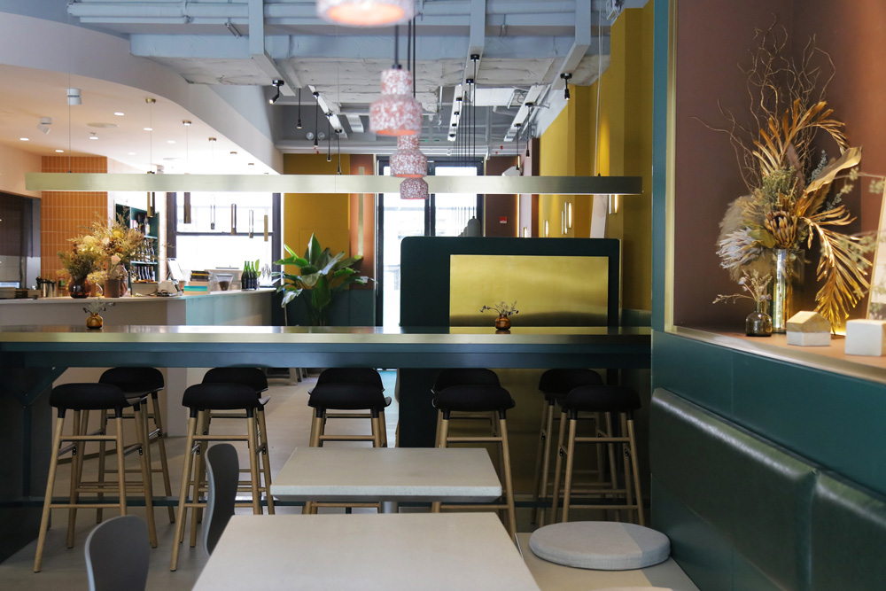
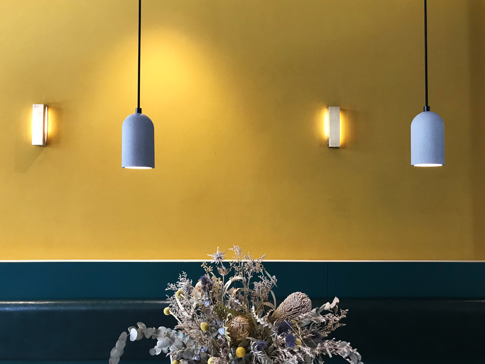
For many people, the first impression of INKWOOD restaurant is the color combinations. Andrea said: “The color of wood, ink and sauce reminds him of the color scheme of the Italian painter Giorgio Morandi. He wants the guests of INKWOOD to feel the intensity and temperature of wood and ink, ‘tasting’ the sauce and ingredients with their eyes first.” In the VI design, a series of flowing color bubbles are used to represent “ink”; while in the main logo, the mirrored writing “INK” and “WOOD” are just simply connected by a very well defined golden stroke. Designers didn’t want to use too many curves in the space to distract customers’ attention to food. Therefore, in the space, an interesting color and material combinations are used to express the concept of “INK” and “WOOD”, highlighting that stroke of symbiosis in a form of a brass stripe, which is on the ground, on the wall, on furniture and as custom-made light fixtures.
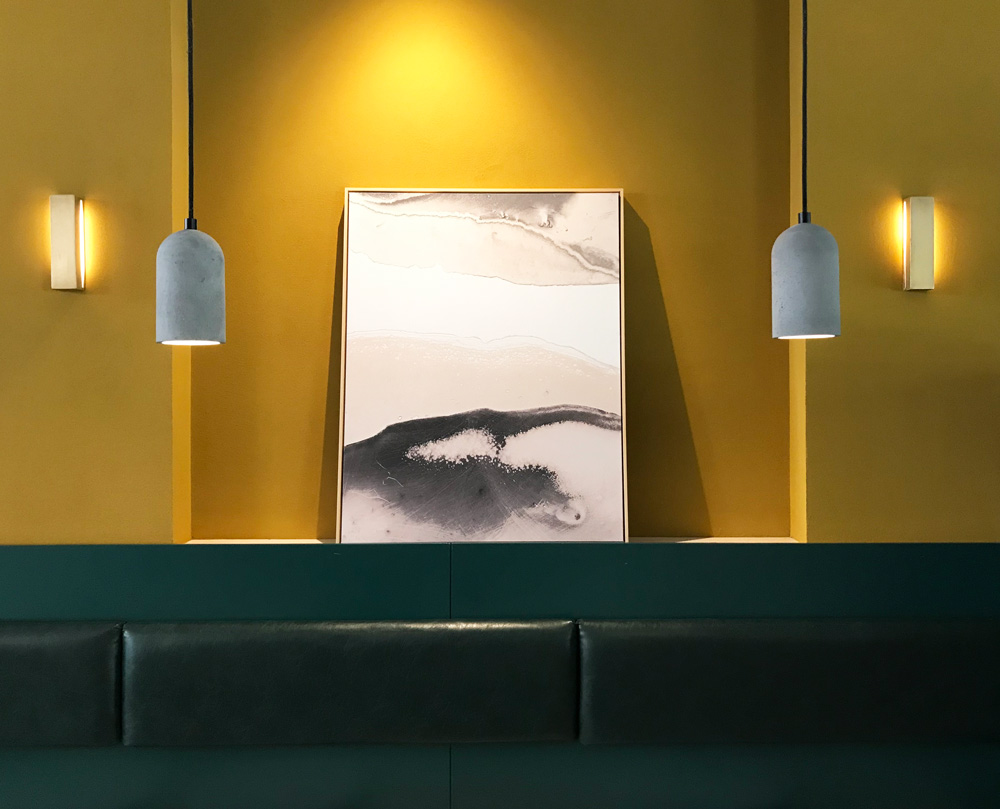
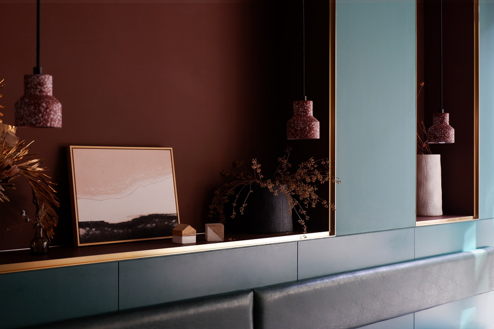
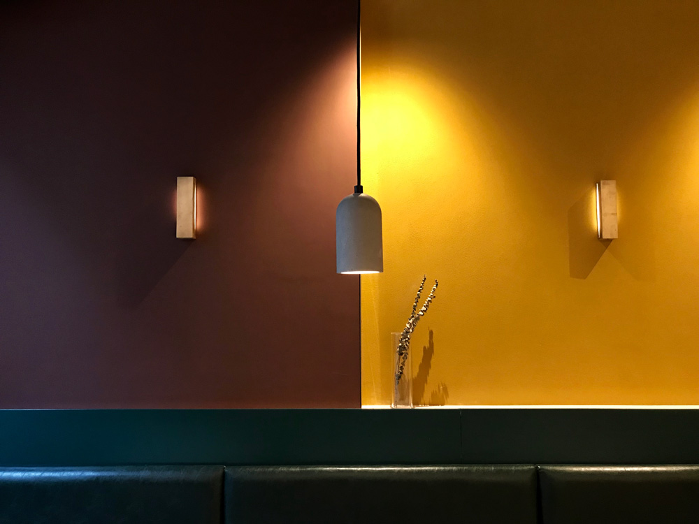
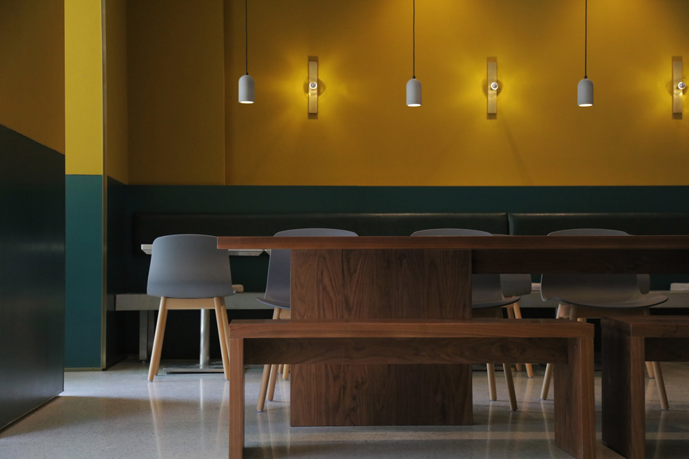
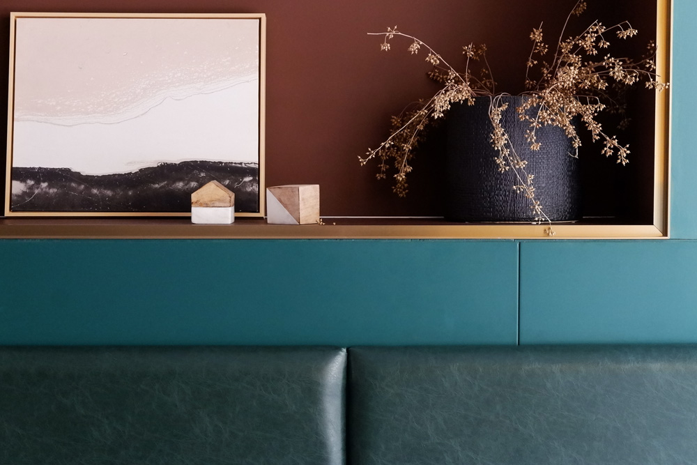
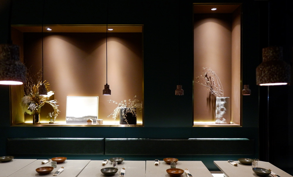
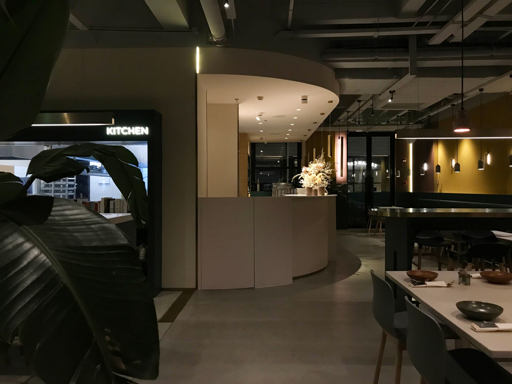
At the entrance of INKWOOD restaurant, the brass stripe with a parallel LED light on the floor extends to the kitchen window, pointing to the core of the restaurant – the kitchen where Beichuan is working. At the entire restaurant, there is dark green boiserie allover the space under 1.2m height, which makes the entire restaurant look like soaked in dark green ink with only two blocks rising towards ceiling, which visually frame the kitchen window and two brown niches. The rest of the wall is in mustard yellow color with rough texture, which absorbs and reflects light to make the whole dining ambient warm and soft. Carefully selected and custom-made accessories and paintings are casually placed on the 1.2 meter waistline, leaving rest of the areas simple.
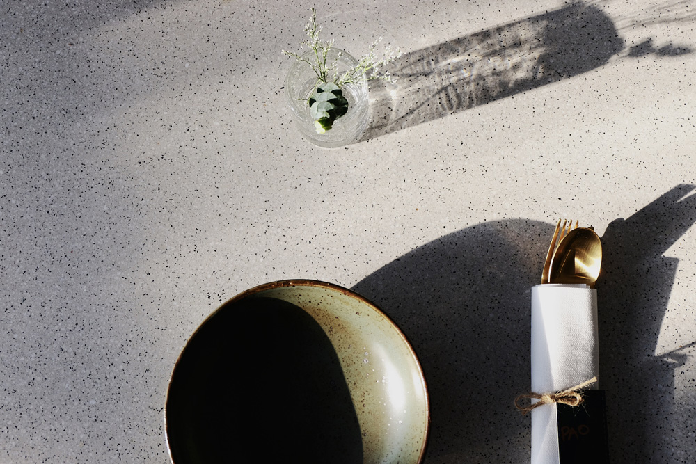
There are a variety of seat settings, which allow different groups of customers to find a suitable corner for them. Worth to mention is the “chef’s table” in front of the kitchen window. The high communal table design allows the guests to have a same eye level height with the chef and cooks working in the kitchen. Through the window where Beichuan and his partners has placed their favorite cooking book collections, customers are able to observe the whole cooking process. The restaurant’s cutlery, accessories and even flower arrangements continue the overall style of INKWOOD’s VI, like the chemistry created by food and sauce, that is delicate, warm and with layers.
INKWOOD餐厅
⽊与墨的连接
INKWOOD餐厅是年轻的主厨杨北川开的第⼀家餐厅,餐厅位于上海番禺路上的上⽣新所。
北川是⼀个东⻄⽂化的混合体,28年的⼈⽣时光⾥,他⼀半在北京胡同和⼩P孩追打嬉戏,
⼀半则切换到北美⽩⼈餐厅的厨房间⾥磨练学习,他好像把东⻄⽂化与教育,扳开、揉碎了
咽到肚⼦⾥,⻓成了⾃⼰。北川⽆论到了哪⾥,都喜欢⽤当地⻝材,沿着⾃⼰的思路,说出
如何处理、搭配、烹煮,然后⾃⼰感叹:“哇,味道肯定不错”。
⼋荒设计这次负责INKWOOD餐厅的品牌视觉识别系统(VI)、空间以及软装的整体设计。
当北川找到他们的时候,据他说是被他们设计的⼀款草字头板凳的⾄简趣味所打动。起初,
当北川对⾃⼰要开的这家餐厅头头是道时,在两位设计主案Andrea和Shirley看来,却其实
⾮常模糊,也不⽴体⽣动。直到后来当他决定将INKWOOD(⽊墨)作为餐厅名称时,⼀切
才突然都串联了起来:“⽊,代表了⼤⾃然;墨,代表了⽇常⽣活。⽊,代表了⻝材;墨,
代表了能使⻝材更为出彩的酱汁”。
在设计过程中,⼋荒设计与餐厅的创始团队⻓时间⼀起讨论概念,⽤Shirley的话来说,“没
个新品牌VI和空间整体设计的过程,都是⼀个⻓时间与客户互相感染和洗脑的过程”。最
终,两位主案决定不把着眼点放在“⽊”或“墨”任何⼀个具象的元素上,⽽是放在他们之间的
联系上,因为他们认为“⽊”或“墨”之间的那笔连接才是INKWOOD餐厅最重要的精神。两个
看似⽆关的并列元素结合所创造出的迷⼈联系和平衡,就像对⼤⾃然的热爱如何与⽇常⽣活
融合,⻝材如何与酱汁相辅相成,餐厅⾥就餐的⼈与⼈之间如何分享互动,以及餐厅灵魂⼈
物——杨北川如何⽤各种⻝材配搭创作美味。
在INKWOOD,给很多⼈留下印象最深刻的是餐厅的⽤⾊。Andrea说:“⽊、墨和酱汁的⾊
彩让他想到了意⼤利画家Giorgio Morandi的配⾊,他想要让INKWOOD的⽤餐者们感受到⽊
与墨的浓重和温度,同时‘品尝’到酱汁和⻝材在⼀起冲撞、对⽐和融合的味道。”在VI的平⾯
设计中,墨的表现是灵动的,是⼀系列流动的⾊彩泡泡;⽽主logo则⽤⼀条简单⽽肯定的⾦
⻩⾊笔划,连接起互相镜像的“INK”和“WOOD”字样。同样的,在空间中,设计师并不想⽤
太多的曲线来分散客⼈对⻝物的关注,因此在餐厅的空间设计中,⽊与墨的表现只剩下了⾊
彩和材质的变化,地⾯、墙⾯、家具、转⻆、各种订制灯具中,凸出的是那笔⾦⻩⾊的连接
以及不同材质所表现出的精致细节。
⼀⾛进INKWOOD餐厅,地⾯上就有⼀条⻩铜和光线⼀起向正⾯的厨房窗⼝延伸,指向餐厅
最重要的核⼼,北川⼯作着的厨房。整个餐厅⼀⽶⼆⾼度以下都是主VI的墨绿⾊护墙板,仿
佛整个餐厅都浸没在墨汁中,只在正对⼊⼝的厨房窗⼝以及窗边的位置拉伸起两个带着壁龛
的墨绿盒⼦,强调盒⼦框出的视觉中⼼。⼀⽶⼆以上的墙⾯采⽤芥⻩的粗糙材质,吸收和反
射光线,使整个⽤餐环境变得更为温暖柔和。精⼼挑选和定制的饰品看似随意的搁在⼀⽶⼆
的腰线平台上。剩余的区域线条简洁,仅仅⽤⾊彩、体块和材质的拼接来体现⽊和墨的主题
与细节。
整个餐厅有各种不同的座位配置,适合不同的⽤餐⼈数的顾客,最值得⼀提的是厨房窗⼝前
的“主厨的餐桌”。⾼桌的设计能让坐在这个桌⼦上的客⼈视平线与厨房内⼯作着的厨师们的
视平线同⾼,透过窗⼝摆放的北川和合伙⼈最爱的烹饪书籍,可以观摩烹饪的全过程。餐厅
的餐具、软装甚⾄花艺也延续了INKWOOD的VI配⾊和空间设计的整体⻛格,述说⻝物的层
次和情感化学作⽤,如同北川的糖葫芦,解构的软糯⼭楂和焦⾹的蜂巢搭配⼀勺奶油撒上些
糯⽶纸,是东⻄⽂化的交融,是北京童年的记忆,也是北川的缩影。