ANADU RESORT 阿那度度假村

LOCATION 地址  | MOGANSHAN 莫干山
CATEGORY 类型  |  HOSPITALITY 酒店度假村

ARCHITECTURE 建筑
INTERIOR 室内设计
FEE 软装设计
VISUAL IDENTITY 视觉识别设计

AREA 1200 m²

READ MORE 更多

Studio8 was commissioned for the visual identity, interior design and architecture of Anadu. Anadu wishes to provide to its guests with a peaceful holiday experience in nature. Keeping the local and environmental character of the location is one of the main concerns during the project development. From construction materials to design elements, and even food ingredients, Studio8 has tried to take full advantage of local resources. In terms of architecture and space design, Anadu is integrated into the surrounding landscape. The studio’s initial approach to the design concept: “Get along with nature, talk to yourself” gradually evolved into the core of the brand’s motto: “Find yourself in nature”.
The surrounding landscape of the project site is rich and unique:; however, after a first contact with the site, the studio team felt something was missing: a lack of water presence. Water itself, and especially a very calm water surface, generates immediately a sense of relax. The studio decided that this element would be the core of the hotel, a connection between the rooms that articulates the structure of the entire building. For that purpose, the roof of each floor was turned into an infinity water feature. By bringing natural elements into the architectural spaces, the design fosters a connection between the building and the outside. “Find myself in nature” becomes, then, a reality when experiencing the different rooms.
Four narratives are unfold in Studio8’s design, and become the themes of the rooms. Each room has been designed as an individual space, with its own story focused on elements that one can find within the surroundings. Each of these elements awake a different sense, or provoke a sensorial phenomenon.
1. Tea – This room faces the white tea harvest; the materials and color palette of the interior design echoes the tea theme.
2. Mountain – The room faces the mountain on the south, and the materials are natural stone and the color palette is dark grey. The water feature is designed to reflect the distant mountains.
3. Bamboo – The room faces the bamboo forest in the east, and its interior has a rice pink color palette and several objects made of bamboo wood.
4. Sky – The room is located on the third floor, which is also the top of the building. It is almost immersed by a boundless water feature, turning the room into a floating island. The studio designers challenged themselves to explore the poetic boundaries of the project’s concept. The third floor, then, was conceived as a platform able to behave like a mirror, and reflect almost the entire surroundings and the sky.

莫干山Anadu度假酒店
水与境之间:在自然中找到自我
Anadu位于浙江湖州的莫干山脉北麓,坡地院落占地30000㎡,东瞰琛碛村,南眺凤凰山、大岗山,西临白茶山坡,北有竹林环绕。
「八荒设计」担任Anadu酒店的品牌视觉识别系统建立,以及建筑和室内设计。Anadu希望为住客提供一个身处自然的宁静度假体验。因此,保持当地的人文和自然氛围成为整个项目非常重要的关注点,从建筑材料到设计元素,甚至食材,都最大程度地充分利用当地资源。于是在建筑与空间的设计中,Anadu被融入到周边的自然元素之中。「八荒设计」最先提出的设计概念:“跟自然相处,跟自我对话”,渐渐也演变成了品牌的核心Slogan—“在自然中找到自我”。
项目基地周边自然景观丰富别致:西面有葱绿且机理独特的白茶坡、北面有连绵叠嶂的远山,东面有茂密深幽随风摇曳的竹林。但「八荒设计」注意到,基地周边缺少了“水”的元素。水,尤其是一池平静的水面,能让人瞬间心情静怡。Anadu想要给住客“一个能够让人发呆一天不想出门的房间”。除了自然风景,如果能给人带来亲水的空间体验,将制造出另一个象限的“境”。水同茶、水同山、水同竹的交合,不但拉近了人与水的距离,同时也建立了建筑空间与自然元素的连接,除了欣赏风景,更创造了心境,才真正能让人能“在自然中找到自我”。

设计初始,「八荒设计」并没有从建筑本身的形态出发,因为他们认为空间的使用者与自然的关系才才是设计的关键。建筑的三层楼均有无边亲水台:一楼的泳池、二楼南面阳台的无边水景、三楼整层屋面的无边水景,每一层都有独特的景致,一层比一层更令人意外

CONSTRUCTION 施工过程

ANADU RESORT 阿那度度假村

GUD RESTAURANT&BAR 古冬餐厅

01_1F bar 一楼鸡尾酒吧 04
01_1F bar 一楼鸡尾酒吧 08
02_1F VIP entrance VIP室入口
03_1F stair case一楼楼梯
05_2F restaurant二楼用餐区 03
05_2F restaurant二楼用餐区 04
05_2F restaurant二楼用餐区 07
detail stairs
08_2F stairs二楼楼梯 02
07_2F balcony二楼阳台01
09_3F terrace三楼露台 03
detail niche 01
detail niche 02
detail restroom 01
detail restroom 02
06_2F stone window frame detail二楼石窗框细节

LOCATION 地址  |  HANGZHOU 杭州
CATEGORY 类型  |  F&B 餐饮

HISTORIC BUILDING RENOVATION 历史建筑改造
INTERIOR 室内设计
FEE 软装设计
VISUAL IDENTITY 视觉识别设计

AREA 495 m²

Gud is a museum-like restaurant and cocktail bar located in a 1930s heritage building. The culinary peculiarity of hotpot is transformed into a physical canvas to highlight the continuous interaction between food and space.

古冬坐落于一栋三十年代的历史建筑内,是一家以火锅博物馆为主题的餐厅及鸡尾酒吧。火锅的饮食文化与烹饪方式被抽象地与建筑紧密结合,营造空间与味觉之间连续的互动。

READ MORE 更多

HOTPOT “MUSEUM” IN HISTORIC VILLA
— STUDIO8 designs GUD Restaurant & Cocktail Bar in Hangzhou

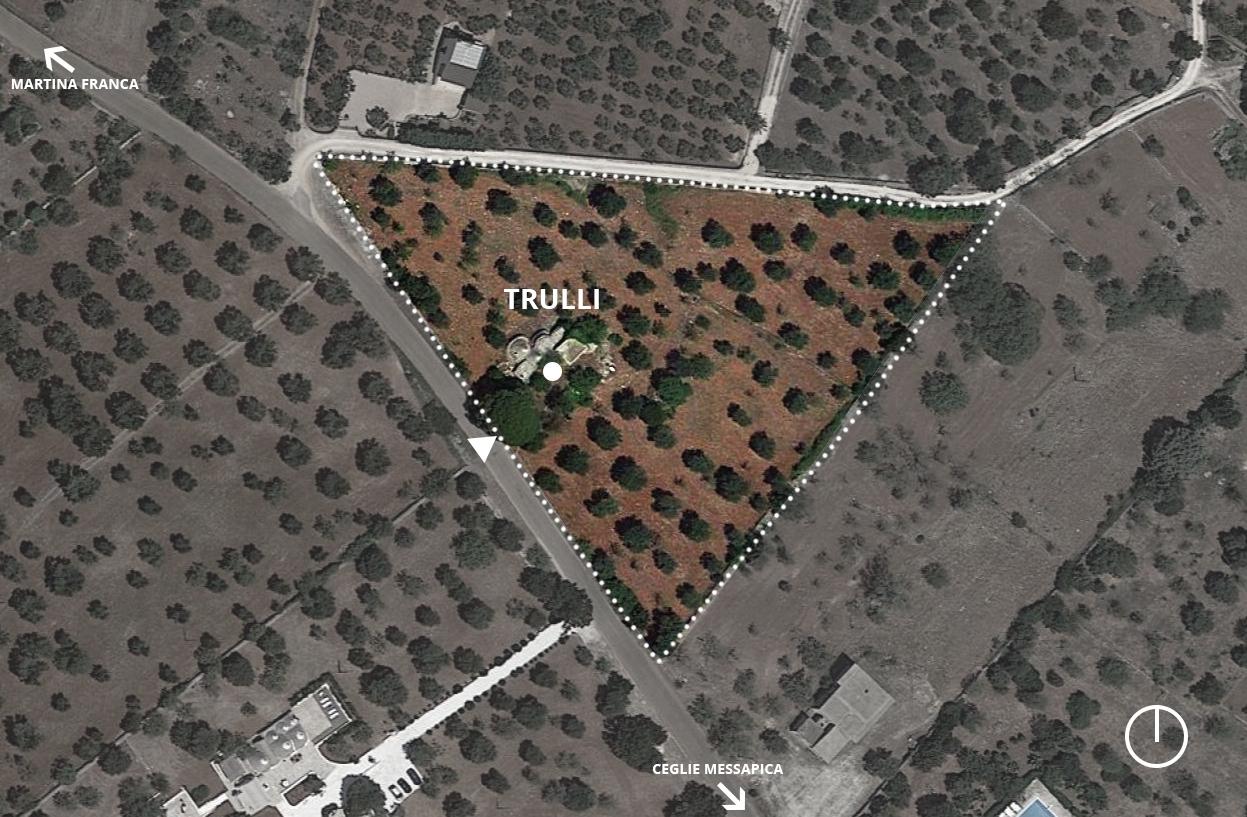
Located in a heritage building from the 1930s in the central area of Hangzhou, GUD is a restaurant and cocktail bar specializing in hotpot cuisine and craft cocktails. STUDIO8 was commissioned to design the architecture re-use, interior and visual identity for the project.

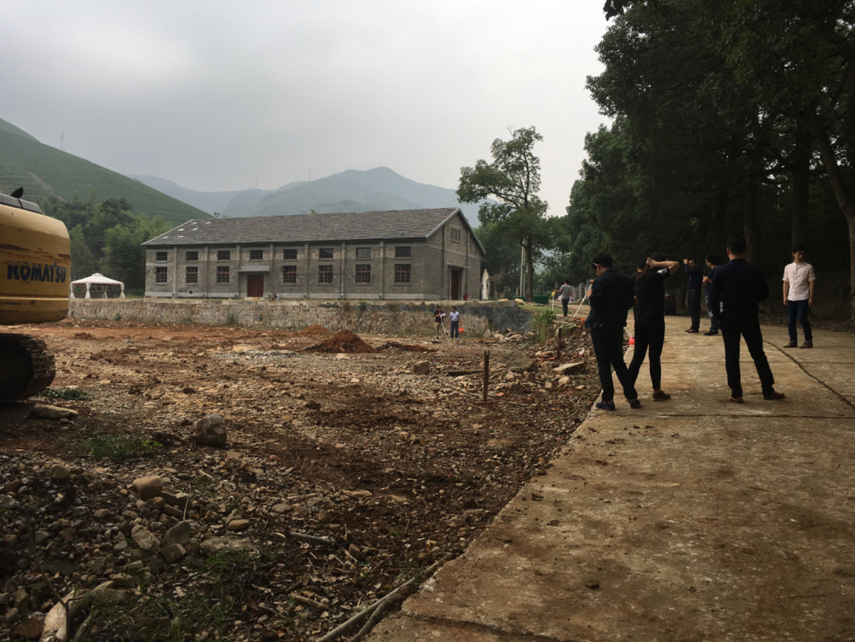
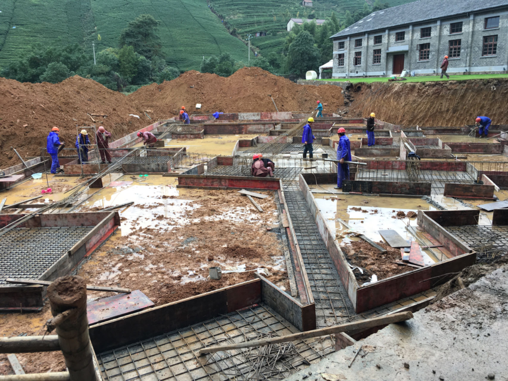
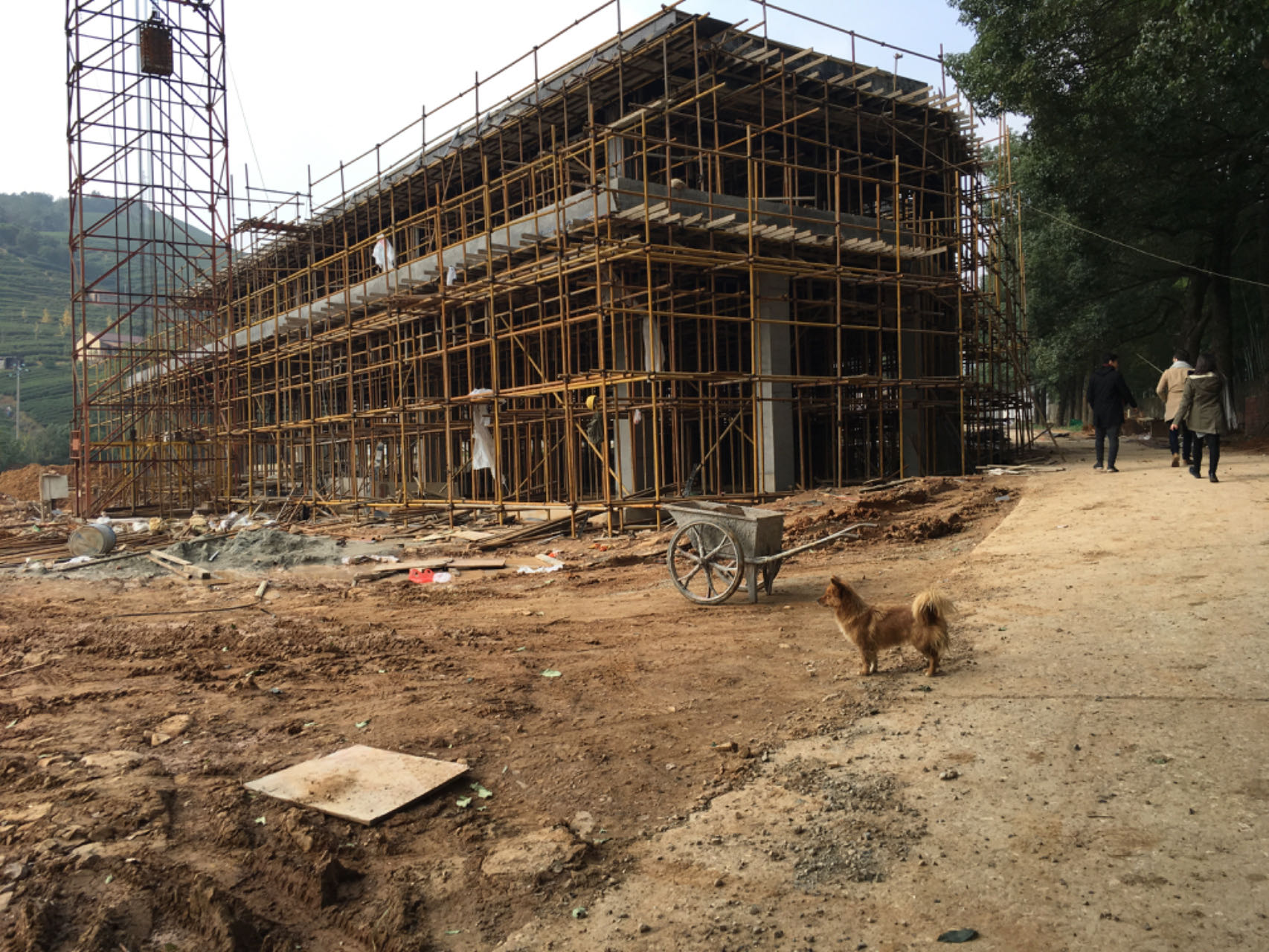
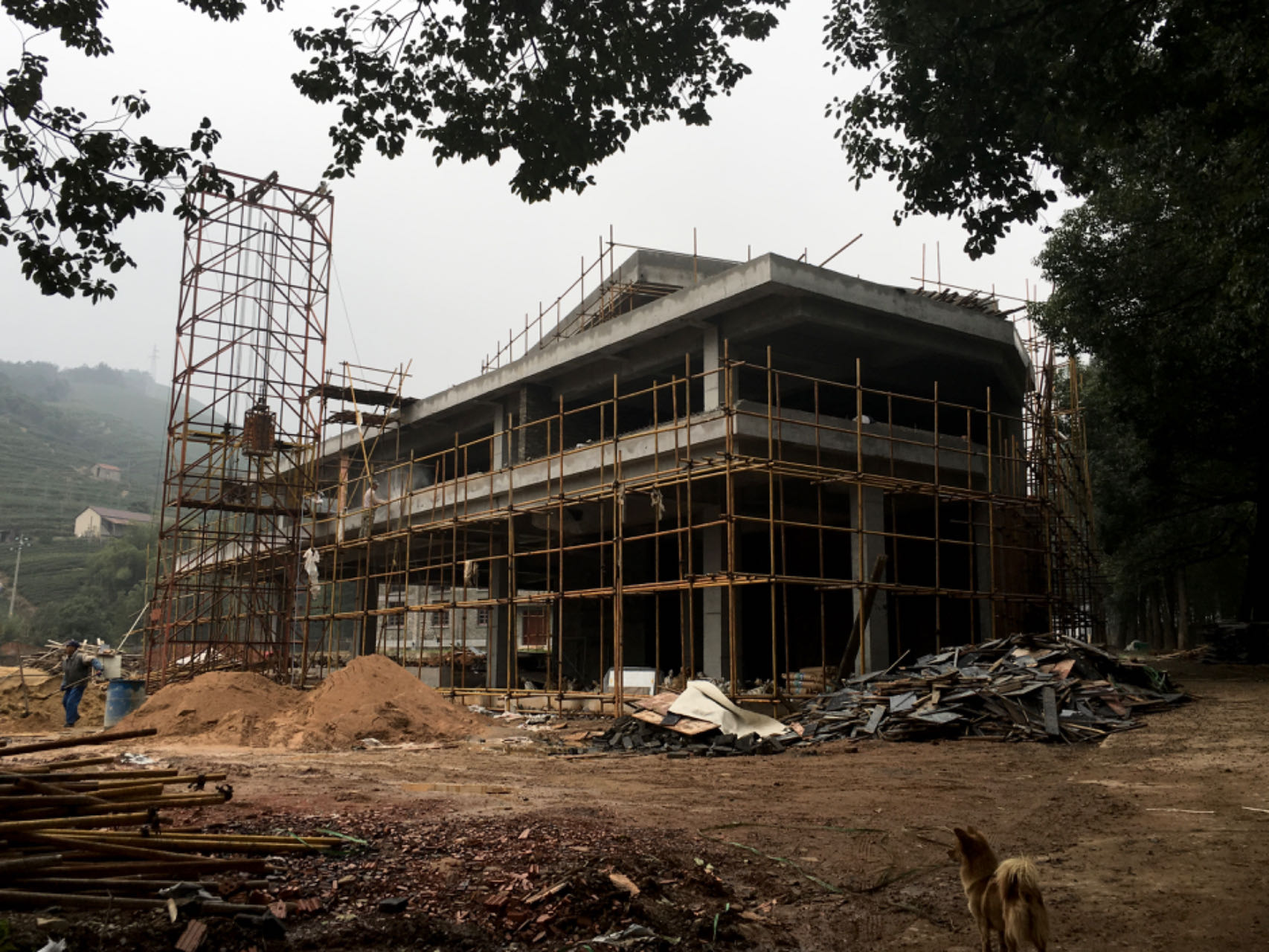
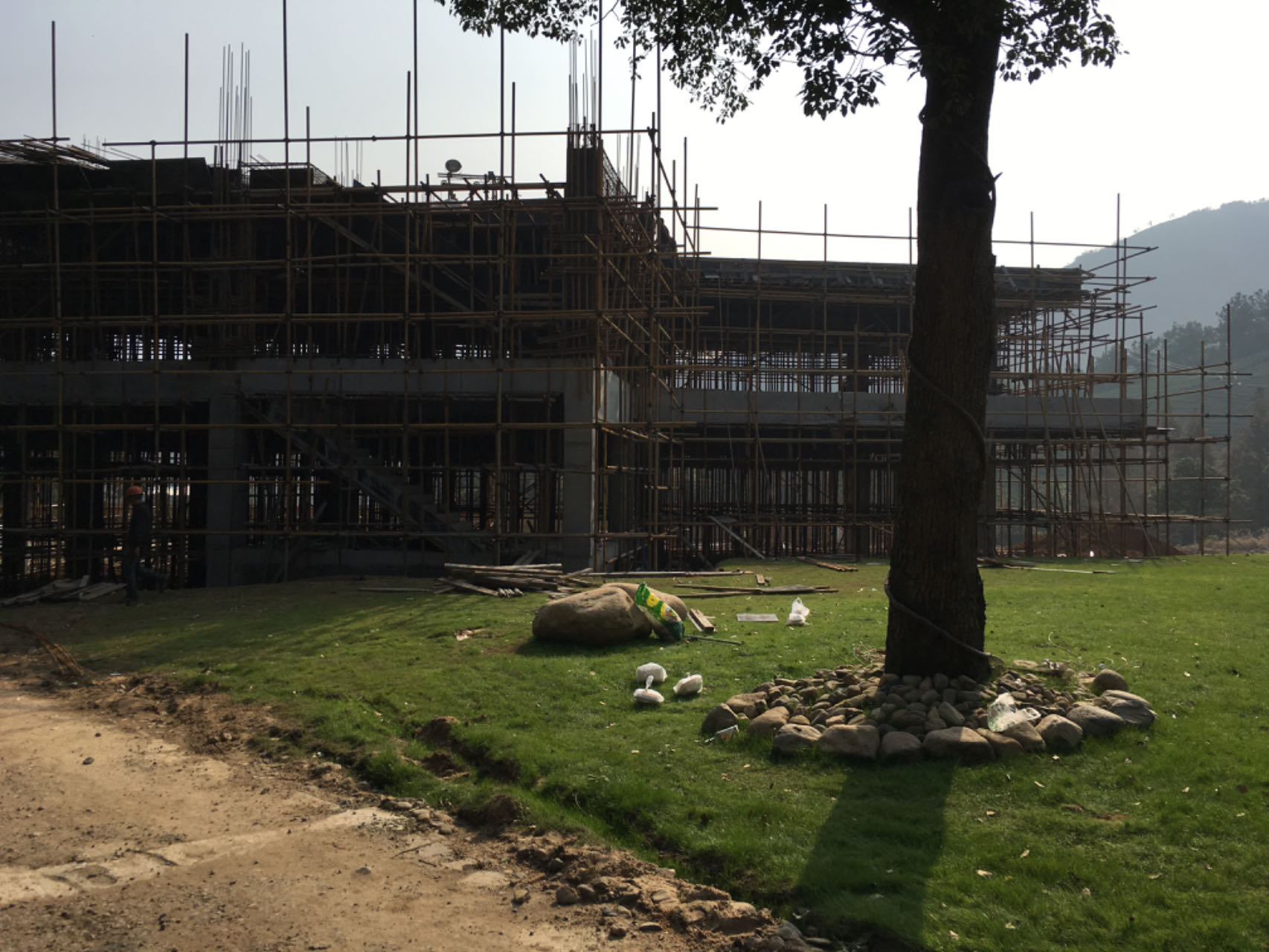
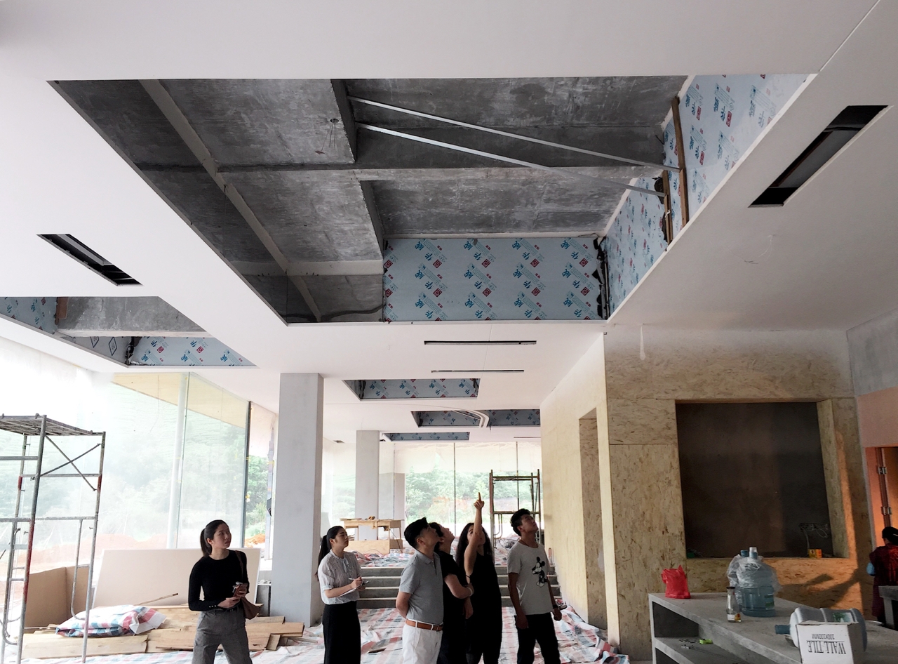
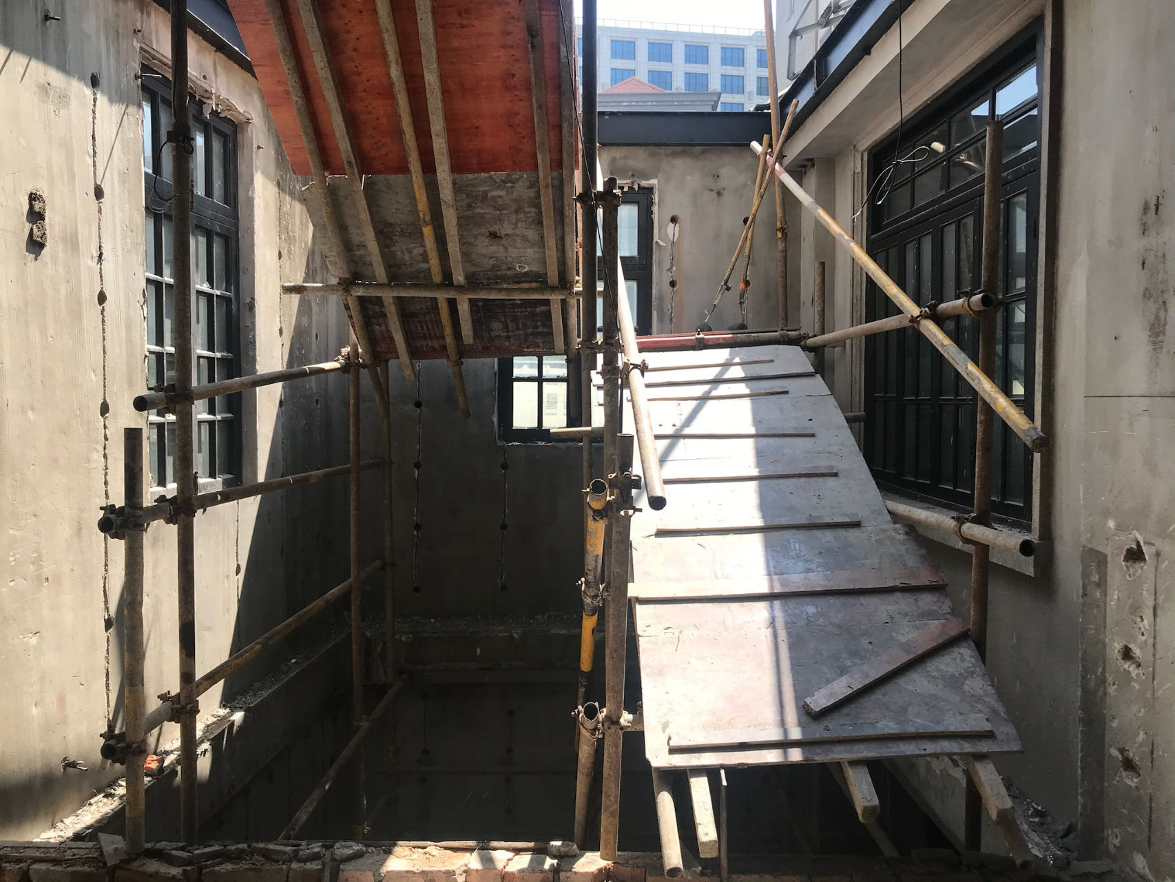
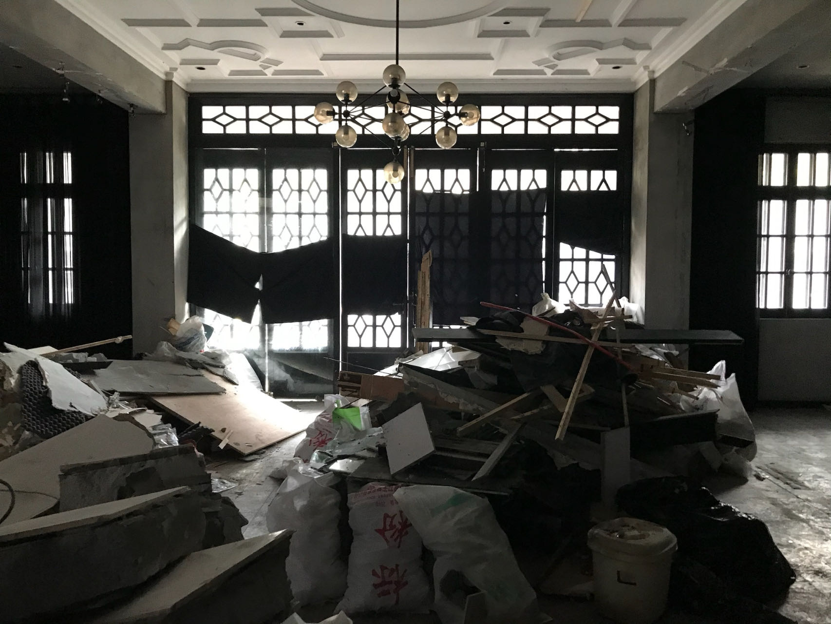
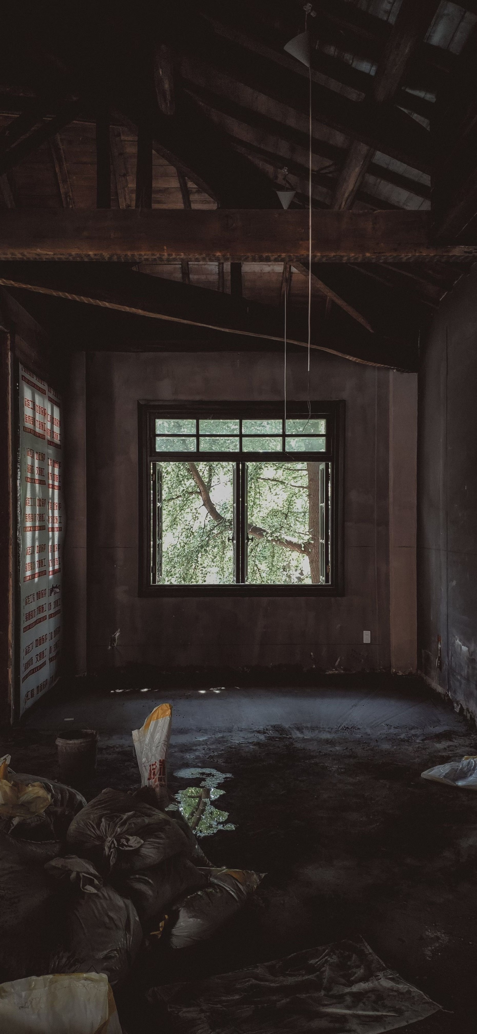
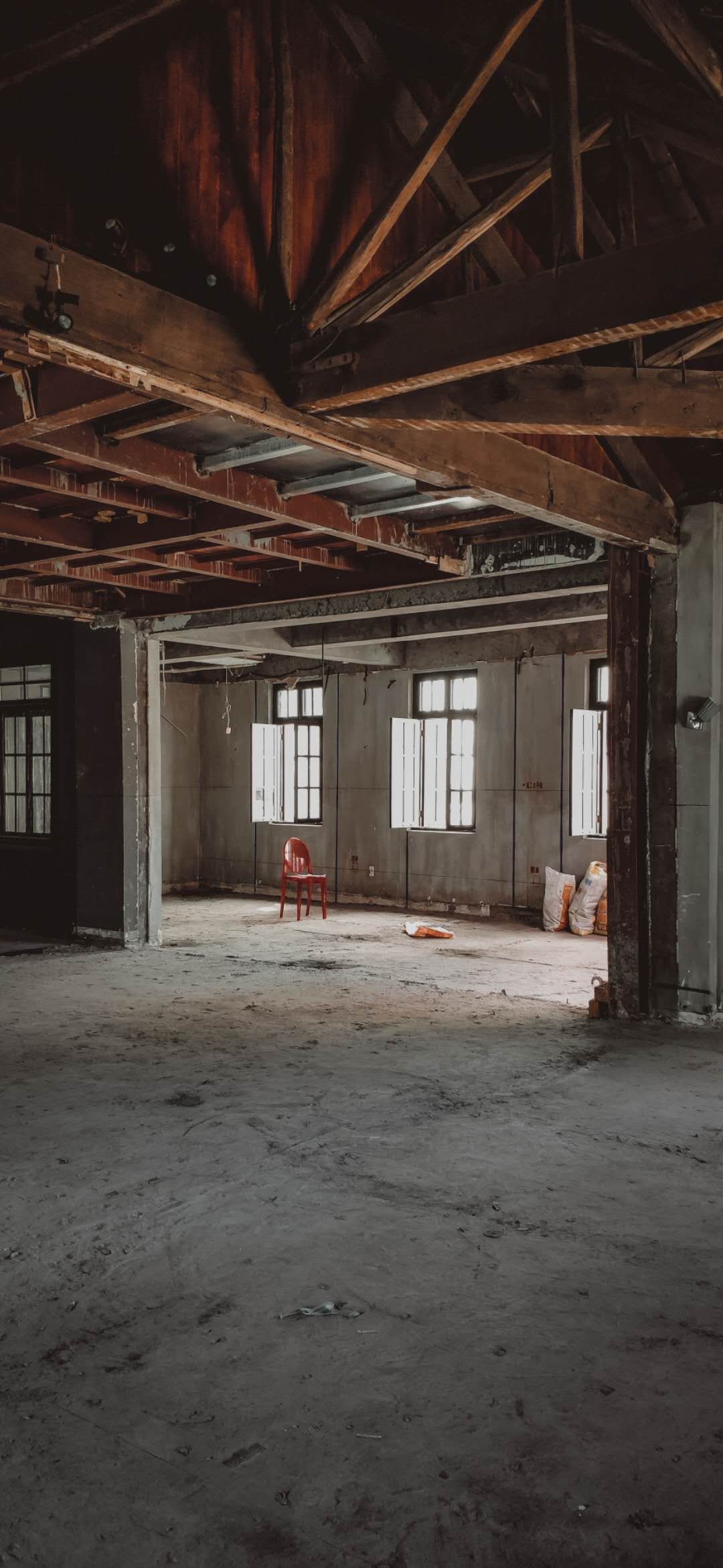
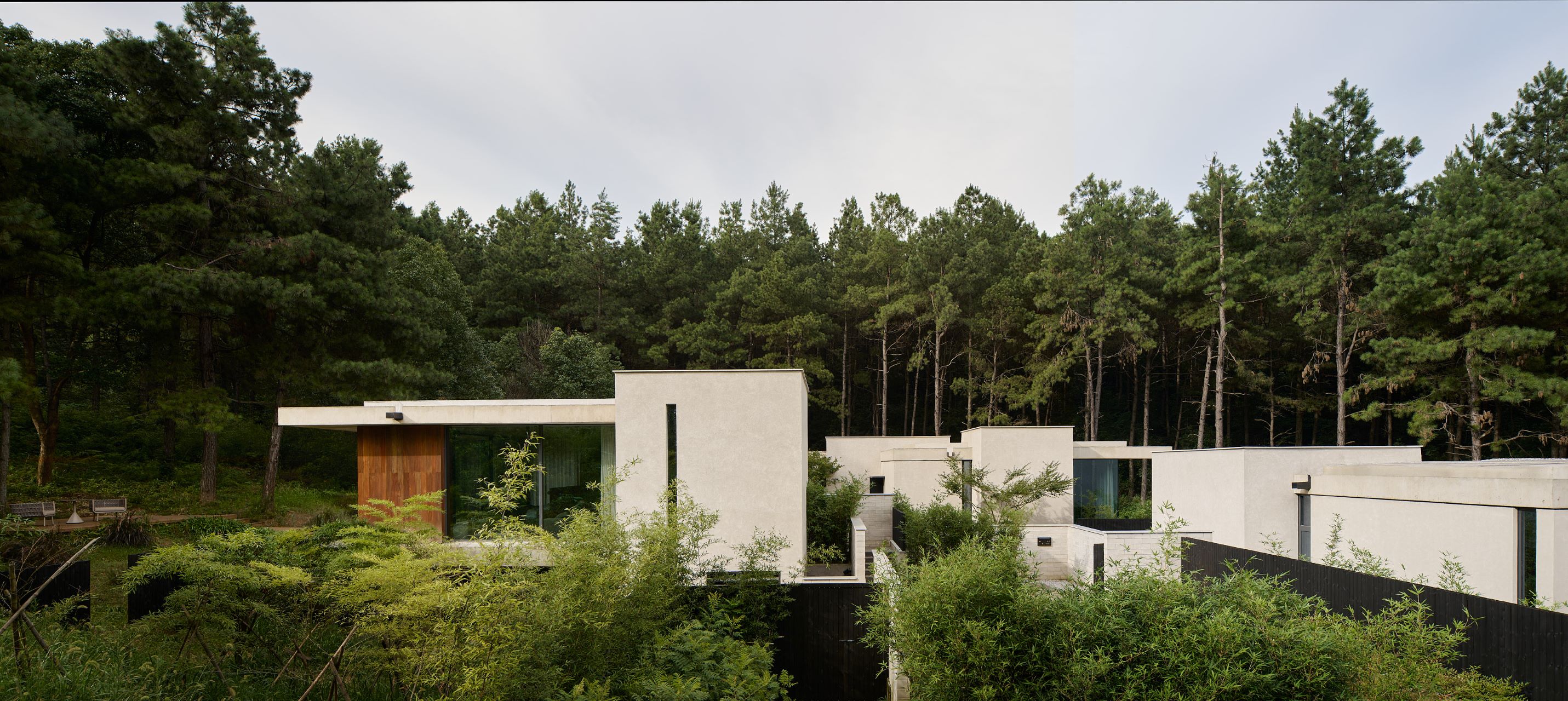
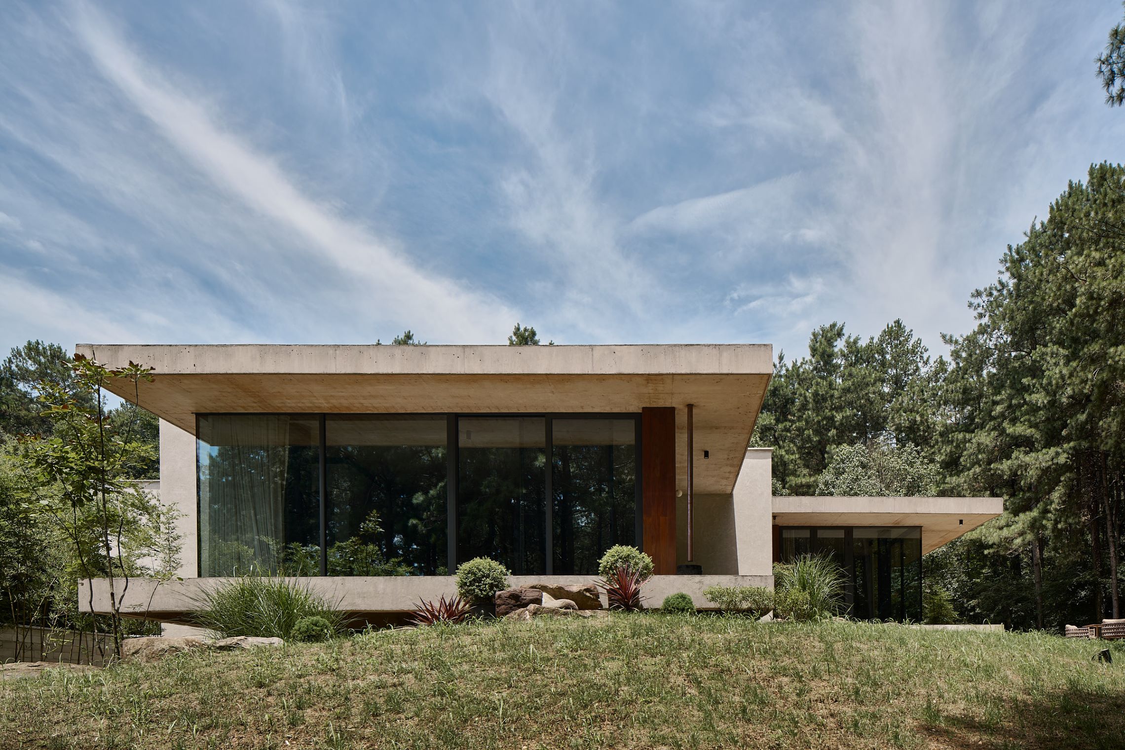
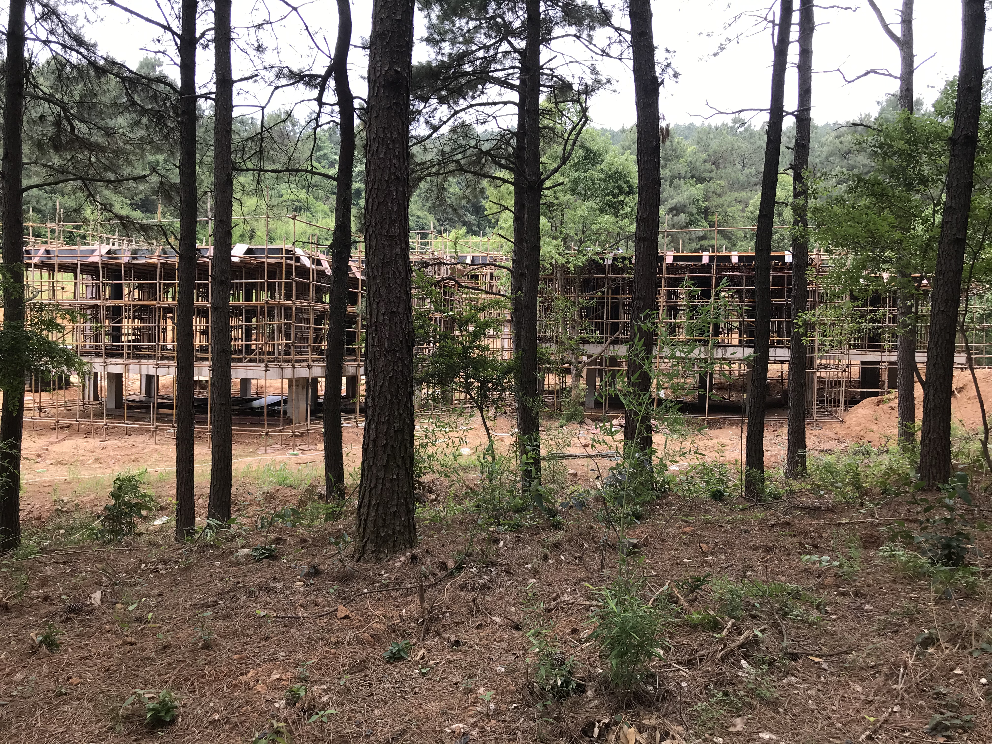
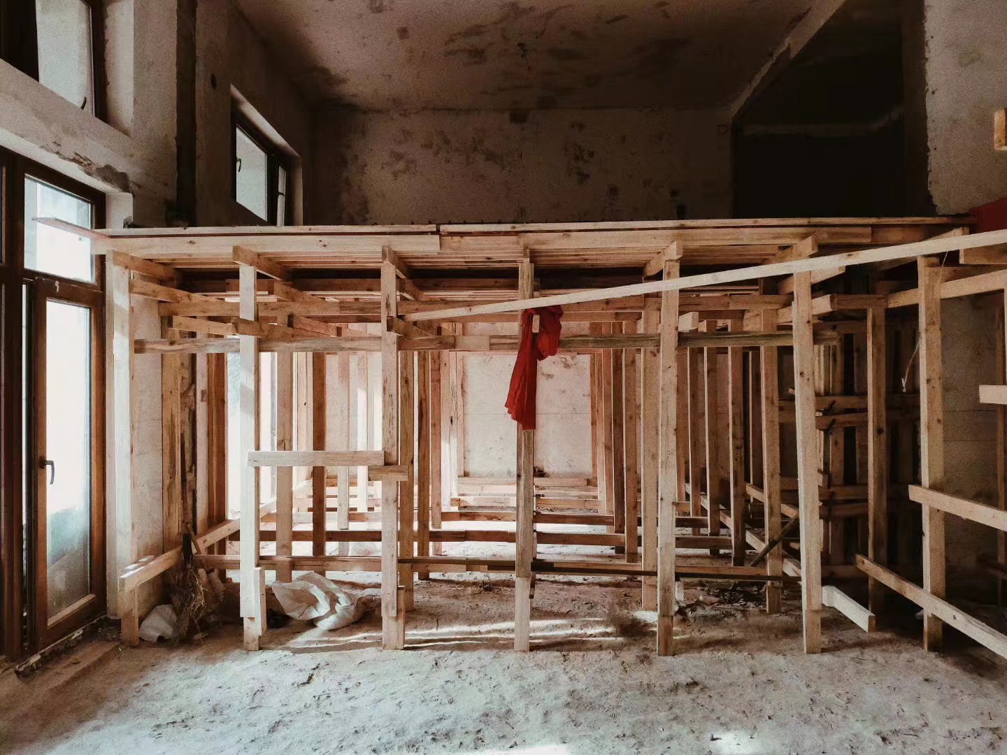
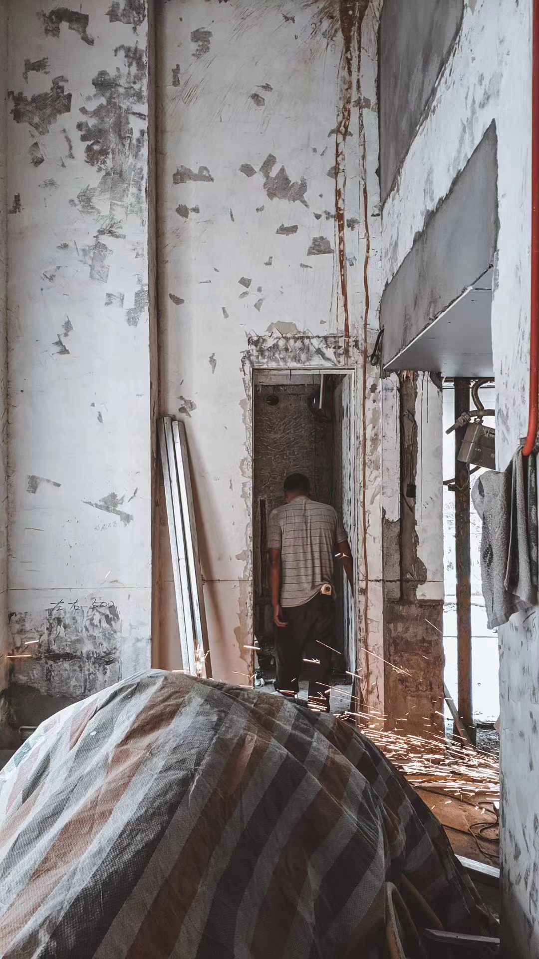
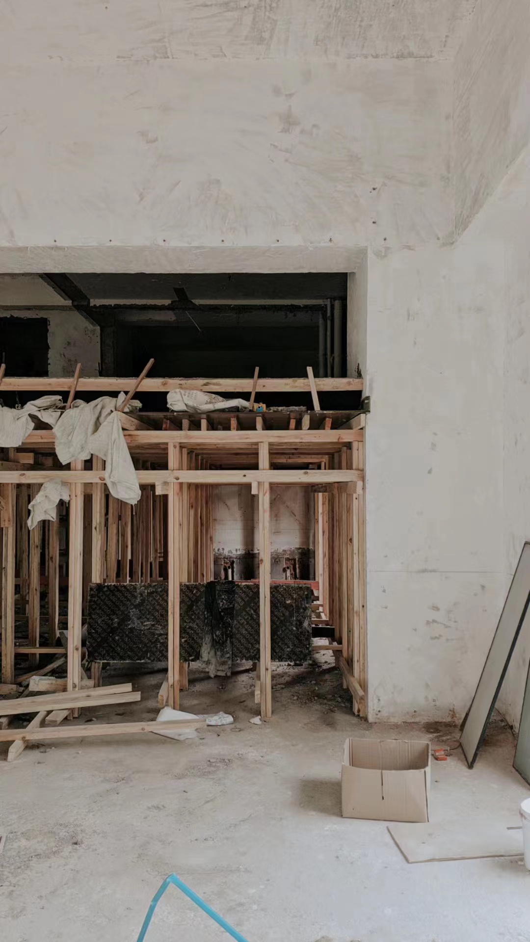
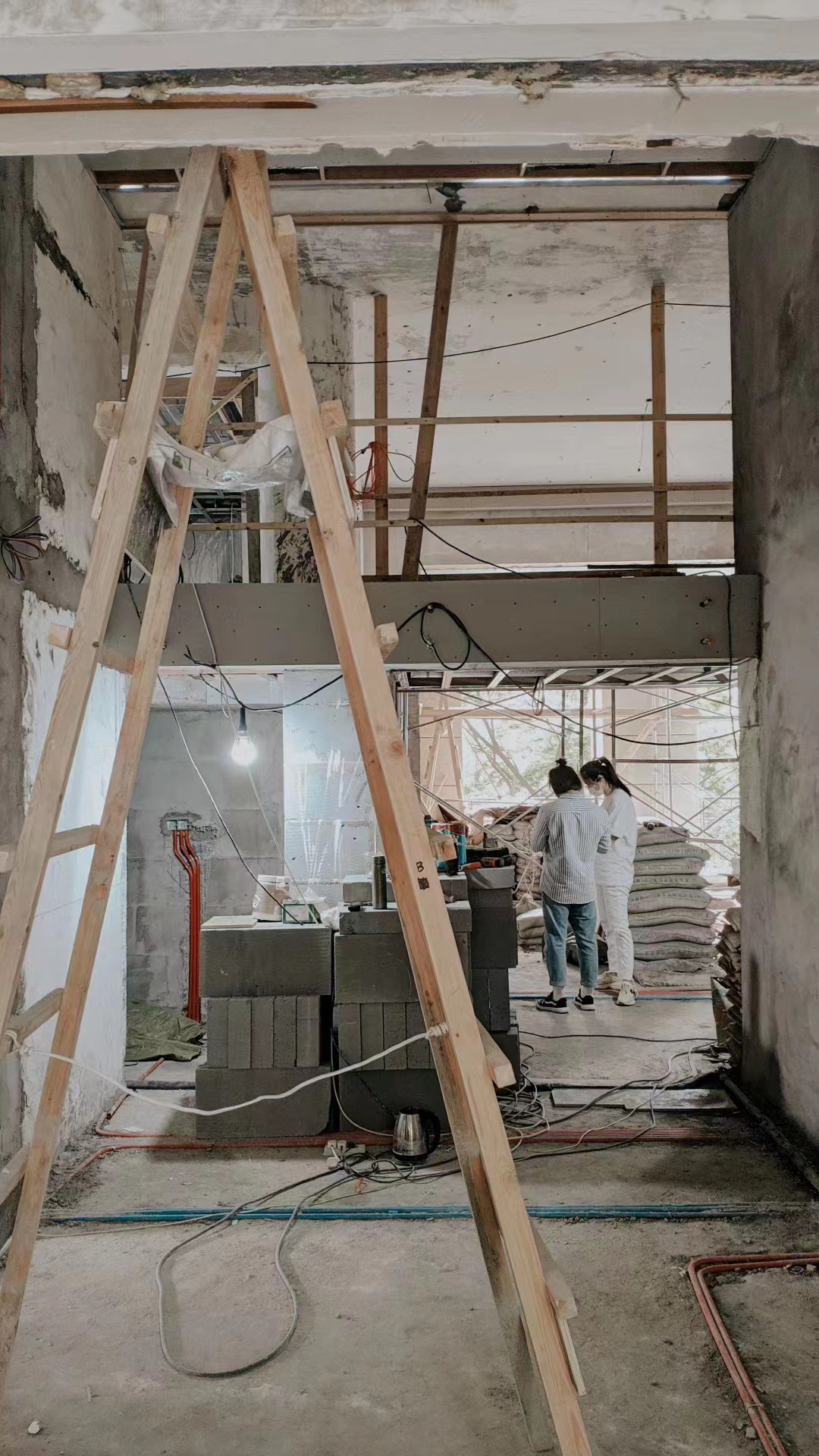
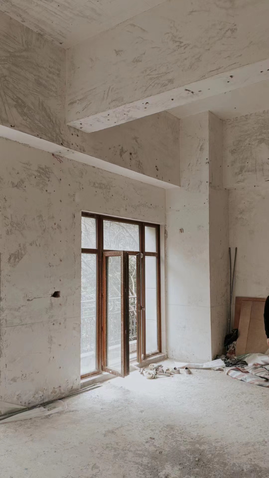
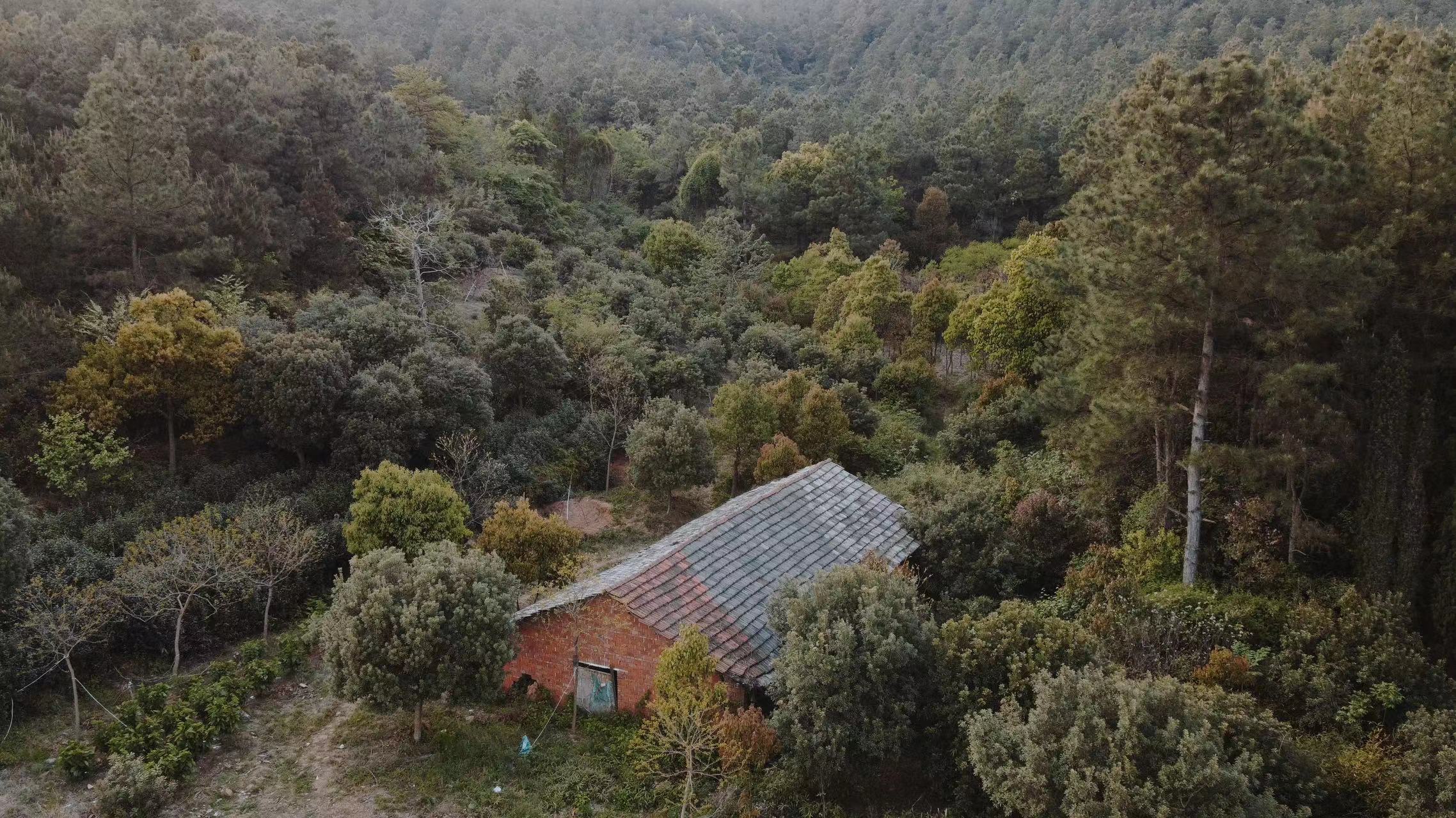
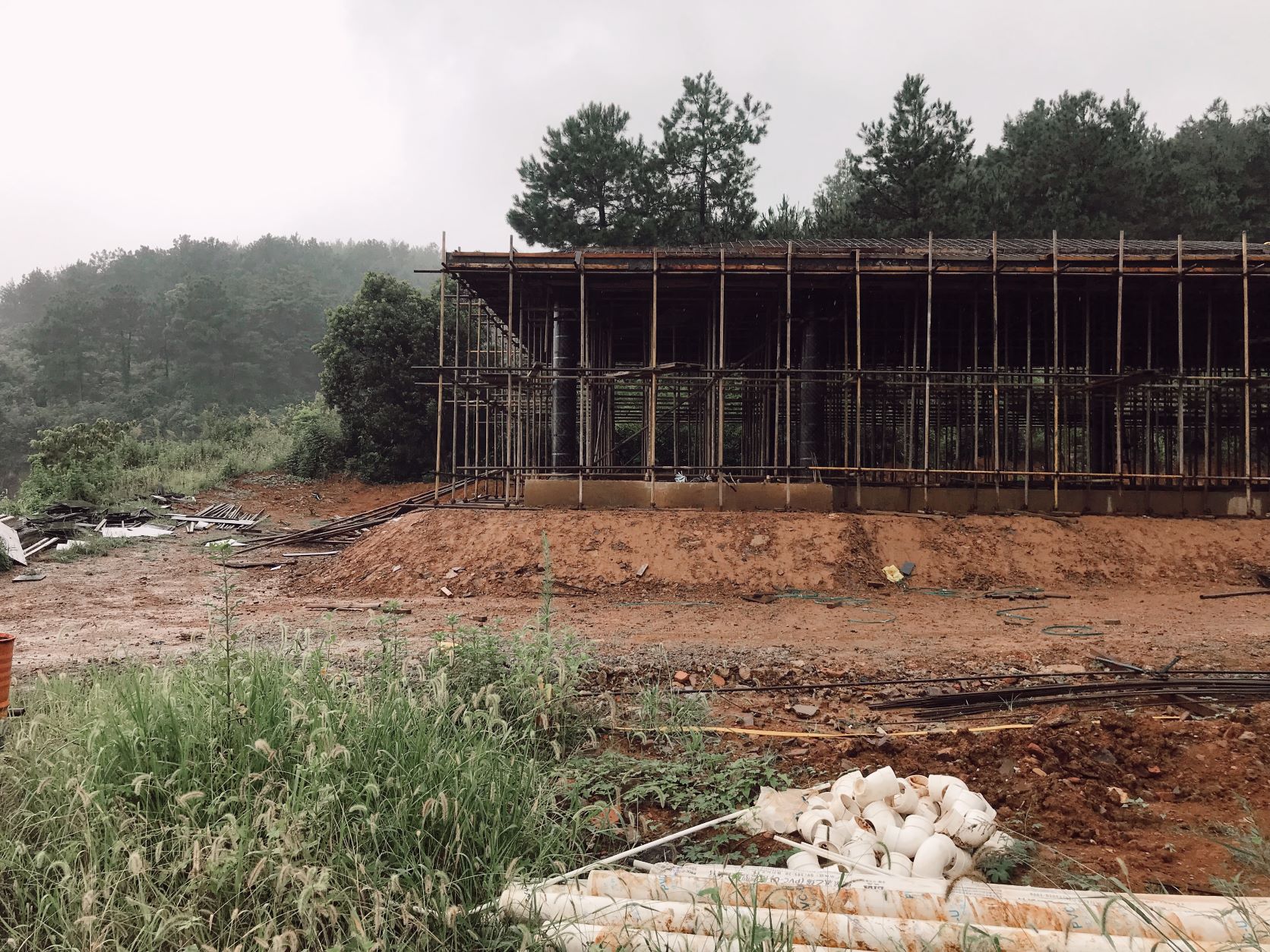
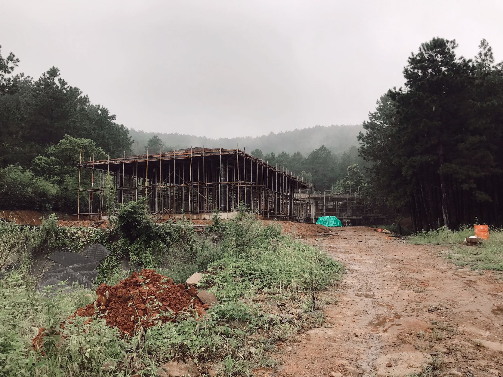
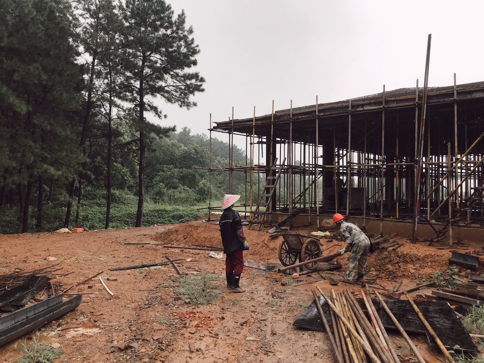
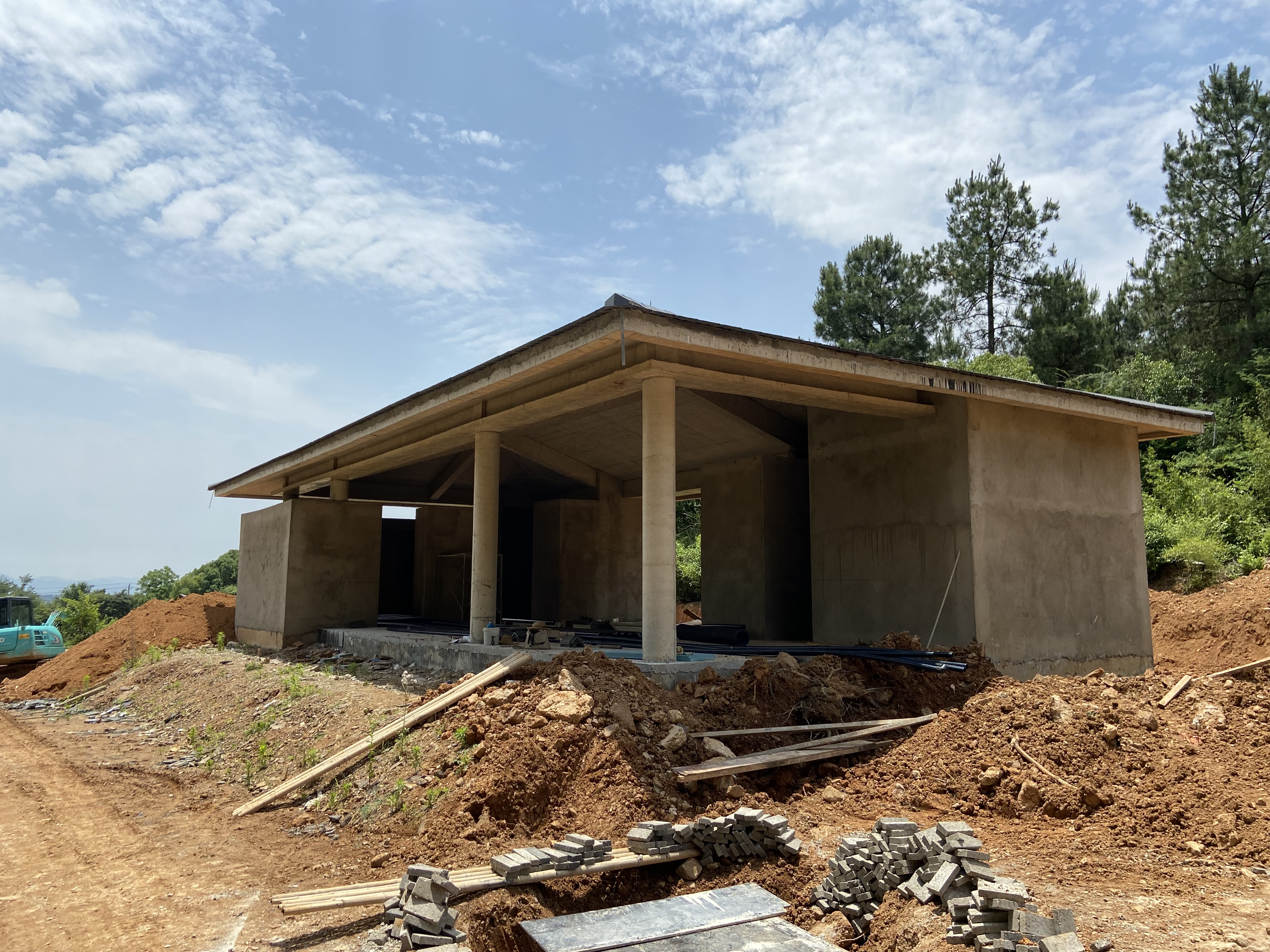
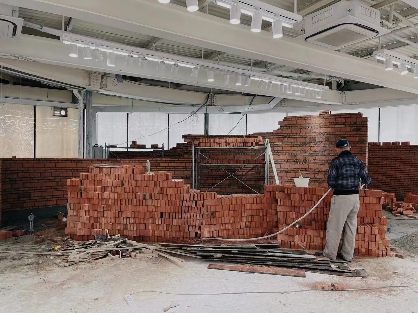
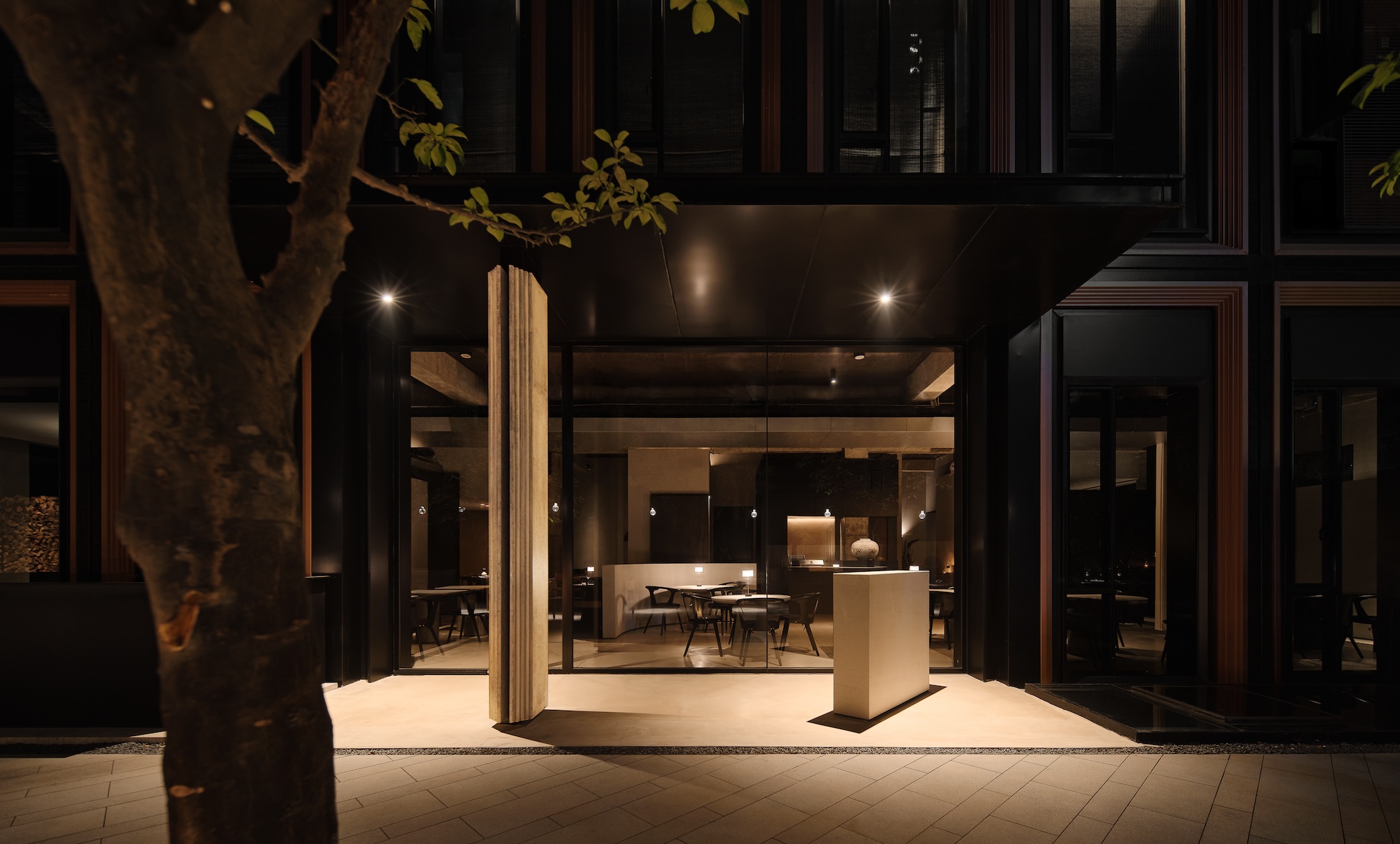
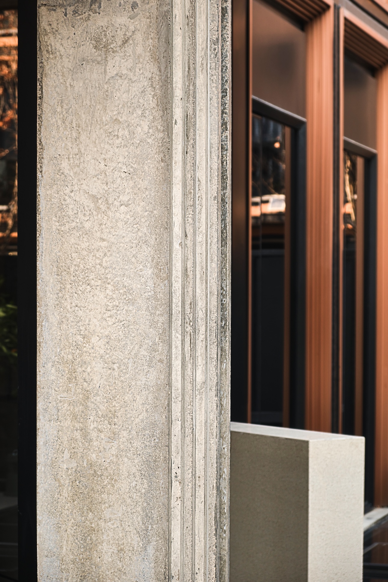
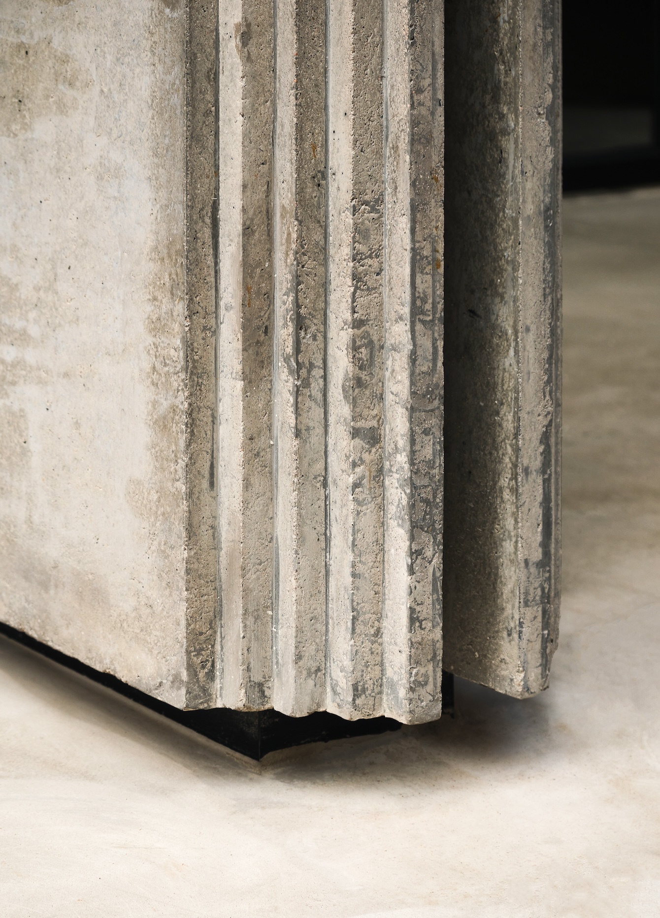
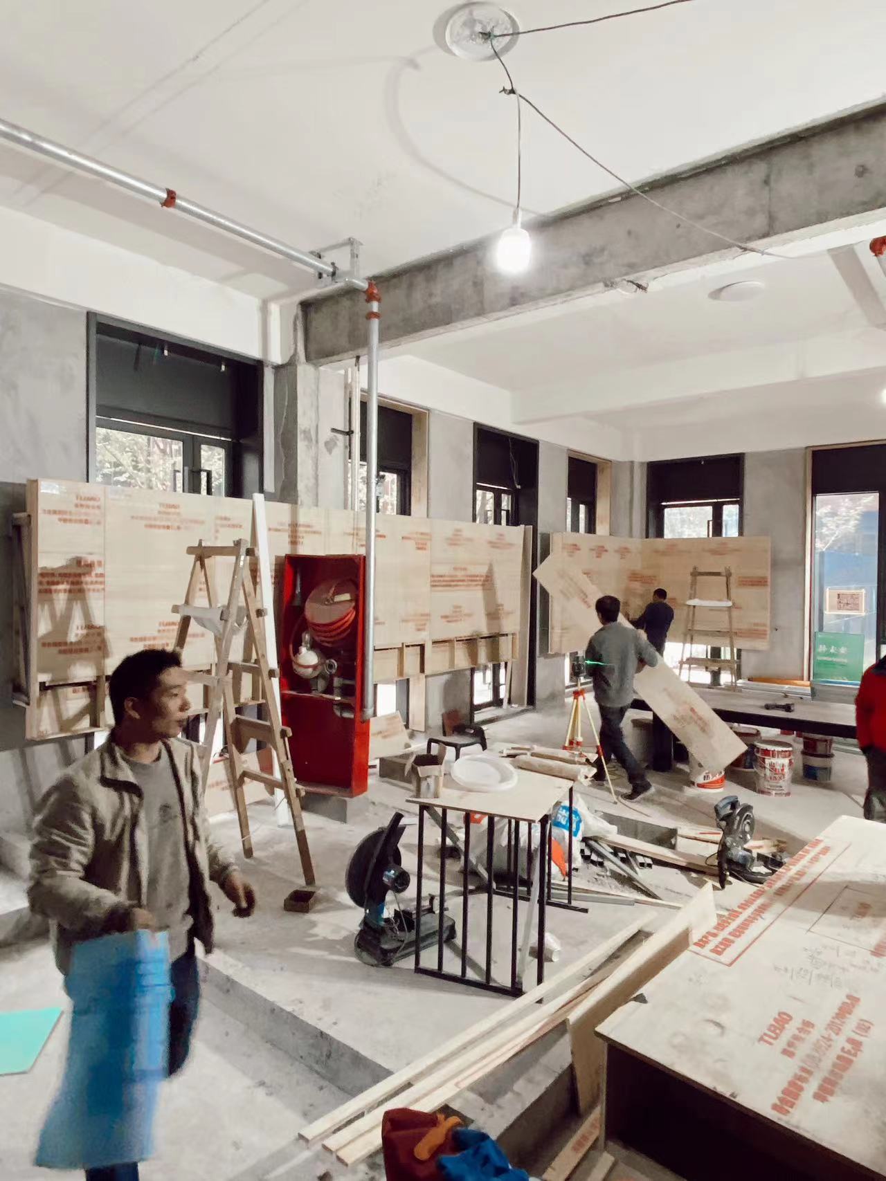
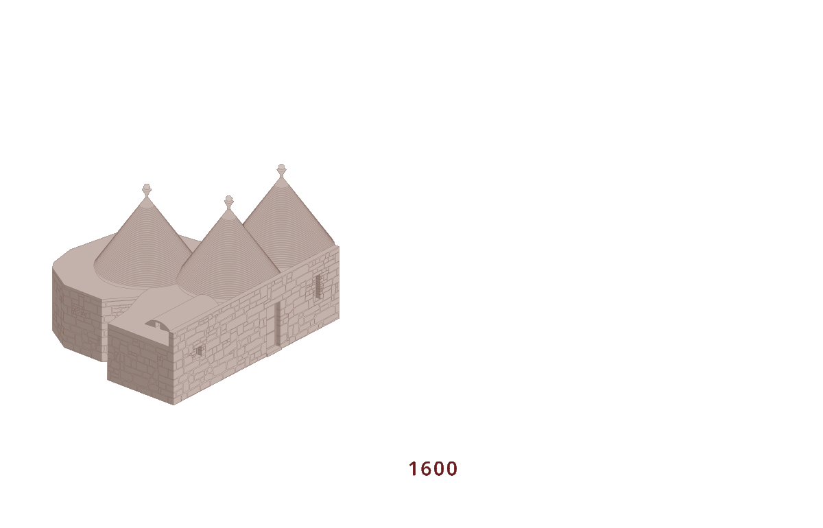
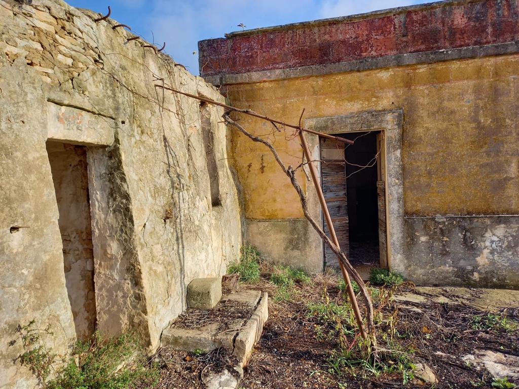
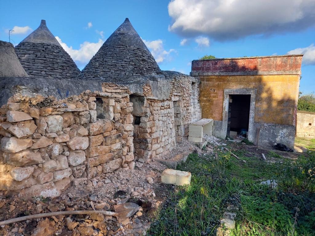
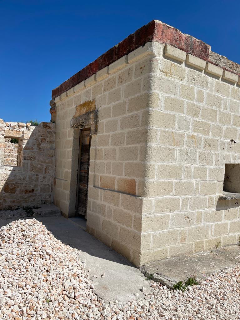
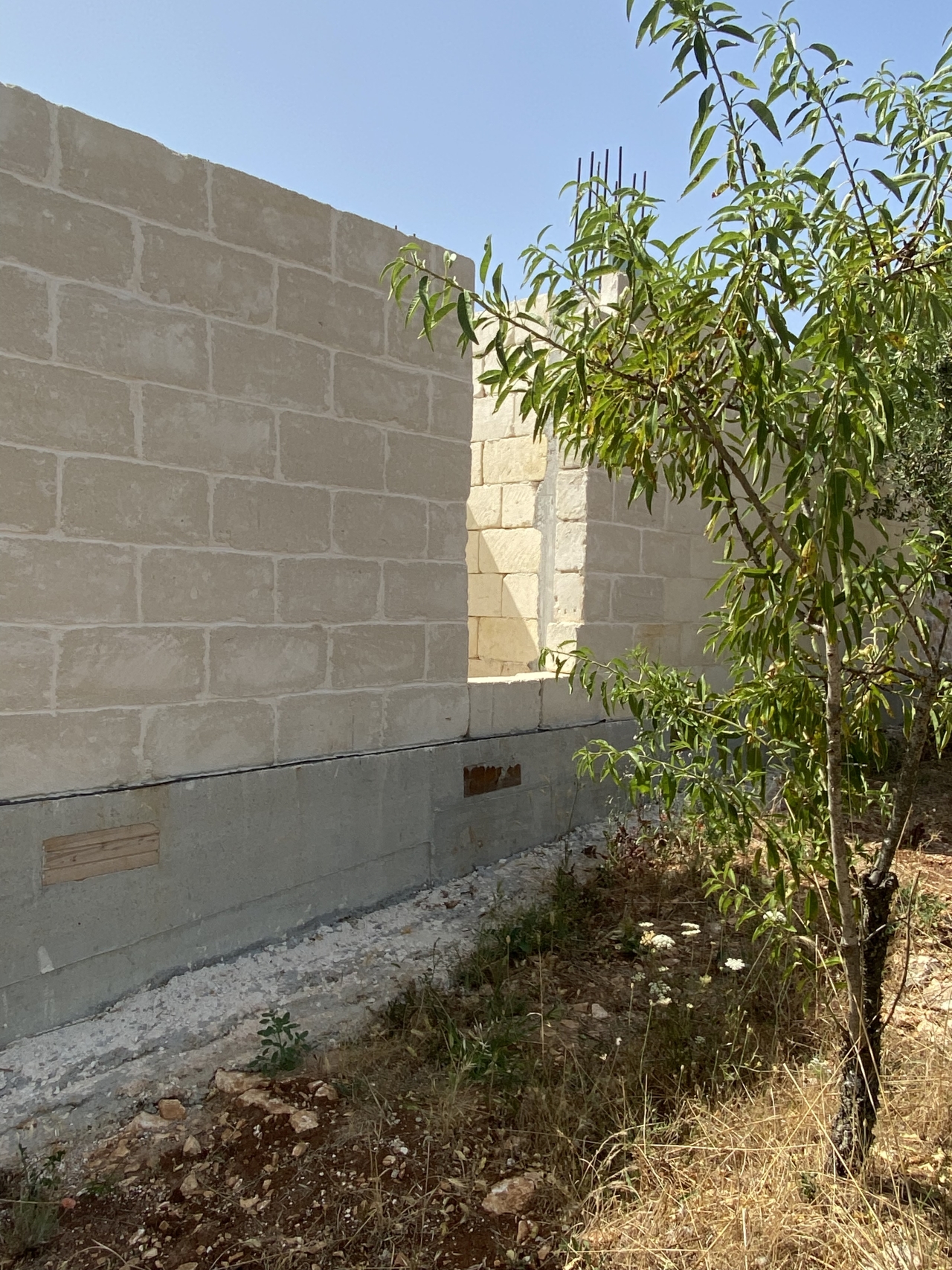
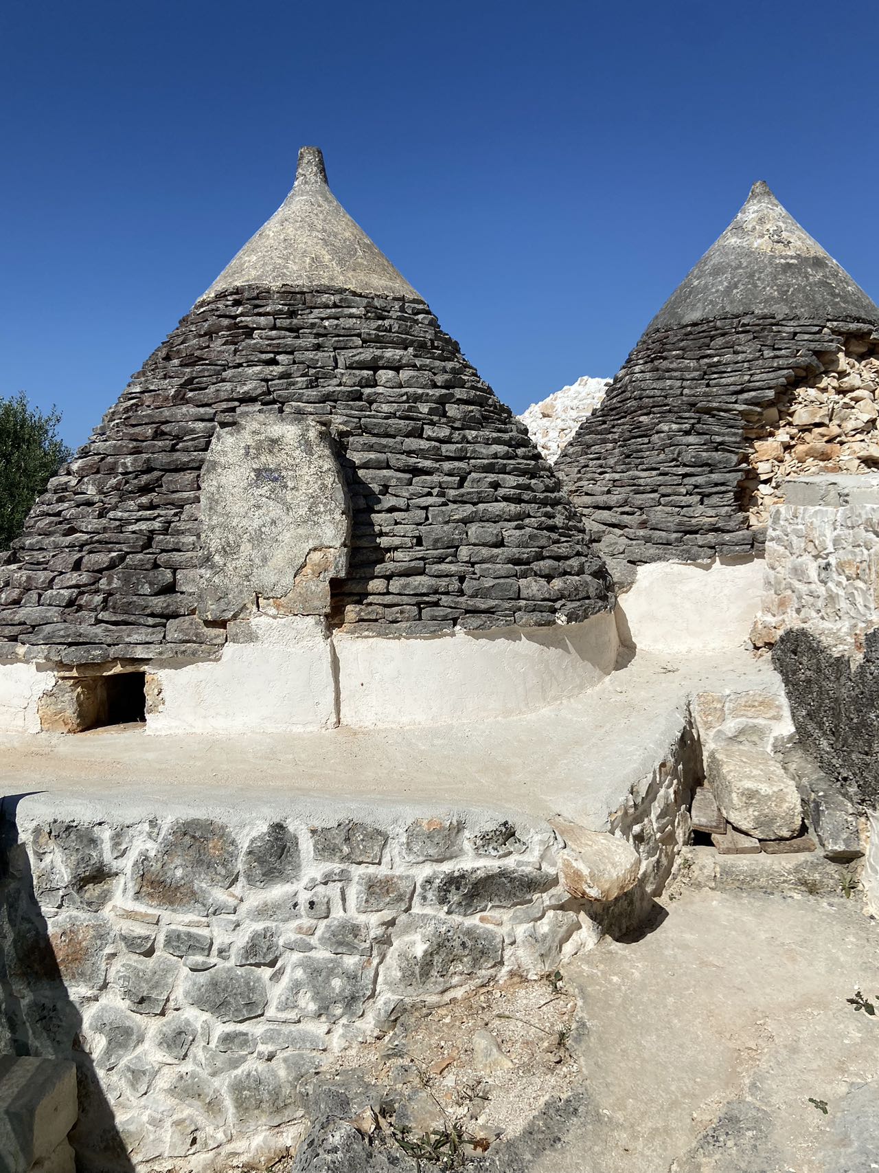
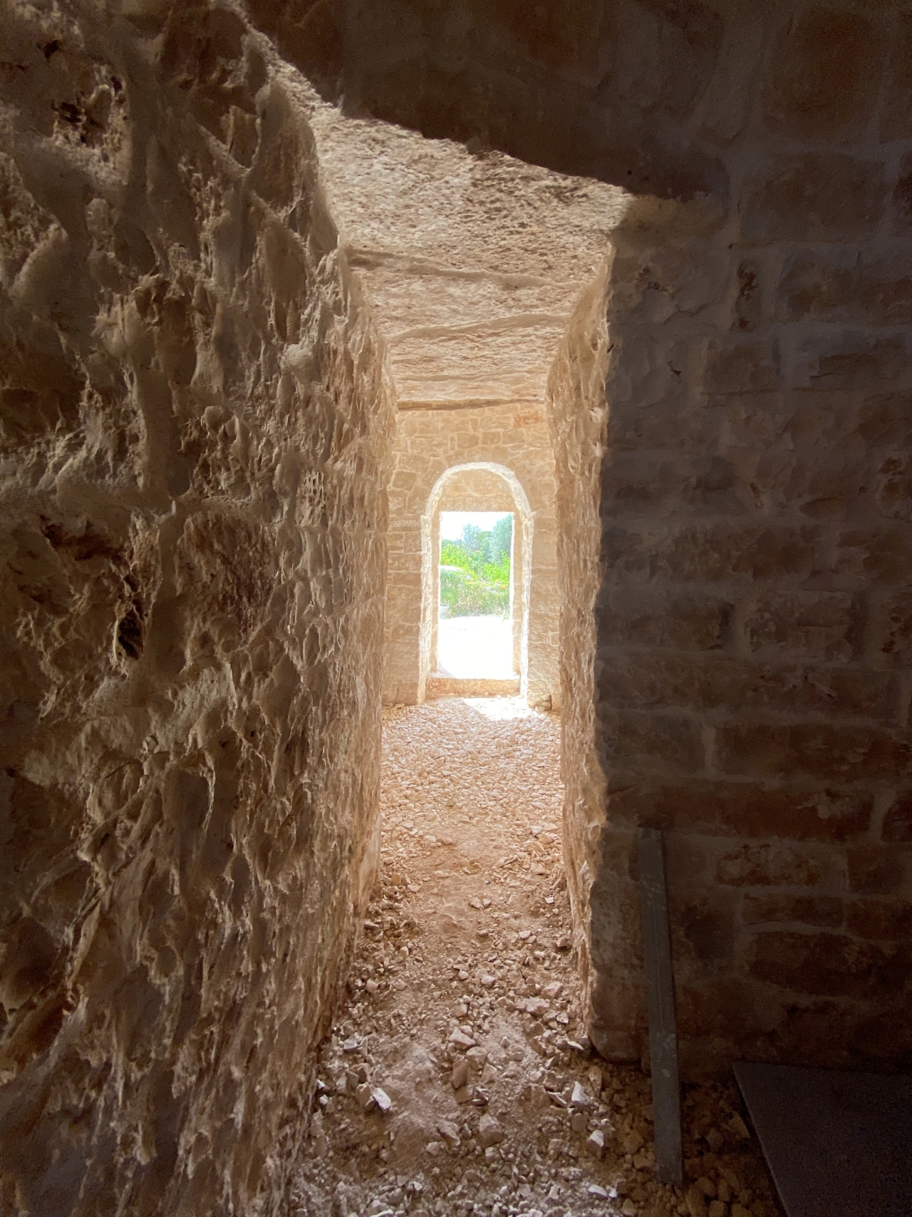
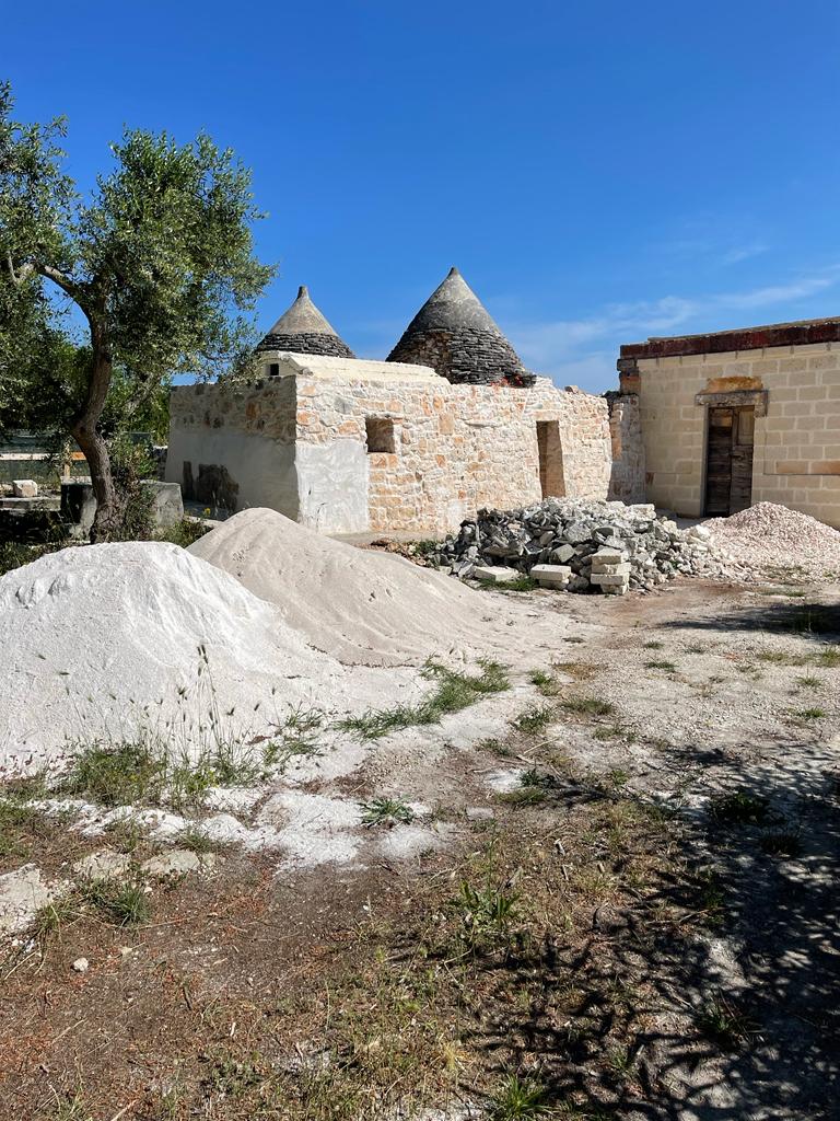
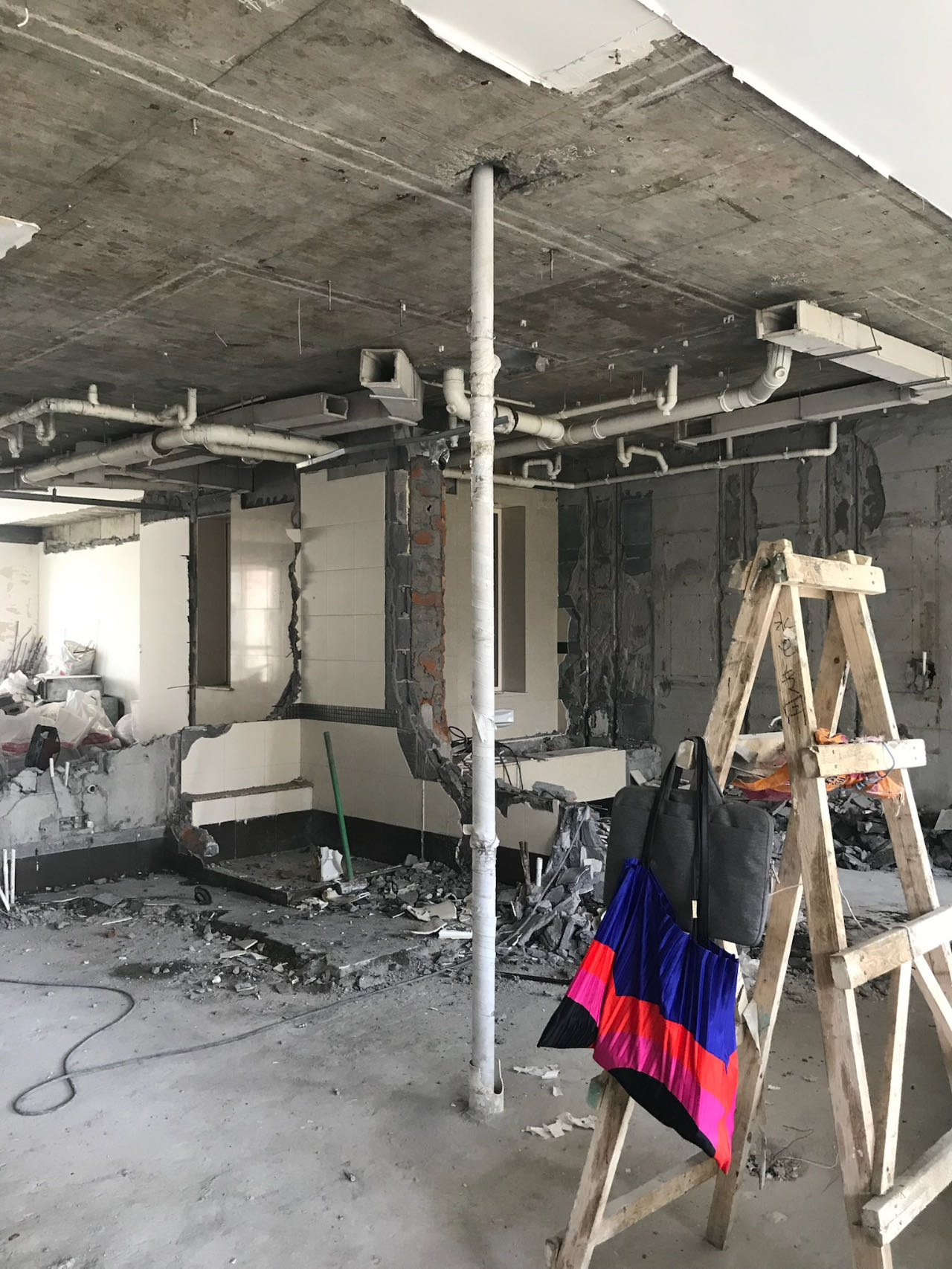
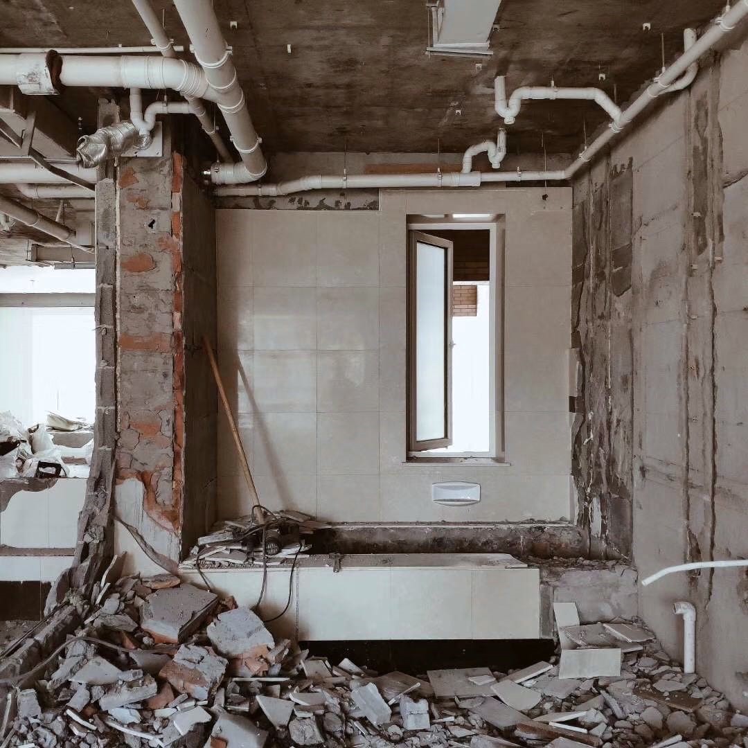
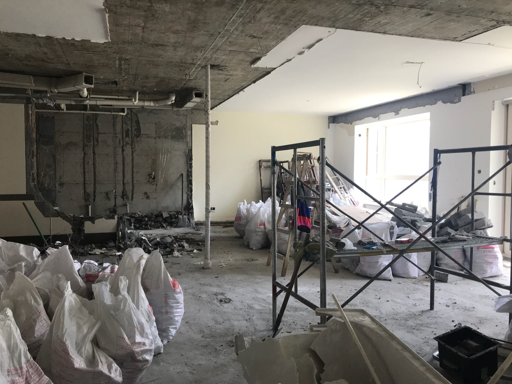
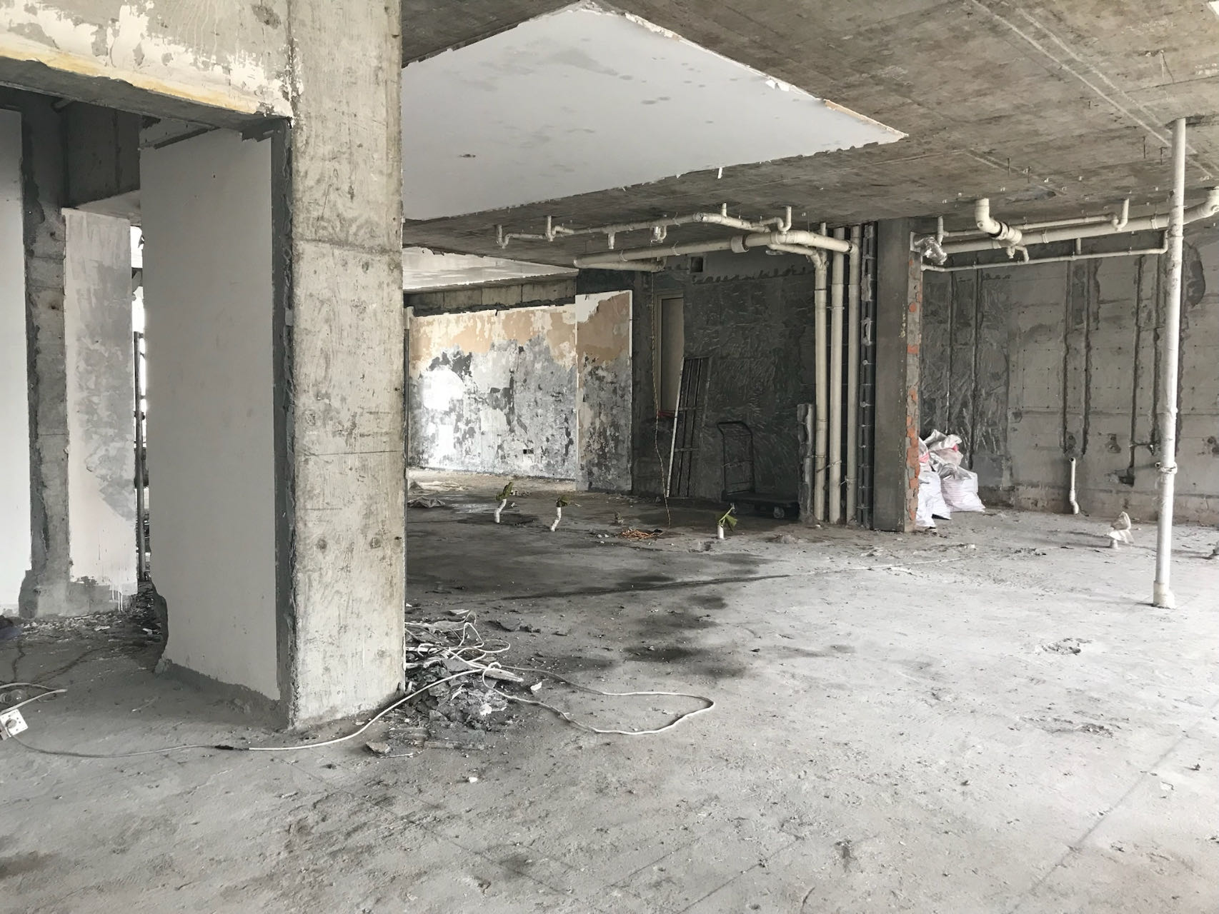
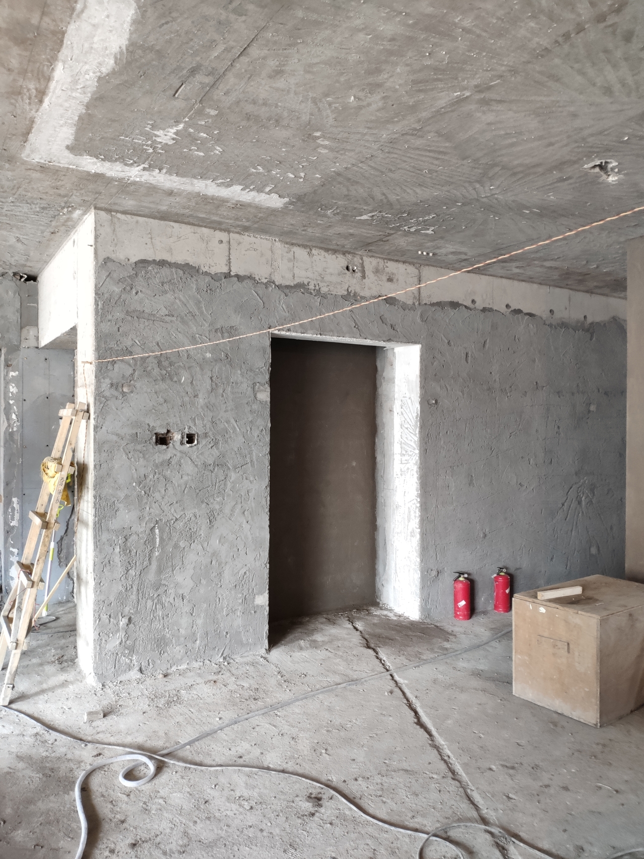
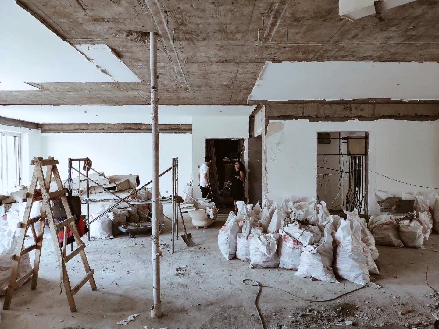
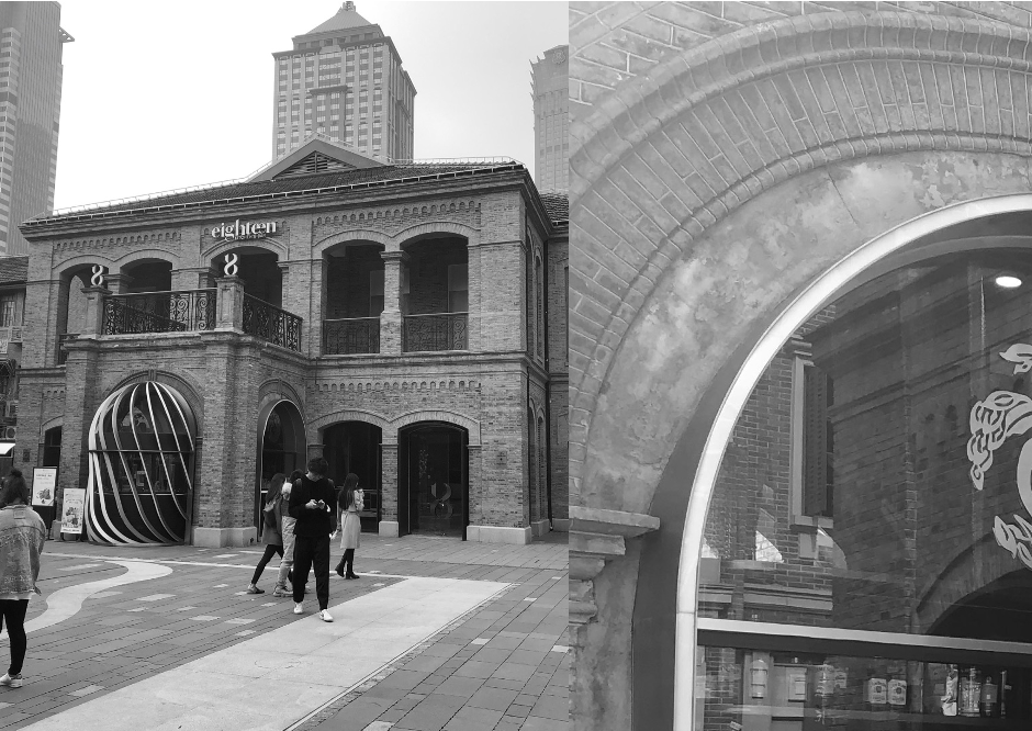
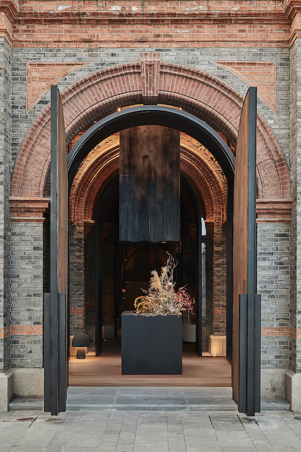
Unfortunately, as happens with many buildings in China throughout modern history, the villa was almost “eaten up” by the city from 1939 to 2020, with only one complete façade left facing the street. The interior was also renovated, extended and changed several times, from residential to multiple commercial uses.

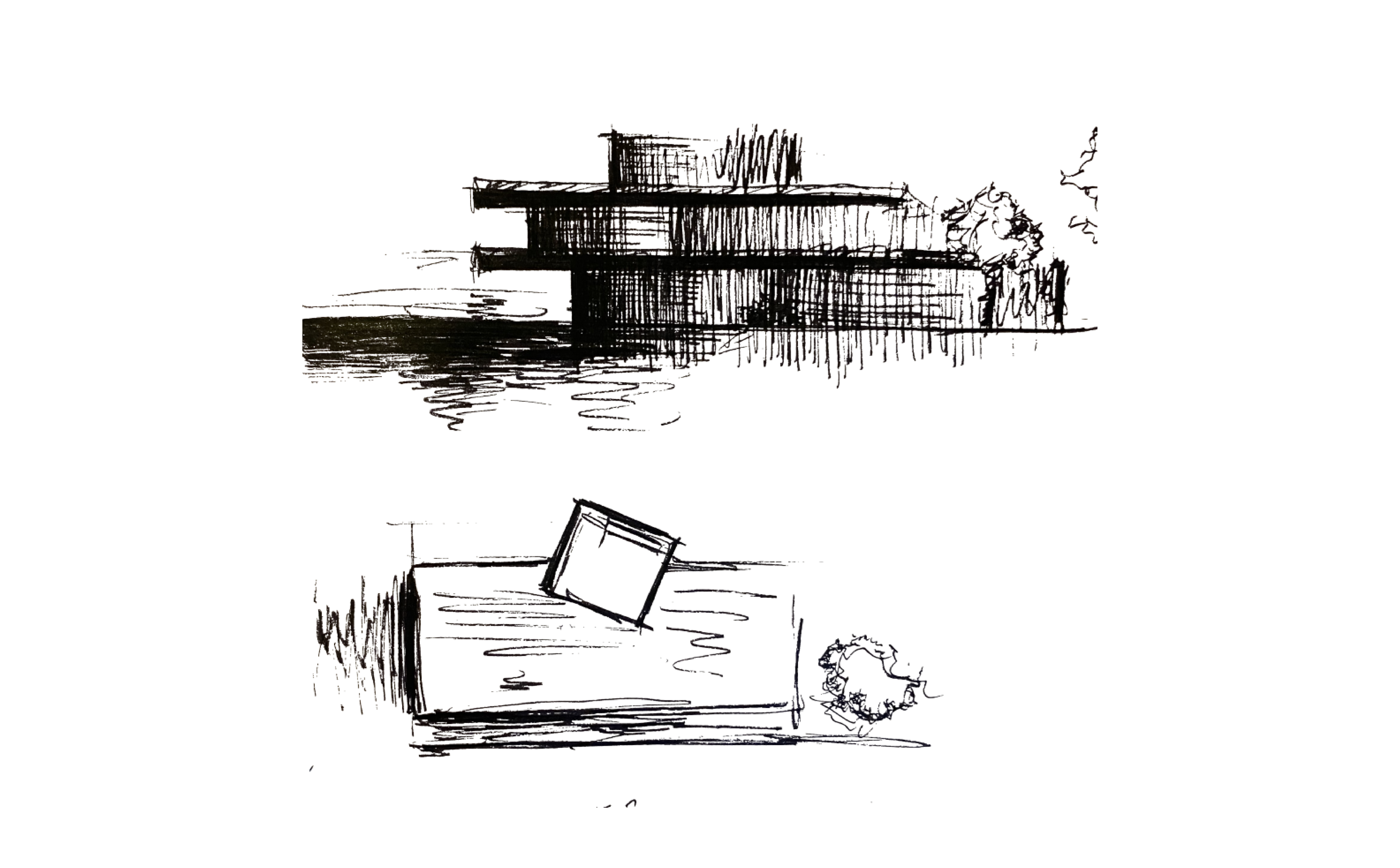
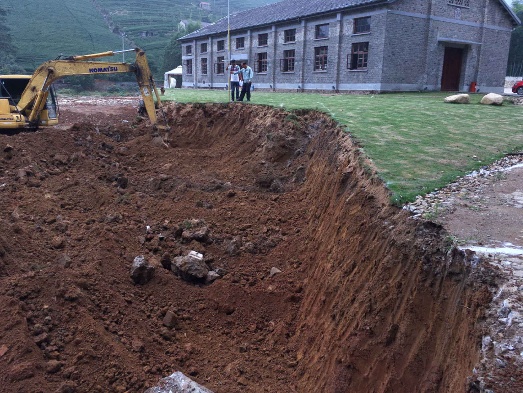
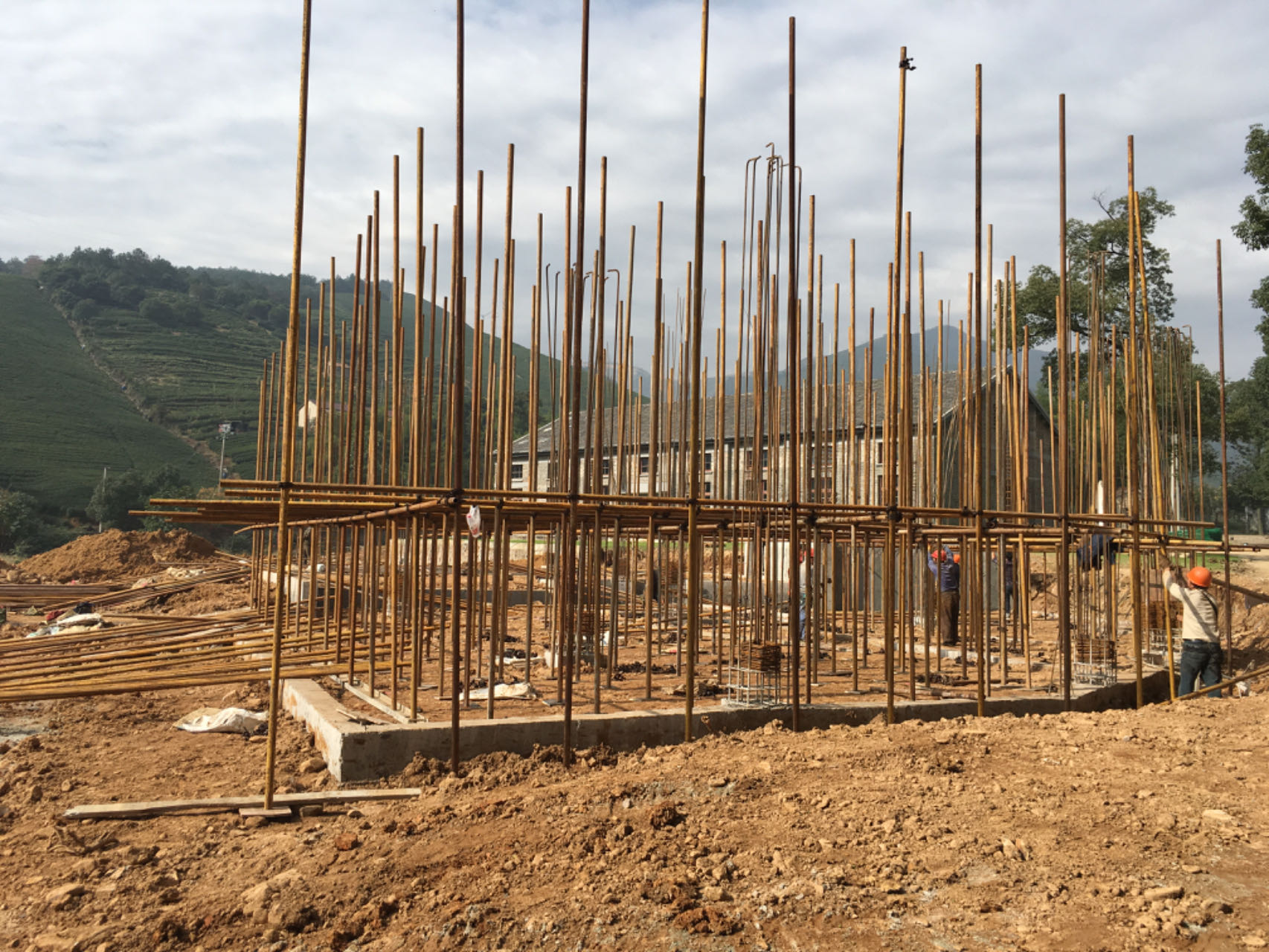
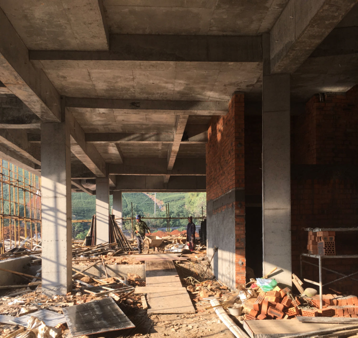
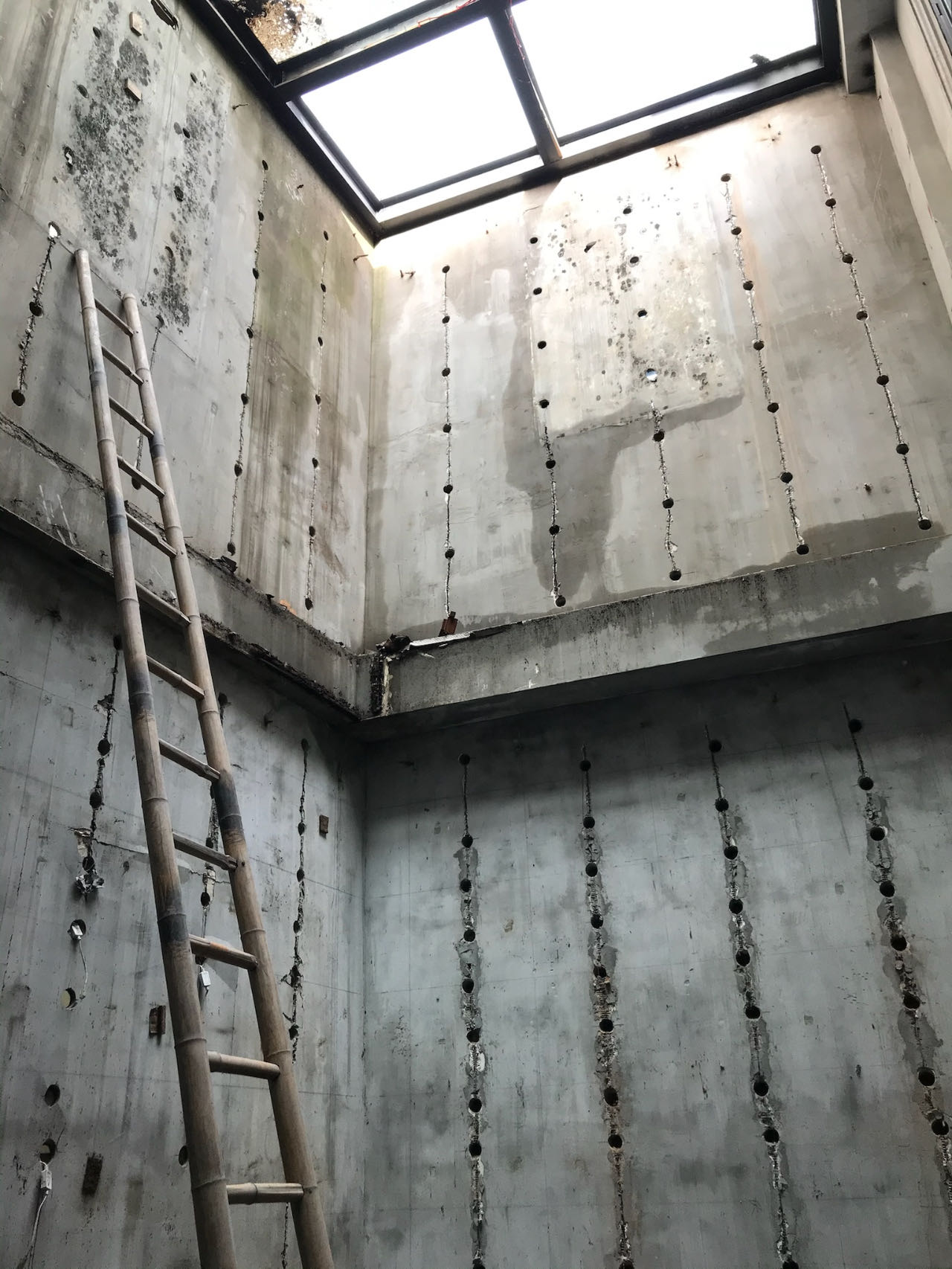
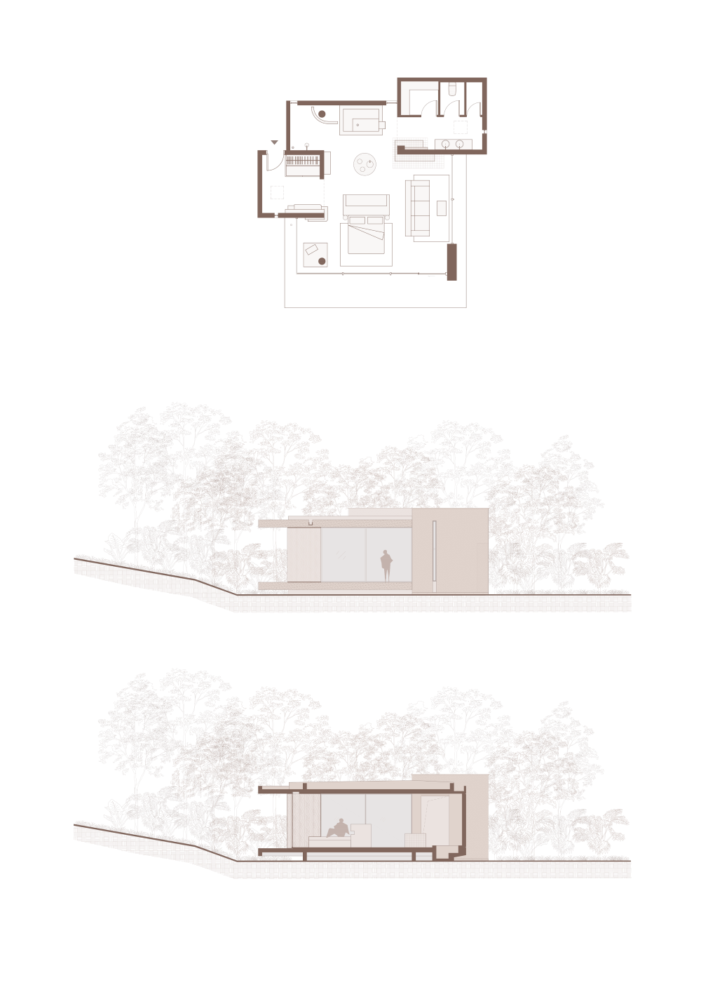
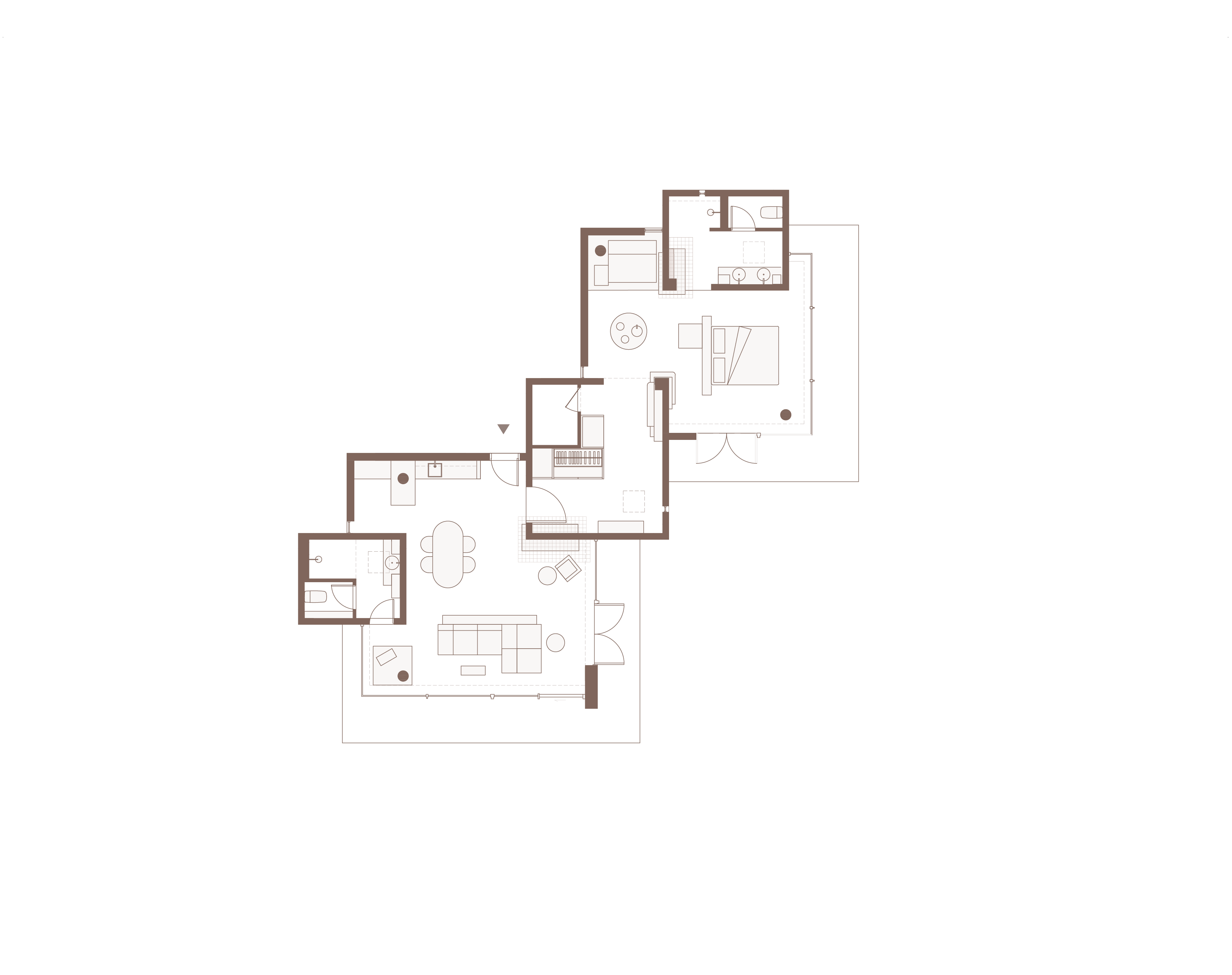
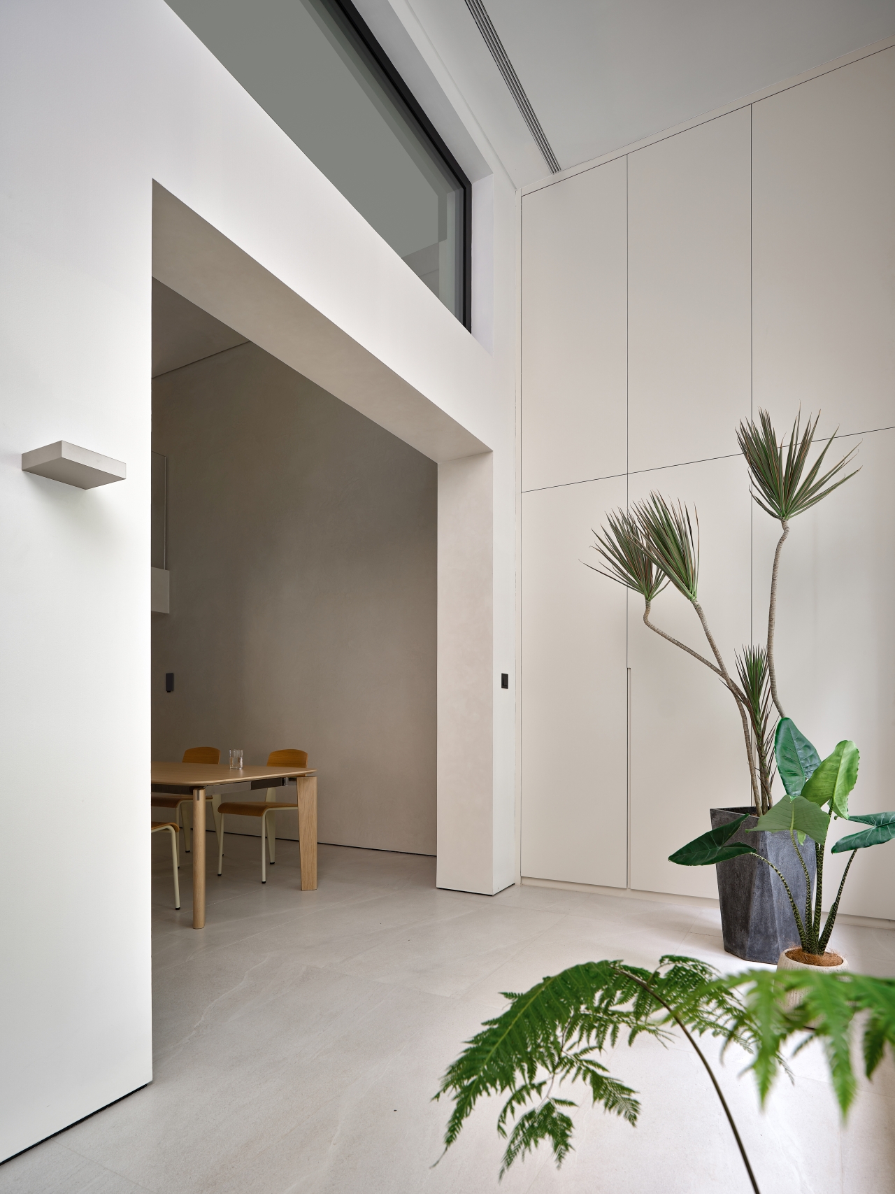
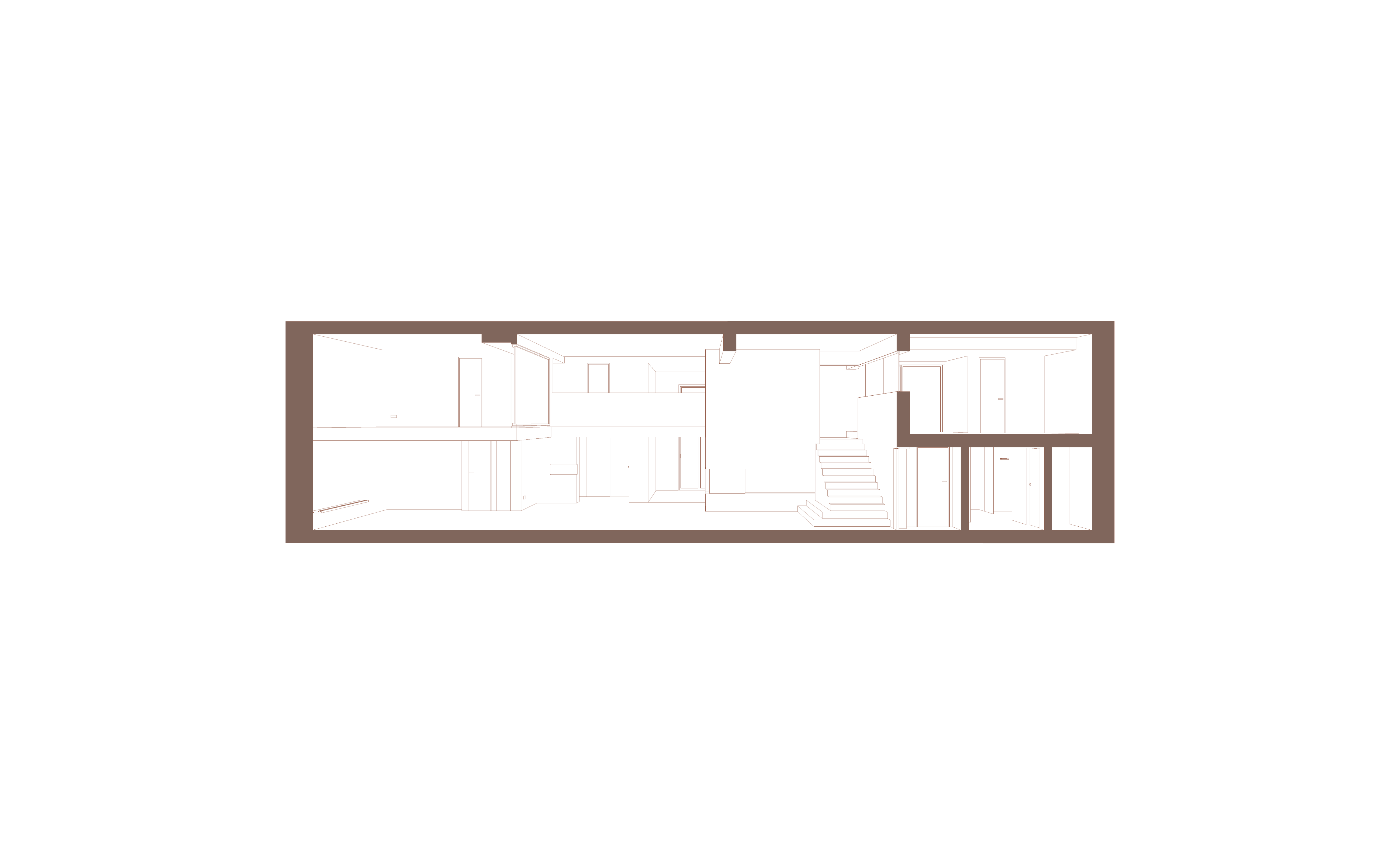
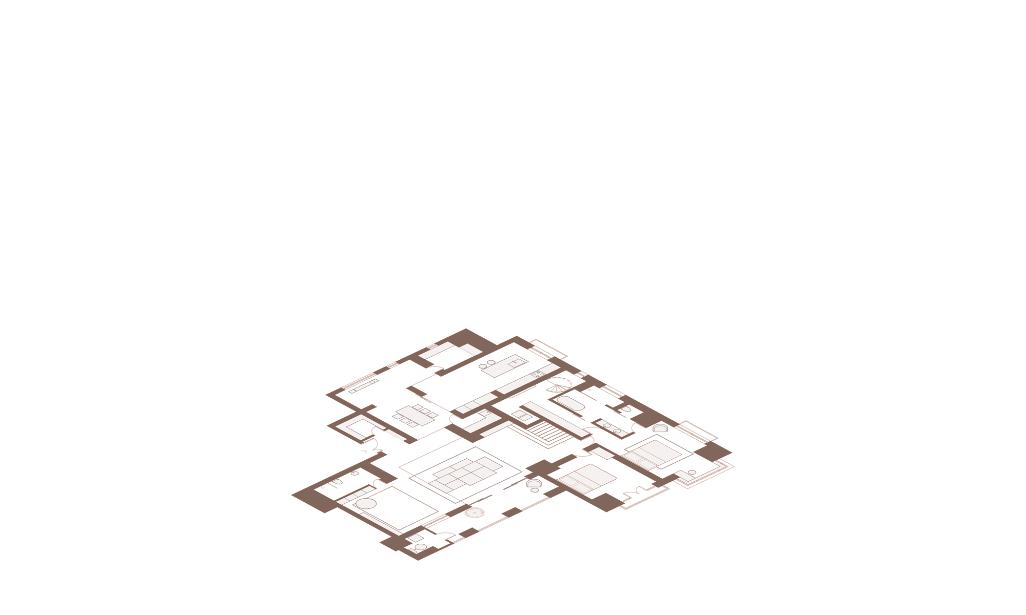
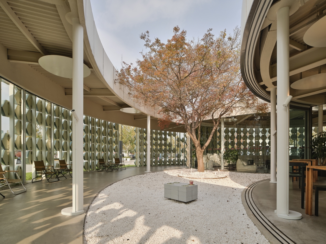
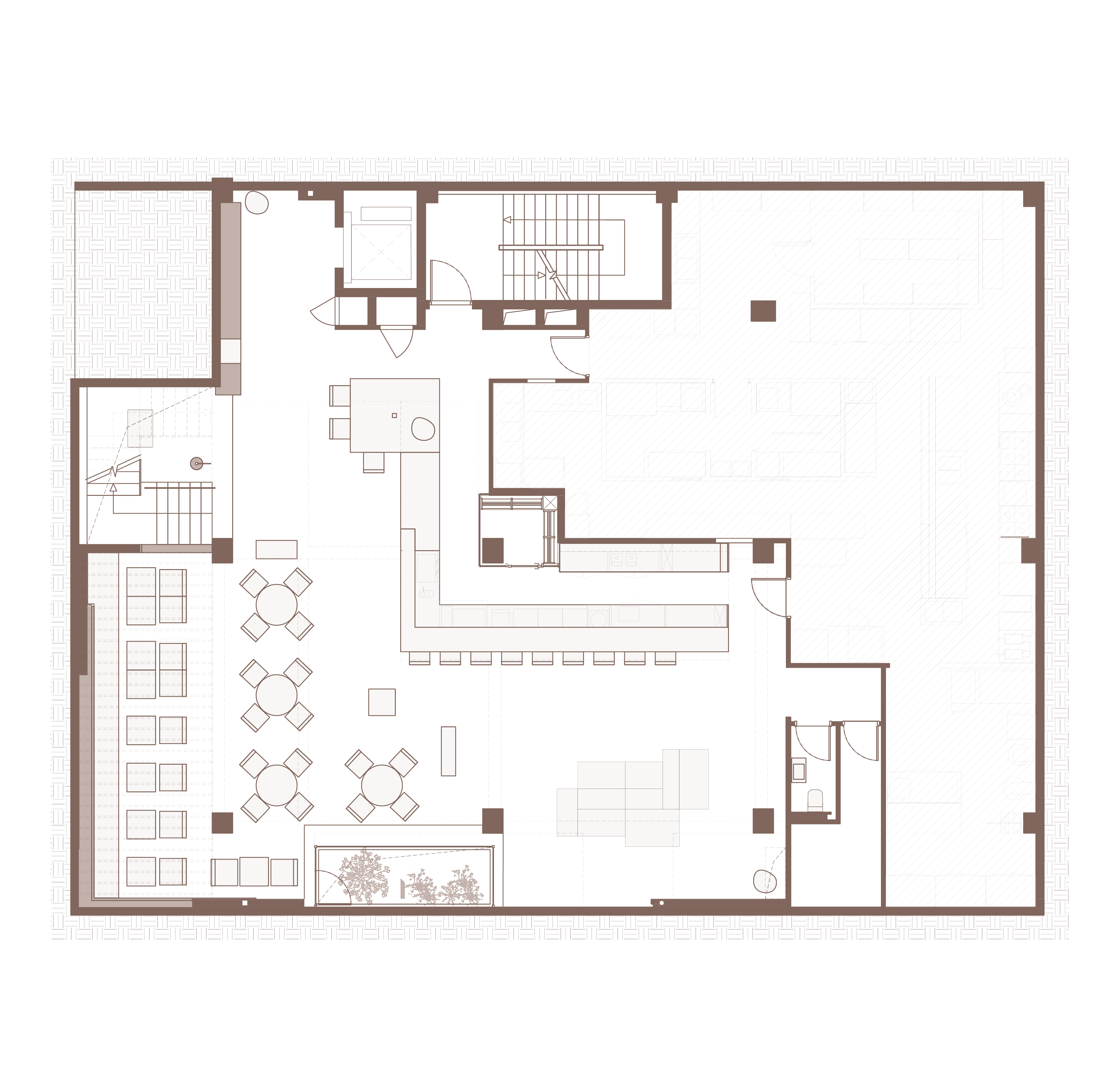
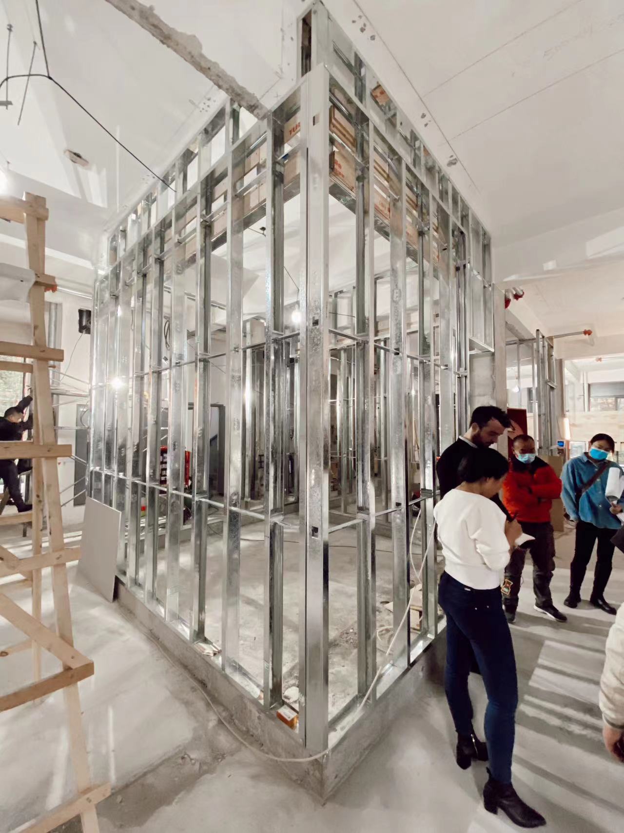
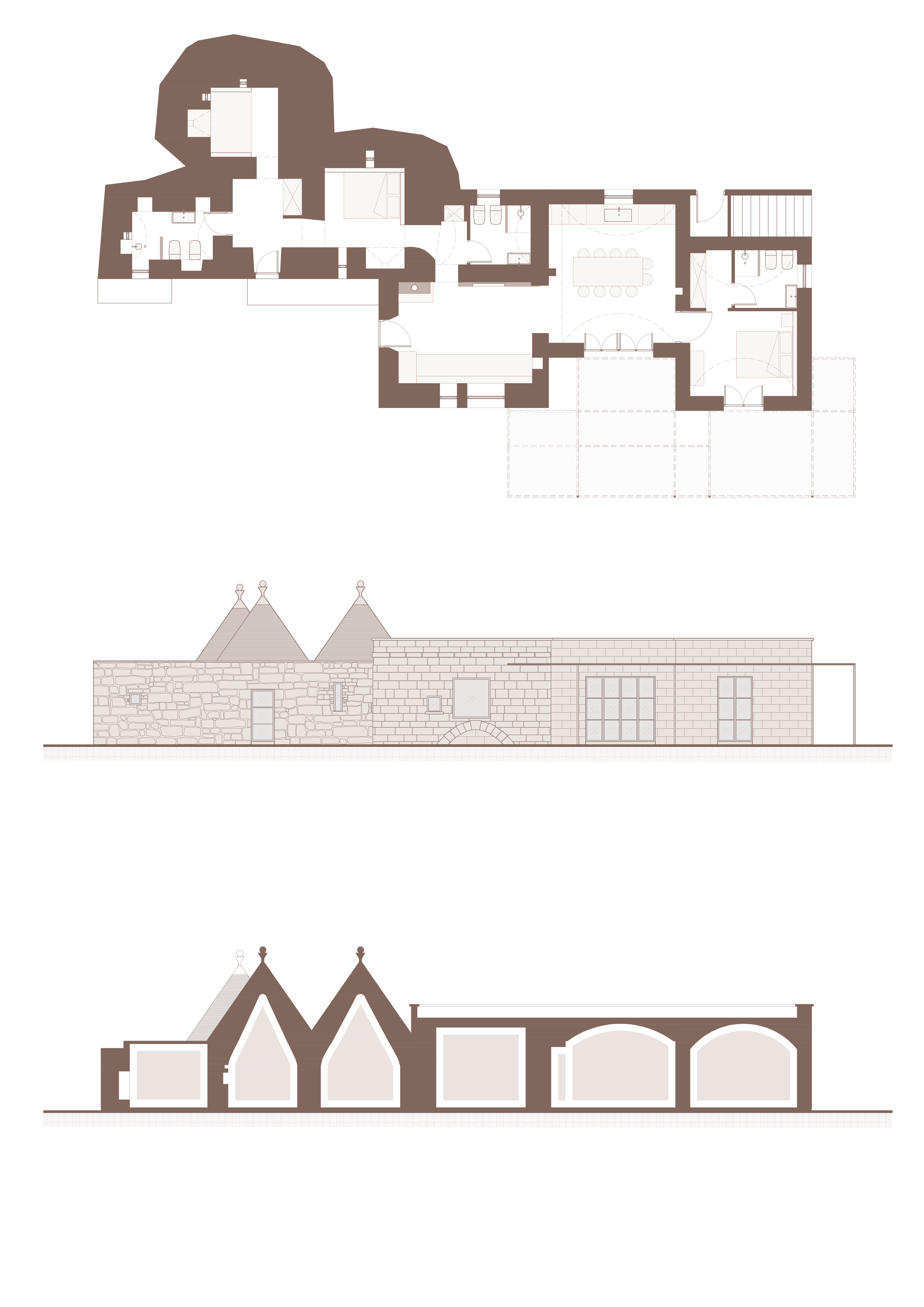
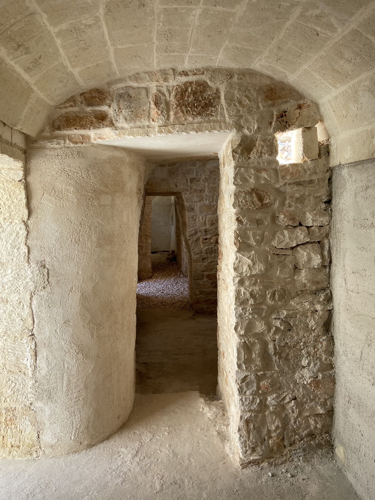
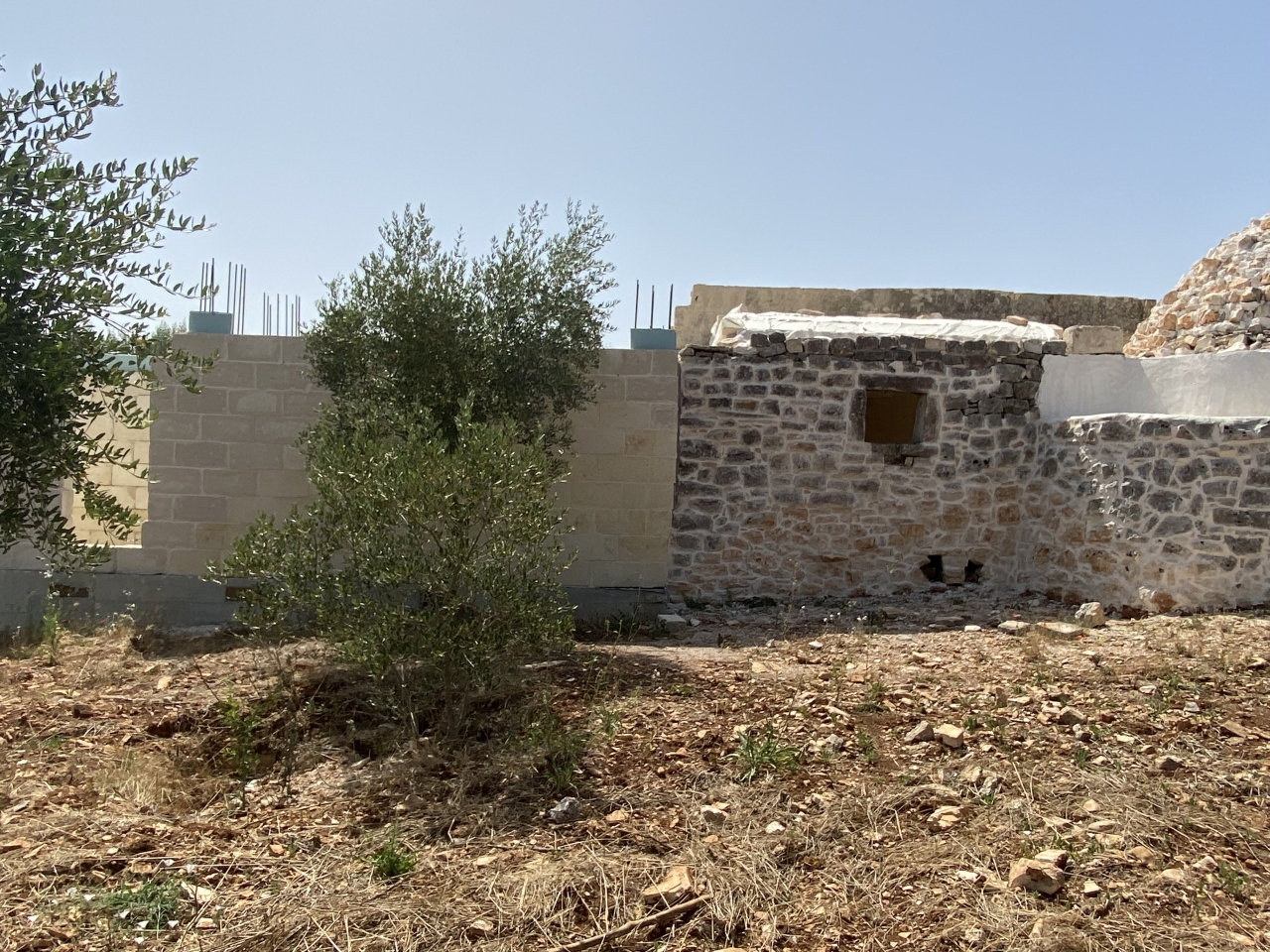
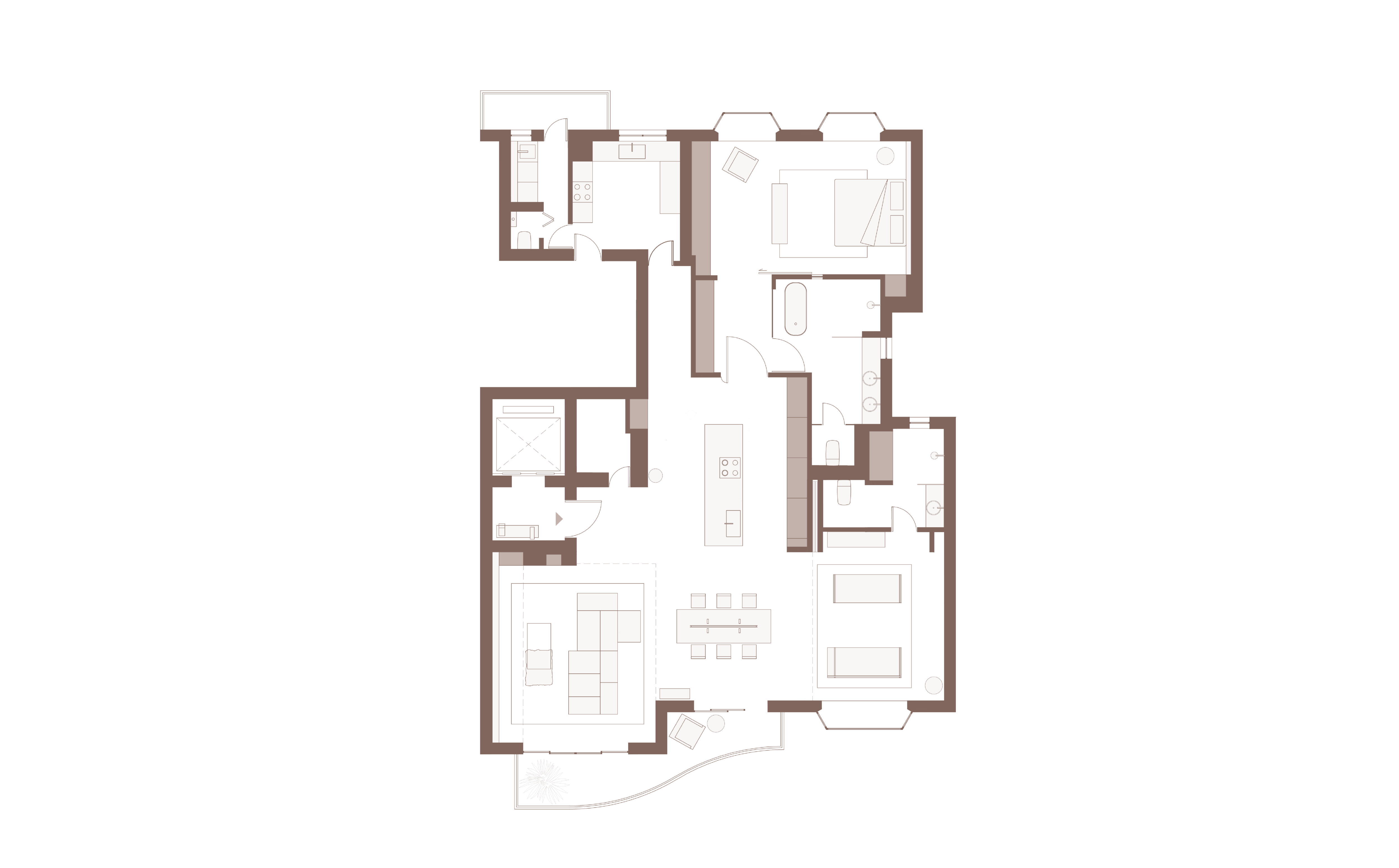
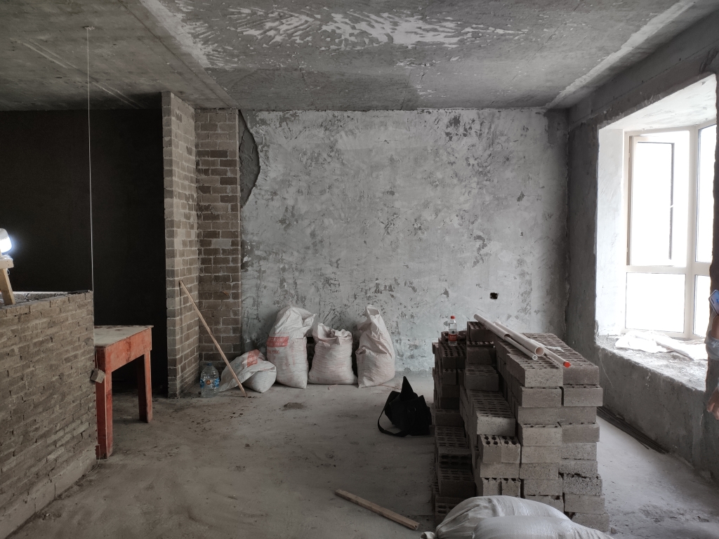
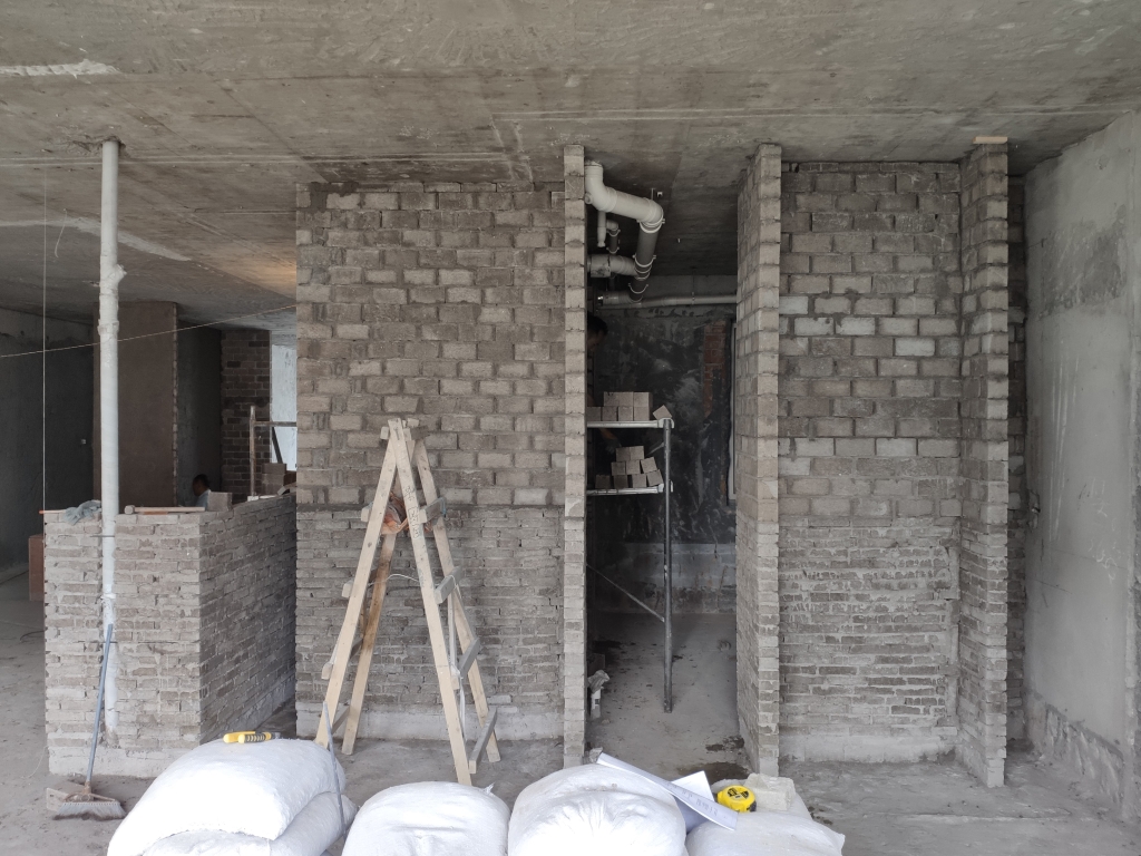
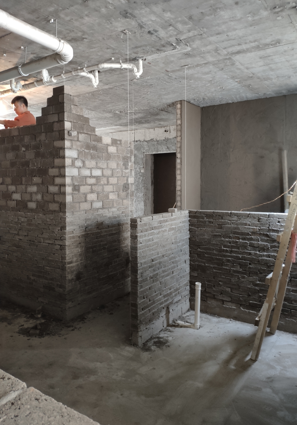
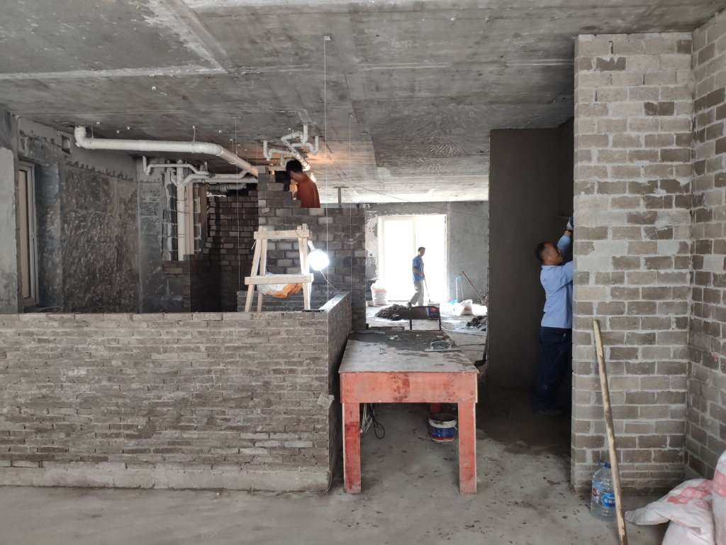
The site includes the villa originally built in 1939, its extension in the north and the ground floor space from the building next door to the west. The architects were given the site to turn into a hotpot restaurant. STUDIO8 believes the best way to preserve a historic building is to make it functional to meet today’s needs, giving a new life to it. The three-story villa was a residential building without any restroom or large kitchen. The re-use of it demanded a delicate and respectful renovation. Therefore, service and utility spaces such as kitchen, restroom and a vertical connection for public use were arranged into the extension and the building next door, leaving the villa for pure culinary experience.

Referencing the richness of the site’s heritage and the culinary peculiarity, the concept was strongly inspired by the food culture and atmosphere and takes a more abstract approach. To STUDIO8, it was extremely important to create, and consequently experience, a physical canvas created to highlight the continuous interaction between food and space.

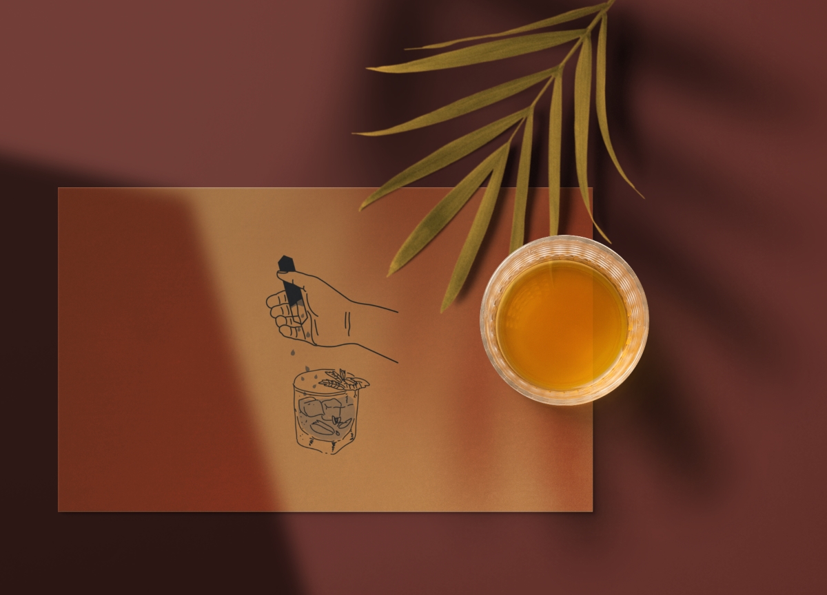
Rather than showing specific local or historical characters of various hotpots from all over China, after studying the core of food culture thoroughly, the architects decided to transform hotpot’s cooking principle into a unique museum-like experience in on different levels. They named the restaurant “GUD” after the historical name for hotpot in 220 AD – “GuDong pot”, like the sound of boiling soup. The logo design was inspired by the shape of copper pots used in that period as well.

In Chinese culture, eating hotpot is a special and important moment where people gather, mostly a group of friends or family, to share food and joy. With heat (from fire or electric stove), the ingredients are deconstructed by the energy and then reconstructed in liquid (water or soup), thus being elevated, together with the time spent among people, to another level of flavor. As the three key elements in hotpot, heat (fire), medium (water) and elevation of flavor (steam) were respectively correlated to each floor as in function, materiality, textures and light.

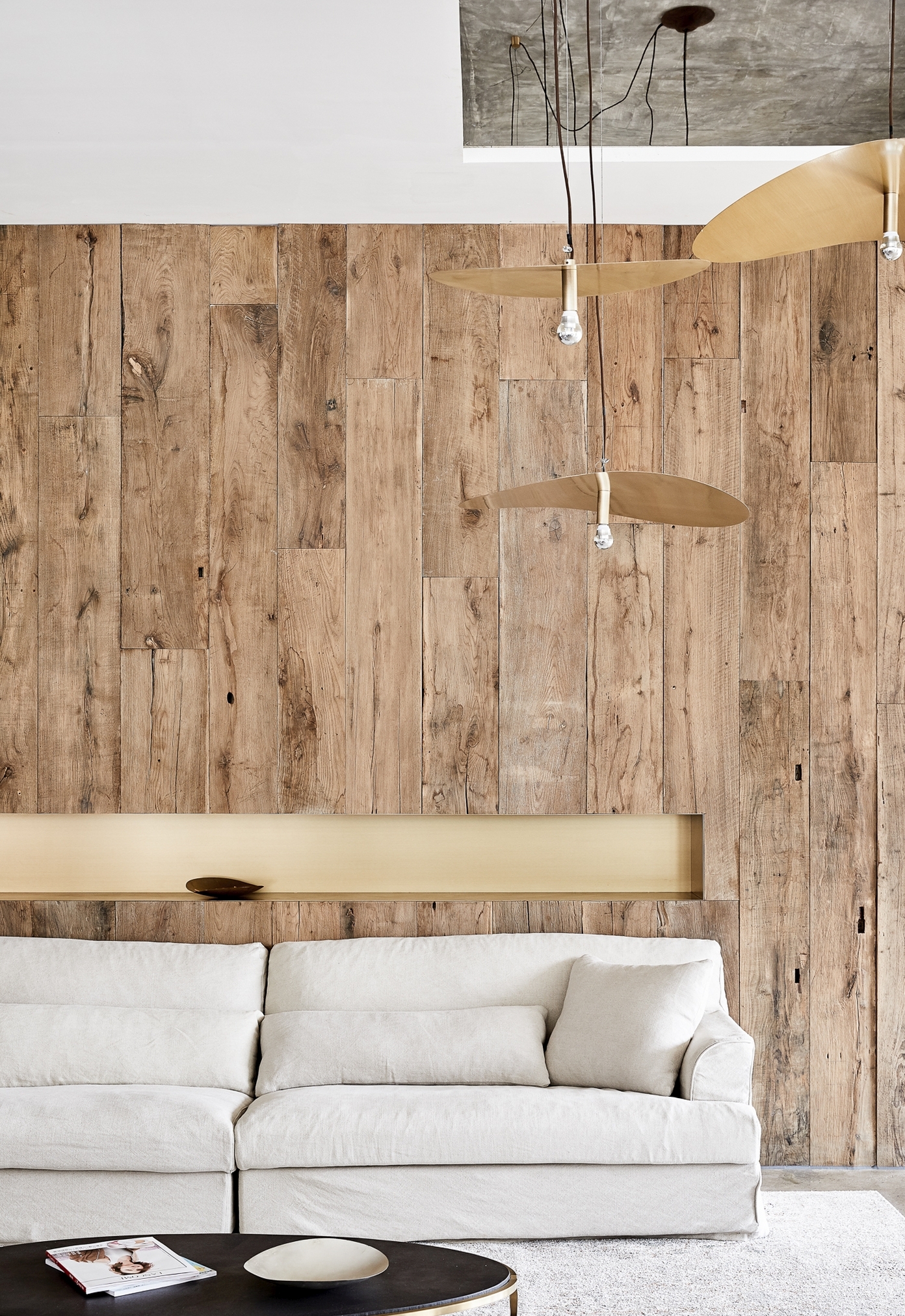
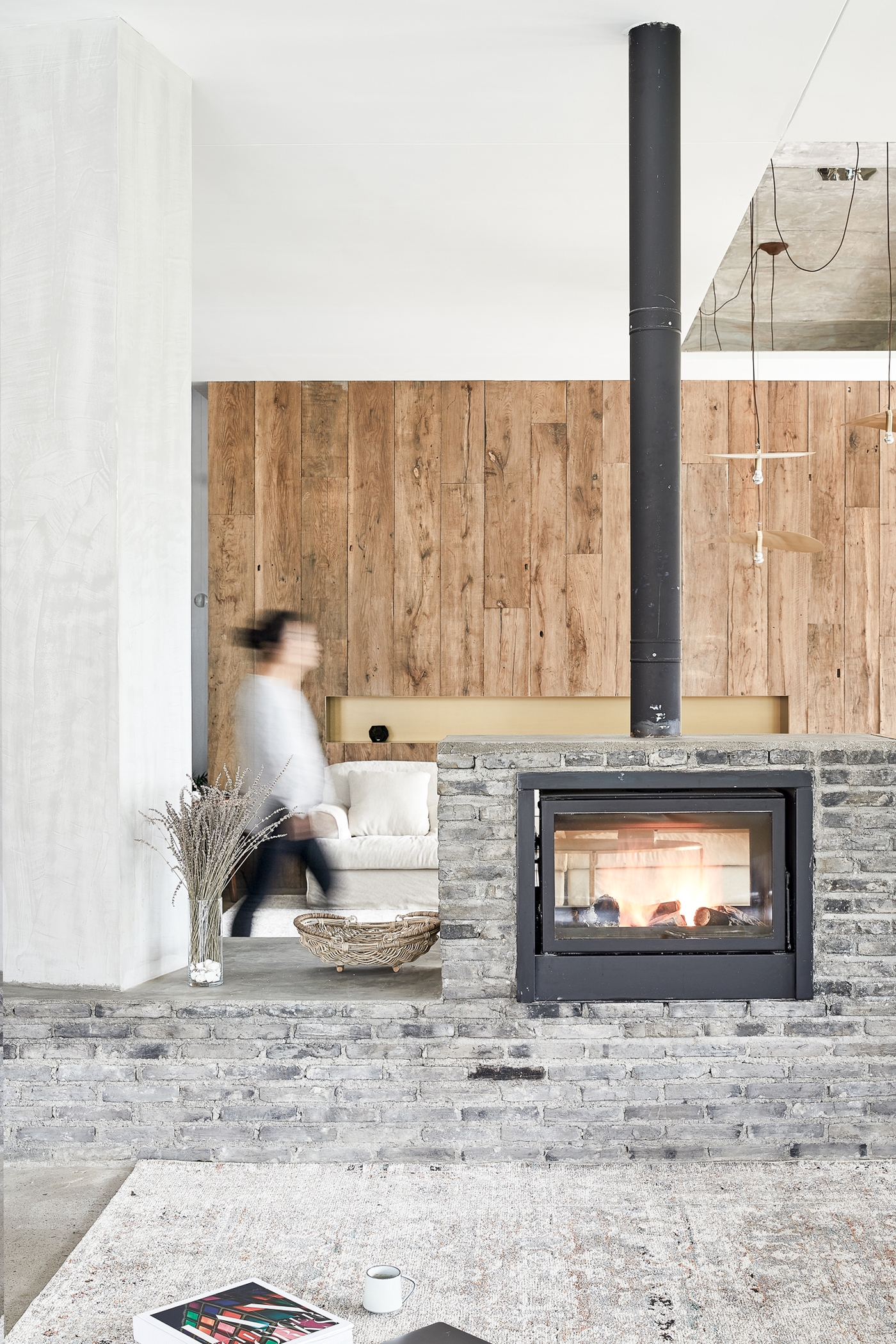
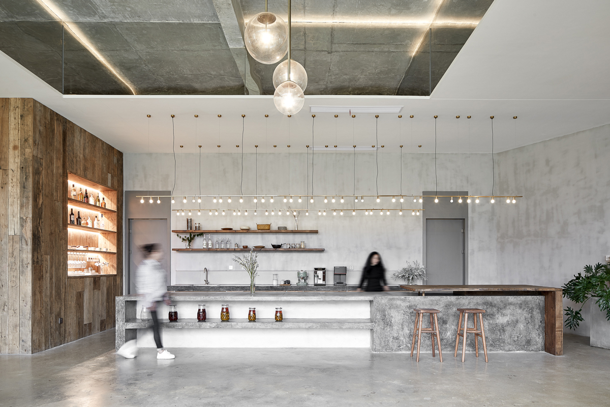
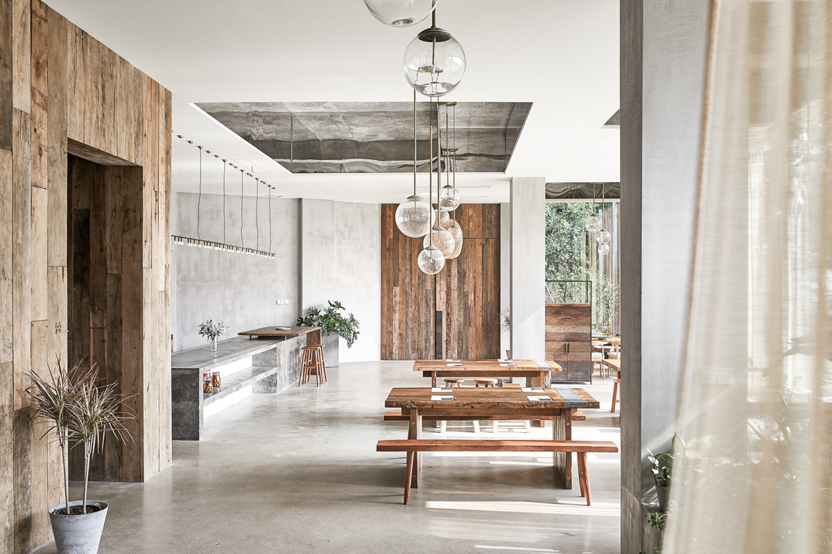
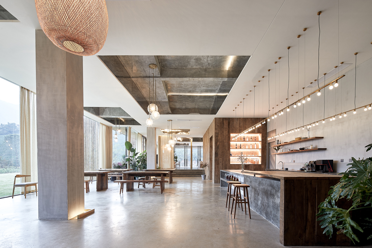
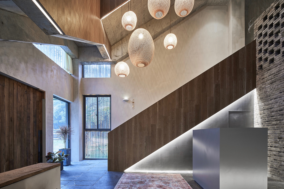
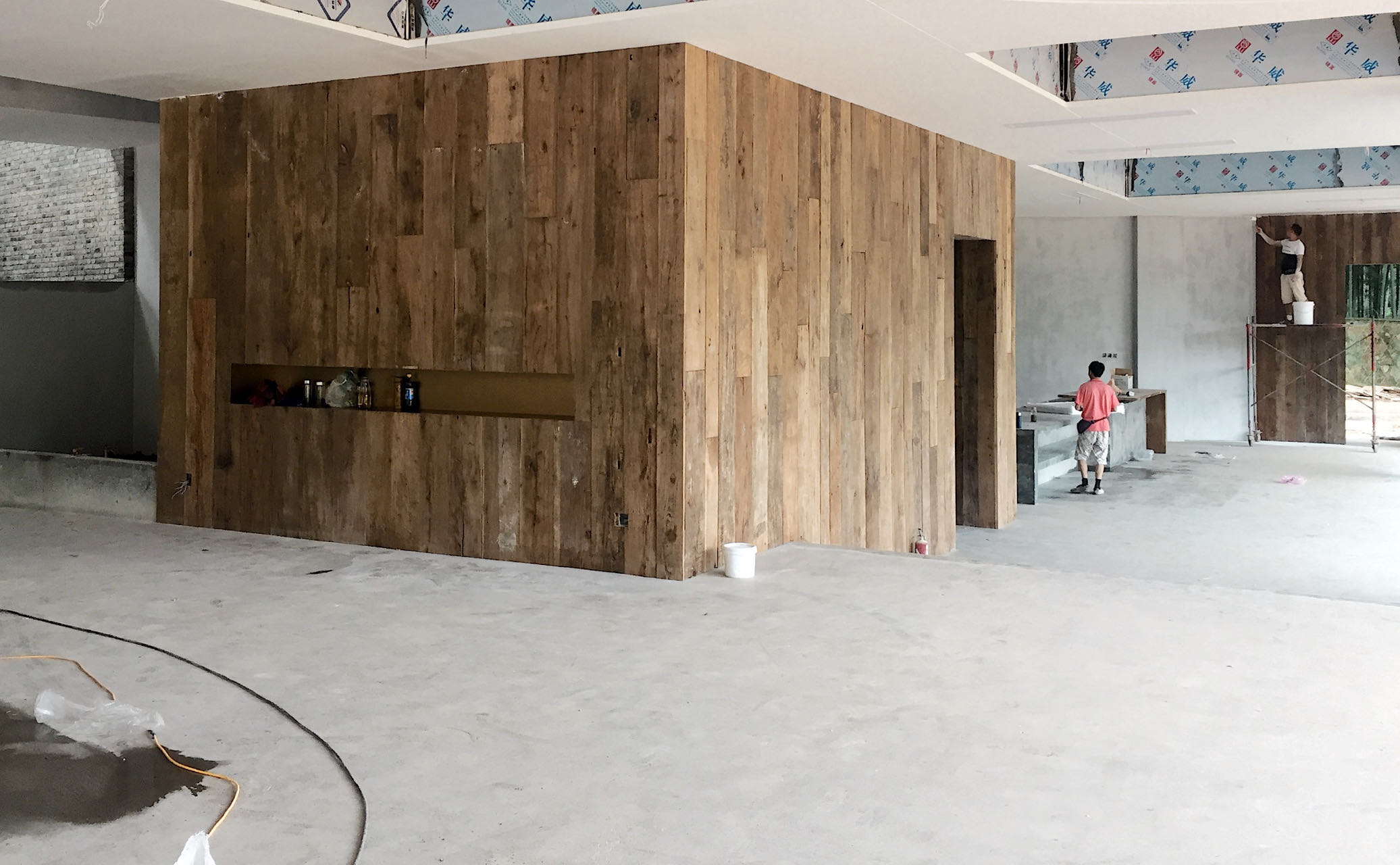
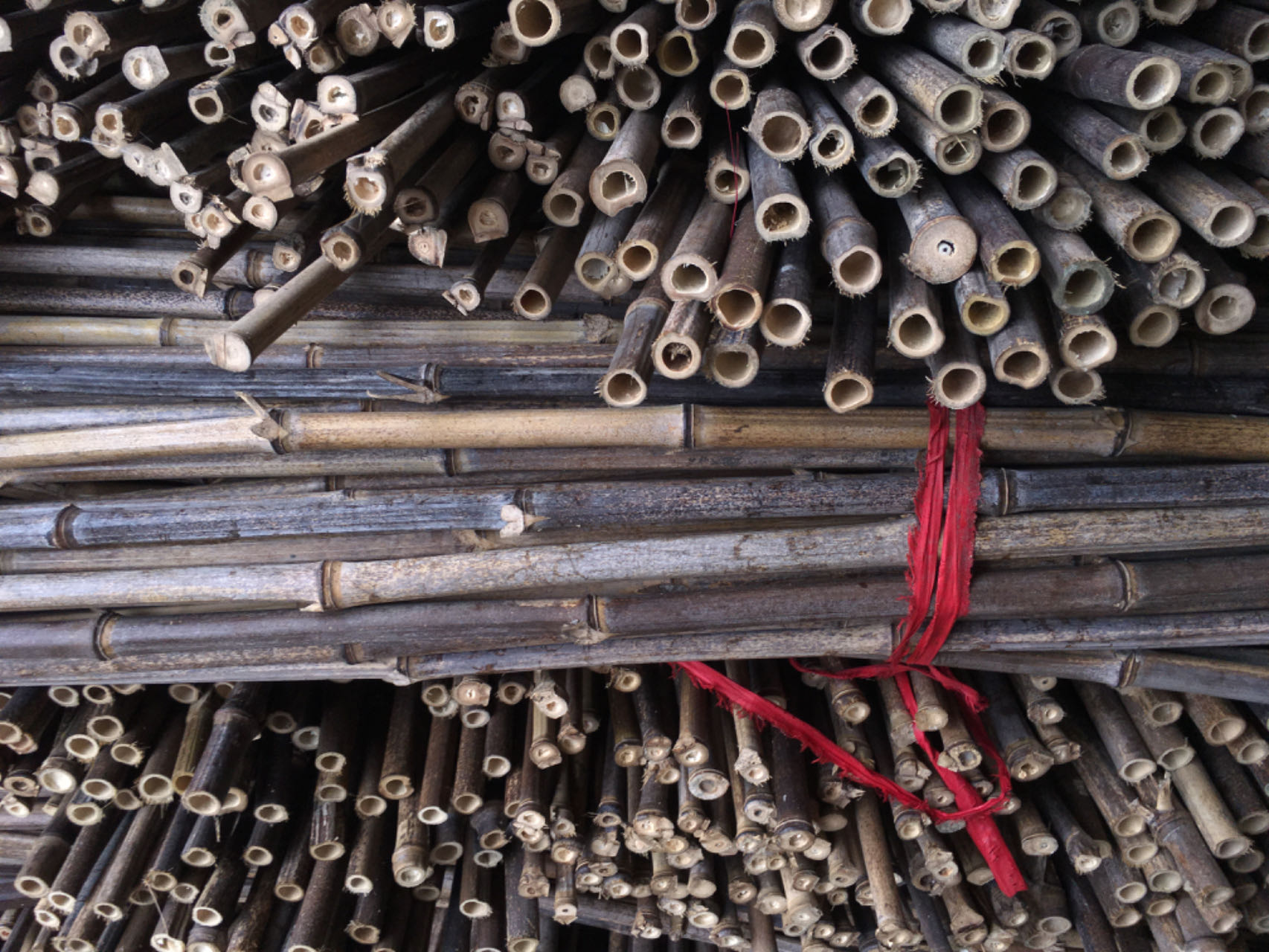
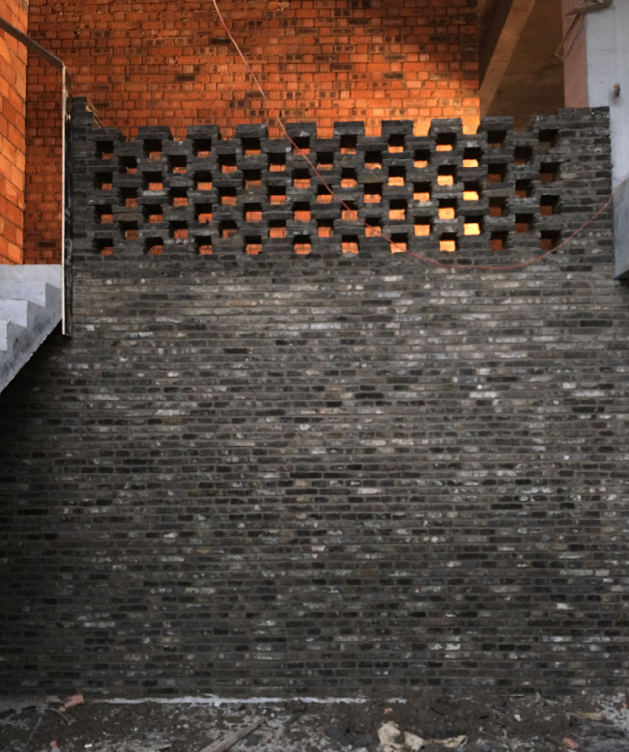
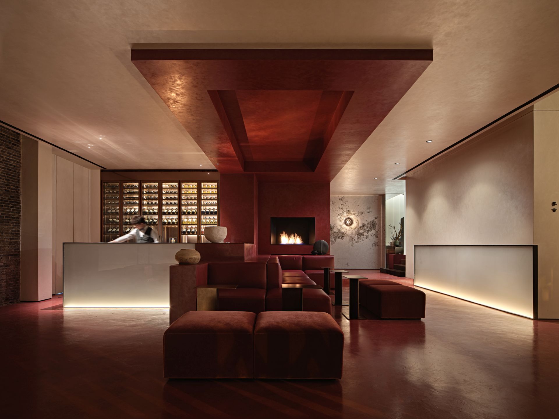
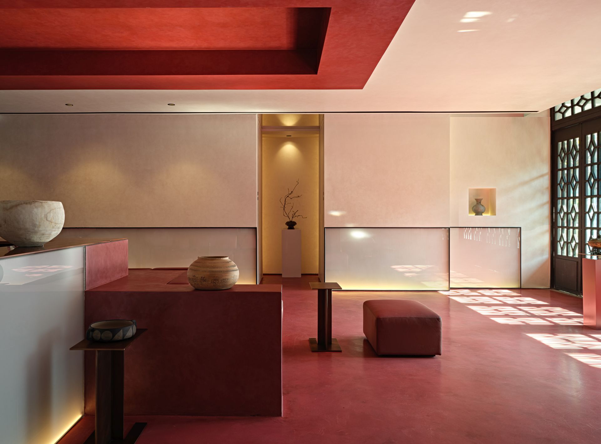
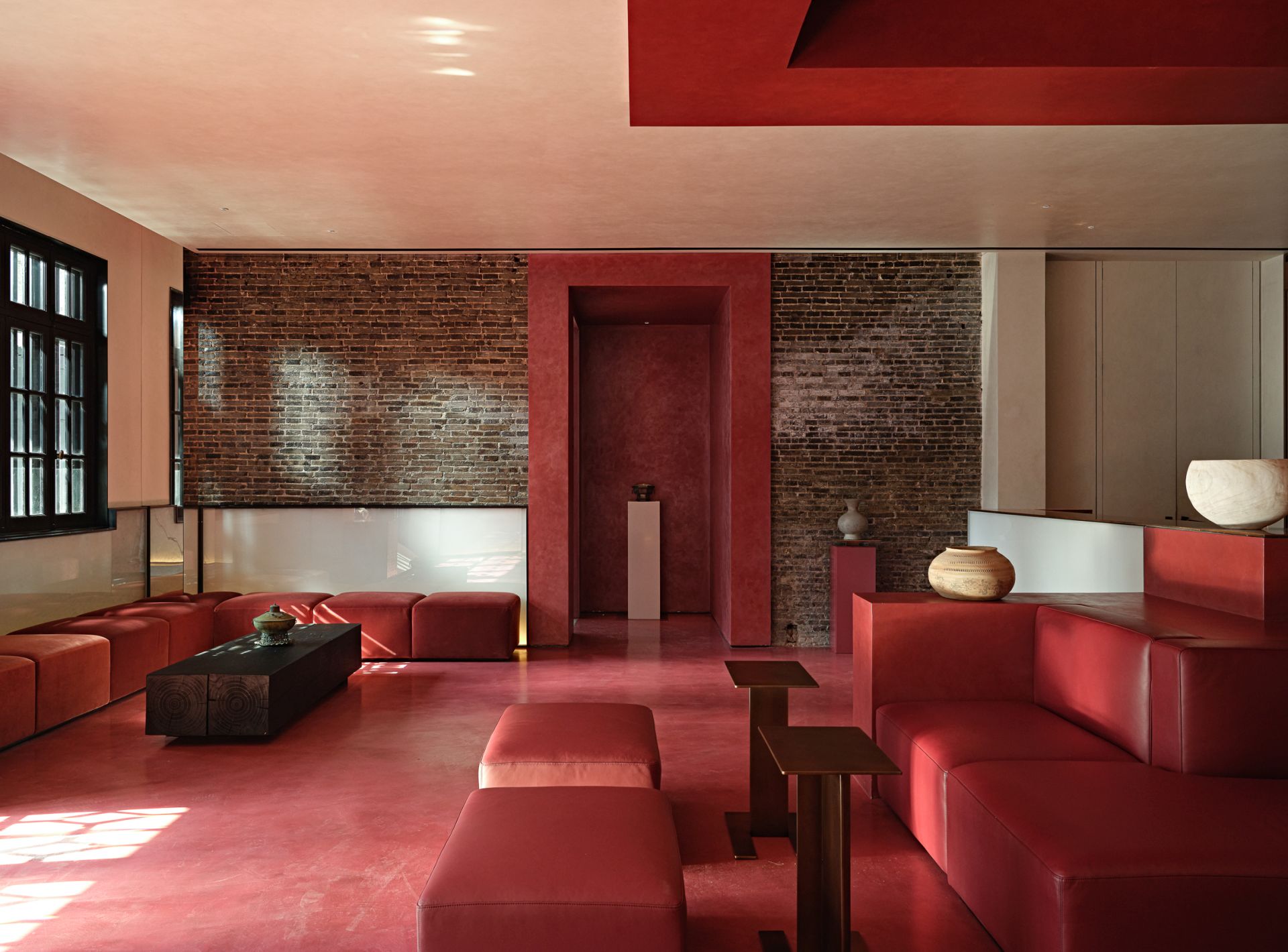
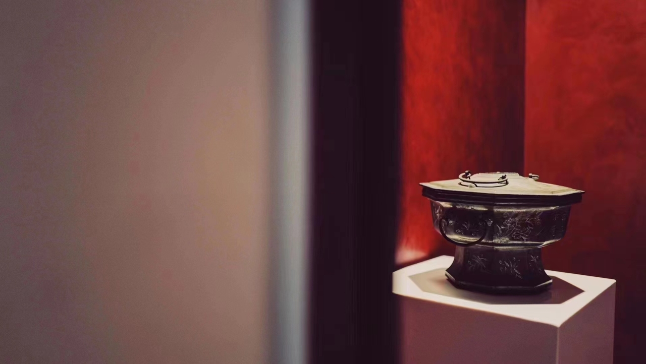
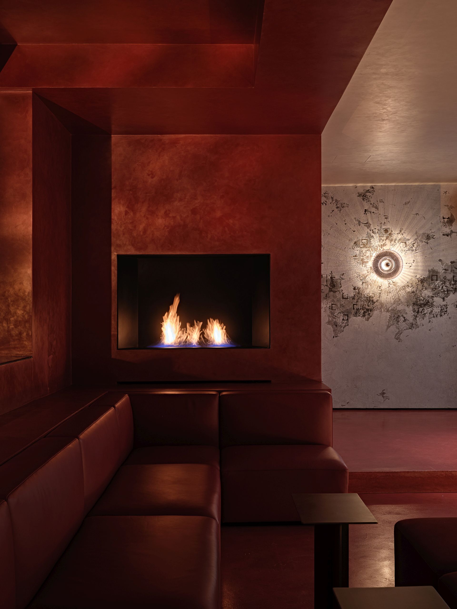
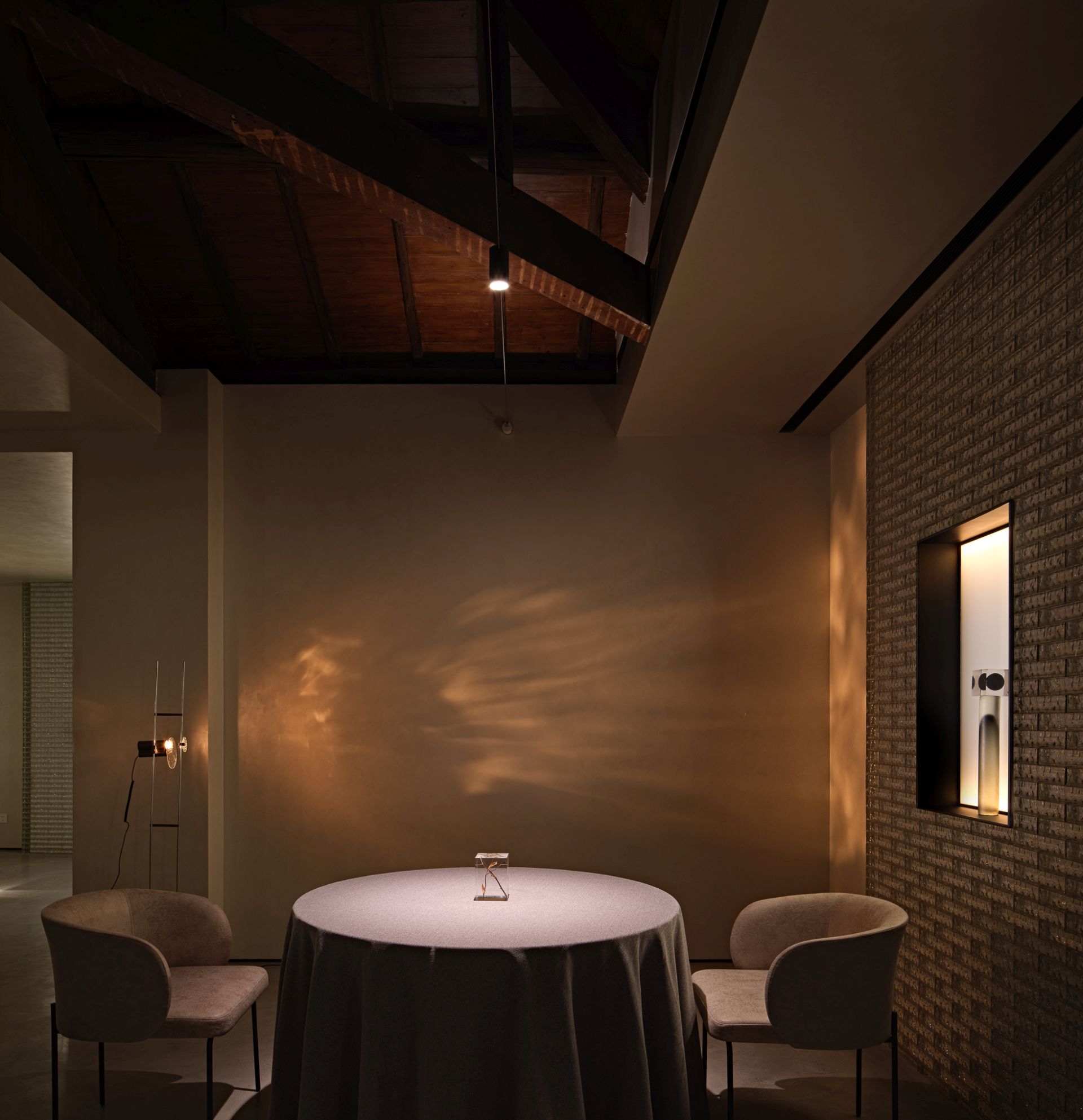
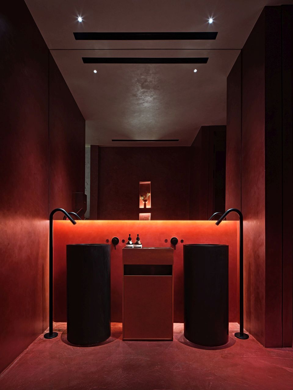
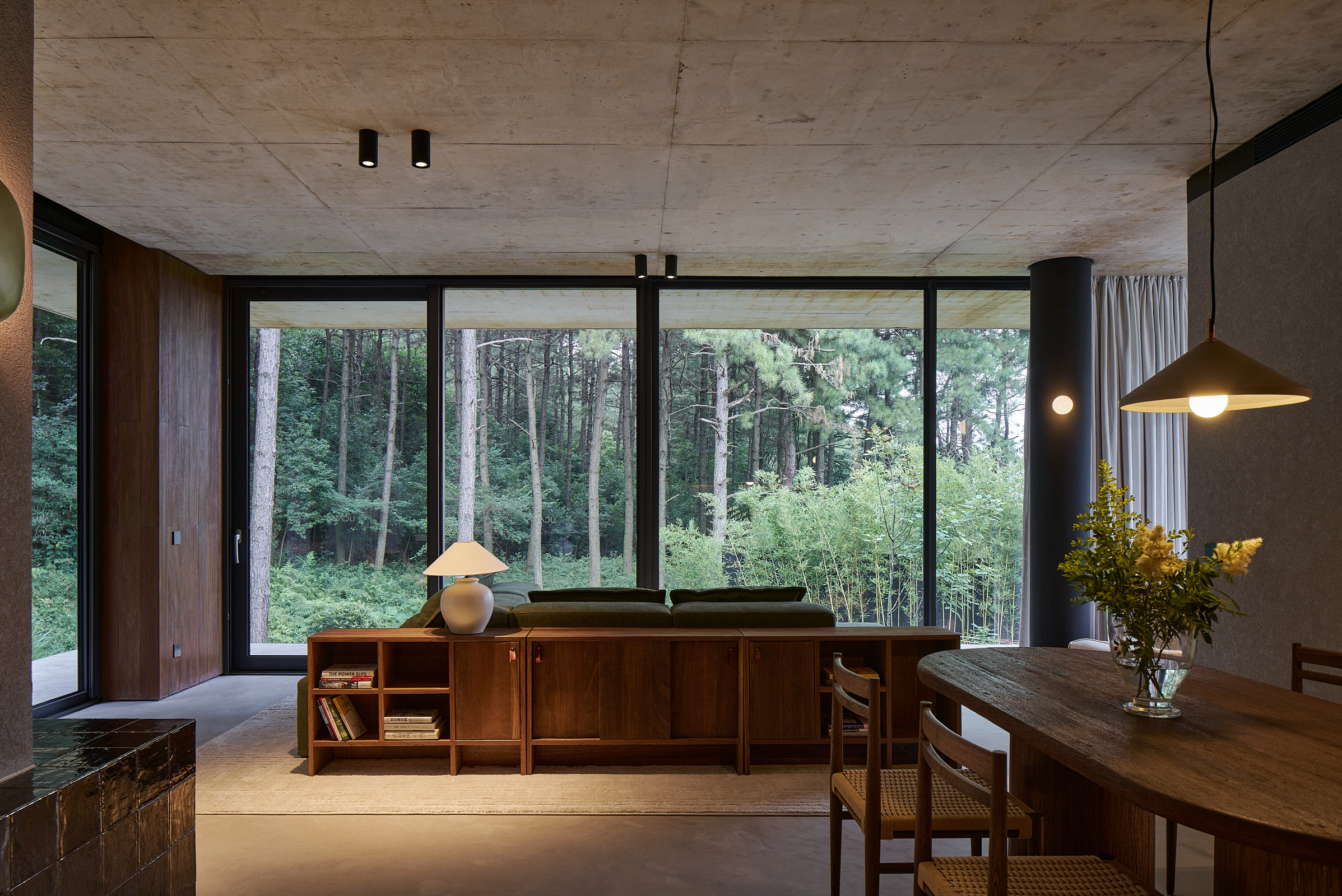
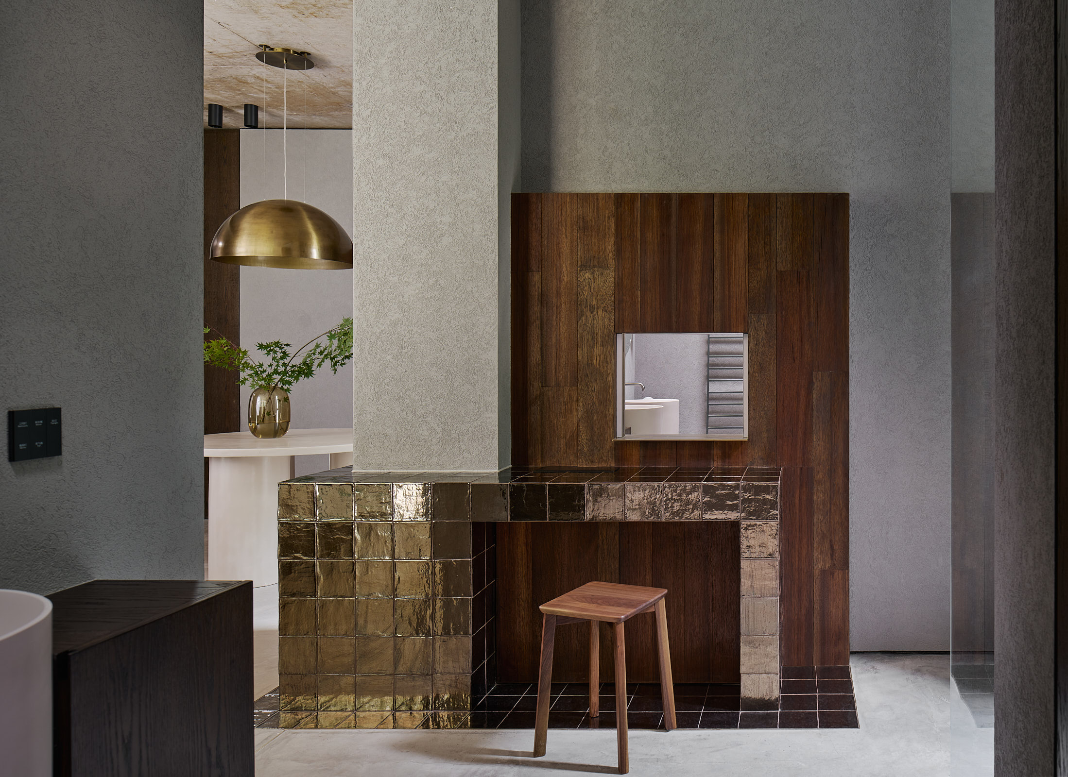
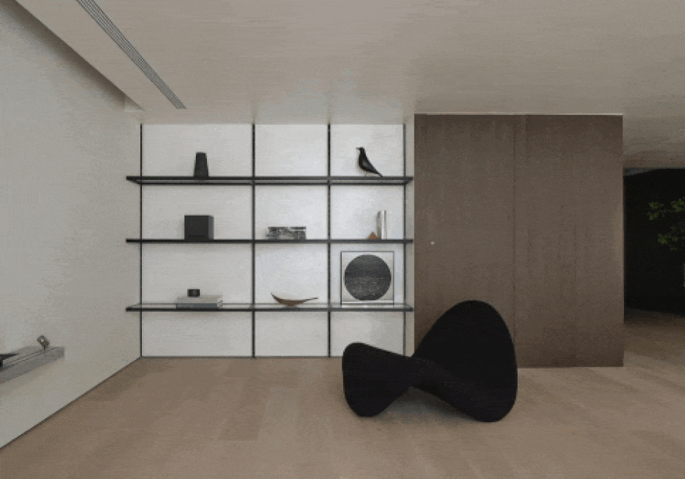
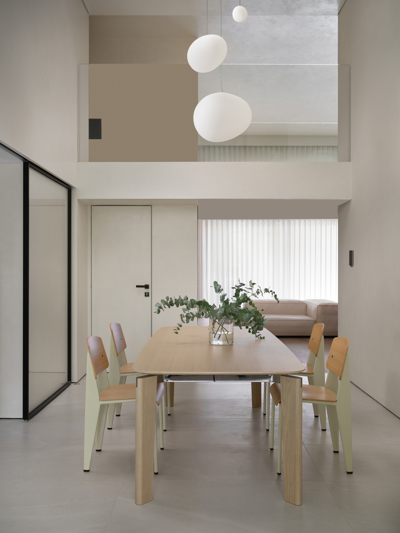
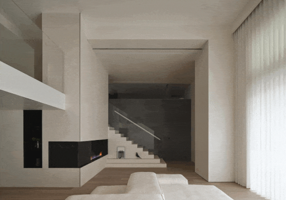
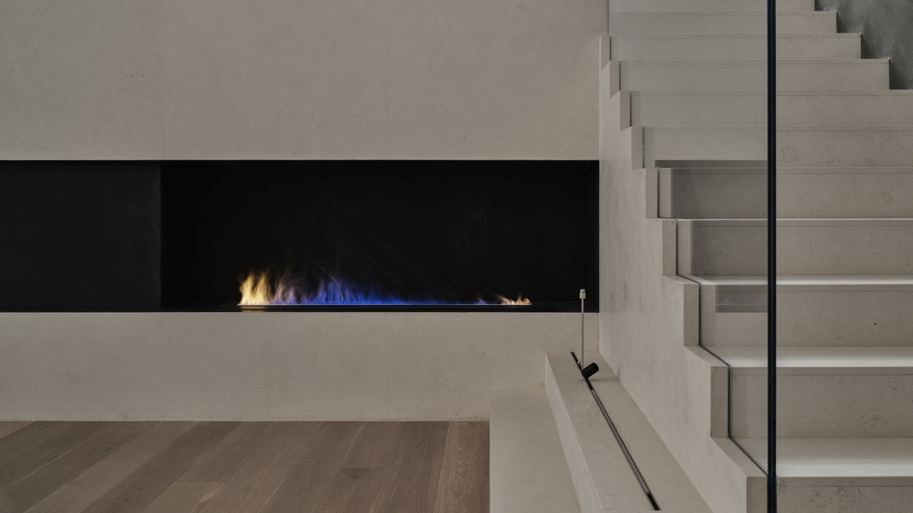
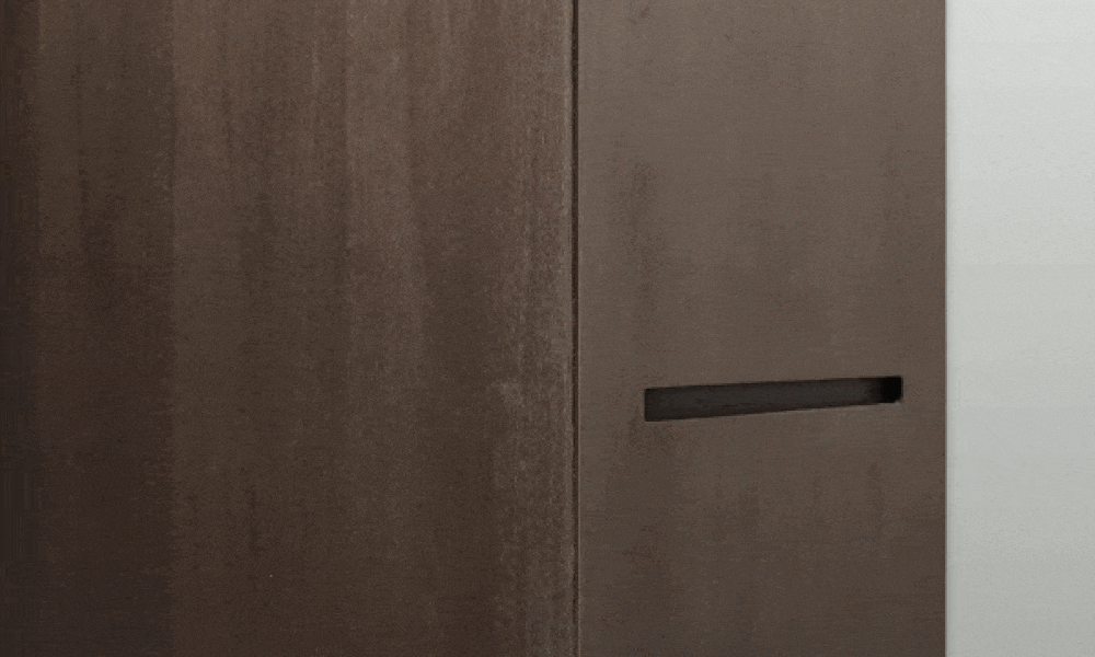
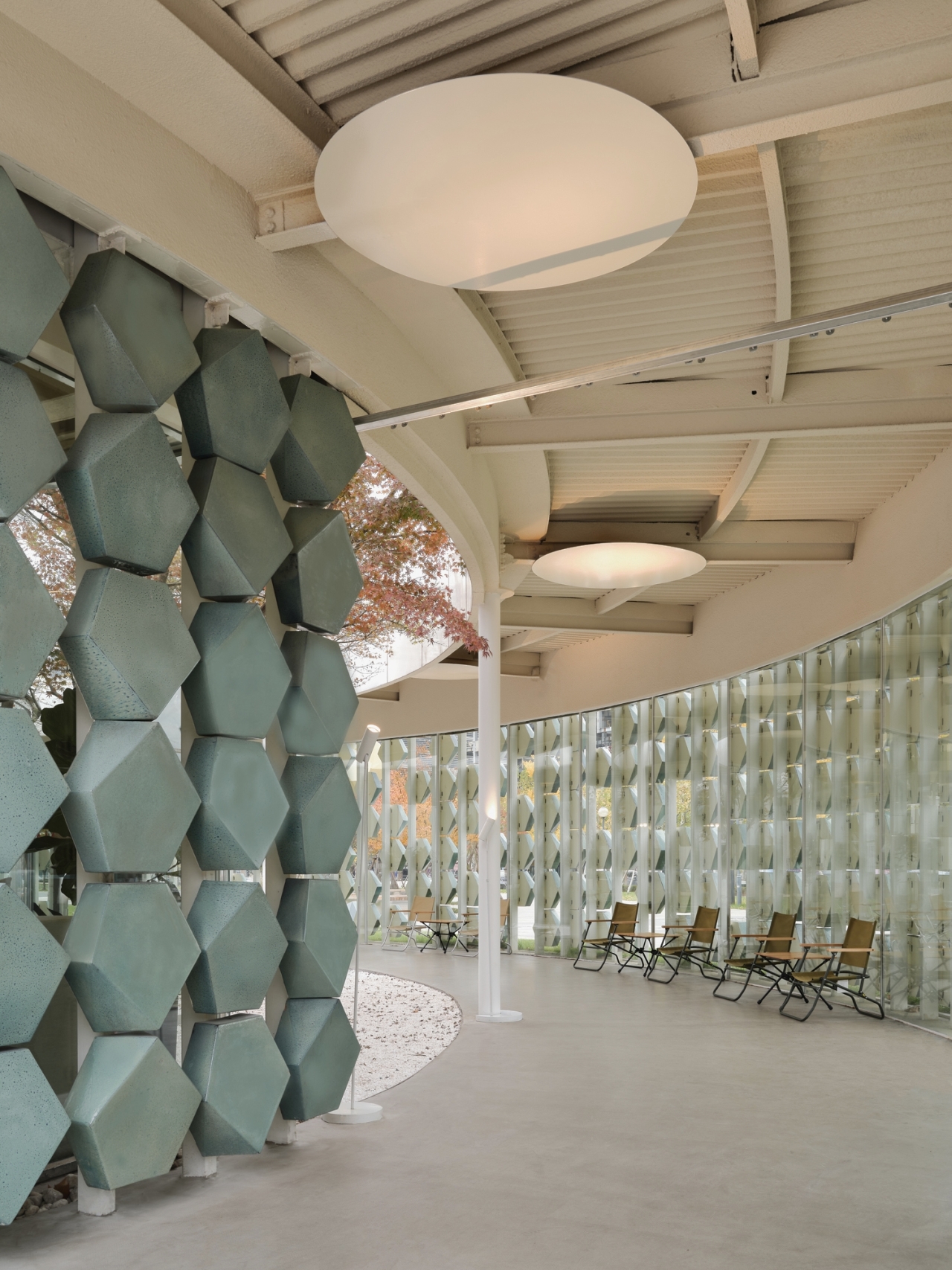
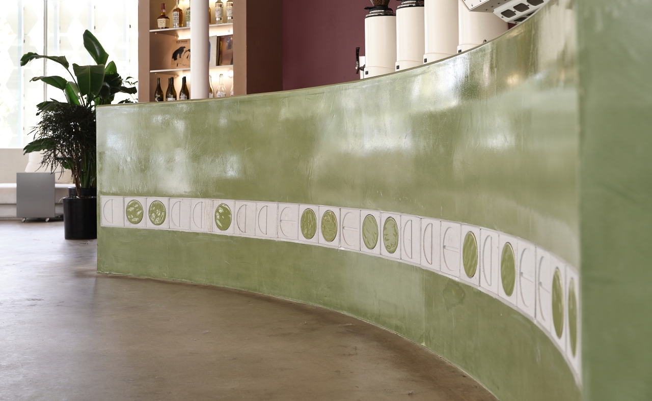
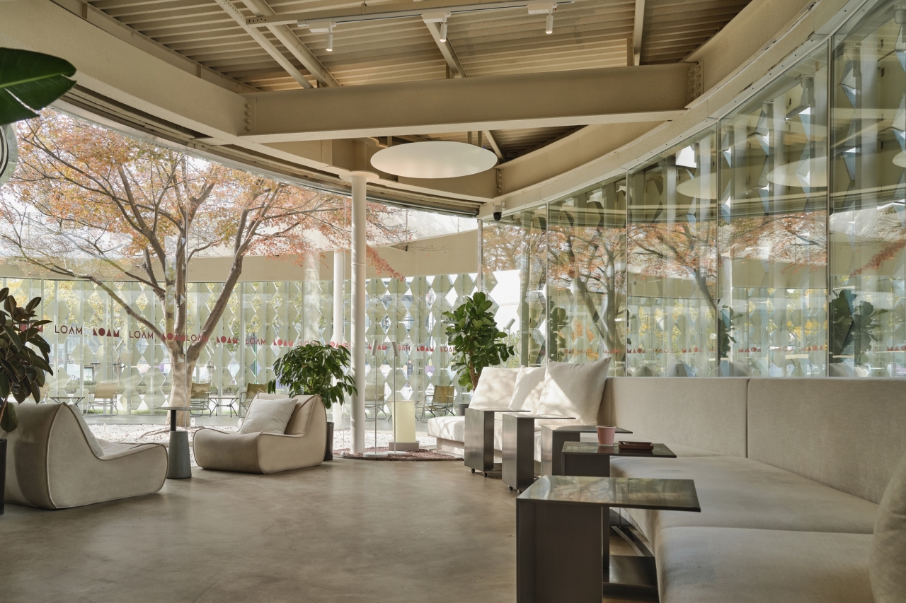
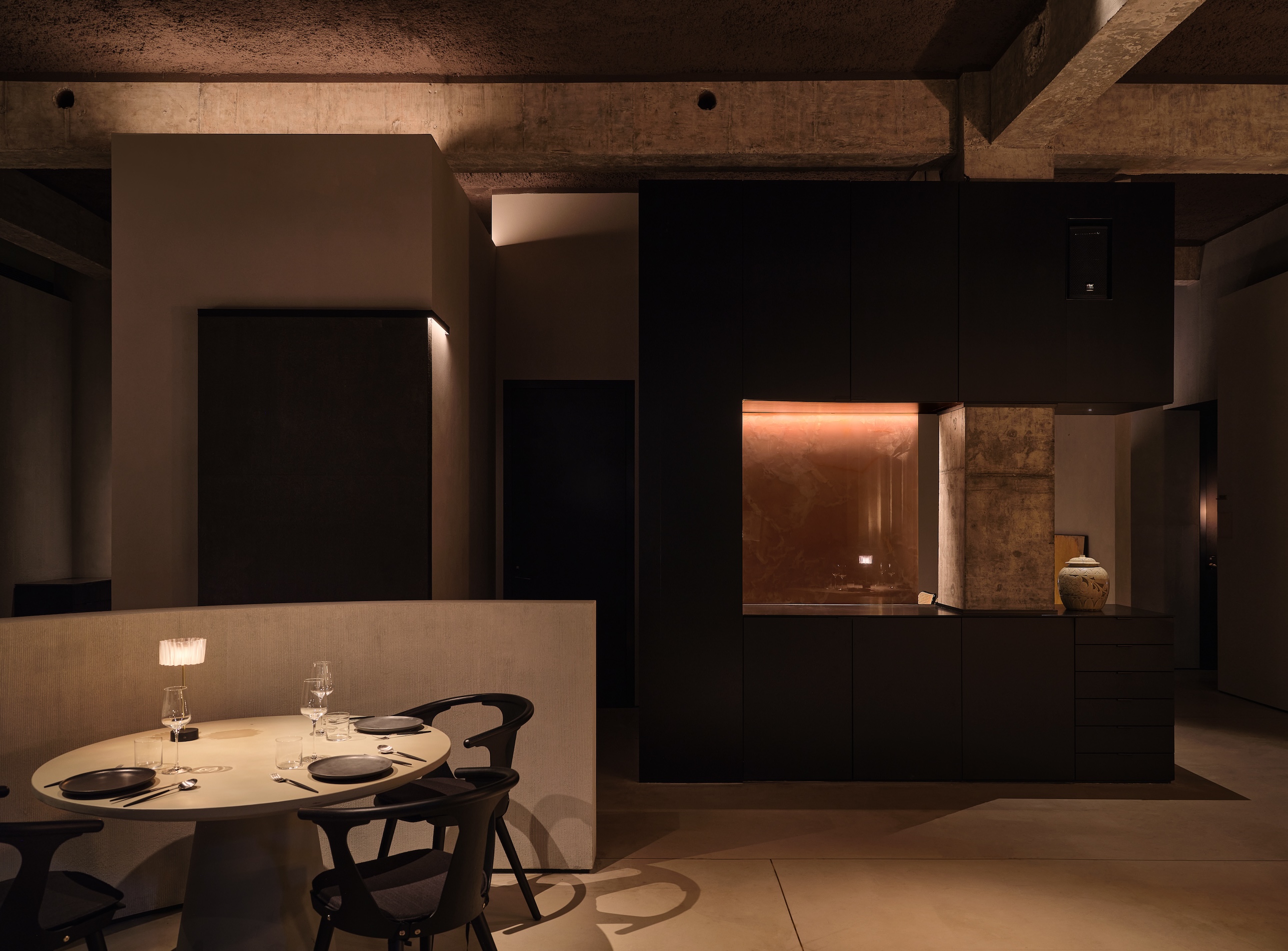
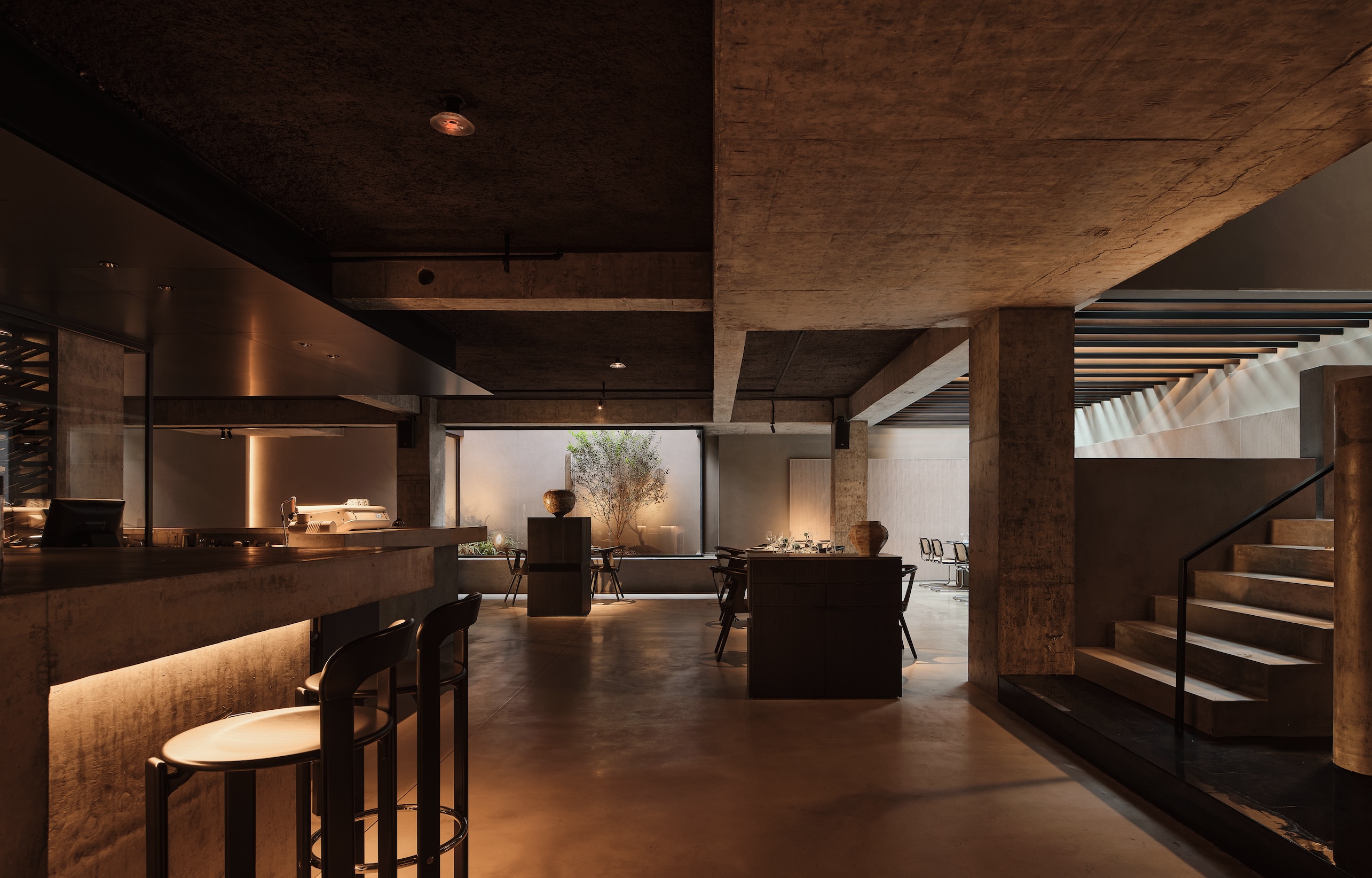
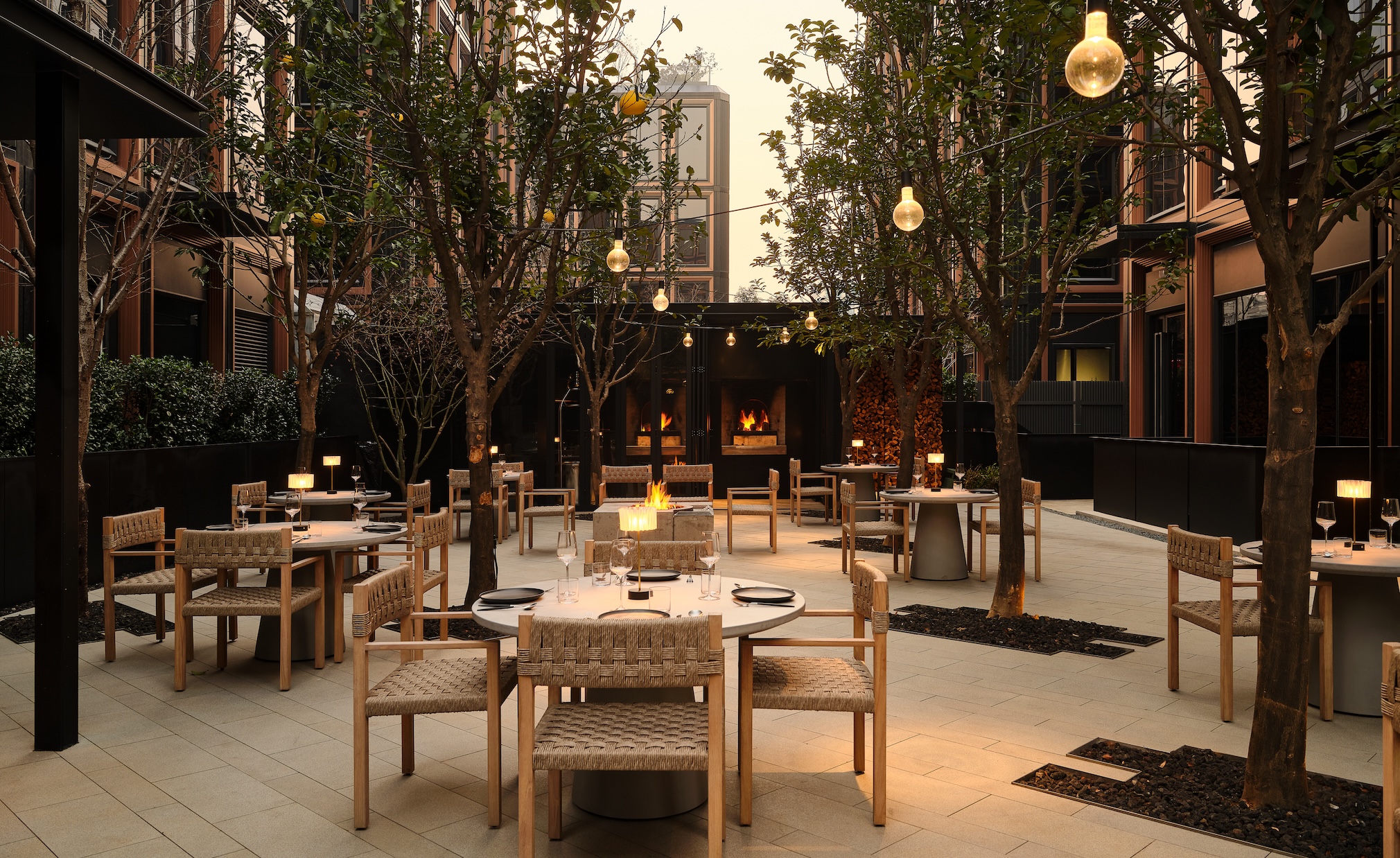
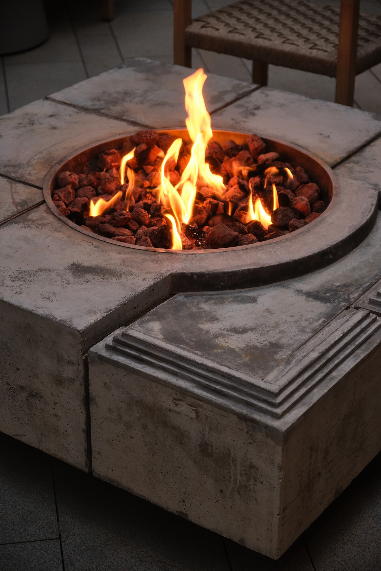
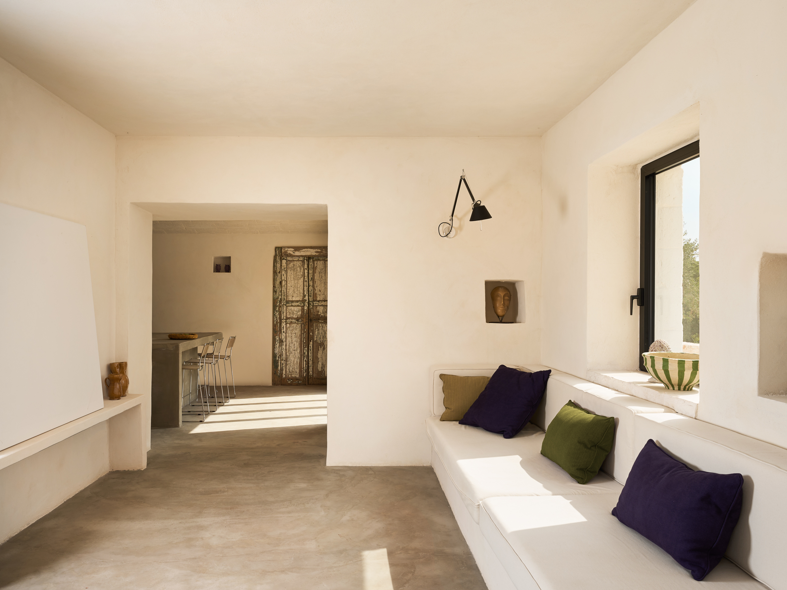
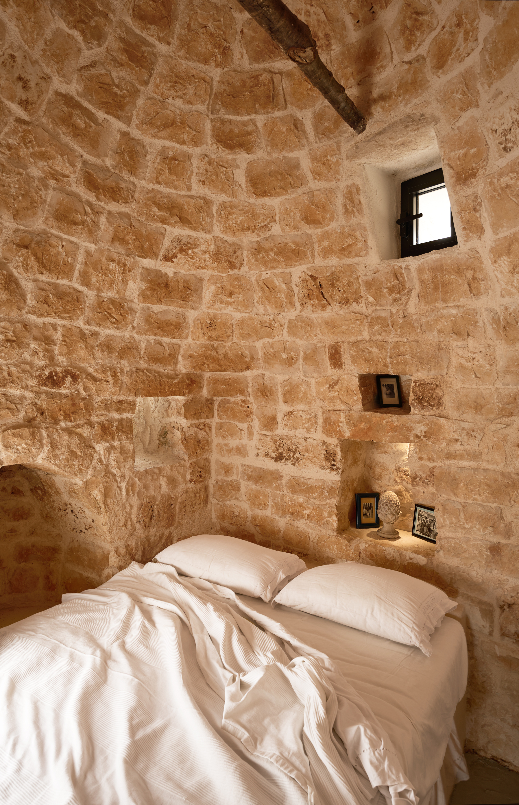
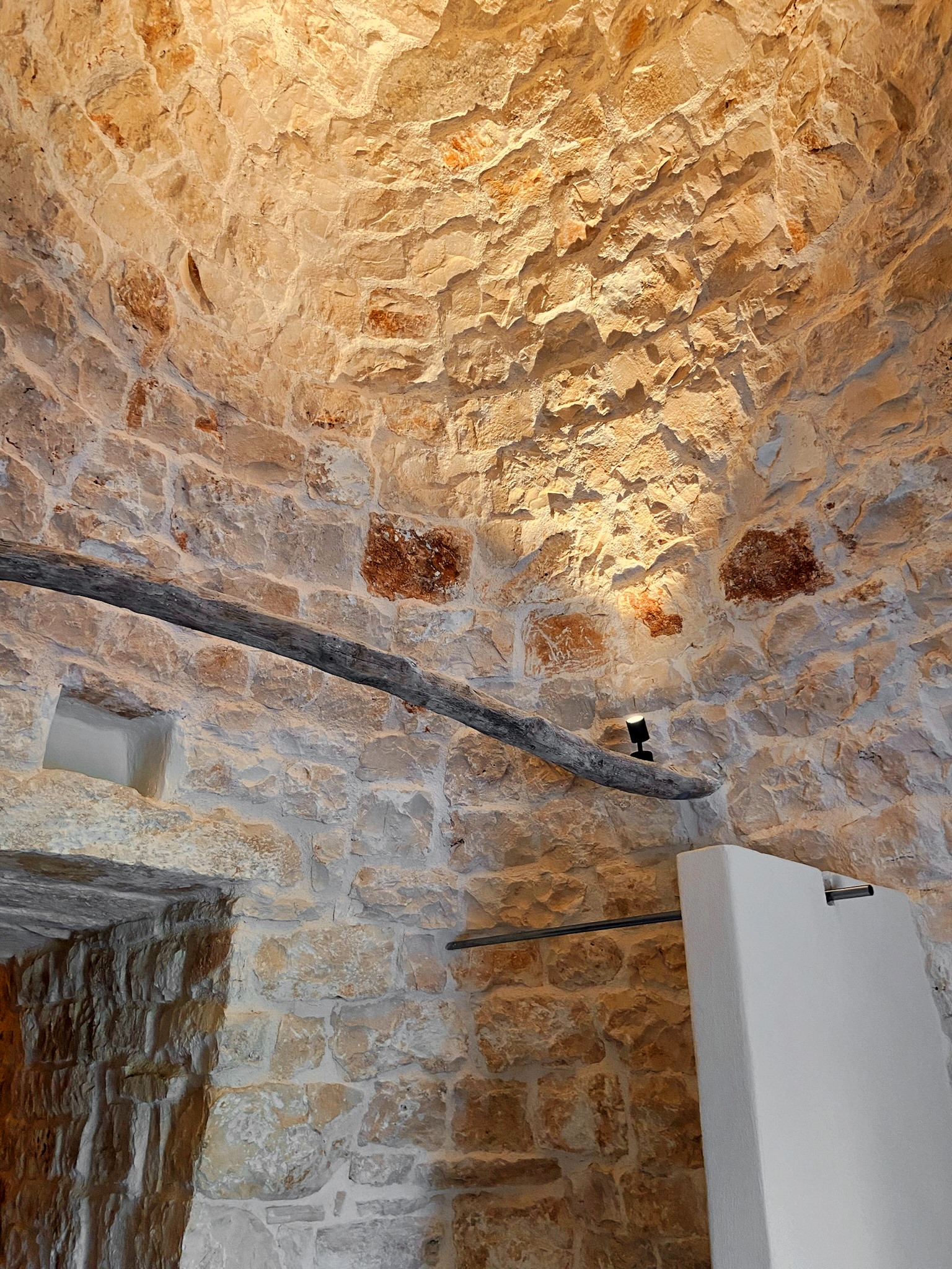
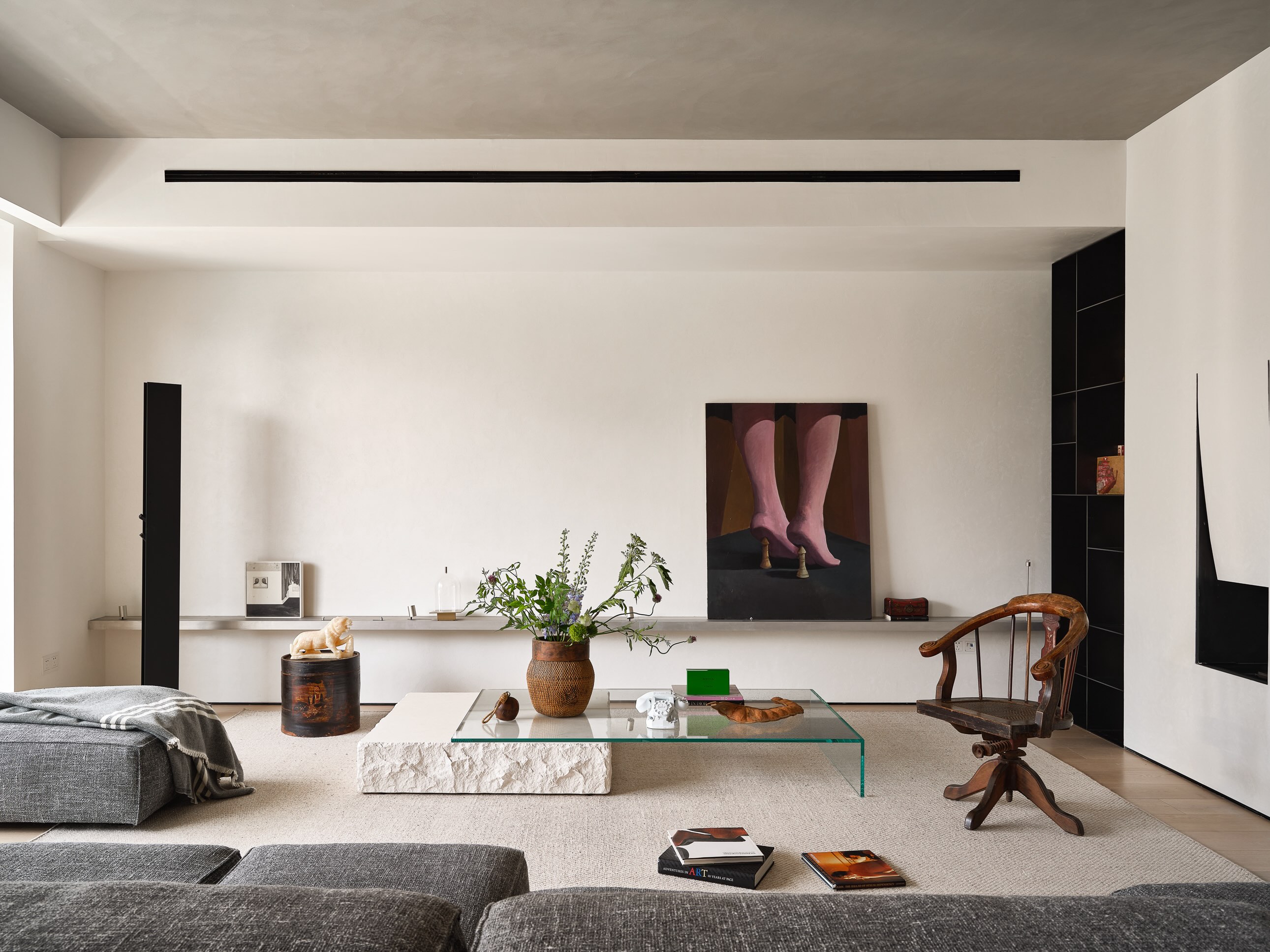
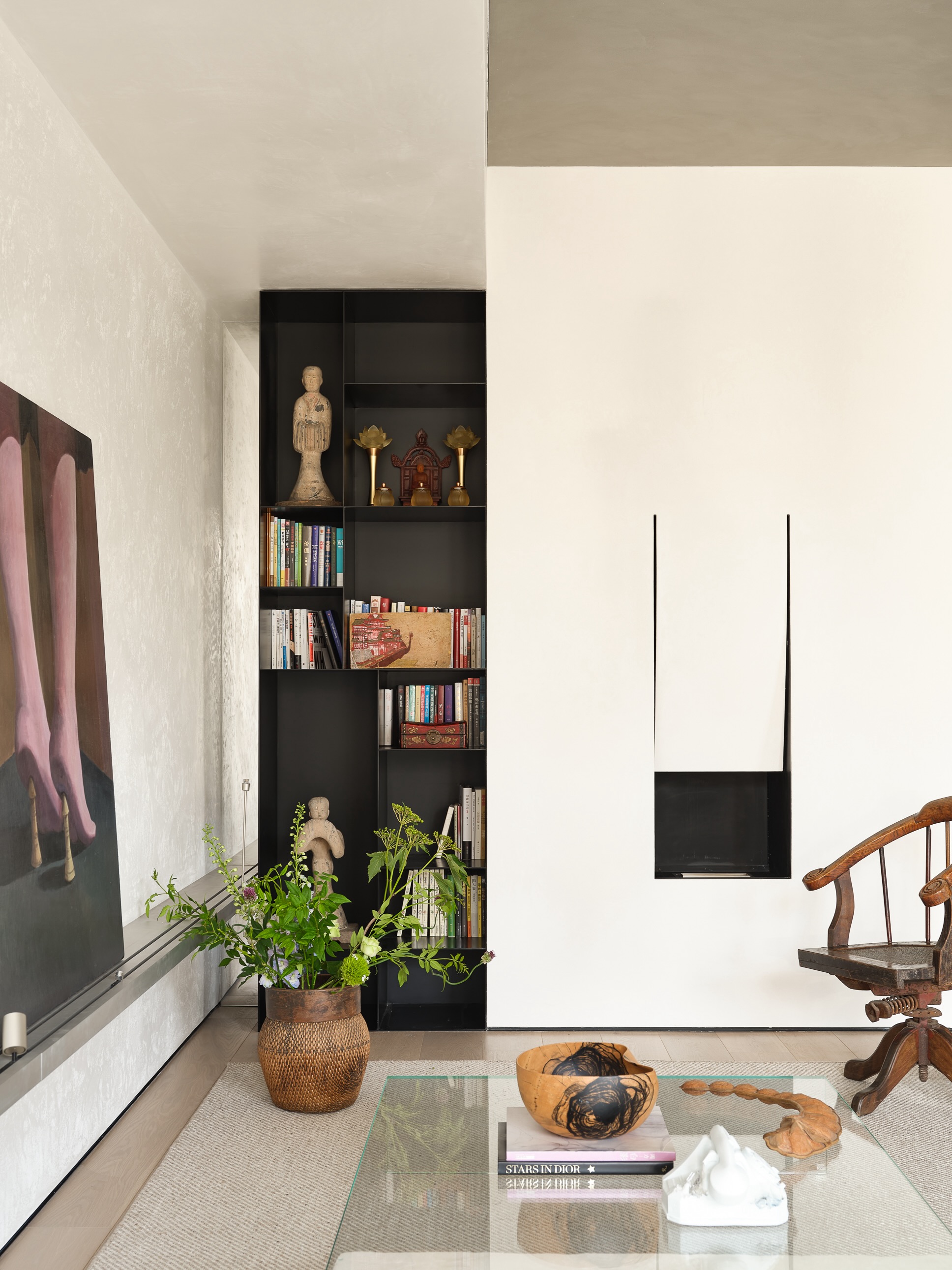
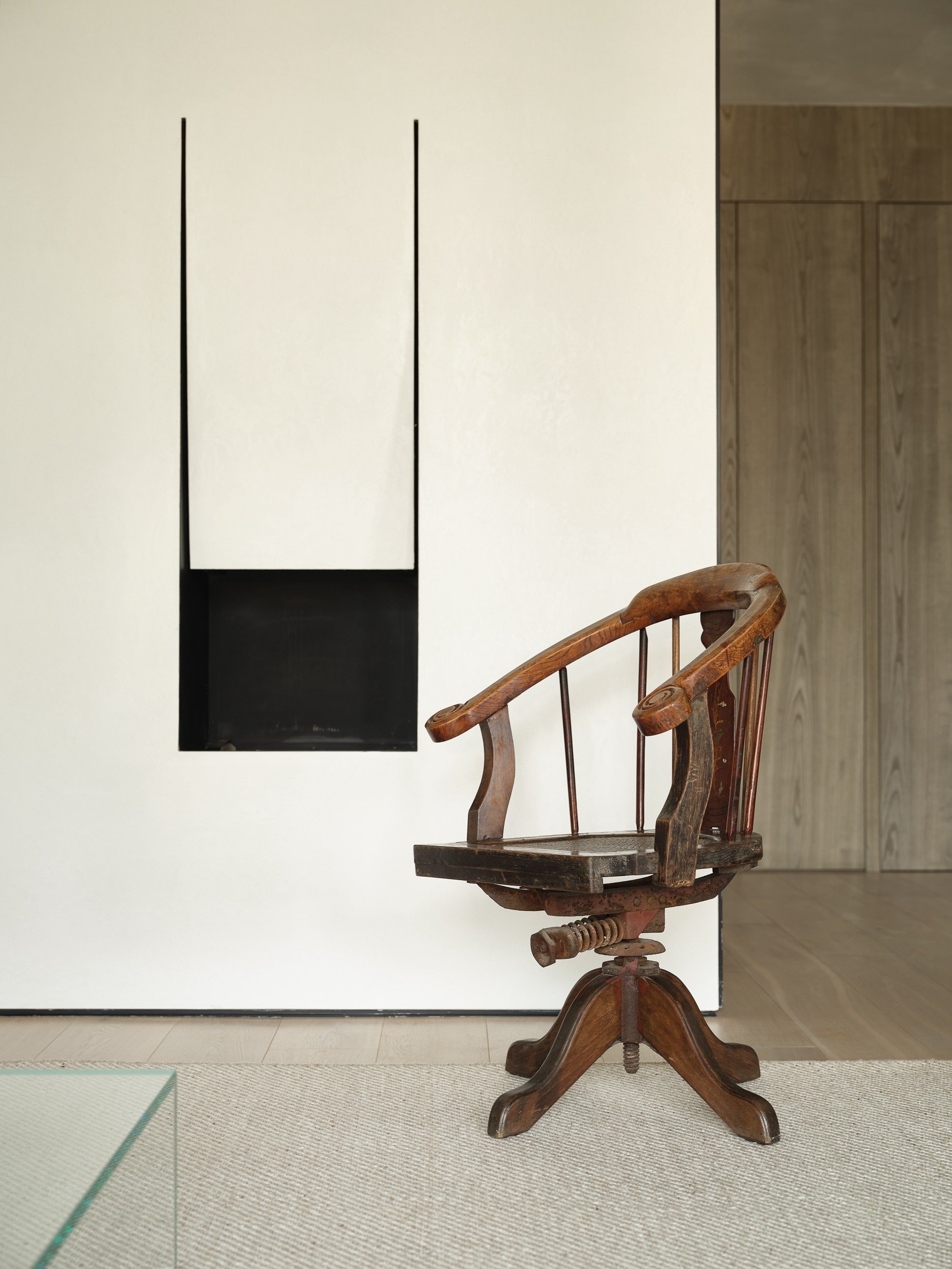
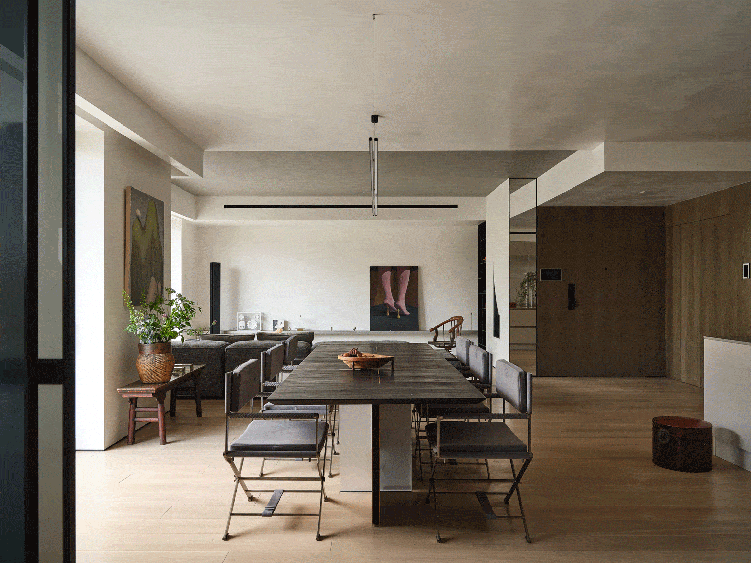
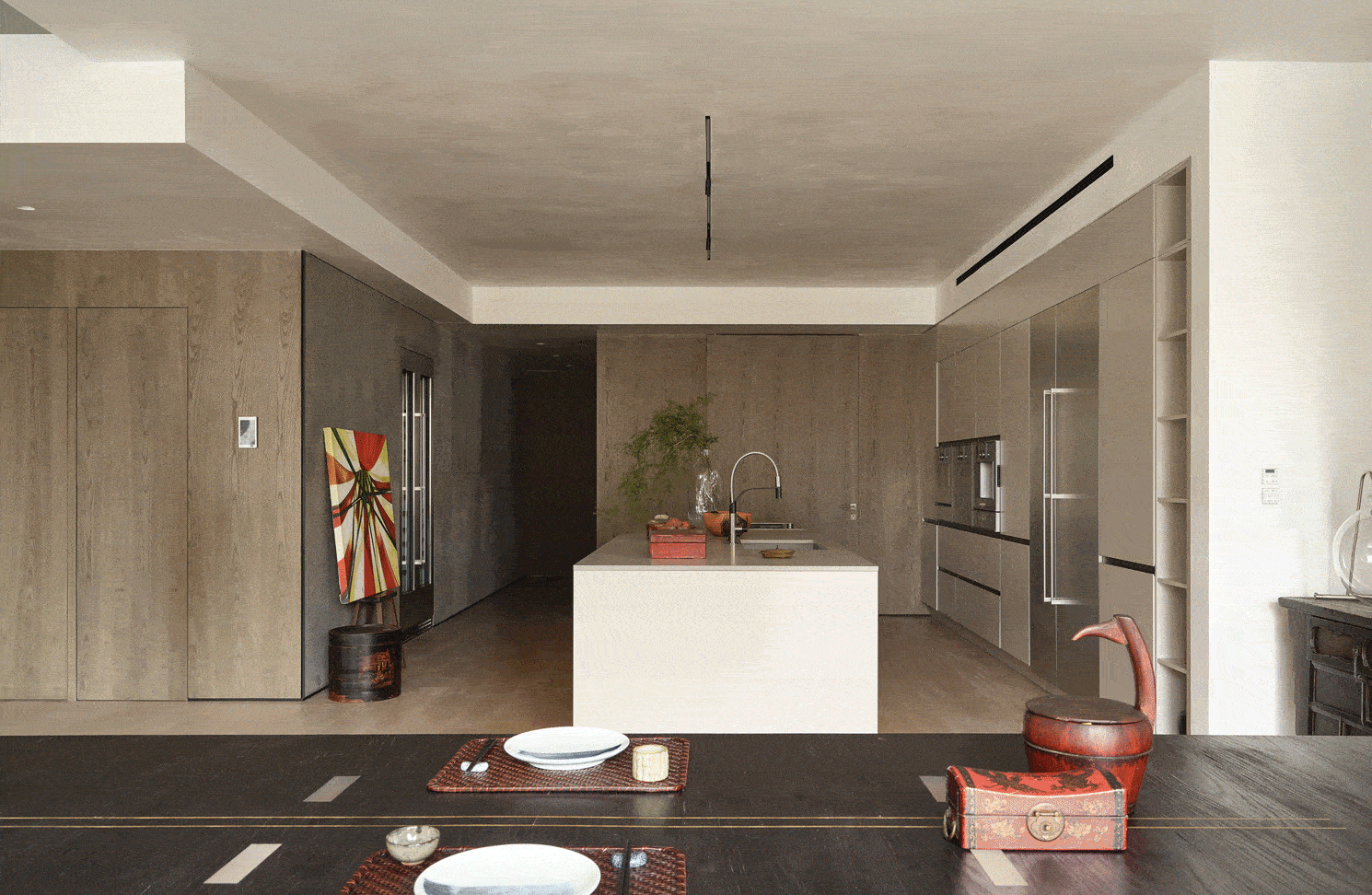
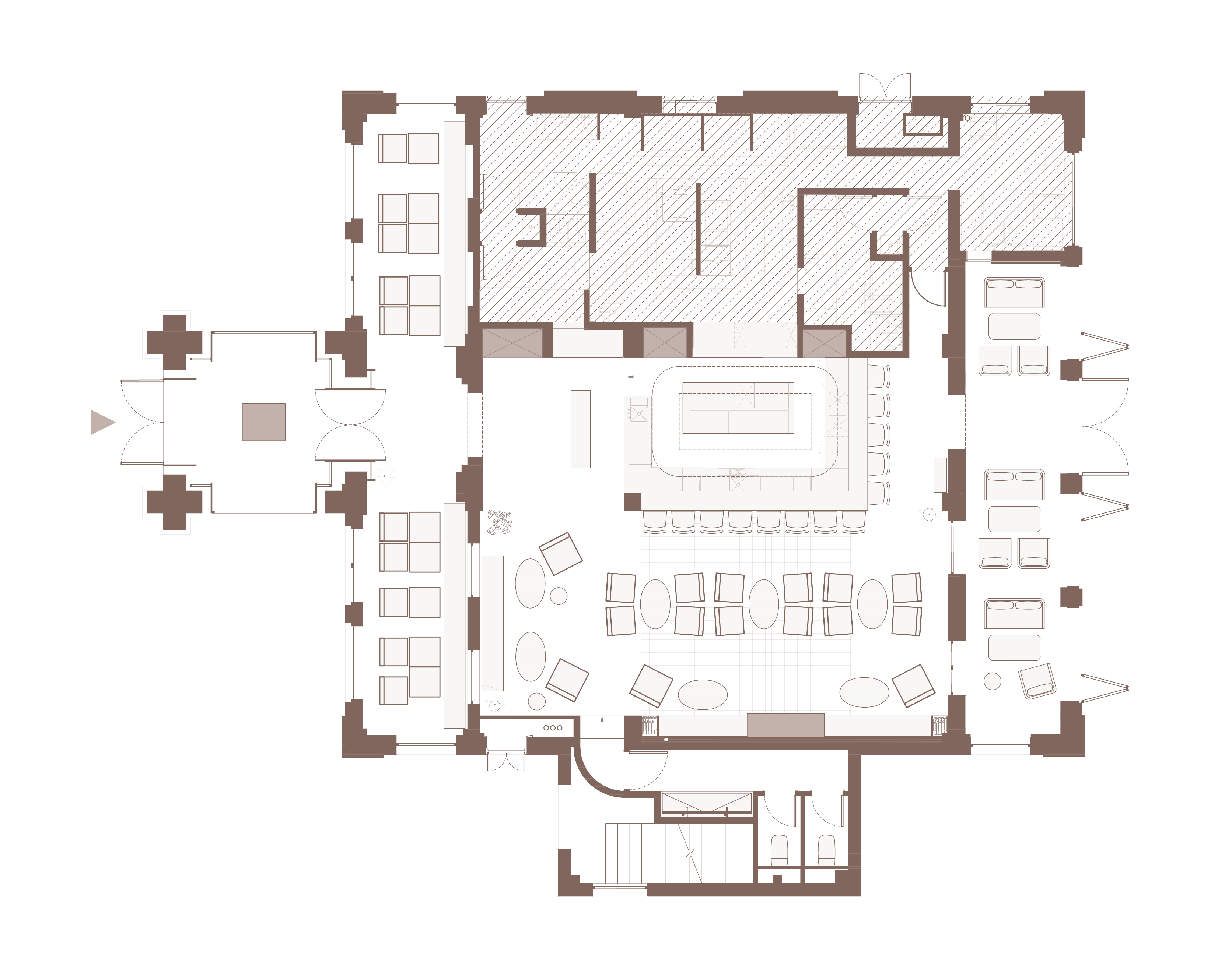
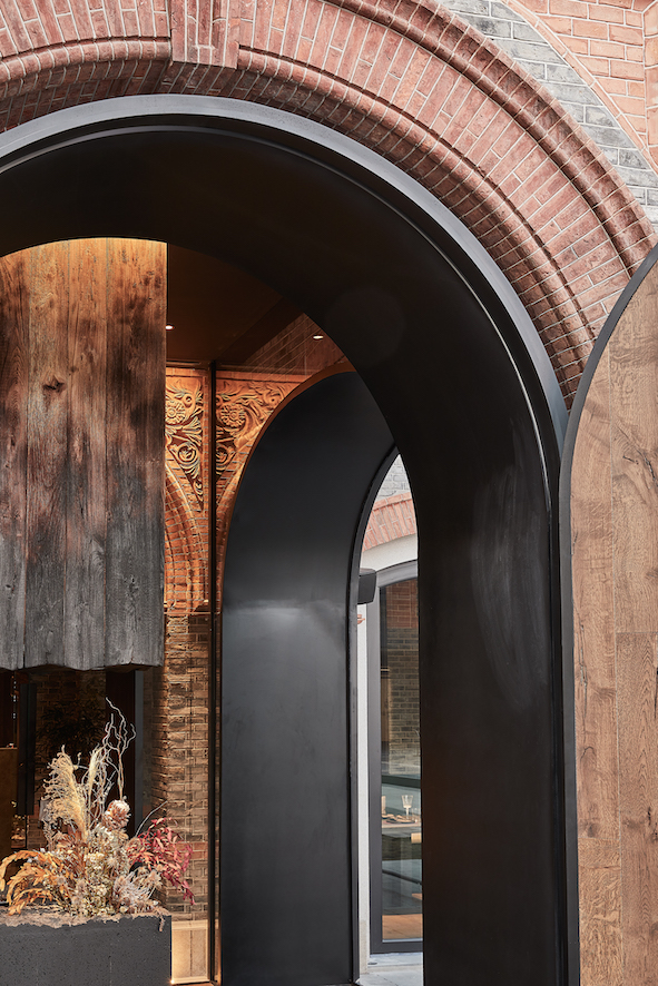
As the first element, heat – the energy that boils the liquid – is a fundamental design factor to the first floor, where human interactions were planned out accordingly. The aim was to create a warmer and more welcoming space at the beginning of the hotpot experience, where people and friends can meet first, have a cocktail and wait for everyone to arrive. Therefore, the first floor is designed as a cocktail bar to act as an energy generator and set the mood. Red floor, fireplace extended towards the ceiling, bottom-lit boiserie, rising sculptural columns that display antique hotpots, and scattered red velvet sofas were designed to give a dynamic and energetic ambience. Metaphorically being deconstructed by “fire”, these elements create a more vivid and warm interaction amongst people. Part of the original brick wall façade was kept and exhibited in the bar to recall the building’s past. A recessed mirrored ceiling at the side of the wall and the doorway towards VIP rooms expands the space and takes the experience to the next level.

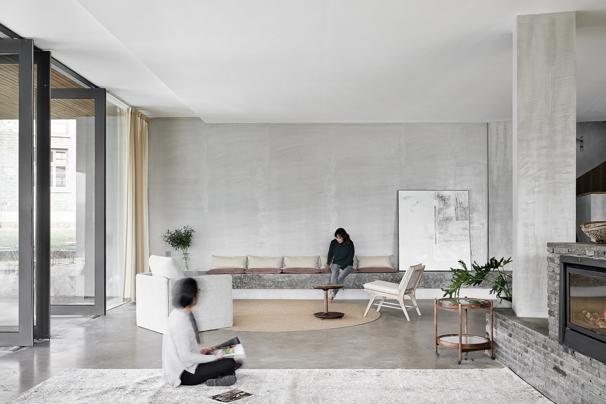
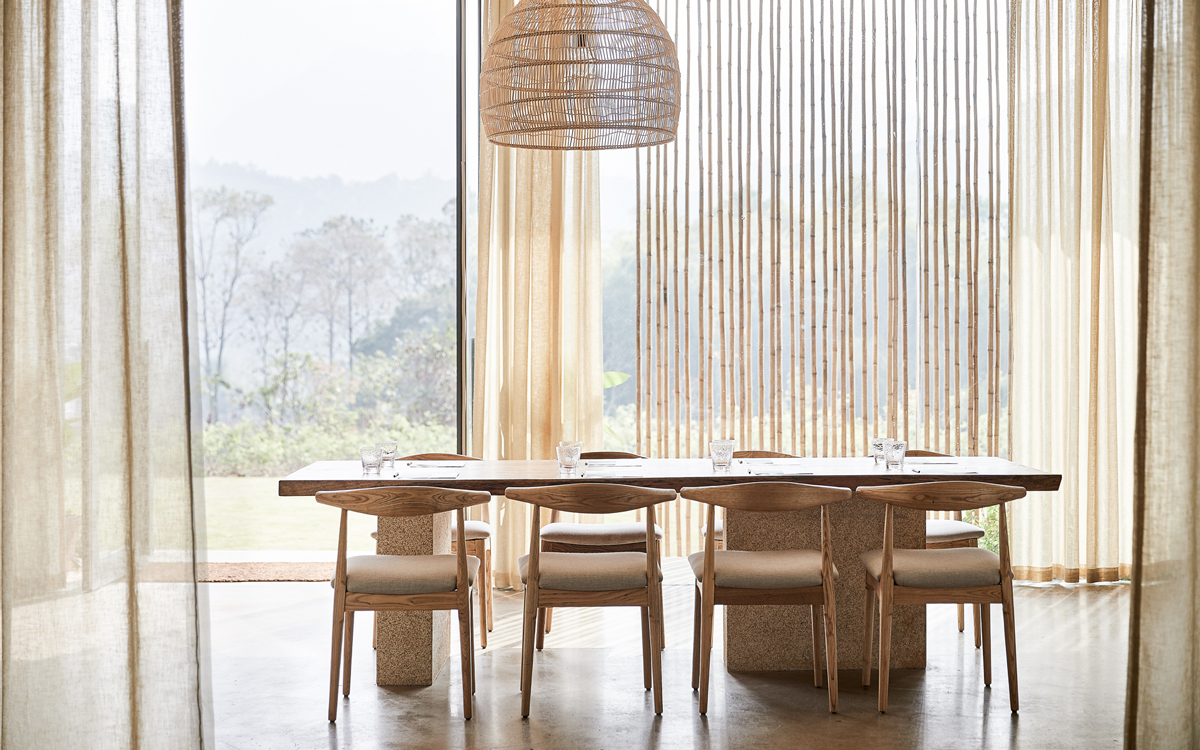
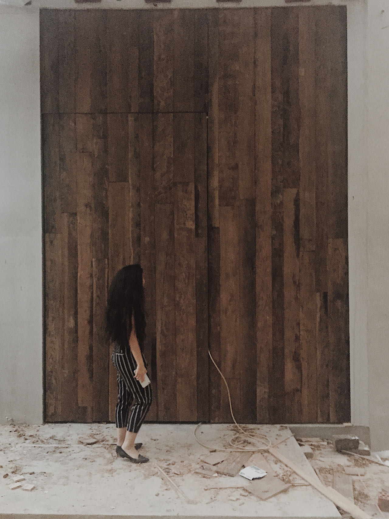
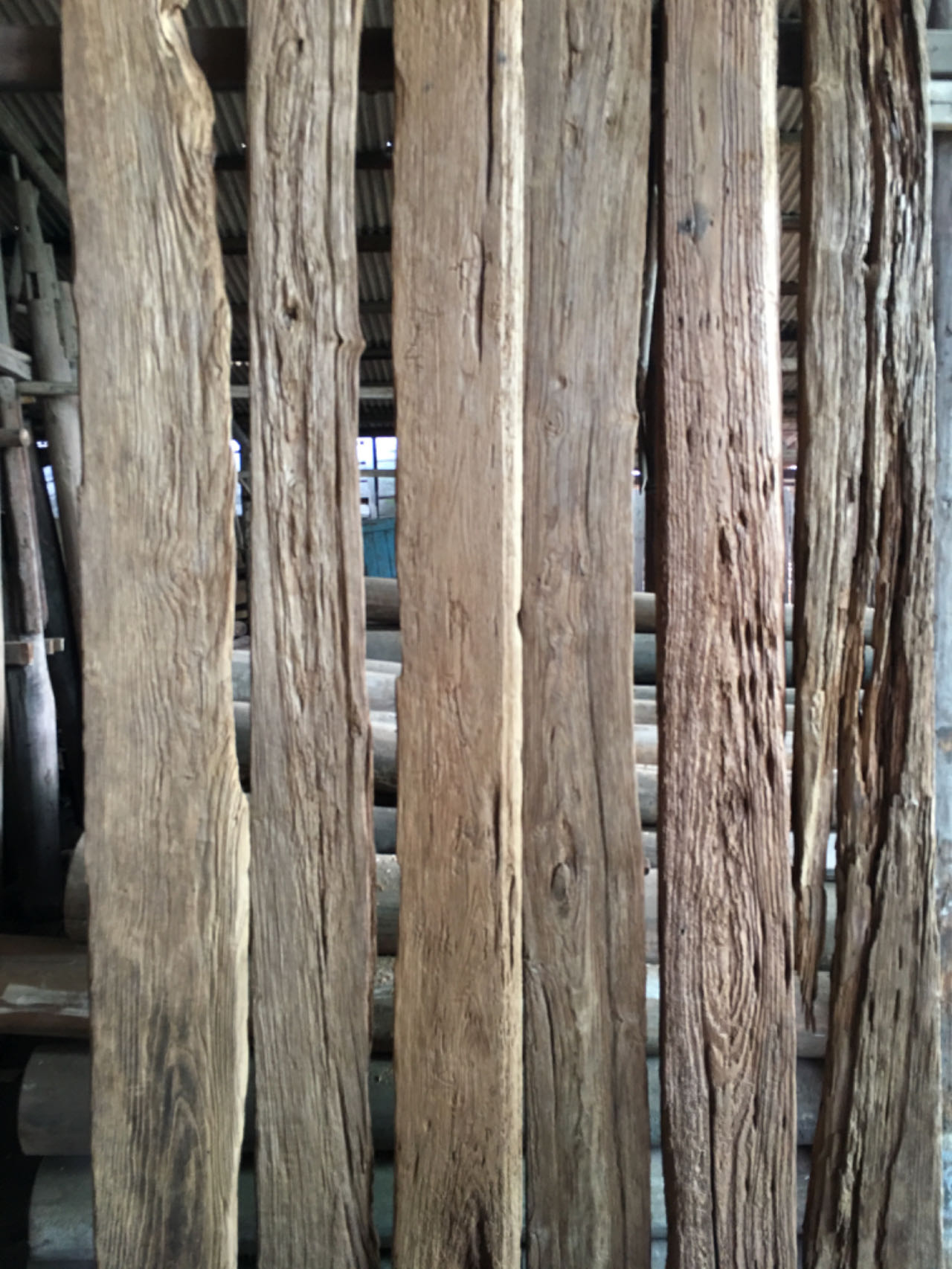
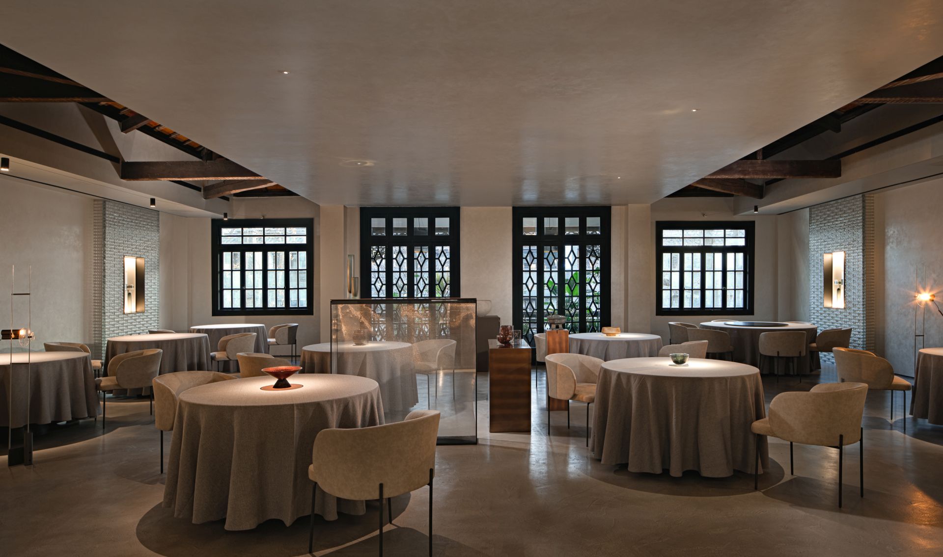
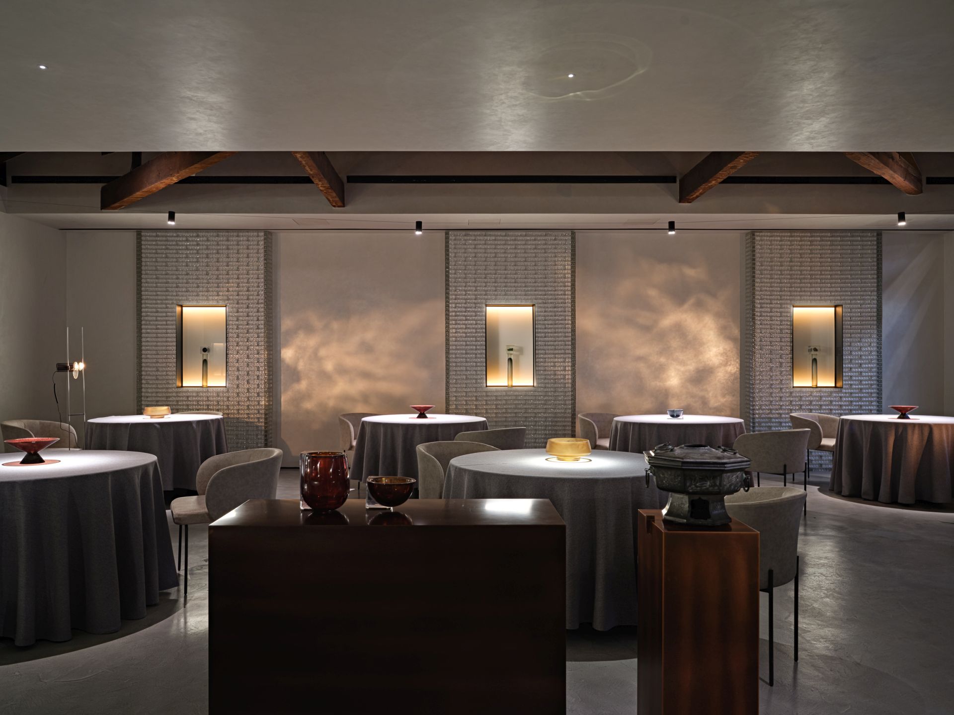
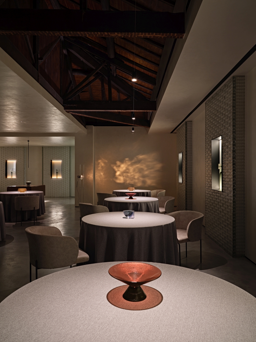
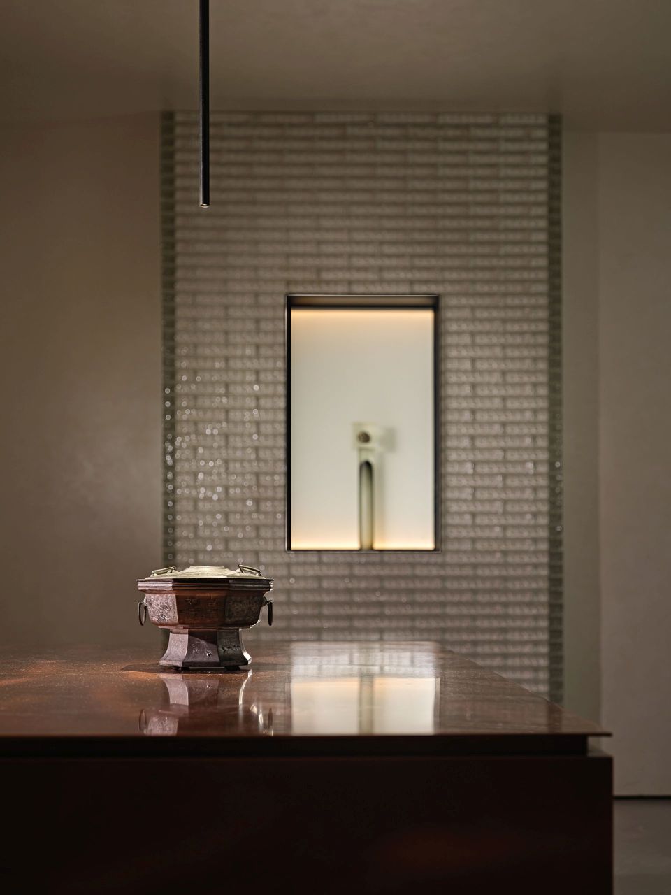
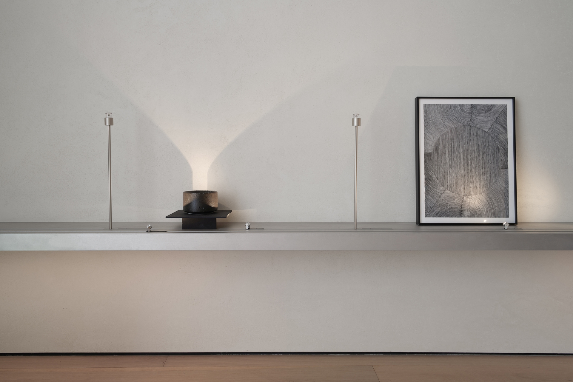
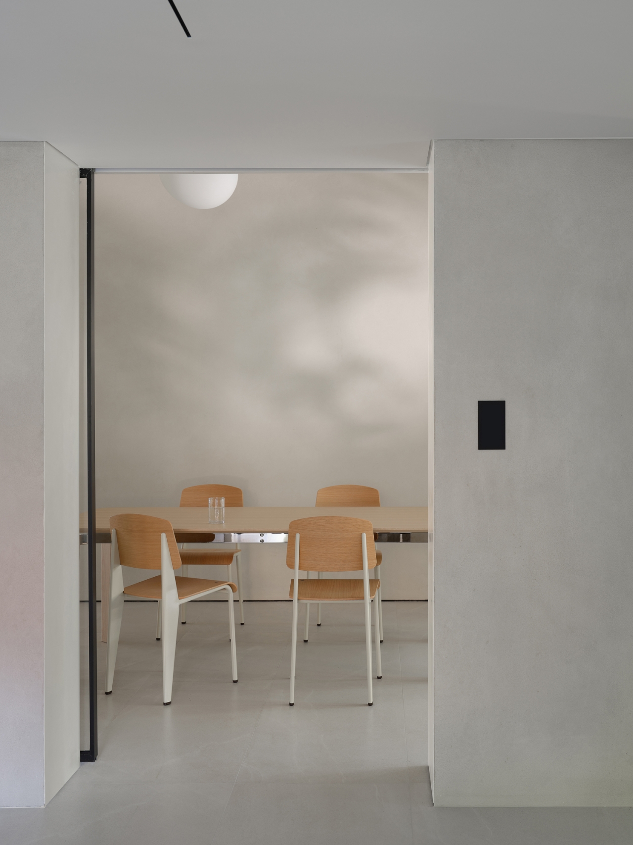
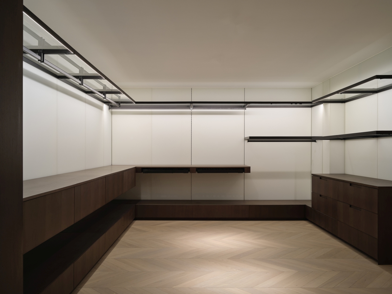
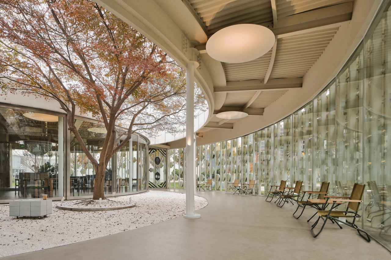
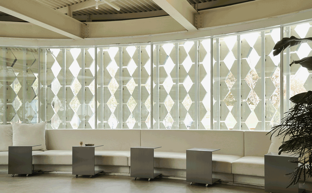
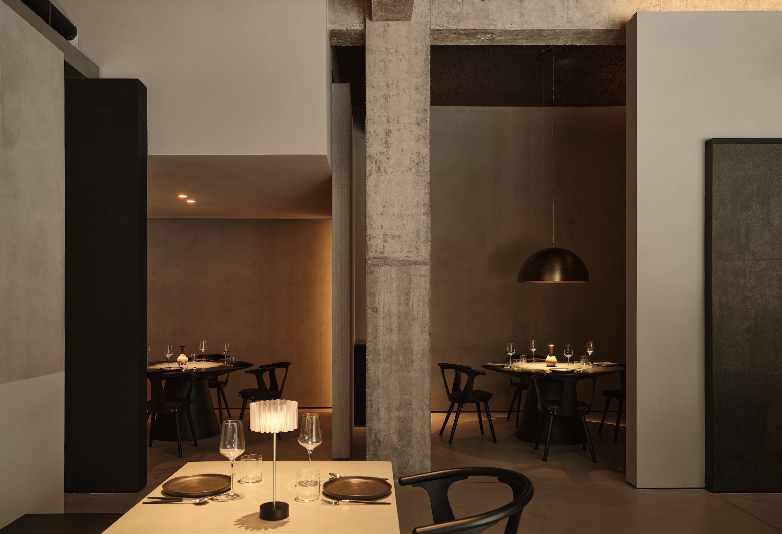
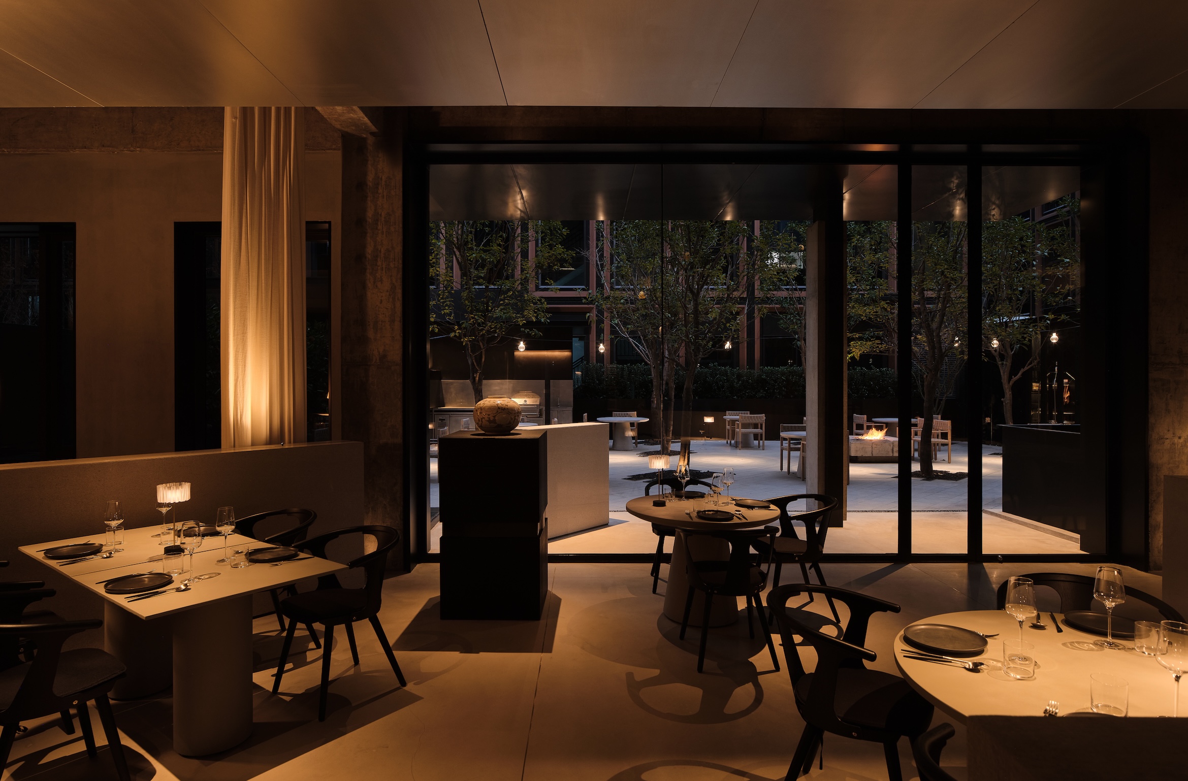
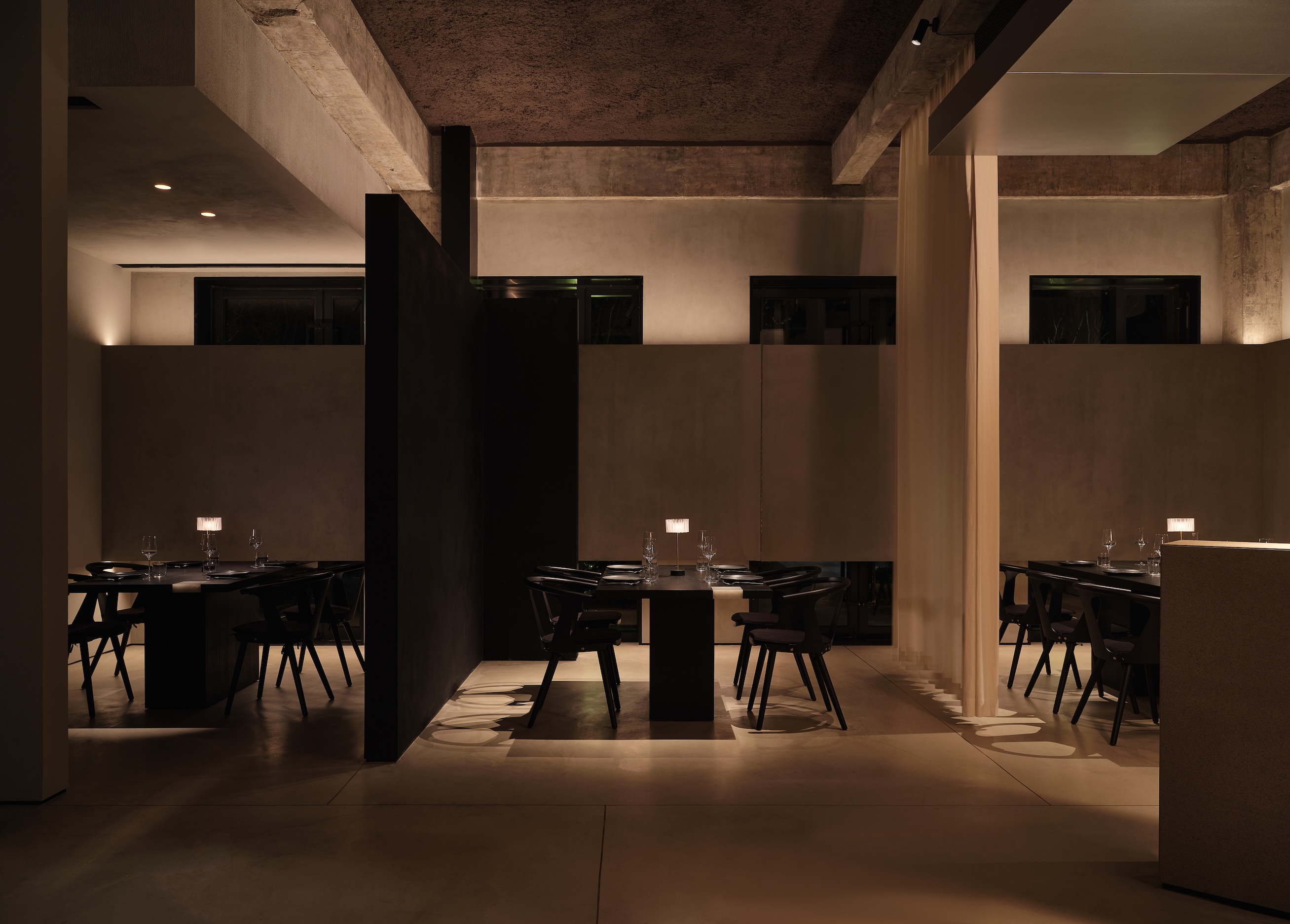
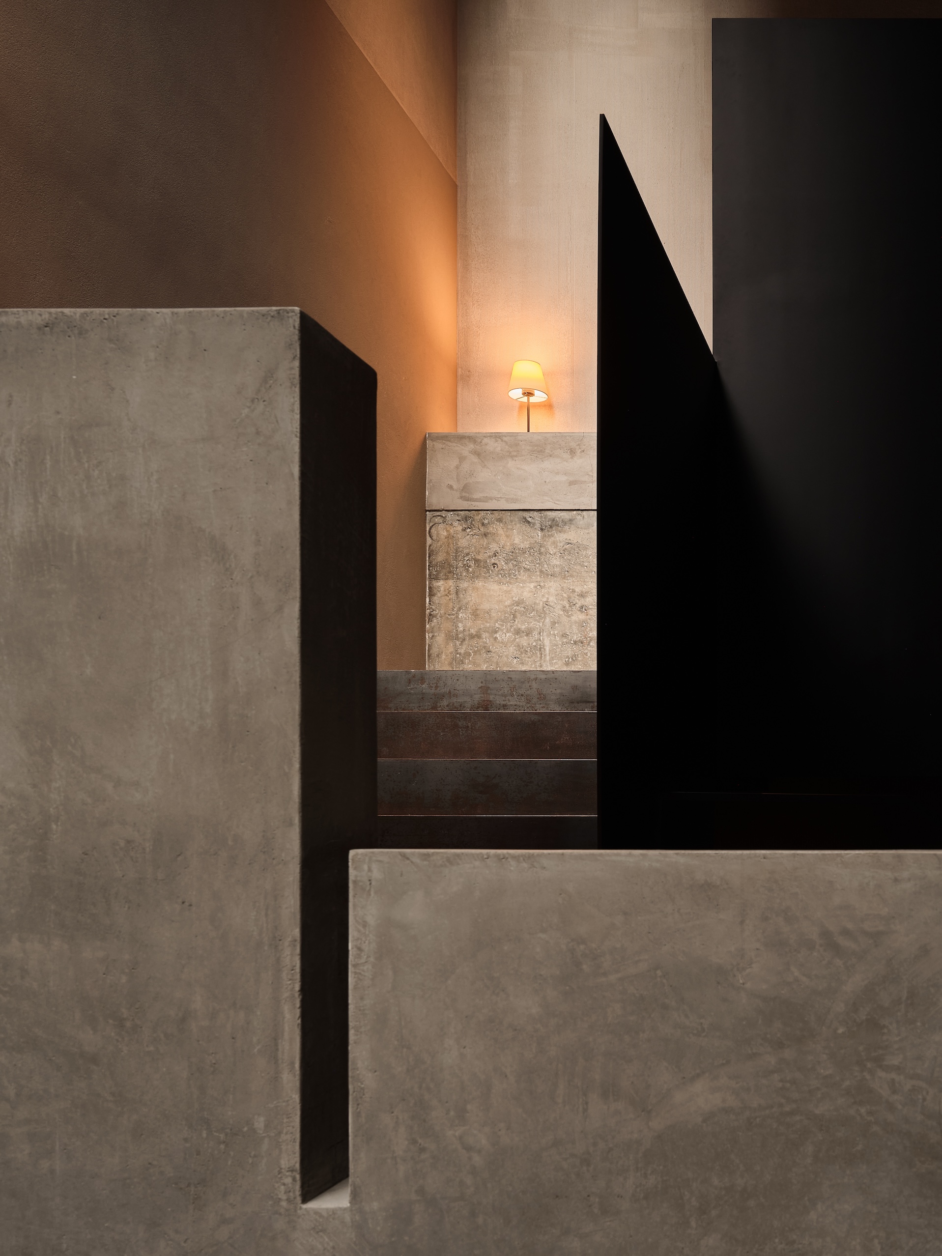
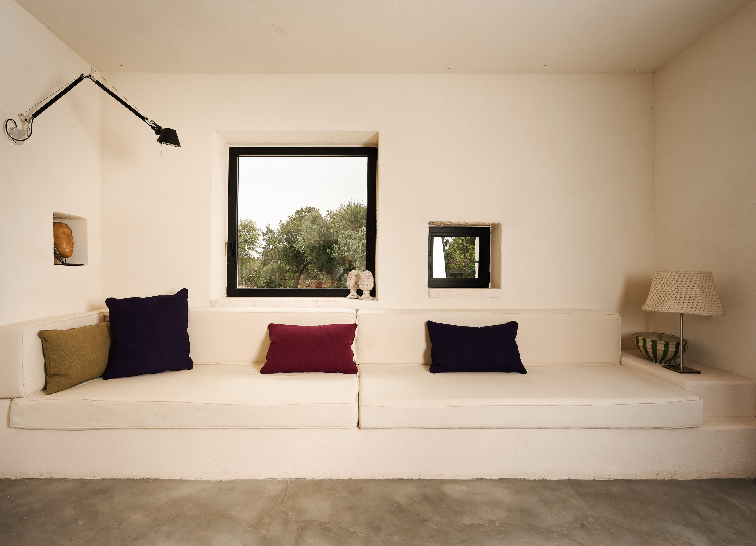
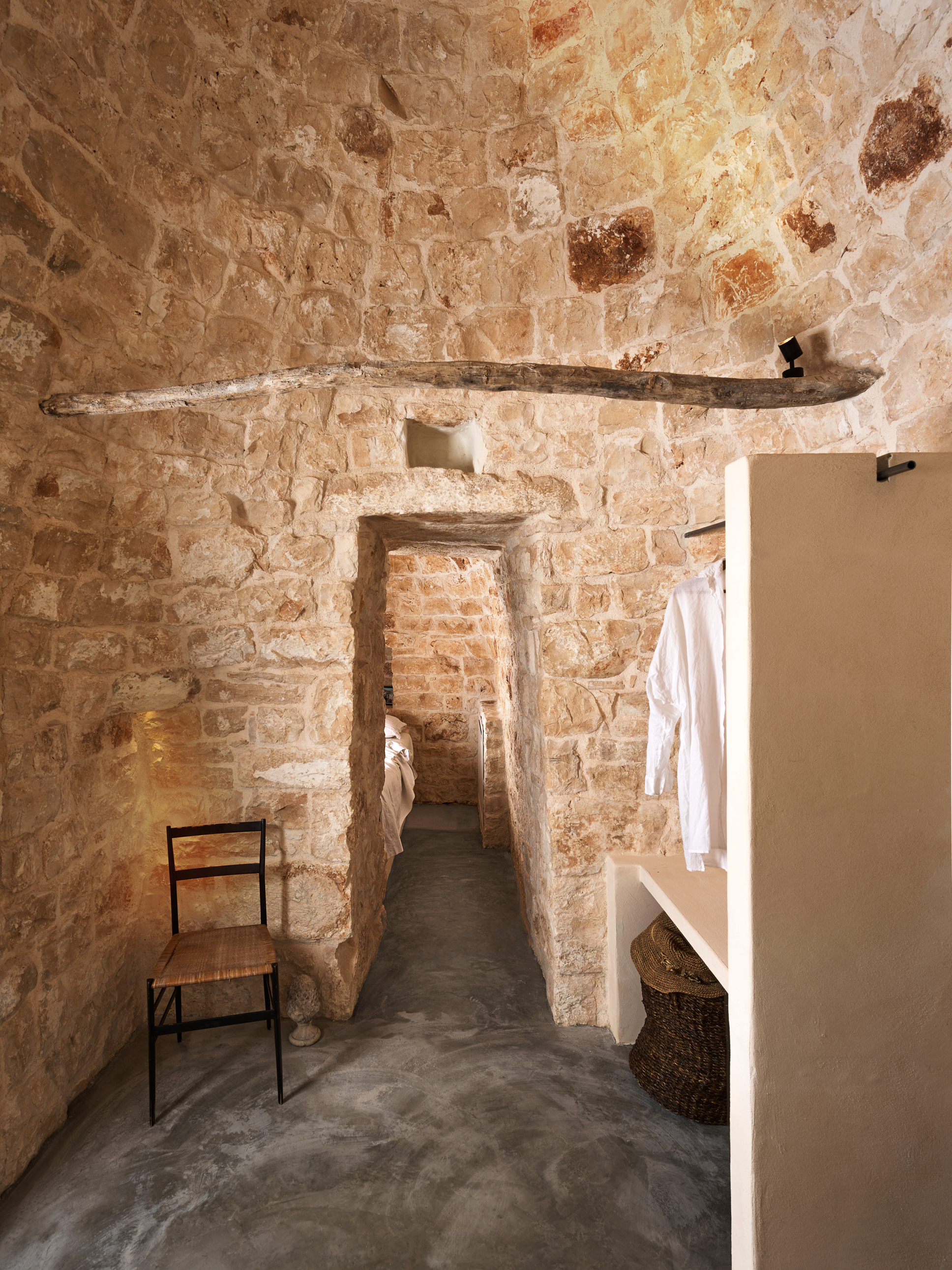
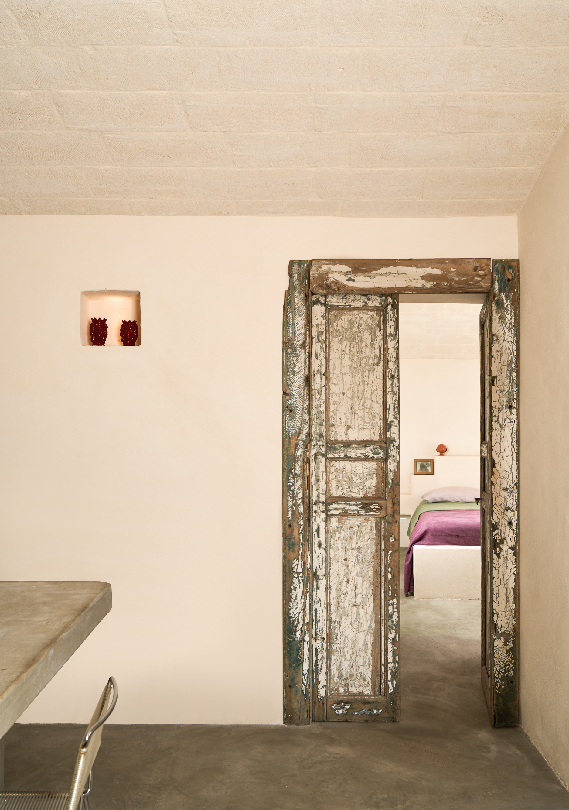
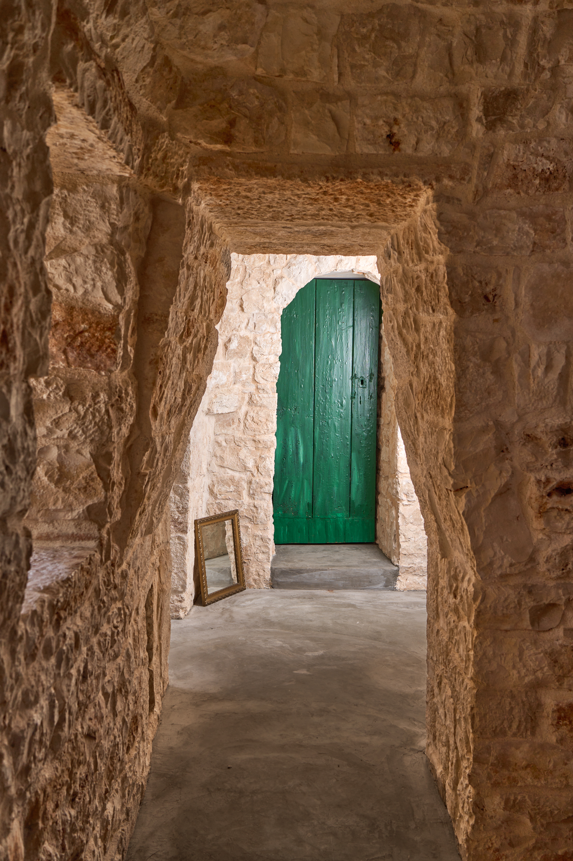
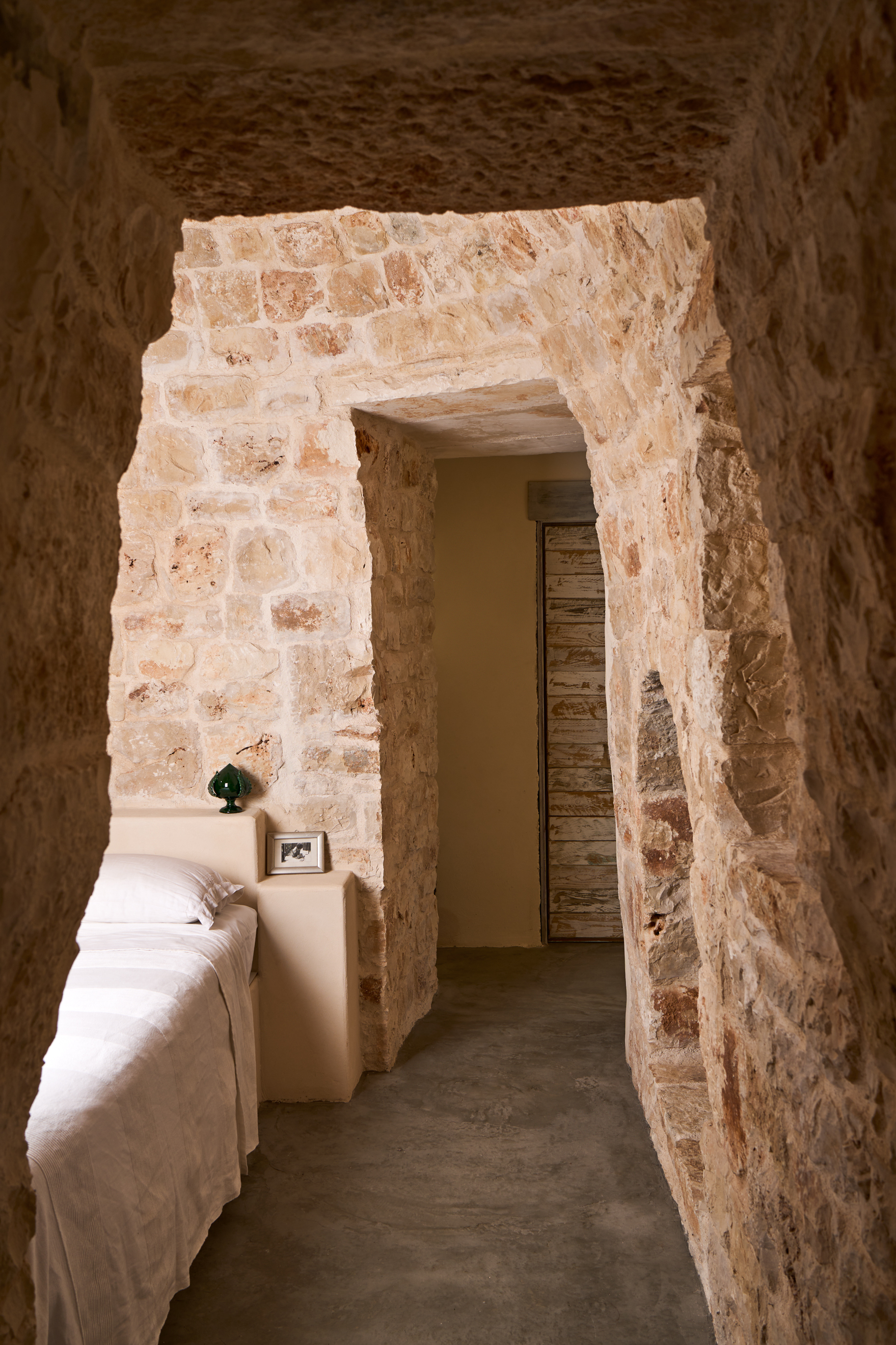
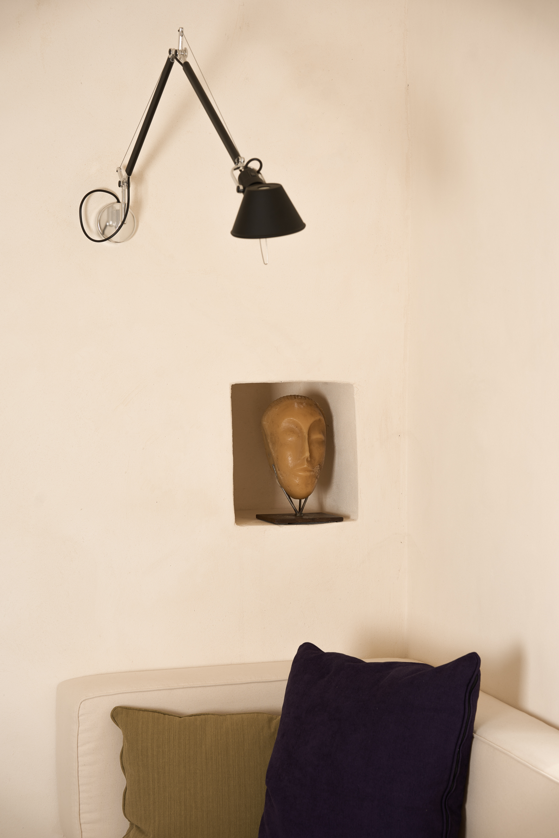
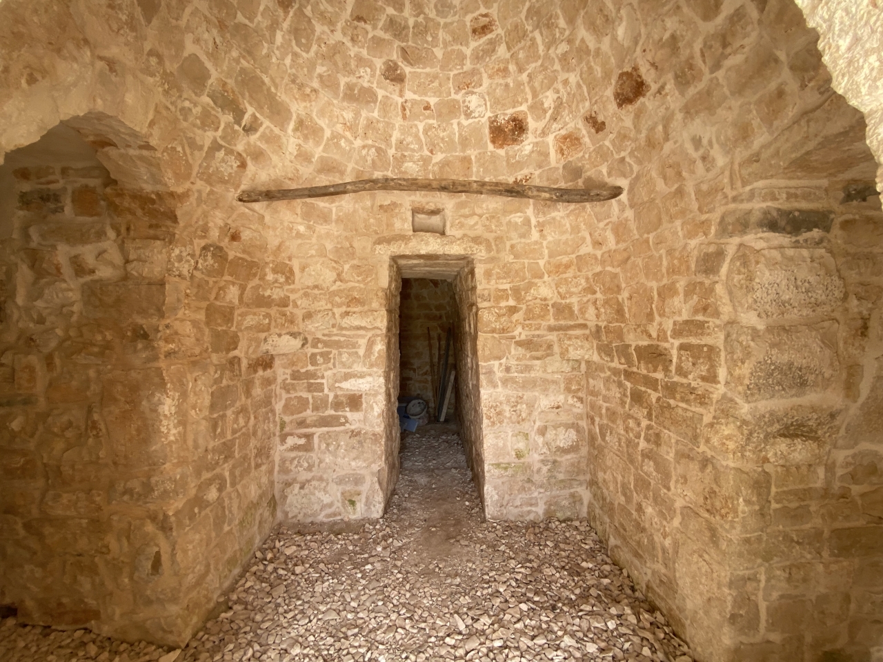
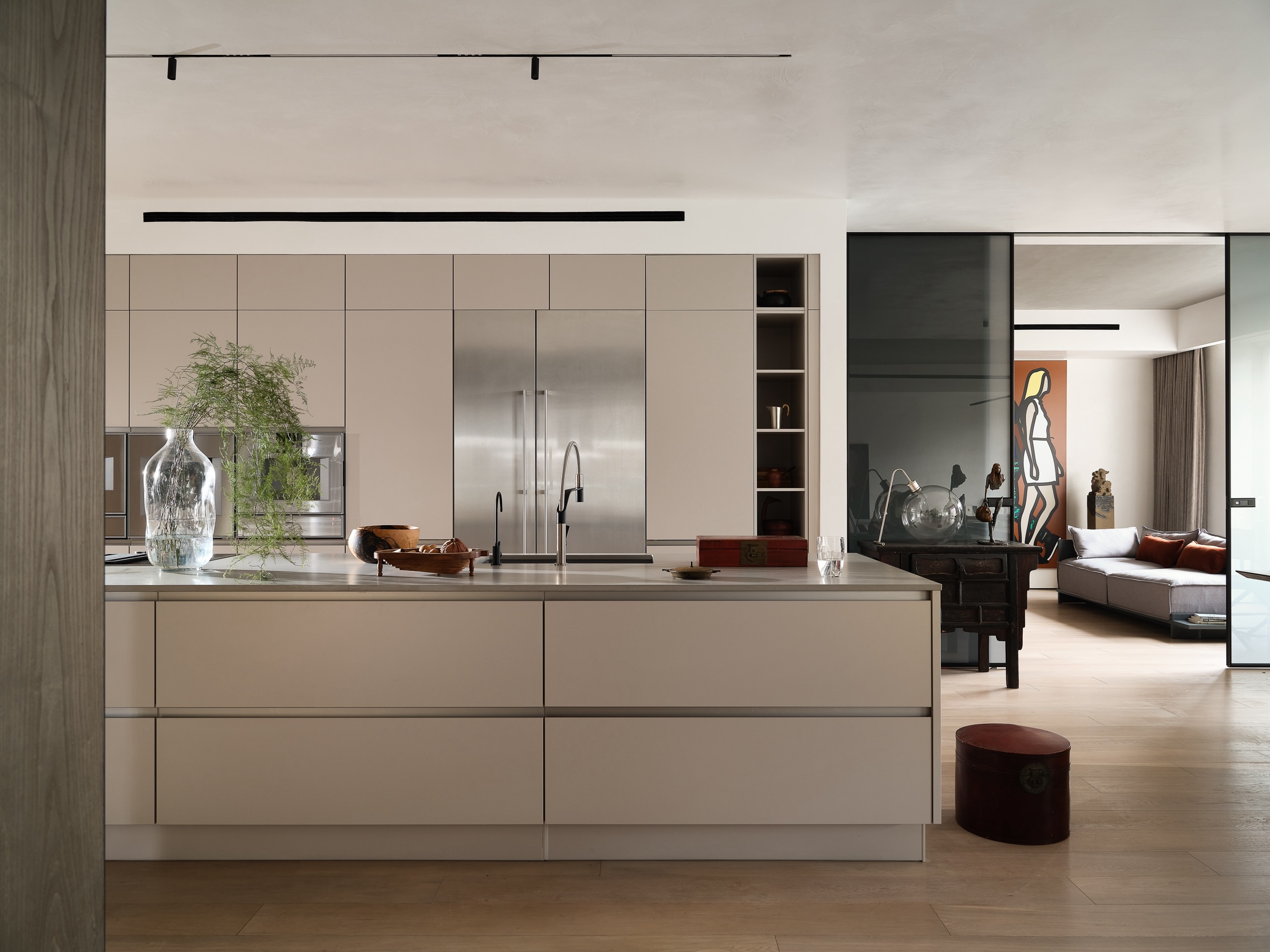
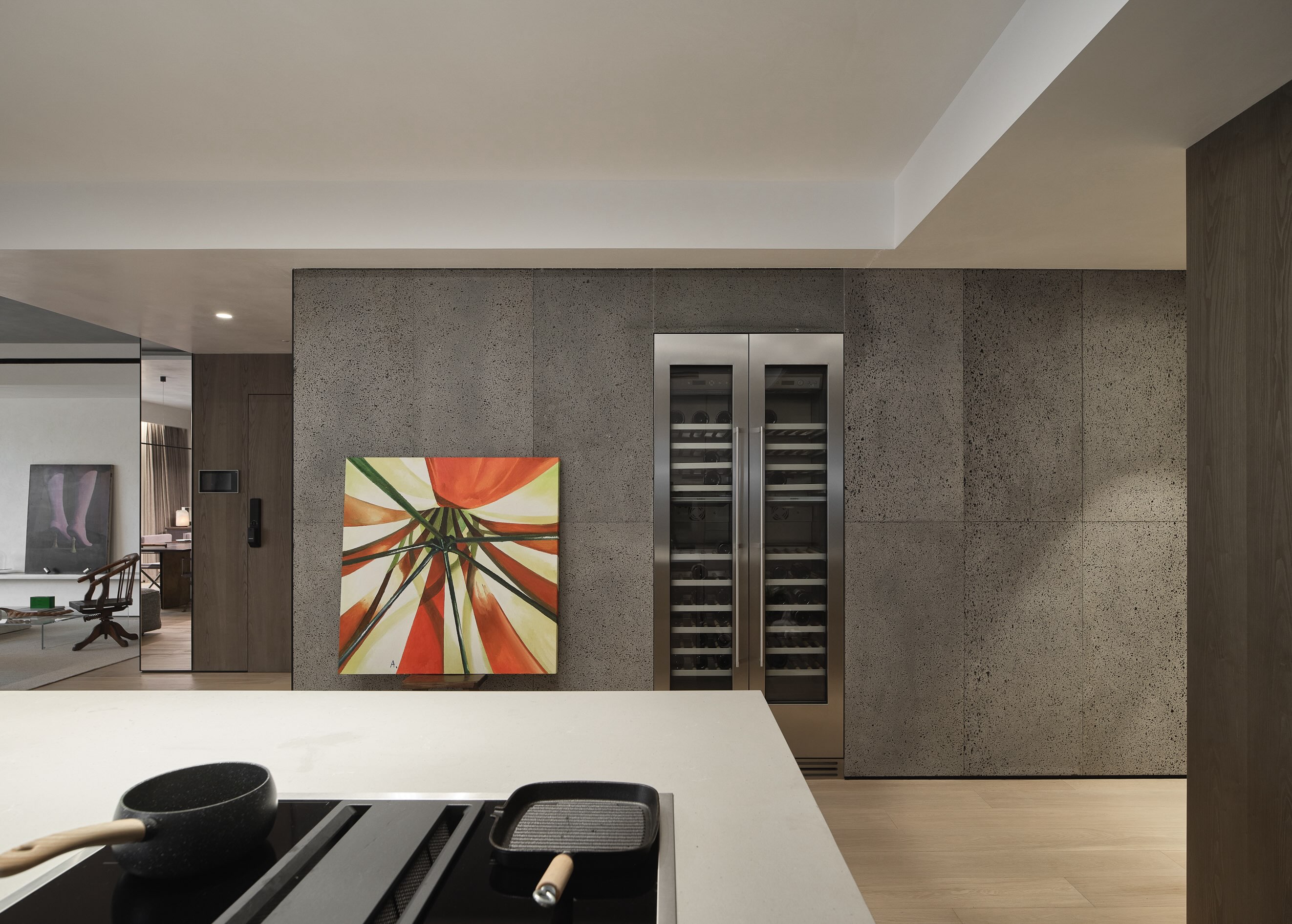
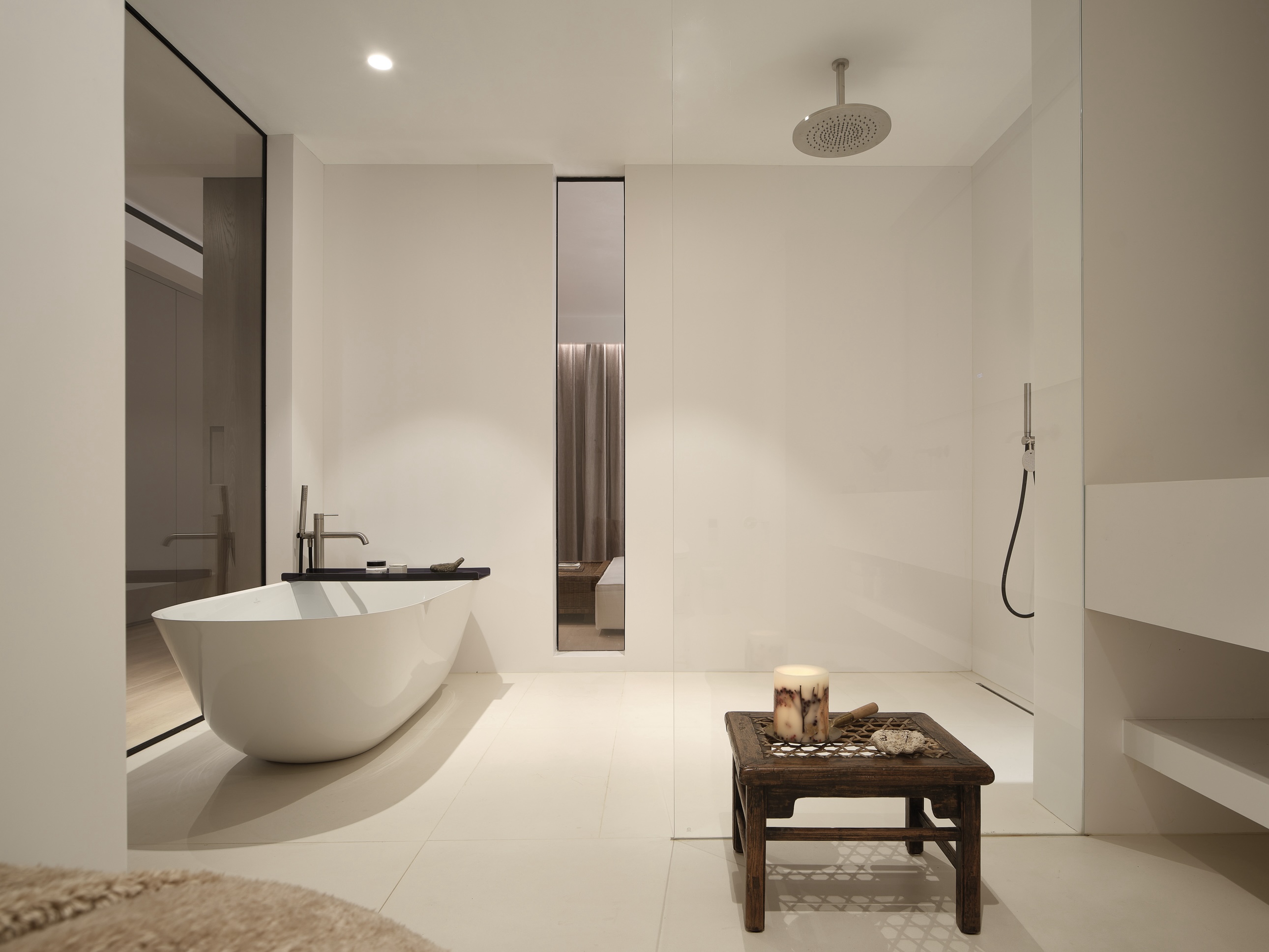
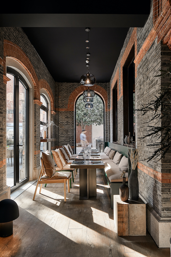
After passing through the heated cocktail bar, comes the second element, water – the medium that reunites all elements. Family and friends are seated together in groups around the round tables at on the second floor for the food experience, a process that the architects relate to water reconstructing the atoms of the ingredients. The second floor is surrounded by glass brick niches, reusing the depth of old windows on the original façade blocked by neighboring buildings. Resin blocks with different cores are displayed as an abstract hint of recomposed flavor. On this floor, an old wall with a stone window frame was preserved and used as a partition between tables. The wooden roof structure and balcony were also carefully protected and highlighted.

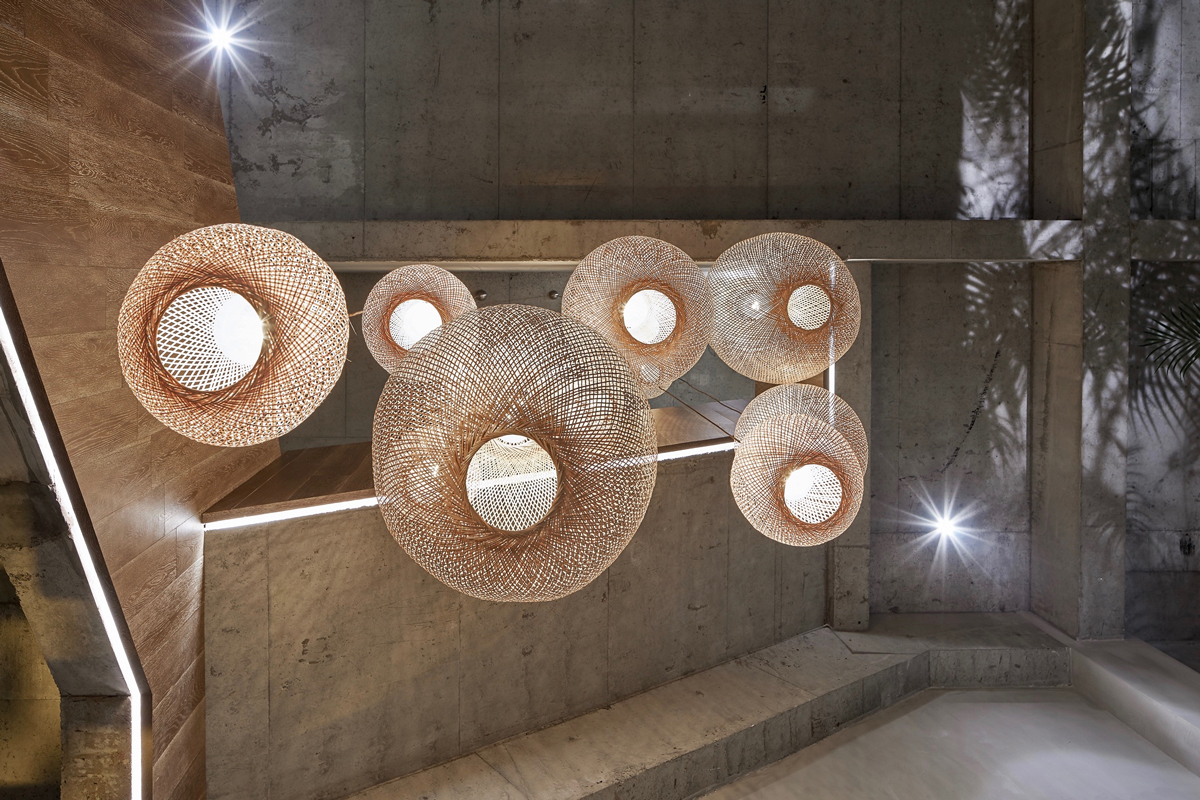
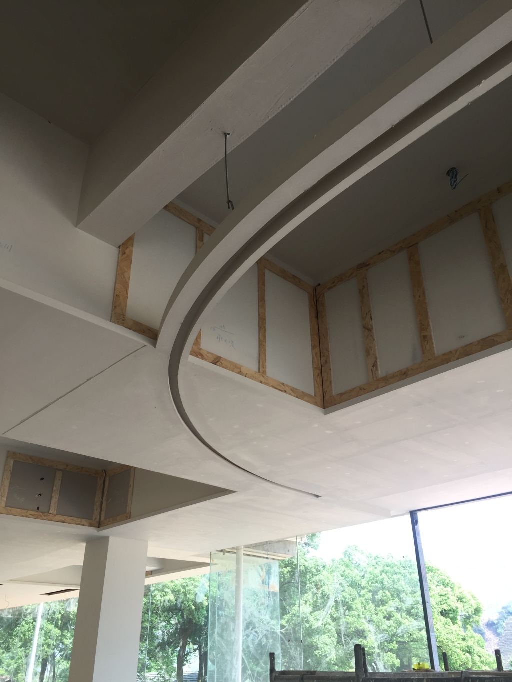
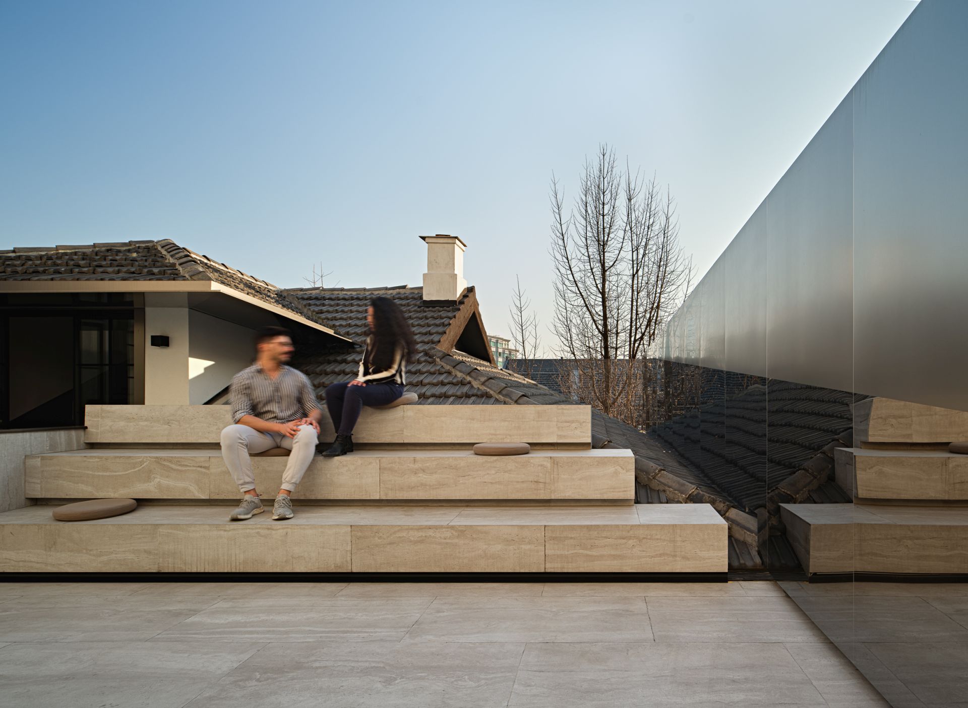
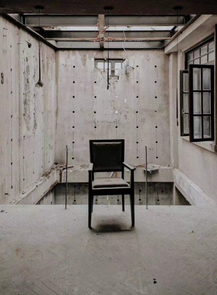
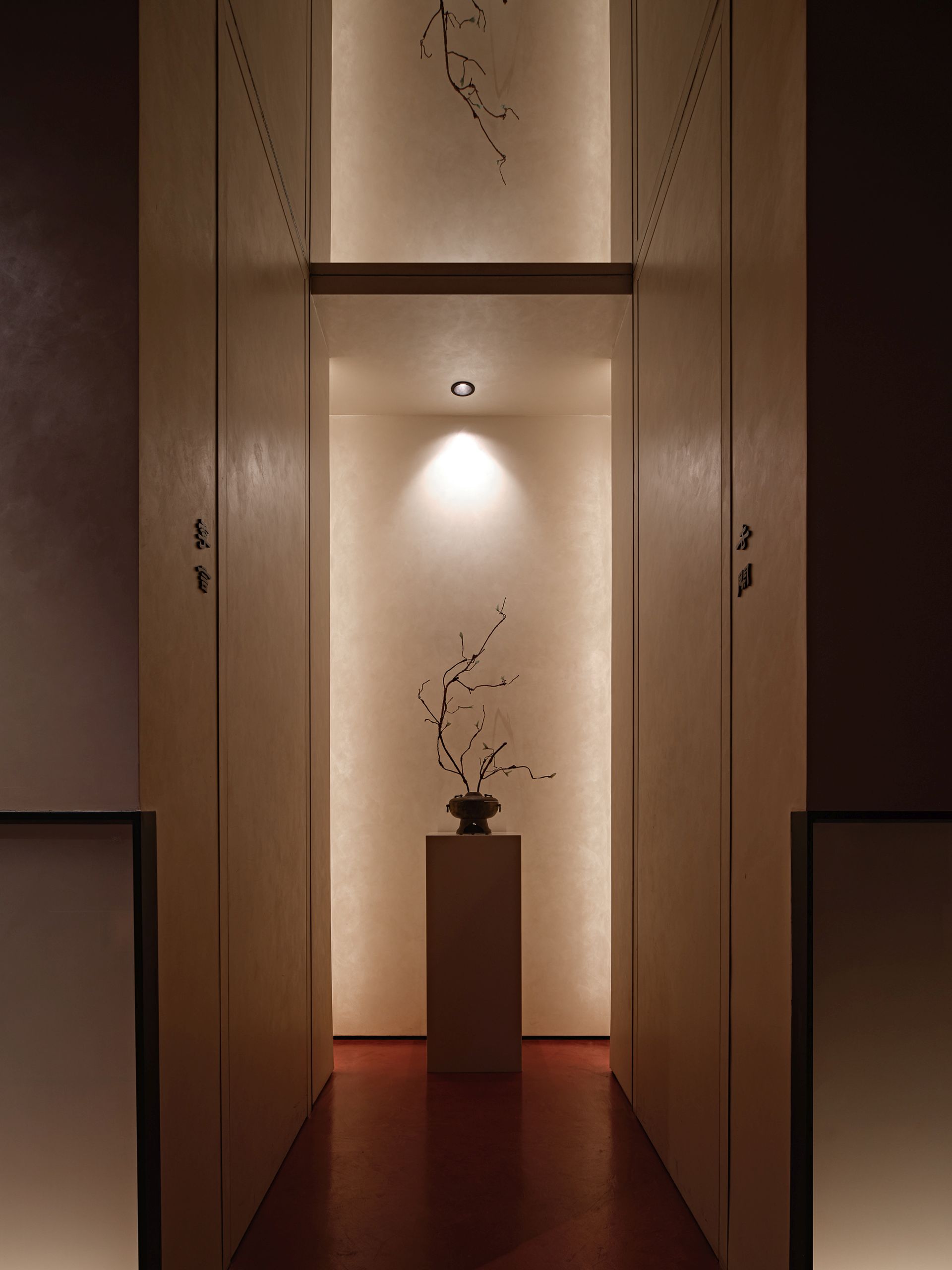
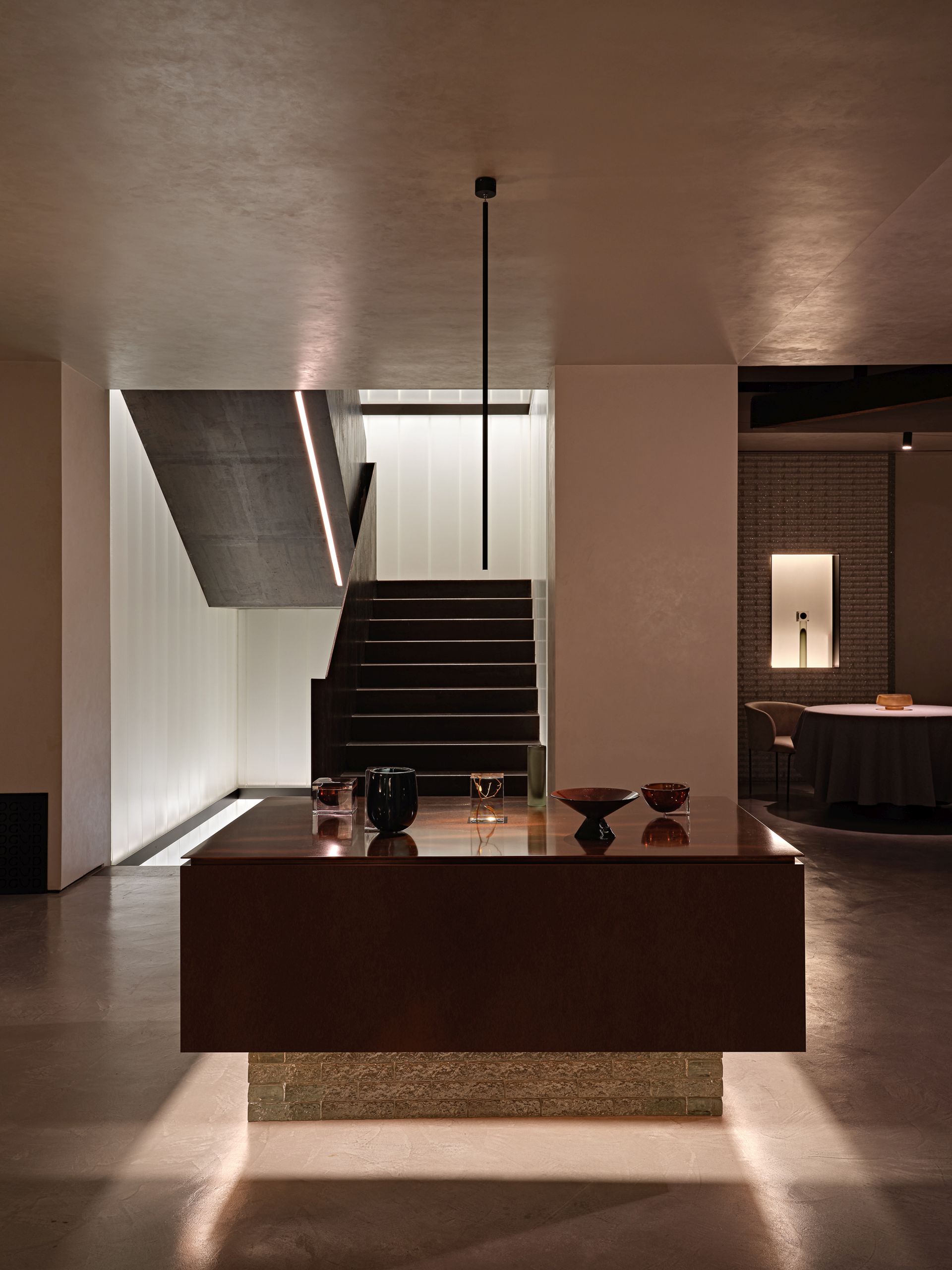
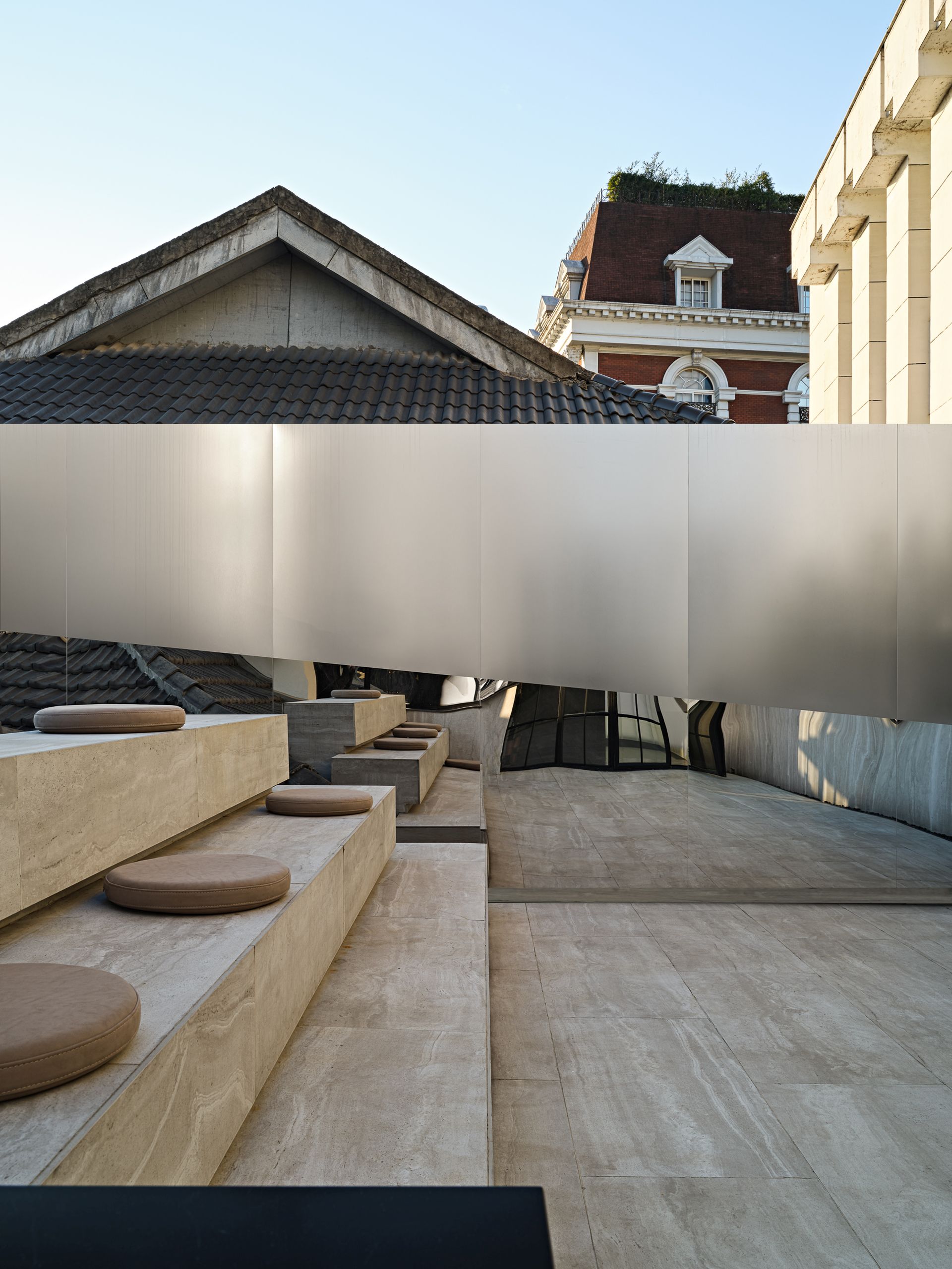
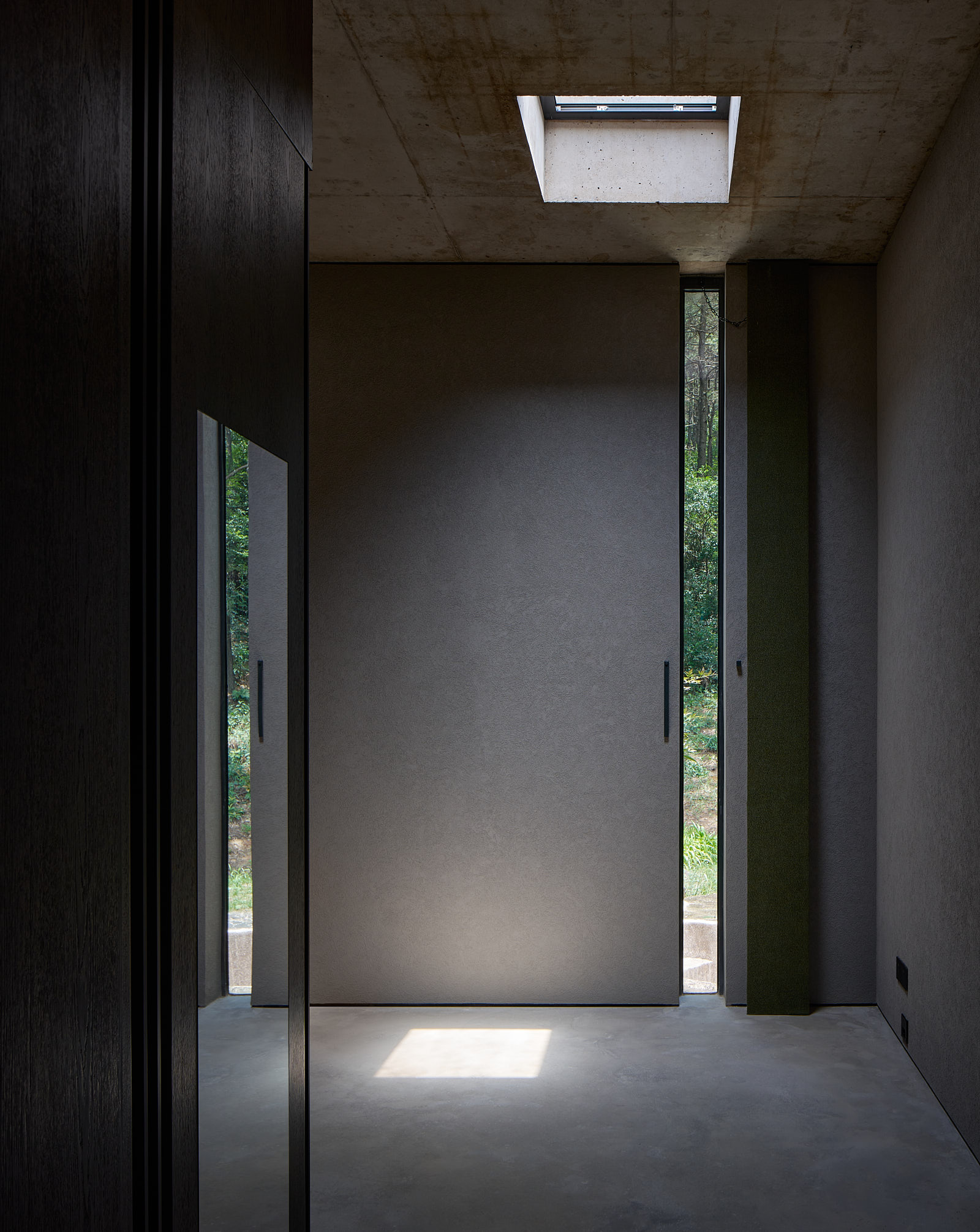
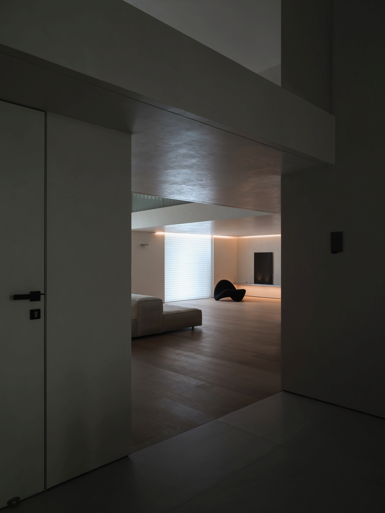
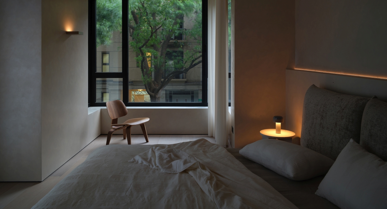
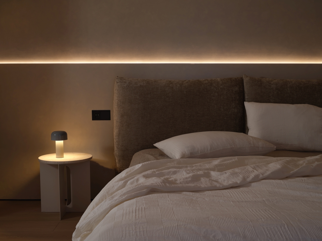
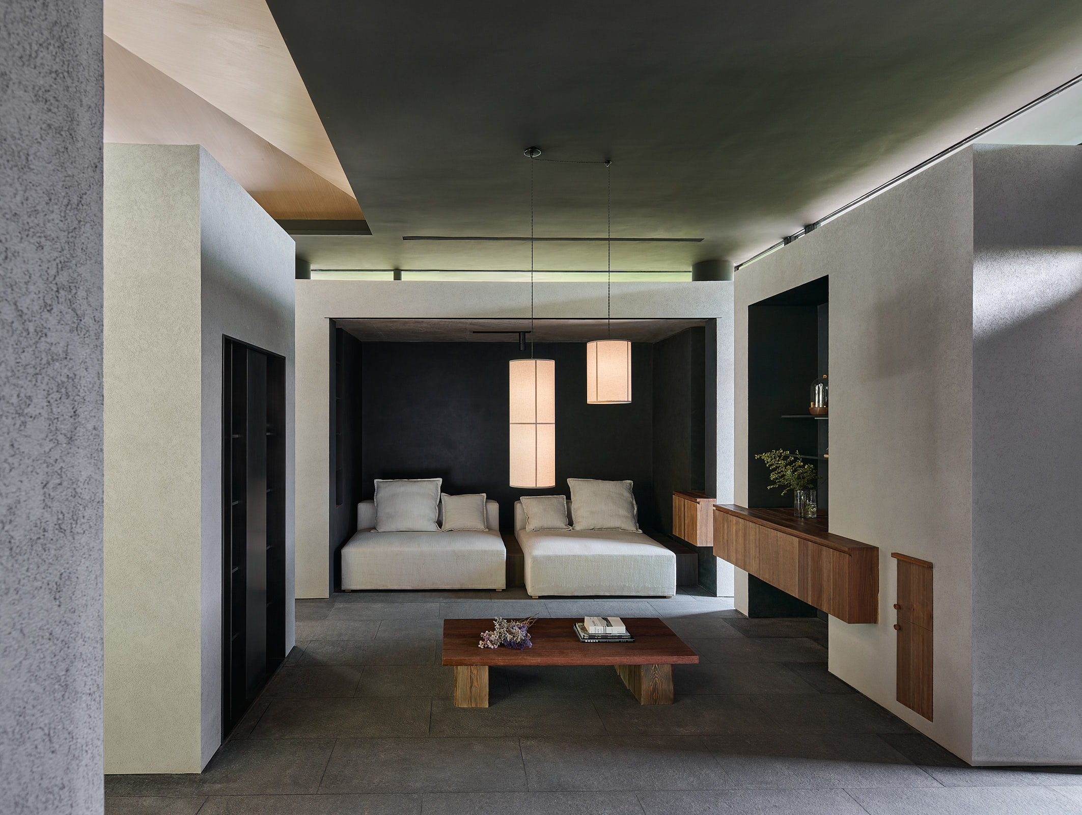
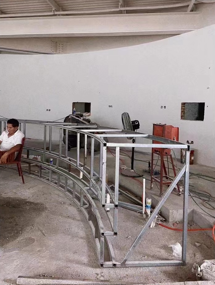
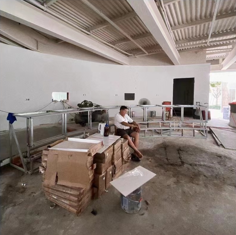
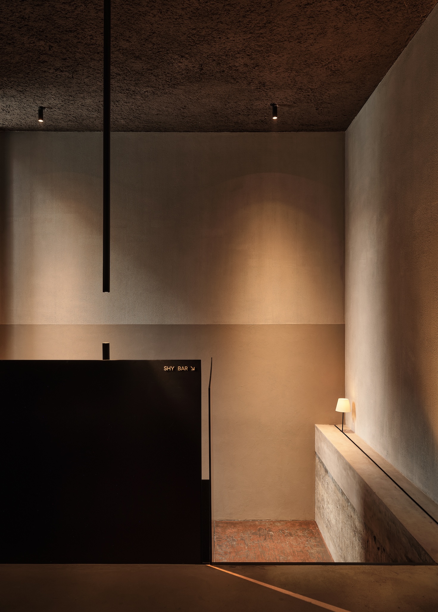
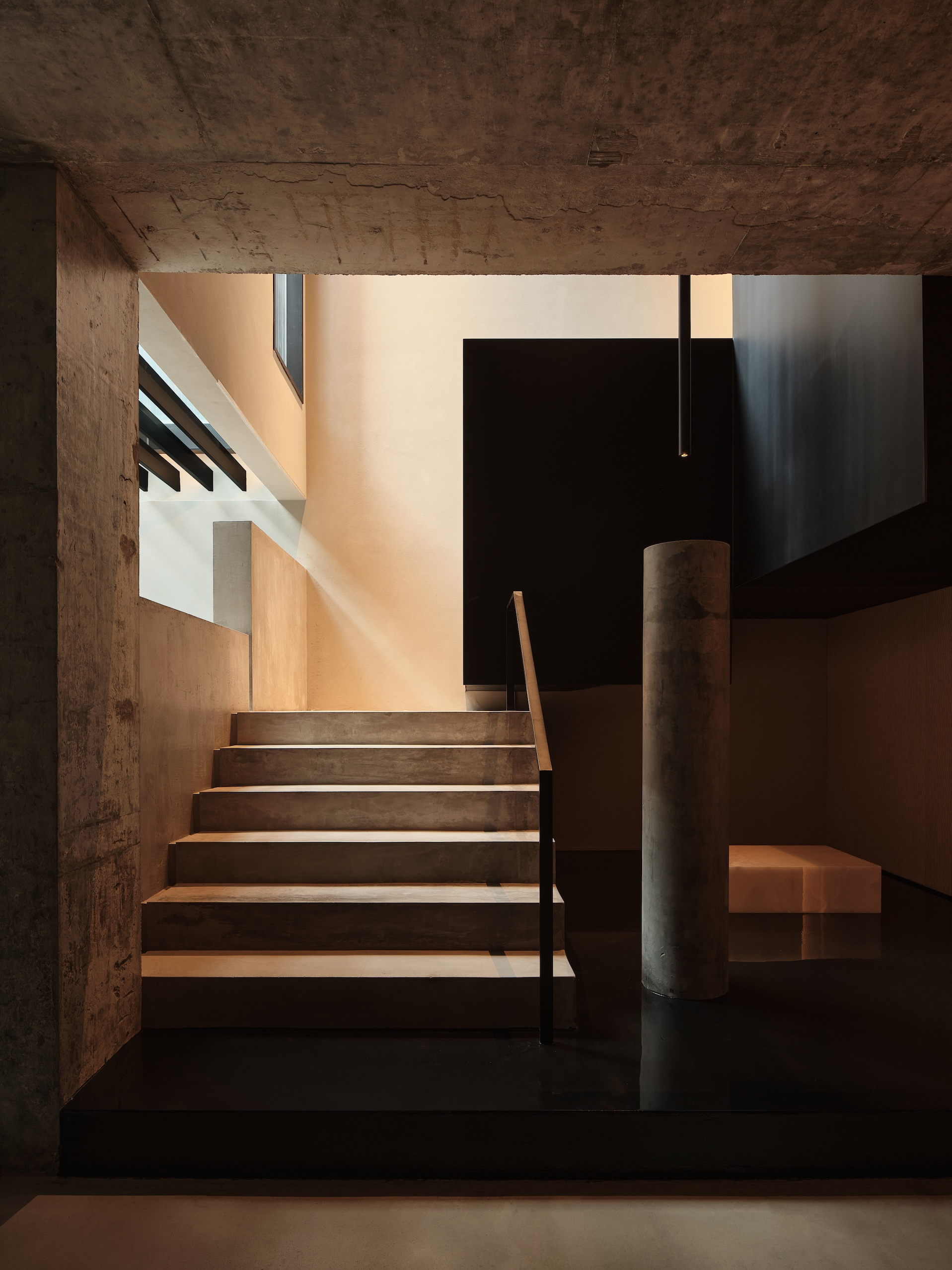
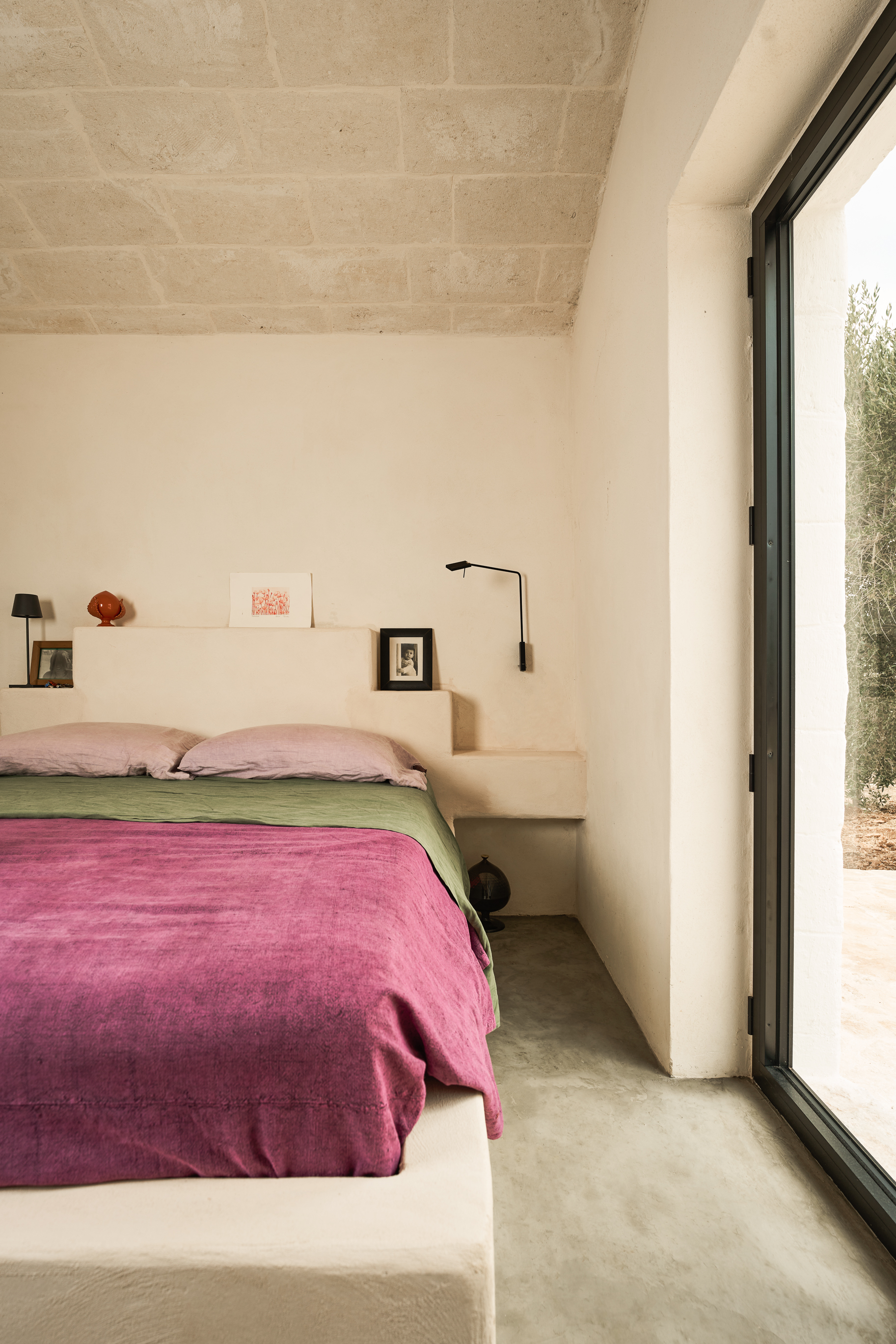
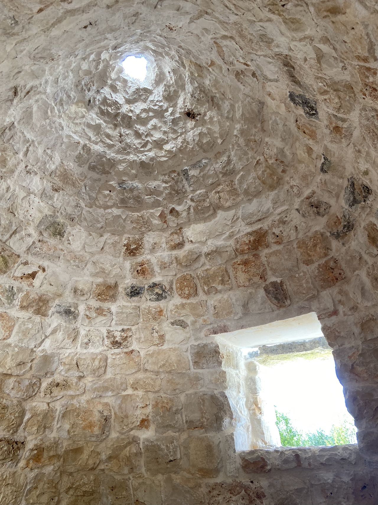
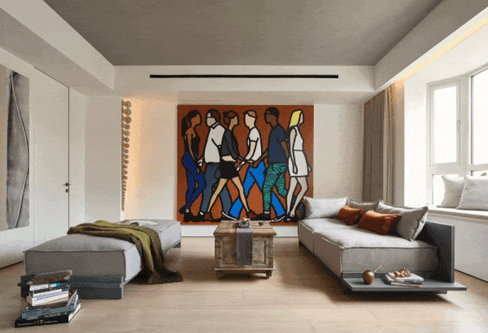
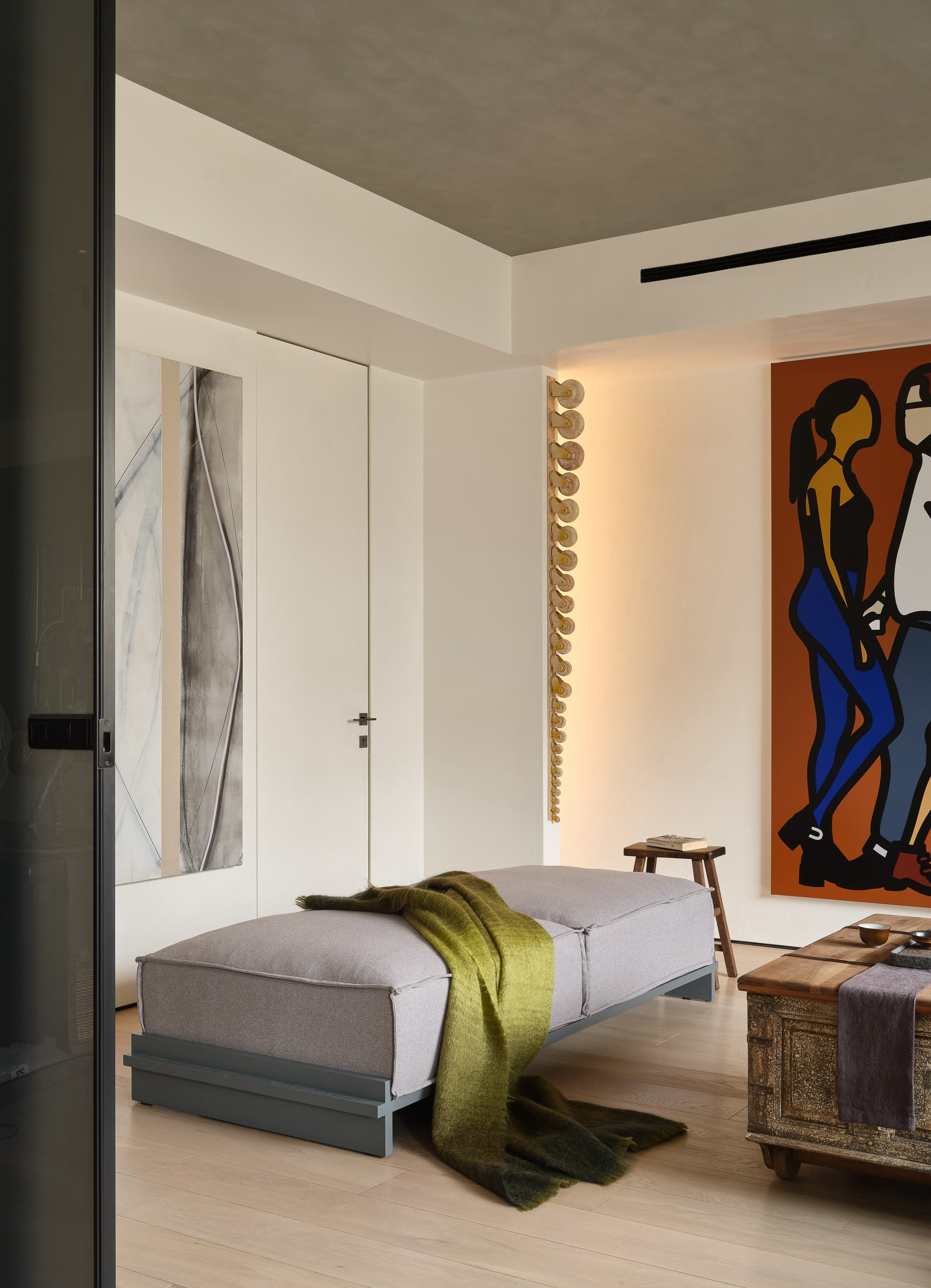
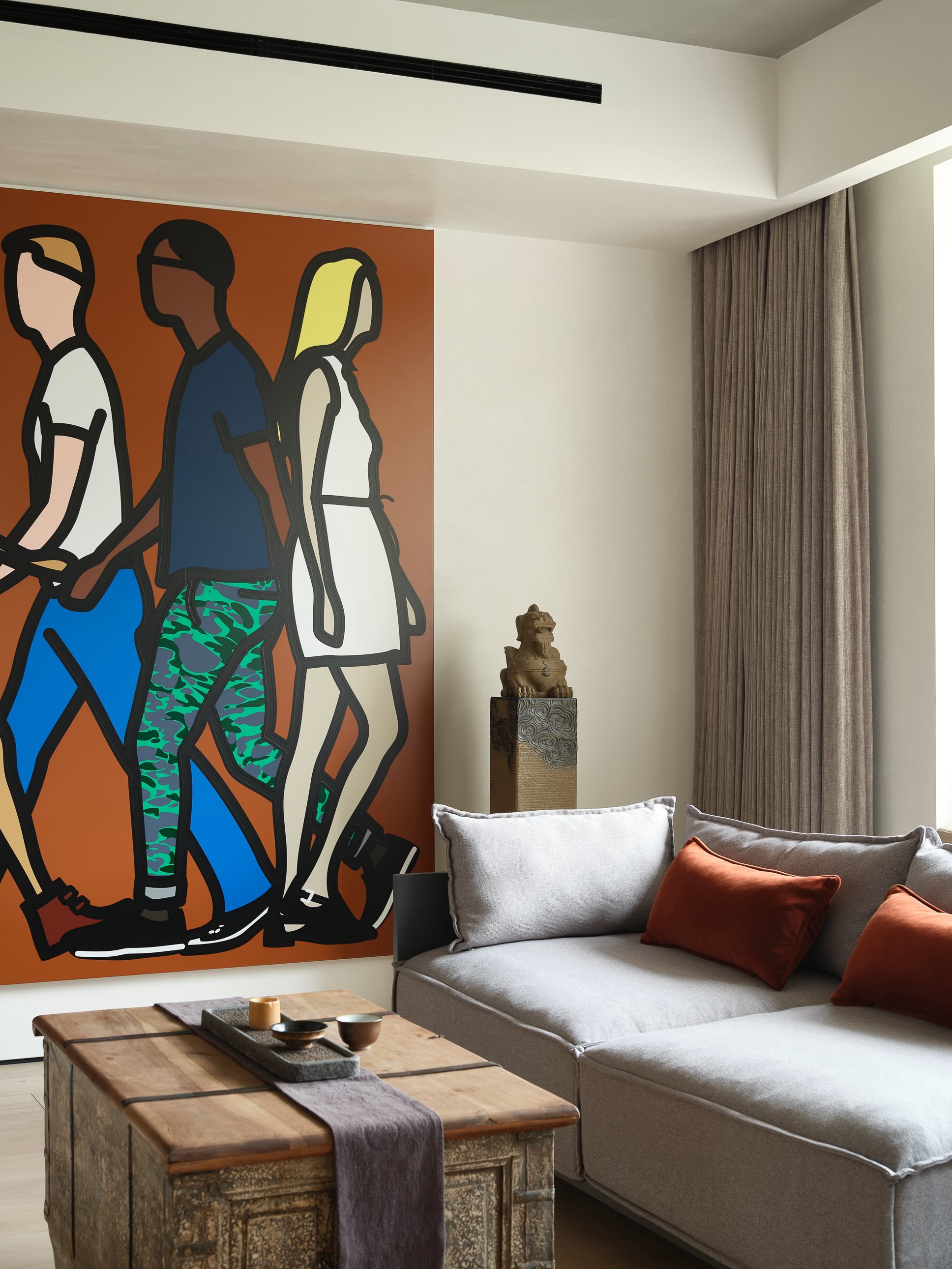
The old wooden stairs of the villa were very narrow, steep and badly damaged, couldn’t serve the current F&B function. For better circulation, the architects relocated the vertical connection of the building to the patio space of the existing building extension. To enhance the experience, the new staircase is covered with double glazed U-shaped glass partitions along all floors with a lighting system to represent the continuous energy flow transition, at the end of which is the terrace space and a more exclusive private VIP room. Here, the customers are reconnected with the city and able to look at it from the different heights and angles, corresponding to the last element – steam – elevation of taste. The simply designed interior shows off the geometric shape of the attic, while benches on the roof allow customers to have a more exclusive interaction with the city.

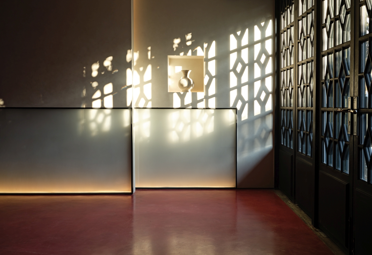
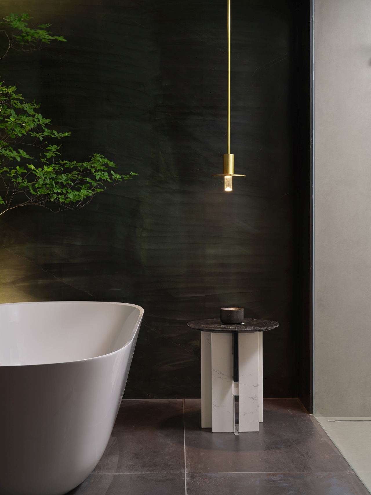
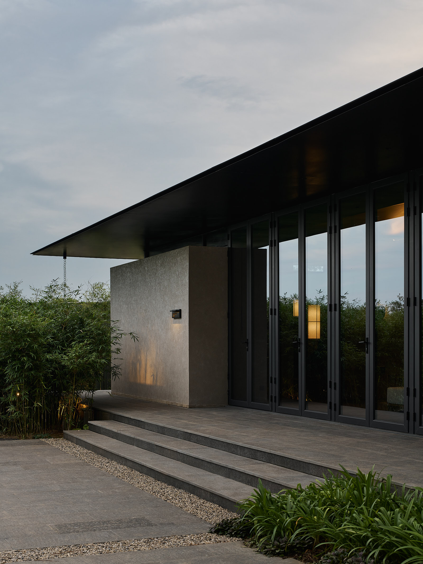
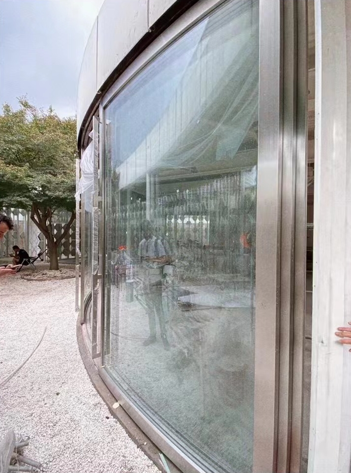
The architects also carefully designed a few other visual features. The stainless canopy on each floor to highlights the beauty of the preserved façade while hiding the gutters. The curved copper board at the entrance serves as a wayfinding sign without changing the original parapet. The stainless steel board on the terrace covers the outdoor equipment and adjacent buildings, creating contrast and solitude, while adding a contemporary touch.

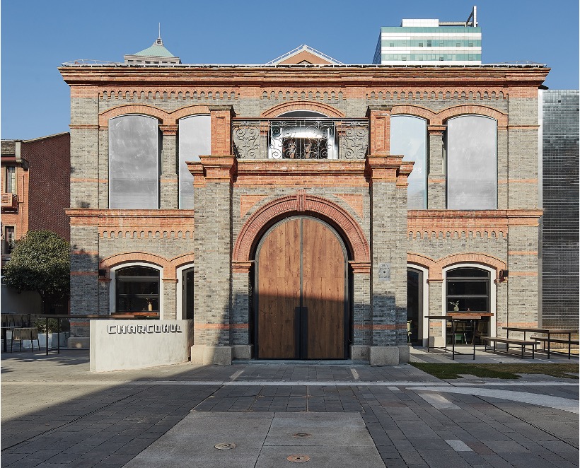
Over the past few years, STUDIO8 has been working on various restoration projects such as Cloud Hotel, Charcohol Restaurant & Cocktail bar, Himalaya Yueyang (under construction) and Former residence of Xu Chongzhi (under construction). As a multidisciplinary architecture studio with mixed Chinese and European culture, STUDIO8’s has been creating story-telling spacial experiences under the principle of designing for the present and respecting history and local culture.

历史建筑中的火锅“博物馆”
——八荒设计杭州火锅餐厅旗舰店

GUD餐厅位于杭州市中心的一栋建于上世纪30年代历史建筑内,是一家专注于火锅美食和鸡尾酒的餐厅。八荒设计受委托担任该项目建筑改建、室内和视觉识别系统的设计。

就像中国的许多老建筑一样,很不幸,从1939年至其被交到建筑师手里,这座别墅几乎已经被城市“吞噬”,只有一个完整的立面面向街道。内部也被进行了多次翻新、扩建和改变,从住宅到各种不同的商业用途,室内原貌已经无从辨认。

交给八荒需要改造成火锅餐厅的场地包括:建于1939年的别墅原址、其北侧扩建部分,和西侧相邻建筑的底层空间。八荒设计向来认为,对历史建筑的最佳保护方式是使其满足当今的功能需求,赋予其新的生命。曾经的这栋别墅是一栋住宅,当时并没有公共卫生间和工业厨房这些功能。对这栋历史建筑的修缮和再利用需要非常细腻和小心,为了保护和尊重原建筑,厨房、洗手间,以及可供公众使用的相对宽敞的楼梯等服务性空间,都被安排在了原建筑之外的扩建区域和相邻建筑内,从而将这栋三十年代的历史建筑空间保留为纯粹的美食体验空间。

该项目的空间设计理念很大程度上受到了建筑历史的特殊性和火锅这一极具中国特色的烹饪文化的启发,通过抽象的方法描绘饮食文化和氛围之间的关系。对八荒来说,一个餐饮项目的空间最重要的就是应该成为美食体验的“画布”,旨在突出食物和空间之间的持续互动。

在深入研究火锅烹饪历史和饮食文化之后,八荒决定摒弃火锅丰富多样的地域或传统色彩,将其核心烹饪原理与建筑更紧密的结合,并转变为多层次的博物馆式体验。他们将餐厅命名为“GUD-古冬”,源自火锅自东汉时期因投料入沸水时发出的“咕咚”声而得名的古称“古董羹”,logo也由当时使用的铜锅形状及建筑的原始地砖片断变化结合而成。

在中国文化中,火锅是非常特殊的主食,而吃火锅的过程则是非常重要的时刻,朋友或家人聚集在一起分享食物和欢乐。通过来自火或电炉热量,食物分子被能量溶解,然后在液体(水或汤)中重新融合;最终,美味连同人与人之间所度过的时间一起,被提升到另一个欢乐的层次。作为火锅的三个关键元素,热量(火)、介质(水)和风味提升(蒸汽)被分别从功能、材质、机理和光线这四个方面与每个楼层连接,也就是之前所提到的,用抽象的方式阐述火锅饮食文化的博物馆式体验。

作为第一个元素,热量——使液体沸腾的能量,是一楼的基本设计元素,这一点也体现在了功能和人的互动上。火锅的饮食文化是需要大家到齐一起开始的,因此作为火锅体验之旅的开始,别墅的一楼被设计成一个鸡尾酒吧,创造了一个更热闹、温暖和吸引人的空间,先到达餐厅的人们可以自由在酒吧落座,点上一杯鸡尾酒,等待每个人的到来。如同能量的加热器,点燃气氛。红色的地板、延伸至天花板的壁炉、底部发光的玻璃护墙板、从地面升起的展示古董火锅的红色立柱,和灵动摆放的红色天鹅绒沙发,旨在营造出充满活力和沸腾氛围,隐喻被“火”的能量所“煮沸”的生动和温暖,以及人与人之间的互动。原建筑立面的部分原始砖墙被保留并展示在酒吧区内,以唤起对建筑的记忆。内凹镜面天花板在墙壁的一侧和通往贵宾室的入口,将空间向二楼水的主题拉升。

通过热闹的鸡尾酒吧,来到象征第二个元素——水的二楼用餐空间。就像水作为媒介,溶解并重构食材的分子,家人和朋友围坐在圆桌旁,享受美食和共同度过美好时光。二楼四周的玻璃砖壁龛利用了被相邻建筑遮挡的原始建筑窗户的深度,壁龛中展示了被树脂块包裹的原石,抽象地象征了食物分子在液体中被融合重组的形态。这层楼同样保留了原建筑扩建后被归为室内空间的带有石窗框的旧墙,作为用餐空间之间的隔断,木屋顶结构和沿街阳台也被小心修缮后保留和展露出来。

原别墅的旧木楼梯非常狭窄陡峭,且已损坏严重,无法满足当下的餐饮功能。因此建筑师决定将建筑新垂直交通安排在建筑北侧原扩建空间的天井内。为了提升体验,新楼梯的所有楼层都覆盖双层U型玻璃,结合照明,使空间光影过渡流畅。楼梯尽头通往露台和阁楼,阁楼用于更私密的贵宾聚会。在这里,顾客与城市重新建立联系,能够从不同的高度和角度看待它,对标作为最后一个元素的蒸汽和品味的提升。室内设计用纯白反光的艺术涂料展示了阁楼天花的几何形状,屋顶上的长凳让客户与城市有更独特的互动。

除此之外,建筑师还做了一些其他的视觉引导装置,例如每层的不锈钢雨篷在隐藏了排水沟、电线的同时结合了照明功能,保存和突出了原始建筑立面装饰元素的美感;入口处弯曲的铜板作为品牌导视标志,但不接触或破坏原始护栏;露台上半镜面半拉丝的不锈钢板,遮挡了室外设备和相邻建筑,旨在为建筑带来清新的对比和小环境,增添一些精致的现代感。

八荒设计近年来参与和完成了诸多(历史)建筑改造项目,如云顶堡精品酒店建筑改造、巧客餐厅与鸡尾酒吧建筑改造、岳阳喜马拉雅改造(在建)和许崇智旧居改造(在建)等。作为一个有着深厚中国和欧洲文化融合的建筑设计事务所,八荒一直秉承尊重历史和在地文化、立足及服务于当下的设计理念,为大家创造一个又一个有故事的空间体验。

BEFORE AND AFTER 改造前和改造后

CONSTRUCTION 施工过程

GUD RESTAURANT&BAR 古冬餐厅

UR DUPLEX APARTMENT 复式公寓

DSCF7924-编辑
DSCF7943

LOCATION 地址  |  SHANGHAI 上海
CATEGORY 类型  |  RESIDENTIAL  住宅

STRUCTURE DESIGN 室内结构设计
INTERIOR 室内设计
FFE 软装设计

AREA 420 m²

Duplex apartment for a close-knit family providing maximum visual and spatial connections between spaces with timeless contemporary tastes.

巧妙的二层结构设计,为复式公寓的主人家庭提供最大的视线和空间连接,以及简约当代的生活环境。

READ MORE 更多

UR Duplex Apartment in Shanghai by STUDIO8
— “ALWAYS HAVING YOU IN SIGHT” APARTMENT connected by one “bridge” and two staircases

How to describe and preserve time when you are with your loving ones? When you are at home, you might want to have some “me” time as well as have all your family members in sight.

Shanghai-based architecture design studio STUDIO8 has completed a 420-square-metre duplex apartment for a young couple with two kids. The couple wants a spatial and clean space where they can have their own space for different activities and at the same time be able to spend quality time with family and friends. Converting the owners’ way of living into timeless space design is a key focus in residential design for STUDIO8. “The owners of a home shall always be the soul of the place and our key inspiration,” said the architect.

The apartment is located on a quiet street in the center of Shanghai along which grows French platanus and magnolia trees over ten-meter-height. The tree crowns are just at the height of the balcony window, which make the apartment an urban retreat for the family. The project involved transforming a 4.6-meter height space into a duplex apartment creating connections between various rooms and updating it to a better match with the clients’ contemporary tastes.

The owner told the architects that they don’t need too many rooms. After listening to the family’s needs and description of their daily life, the architects have decided to make the space as open as possible creating most chance of sight connections between areas. Taking advantage of the height of the apartment, a sculptural volume formed by a passage, a straight staircase and a fireplace is inserted into the junction of living room, dining room and kitchen, joining as well as dividing the public and private functions of the house. In order to make the mezzanine more solid and stable, STUDIO8 has decided to use reinforced concrete as structure, which makes it crucial to study the opens of each space and position the beams strategically hidden without affecting the ceiling height for both floors.

The passage of central volume starts from the entrance, passing through the dining room and living room at its both sides, horizontally connecting the kid’s room, storage room, couples’ walk-in closet and husband’s study room on the upper floor, while the straight staircase and the fireplace, as the feature of the double height living space creates the vertical connection. From the family room downstairs to the study room upstairs, from the veranda to the living room, from the passage upstairs to the fireplace corner downstairs, the family can have sight connection with each other from every corner of the open area. A second more private metal staircase is also from the master bedroom to their walk-in closet.

Special lighting features are designed to complement the humble material choices. Lava stone and stucco of marble powder provide the space a timeless homogeneous shade with subtle reflection on surfaces of different textures. A dynamic modular sofa island is placed in the center of the living room to connect all areas around, where the kids can climb from one side to the other. The family room next to it, being comparatively the lowest space, is opening towards the double height staircase with continues light oak floor and low furniture setting that make the space cozy and spatial. Beside the dining table with irregular pebble-shaped frosted glass pendants hanging over is the veranda and the warm grey monochromatic kitchen. The kitchen is under the walk-in closet that limited its ceiling height. But thanks to the connection with the dining room and the sight of the street trees from the veranda windows, it feels just like a breath between the two areas.

“We really enjoy the time STUDIO8 has planned for us in different corners and the fact that we can always have each other in sight”, said the owner. And that’s exactly STUDIO8’s aim for this duplex apartment.


上海梧桐树下的复式公寓
——八荒设计“视线连接”复式住宅

当与家人在一起时,如何描述时间?如何保存时间?你或许既希望能够给自我一些空间,同时又能够让家人都时常存在在你的视线中。

八荒设计完成了一套上海420平米复式公寓。公寓的主人是一对年轻夫妇和他们的两个孩子,他们希望他们的家是一个有空间感、简介,有满足不同功能的私人空间,同时也能够与家人朋友共度品质时光的地方。如何将主人的生活方式诠释于空间向来是八荒设计在住宅设计中的最大关注。八荒设计的建筑师说:“一个家的主人应该是空间的灵魂,是我们设计中的唯一重要灵感”。

公寓位于上海市中心一条种满法国梧桐和玉兰树的幽静街道。超过十米的梧桐与玉兰树冠刚好遮挡住了阳台的窗户,为家庭带来一份都市纷扰中的宁静。项目涉及到将一个四米六高的空间改造为一套空间灵动连接、风格当代简约的复式公寓。

公寓的主人说他们不需要太多的房间,他们每天都有很多时间在一起相处。在倾听了主人的需求和生活状态后,八荒的建筑师决定突出房子的开放性和空间感,最大程度的提供空间与空间之间视线连通的可能。利用四米六的特殊层高,一个由通道、楼梯和壁炉构成的有雕塑感的构筑物被巧妙的插入空间中客厅、厨房和餐厅的交界处,有机地分割同时连接了公寓的私人和公共功能空间。为了使二层空间给人更加稳定、扎实的感觉,八荒设计选择了使用钢筋混凝土来构筑公寓的复式结构,这就使得如何有策略地利用空间开敞方向、和隐藏相对笨重的二层结构的梁显得至关重要,才能使四点六米的层高不会因为局部插入了二层结构而显得压抑。

位于公寓中间的通道从家的入口开始,横向的连接了位于二层的孩子房间、储藏室、夫妻的衣帽间和男主人的书房。从通道上可以看见两侧的餐厅和客厅,空间被分隔开同时又完全连通。挑空客厅中心的楼梯和壁炉纵向连接着复式公寓的两层空间同时也是客厅的视觉中心。从楼下的家庭室到楼上的书房,从连接餐厅和厨房的早餐日光室到客厅的阳台,从二层的通道到一层客厅的壁炉边,开放空间的各个角落都功能明确但又可以视线相连。同时增加了一部螺旋式的钢楼梯,连接主卧与楼上的衣帽间,保证主人使用的私密性。

特殊的设计旨在与简约的材料选择形成对比。 火山石和大理石粉灰泥为空间提供了均匀色调以及经久的美感,光线在不同纹理的表面上形成微妙的反射。 一组动感的模块化沙发中岛被放置在客厅的中央,连接周围的各个区域,孩子们在上面可以从一侧爬到另一侧。 客厅旁边的家庭房是相对最低的空间,但这里向挑空空间敞开,配合连续的浅色橡木地板和低矮的家具布置,使空间显得温馨而宽敞。 悬挂一组不规则鹅卵石状磨砂玻璃吊灯的餐桌旁,是日光室和暖灰色的单色厨房。 厨房位于步入式衣橱下方,天花高度受到限制。 但位于高天花的餐厅和日光室的行道树影间,感觉就像两个区域之间的一次呼吸,全然没有压抑之感。

“我们真的很享受八荒设计为我们安排在家里不同角落的时光,而且这里的每一刻时光我们都能关注到彼此”公寓的主人说道。 这也正是八荒设计这套复式公寓的想要达成的效果。

BEFORE AND AFTER 改造前和改造后

CONSTRUCTION 施工过程

PURO APARTMENT 私人公寓

LOCATION 地址  |  SHANGHAI 上海
CATEGORY 类型  |  RESIDENTIAL  住宅

INTERIOR 室内设计
FEE 软装设计

AREA 204 m²

CONSTRUCTION 施工过程

PURO APARTMENT 私人公寓

ASKO HOUSE 厨电展厅

LOCATION 地址  |  SHANGHAI 上海
CATEGORY 类型  |  COMMERCIAL 商业

FACADE RENOVATION 建筑改造
INTERIOR
室内设计
FEE 软装设计

AREA 535 m²

STUDIO8 has defined “responsibility” as the concept and aim of this project, expressing both the brand’s attention to the environment and STUDIO8’s sense of responsibility as an architecture firm in commercial space renovation projects. The inspiration for the interior design comes from the abstract beauty of the Nordic forest, immersing in the quality of life and environmental awareness conveyed by the space and exhibits.

八荒设计将“责任”定为设计主题,一方面表达品牌堆环境的关注,也表达了八荒作为建筑事务所,对商业空间建筑改造项目的使命感。室内设计灵感来自于北欧森林的抽象之美,让漫步于展厅的参观者仿佛置身于一片抽象的北欧森林,沉浸式地体验空间和展品所传达的生活品质和环境意识。

READ MORE 更多

BALANCE BETWEEN LIFE AND NATURE:
KITCHEN APPLIANCE SHOWROOM IN ABSTRACT NORDIC FOREST

STUDIO8 Architects recently completed the design of the Nordic kitchen appliance brand ASKO’s first domestic flagship experience center. STUDIO8 was responsible for the building facade renovation and interior design of the experience center. The experience center is located in Lujiazui Binjiang Financial City next to the old shipyard in Pudong. Each building along the street has a different architectural facade style representing its own corporate image.

How to express brand value in space? STUDIO8 has defined “responsibility” as the concept and aim of this project, expressing both the brand’s attention to the environment and STUDIO8’s sense of responsibility as an architecture firm in commercial space renovation projects.

The inspiration for the interior design comes from the abstract beauty of the Nordic forest. The architects use multiple dimensions such as technology, space, color, material, and landscape to tell multiple narratives, allowing visitors to feel as if they are walking in an abstract Nordic forest, immersing themselves in the quality of life and environmental awareness conveyed by the space and exhibits.

The building facade transforms the consideration of sustainable lifestyle into spatial language. STUDIO8 delivered a simple and responsible solution for the facade design. The second facade of matte black sunshade louvers wrap around the original glass facade. Under the sunlight, light and shadow shining through the gaps of the aluminum louvers outline the “expressions” of the two spaces divided by the building façade, leaving a quiet but significant note on this street different from other corporate pavilions on the street. The density of the shading louvers gradually become sparse from top to bottom, providing different levels of transparency and privacy for indoor spaces on different floors. From outside, the building facade looks like morning mist rising on the Nordic horizon and gradually dissipating.

The “expressions” on the façade are the result of precise calculations of the building’s orientation and the angles of sunlight at different seasons within a year. In summer, it can reduce the energy consumption required by the exhibition hall due to shading system; and in winter, it can introduce beautiful light and shadow, raising the energy efficiency inside the experience center. At the same time, its transparency allows the interior to be vaguely visible from the street. Like the concept of “forest”, it creates a profound and gentle visual experience. This design, which combines aesthetics and environmental protection, reflects the practice of sustainable lifestyle.

Based on the circulation flow and the existing structural columns on the site, STUDIO8 organically arranged a “tree array” of irregular polygons with different sizes. Especially on the first floor, the double height space near the facade resembles towering trees and, with the lighting fixtures, gives visitors an impressing feeling as if they are strolling in a primitive forest. Green plants are scattered throughout the space and terrace, showing life everywhere. There are edible spices such as mint and rosemary. While appreciating, the concept of sustainability is also embodied in the details of the space.

The balance between life and nature comes from the harmonious symbiotic relationship between humans and the environment. The aim is to create an abstract experience that transforms the physical space of the experience center into an immersive walk in nature, bringing visitors into the serene and fresh “Nordic forest” atmosphere. The architects cleverly incorporated various abstract elements of nature, such as icebergs, oceans, and forests, into the exhibition hall, allowing visitors to feel the natural tension brought by the materials and narrating the story of the Nordic forest. The metaphorical global issues such as global warming and pollution are also environmental problems that the design and brand want to focus on and explore. Communicating brand philosophy and thoughts through space is the original intention of the design this time.

The second floor is a VIP dining area where guests can feel the refinement and ceremony lifestyle in the dining space surrounded by a fireplace and an open kitchen. On this floor, the elements of the abstract Nordic forest are not as strong as on the first floor, but they are still clearly visible in the double height space connected to the first floor. The density of the sunshade louvers on the building facade of the second floor provides both a distant view of the outside and a certain degree of obstruction, providing privacy for the VIP dining area.

The third floor is a small wine and cigar room for business discussion. Here, the elements of the abstract forest are no longer visible, but are replaced by a terrace surrounded by maple trees and edible herbs, reconnecting with the city. The ground of the terrace is made of raised reclaimed wood floor, simple and environmentally friendly.

In response to the problems of excessive urbanization and unbalanced agricultural cultivation, the vertical greening, hydroponic greening, and terrace greening in the showroom have chosen edible varieties such as rosemary, basil, sage, and mint. Besides landscaping purposes, they are also provided to participants in cooking training for experience.

In the end, as a kitchen appliance brand experience center, the responsibilities that companies and architects can do and bear are still very limited, and the urgency of environmental issues requires more attention. Therefore, in different corners of the showroom, there are descriptions of the environmental situation and issues at the time of the completion of the Asko House, serving as reminders to all visitors of their environmental protection awareness.

In addition, the project also uses reclaimed materials, energy-saving lighting fixtures, and intelligent environmental protection facilities, fully reflecting the Nordic style’s emphasis on environmental protection and sustainable living. The integration of philosophy and modern technology creates an exhibition space that is not only contemporary but also highly humanistic.

This showroom design perfectly captures the essence of the balance between life and nature, demonstrating the brand’s and designer’s practice of nature and sustainable development. Through the clever integration of design elements, visitors can intuitively feel the tranquility and vitality brought by the space while exploring the journey of the abstract Nordic forest, and at the same time, rethink the importance of a sustainable lifestyle.

生活与自然间的平衡
抽象北欧森林中的厨电展厅

八荒设计近日完成了北欧厨电品牌ASKO在国内的首家旗舰体验中心设计,八荒设计负责体验中心的建筑立面改造以及室内设计。体验中心位于浦东老船厂边的陆家嘴滨江金融城,沿街建筑各自有着分别代表自己企业形象的不同建筑立面风格。
如何将品牌价值表达于空间?八荒设计将“责任”定为设计主题,一方面表达品牌堆环境的关注,也表达了八荒作为建筑事务所,对商业空间建筑改造项目的使命感。
室内设计灵感来自于北欧森林的抽象之美。设计师在技术、空间、色彩、材质和景观等不同维度多重叙事,让漫步于展厅的参观者仿佛置身于一片抽象的北欧森林,沉浸式地体验空间和展品所传达的生活品质和环境意识。
建筑立面将对可持续生活方式的思考转化为空间语言,八荒设计在此次外立面设计上交付了一个简单负责的解决方案。黑色哑光遮阳格栅的二次立面包裹在原来的玻璃立面上,在阳光照射下,铝合金遮阳格栅缝隙中透出的光影,勾勒出建筑内外两个空间的“表情”,在这条企业馆林立的街道上落下一个既有分量又安静的音符。遮阳格栅自上至下密度逐渐稀疏,为不同楼层室内空间提供不同的通透度和私密性。建筑立面从外部看起来如同北欧地平线上升起的晨雾,逐渐消散。
幕墙上的“表情”是经过对建筑朝向以及一年内不同季节日光照射角度的精密计算后,所得出的最佳角度与密度,在夏天可以减少展厅因日照所需消耗的能源,冬天则可以引入优美的光影,有效减少展厅内部的能源消耗。同时有着极强的通透性,从街道可隐约看到展厅内部,一如“森林”的概念,打造出一种意味深长而又柔和的视觉体验。美学与环保兼具的设计,体现了对可持续生活方式的践行。
八荒设计依据动线,结合场地中原有的结构柱,有机地布置了粗细不一,截面为不规则多边形的“树阵”,尤其是一楼靠近立面的挑空空间,形似参天大树,配合灯光,让初临展厅的访客仿佛漫步原始森林般震撼。绿色植物散布在展厅各处以及露台,无处不显郁郁生机。品种有薄荷、迷迭香等可食香料。观赏的同时,可持续理念也付诸在空间各处细节内。
生活与自然之间的平衡来自于人与环境的和谐共生关系。旨在创造一段将展厅物理空间转化为能使人身临其境的漫步大自然的抽象体验,将访客带入感受“北欧森林”的静谧清新。设计团队在展厅中巧妙加入各种抽象的自然元素,如冰山、海洋和森林,感受材质自带的天然张力同时亦将北欧森林的故事娓娓道来。其隐喻的全球变暖和污染等全球问题,也是本次设计及品牌想要关注探讨的环境问题。以空间传达品牌理念及思考,也正是八荒此次设计的初衷。
二楼是VIP用餐区,在壁炉和开放厨房围绕的用餐空间中,能够感受生活的精致和仪式感。在这层楼,抽象北欧森林的元素虽不像一楼那么强烈,但仍在与一楼连接的挑空空间清晰可见。二楼高度建筑立面上的遮阳格栅密度始终,既可远眺窗外,又形成一定的遮挡,为VIP用餐空间提供了私密性。
三楼是一个小型的红酒雪茄室,用于洽谈。在这里已经看不到抽象森林的元素,取而代之的是被枫树和香草围绕的露台,重新与城市连接。露台的地面是抬高的再生木地板,环保质朴。
针对过度城市化以及农耕不平衡的环境问题,展厅里的垂直绿化、水培绿化以及露台绿化选择了迷迭香、罗勒、鼠尾草、薄荷等可食品种,除了景观用途,也提供给前来参加烹饪培训的体验者。
最终,作为厨电品牌体验馆,企业和建筑师所能做的和担负的责任还是非常有限的,环境问题的迫切性需要更多人来关注。因此在展厅中的各个角落都写有一些展厅落成时的环境现状和问题,作为引起所有参观者环境保护责任的提示。
此外,展馆还采用了可再生材料、节能照明和智能环保设施,全方位体现出北欧风格对环境保护和可持续生活的重视。将理念和现代科技融合创造一个展厅空间,不仅具有未来感,也极具人文主义色彩。
本次展厅设计完美地捕捉了生活与自然平衡之美的精髓,展示了品牌及设计师对自然和可持续发展的实践。通过巧妙的设计元素融合,让访客在探索抽象北欧森林的旅程中,直观地感受空间所带来静谧与生命力,同时思考可持续生活方式的重要性。

BEFORE AND AFTER 改造前和改造后

CONSTRUCTION 施工过程

ASKO HOUSE 厨电展厅

LOAM CAFE’ 瓷屋咖啡

DSCF0615
DSCF0738-编辑
DSCF0917

LOCATION 地址  |  SHANGHAI 上海
CATEGORY 类型  | F&B 餐饮

INTERIOR 室内设计
FEE 软装设计

AREA 258 m²

CONSTRUCTION 施工过程

LOAM CAFE’ 瓷屋咖啡

DSCF0615
DSCF0738-编辑
DSCF0917

CLOUD HOTEL 云顶堡酒店

LOCATION 地址  | MOGANSHAN 莫干山
CATEGORY 类型  |  HOSPITALITY 酒店度假村

ARCHITECTURE 建筑
INTERIOR 室内设计
FEE 软装设计

AREA 1061 sqm

READ MORE 更多

CLOUD HOTEL RENOVATION PROJECT
— Lost in the mountain clouds, nestled in the forest

Nestled in the mountains of Moganshan, Cloud Hotel sits serenely in a bamboo forest in Deqing County, a popular retreat destination 200km away from Shanghai. The original building had three levels built along the mountain slope and carried features inspired by European castles. STUDIO8 was commissioned to renovate the architecture and interiors and redesign the visual identity.

In the renovation process, STUDIO8 aimed to best utilize the natural slope formed by the landscape, while taking full advantage of the spectacular mountain views. The designers were also faced with a challenge to create a dynamic integration of the spatial experience and the “Cloud” brand image, and to infuse it into all design decisions. “Architecture built in nature functions as the media in between humans and nature; it should blend into the landscape organically, instead of just being in it,” says the studio principal.

The original building had guest rooms on the first and second floors; a lightweight extension with arched glazings had been added on top to serve as the dining space. While the architecture lacked a coherent hierarchy and style, it did have a feature that served the renovation well – it was not built directly against the mountain, providing much more room and potential for the extension. Rather than stacking upwards, STUDIO8 decided to bring life to the underused belowground levels, adding more layers into the space without increasing the height of the building or creating additional impact to the environment.

The new hotel has a total of five levels terraced alongside the mountain slope. Entering from the west corner of the premises, guests pass through the garden and arrive at the reception, a glass room enclosed by large glazings. On one side of the reception is the wine cellar and the private dining room, linked by a sunken garden designed to provide more natural light and better views; on the other side lies the steel staircase, leading to the swimming pool and the restaurant on the second level.

To achieve a consistent brand image, STUDIO8 carefully curated the interior and visual identity design of the hotel to match well with the “Cloud” concept. The ubiquitous presence of curve and arch elements akin to clouds can be seen throughout the space – the ceiling, the spiral staircase, and the openings in various expressions. All guest rooms have a white arched terrace that overlooks the swimming pool and provides a panoramic view of the valleys and gentle hills beyond, conveying a feeling of “walking in the clouds”.

Pure white finishes give a clean background to the interiors of the restaurant, while the bronze accent found in the tables and lighting adds a warm, earthy tone. The dining area boasts a cloud-like fluctuating ceiling that also hides the light strips and air vents in between the gaps. A one-off vintage cabinet from Belgium – the focal point of the dining space – is set against the whitewashed wall. The restaurant also features customized circular dining tables made of wood, local granite and rufous lacquered stone.

To avoid cliché and excessive ornaments, the interior settings are kept to a minimum for a bright and airy feel. Guest rooms have a subdued aesthetic. In the largest suite, a bespoke laurel green headboard hangs from a brass rod, echoing the green-hued Persian carpet and green walls in the bathroom. The curve element appears not only in the spiral stair but also in the bathroom partition walls. Gentle curves soften the room’s layout, re-emphasizing the light and airy feeling of the “Cloud”.

Cloud Hotel isn’t the first hotel in Mogan Mountain that STUDIO8 has worked on – back in 2017, it completed the architecture, interior and visual identity design of Anadu, another luxury resort in the same region. Both being a covetable getaway for people to jump out of the city and have a moment of peace, Anadu, built from the ground up, boasts a meditative, solitary experience which connects to the nature; while Cloud Hotel transformed the originally ponderous building into a poetic and ethereal presence by blending it into the landscape in a rather spontaneous manner.

云顶堡酒店改造项目

——云深不知处,只在此山中

坐标德清县莫干山镇庙前村干庙坞1号。改造前的云顶堡是一幢略带城堡元素的度假酒店。虽名“云顶”又依山而建,但这座建筑却并丰在山顶之上,而是在竹林之间。

八荒设计拿到项目后第一个考虑的问题,就是如何在有限的占地面积中,最大程度地利用山地特有的高差优势对建筑进行改造。同时,也面临着另一挑战——如何将云顶堡的品牌概念与人的空间体验更有机地结合, 提升人、建筑和自然的融合。八荒设计师认为自然景观中的建筑,作为连接人与自然的媒介,应该真正与自然融为一体,而不是仅仅简单地存在于其中。

改造前的酒店是一栋半山坡的三层建筑,一楼二楼设为客房,顶楼加盖了以玻璃立面为主的轻质结构,作为餐厅。原建筑层次单一,加盖的顶层结构也与另外两层风格截然不同。但有趣的是,不同于传统的欧式城堡,原建筑几乎是依山挑空而建,这给未来扩建和空间层次衍生带来了很多可能性。因此,八荒设计决定采用不同于常规的方式,不向上扩建,而是充分利用山地地形,沿山势向下扩建两层。这样,在不增加建筑高度的基础上,将原本的三层扩成五层,把建筑改造成更具空间感的多层次结构,同时控制了改造对环境的冲击。

建筑的五个楼层倚靠山势,并不垂直重叠,以退台的形式分布。入口在最低点的盘山路边,穿过花园便是玻璃结构的前台。前台玻璃房的后面是VIP餐厅包房和酒窖,考虑到采光及景观,设计师在此处设计了一个下沉式小花园,将包房和酒窖连接。前台另一侧是钢结构楼梯,通往二层的泳池平台和餐厅。餐厅面对泳池,阳光透过微波粼粼的泳池折射到餐厅,让宾客在用餐的同时感受到户外的生机。

完成了对建筑的结构改造后,八荒设计就开始了对云顶堡室内空间和品牌形象的设计。大到楼梯、小到桌椅,都采用了定制设计,努力营造一个简约优雅的世外“城堡”。设计师将云的概念融入到各种设计的细节之中,酒店内处处可见。餐厅天花板吊顶、套房旋转楼梯和窗户开口处都巧妙地运用了拟云状弧形和拱形元素。顶层套房里的白色旋转楼梯根据云的模样构思,从下向上看,仿佛一朵云彩悬浮在房间中。房间的窗户上方与阳台门顶的半圆设计亦是采用了云朵的形象,不仅将室内外连接,更让宾客有住在云端的感觉。

纯白的饰面给予餐厅一个干净的背景,餐厅原木色的桌椅有着树木的纹路, 与自然景色相呼应,让人拥抱自然、回归自然,、融入自然。就餐区云朵般起伏的吊顶,同时也把光带、空调出风口巧妙的隐藏于云朵的缝隙中。设计师从家具厂仓库淘来的独一无二的自比利古董餐柜依靠着就餐区的白墙,不动声色的吸引着所有目光。为了与其独特性相得益彰,圆形餐桌也采用专属定制,以当地木材、花岗岩和锈蚀漆石制成,配合了整个项目的几何线条及材质风格。

摒弃一般度假村老套或过度的装饰风格,八荒设计选用简约大方的家具、配件和设施,营造出了明亮轩敞的宜居空间。客房的色调趋于柔和,每个房间被赋予不同的颜色主题。最大的套房里,定做的月桂绿皮质床头与绿调的波斯地毯和卫生间的绿漆相呼应。弧形元素不仅存在于旋转楼梯中,也体现在了卫生间隔断墙的设计里。温柔的曲线来中和房间的方正格局,再点“云顶”主题。

云顶堡是八荒设计继2017年完工的集建筑、室内、品牌形象设计于一体的庄园酒店Anadu后的第二家轻奢精品度假酒店。两者皆作为让人垂涎的餐松饮涧之地,同新建建筑Anadu在自然中宁静悠远,沉心独立不同的是,作为建筑改造项目,云顶堡酒店无论从空间层次,还是设计风格,都从原建筑的单调、繁琐,以云朵的随机性连接空间,变得层次丰富优雅飘逸,并融于自然。

BEFORE AND AFTER 改造前和改造后

CONSTRUCTION 施工过程

CLOUD HOTEL 云顶堡酒店

CHARCOHOL RESTAURANT 巧客餐厅酒吧

BEFORE

AFTER

02-entrance 02
03-entrance 03
04-foyer 01_key visual column
04-foyer 04_key visual column
05-wood arcade 02
05-wood arcade 01
06-charcoal main hall 02_bar
06-charcoal main hall 07_arch
06-charcoal main hall 07_detail
07-ash arcade 01
07-ash arcade 02
07-ash arcade 04
08-detail 01_furniture

LOCATION 地址  |  SHANGHAI 上海
CATEGORY 类型  |  F&B 餐饮

ARCHITECTURE 建筑
INTERIOR 室内设计
FEE 软装设计
VISUAL IDENTITY 视觉识别设计

AREA 300 m²

READ MORE 更多

When Time Axis & Temperature Axis Cross
—CHARCOHOL Restaurant & Cocktail Bar

Located in a heritage building in Fengsheng Li in the center of Shanghai, CHARCOHOL is a restaurant and cocktail bar specializing in charcoal-grilled global cuisine and craft cocktails. STUDIO8 was commissioned to design the visual identity, architecture re-use, interior, landscape and soft decoration for the project.

Creating an exclusive food experience always starts with a strong concept in mind, which gradually evolves until it’s finalized with carefully selected details. When Chef Mandela Zhu first met STUDIO8’s design principals, Shirley and Andrea, he told them the food and drinks of his new bar are greatly inspired by forest and fire. The miraculous chemistry of taste happens when carefully selected simple ingredients are cooked at the right temperature for the right time. In a way, design is very similar to culinary arts. STUDIO8 was very inspired by the chef’s cooking principles in all of their F&B projects. This is why Shirley and Andrea named the restaurant CHARCOHOL, a combination of charcoal and alcohol, also the concept of CHARCOHOL’s logo.

STUDIO8 embarked on creating a space that reflects the chef’s vision and ultimately goes beyond it. Inspired by the transformative nature of charcoal and its role in food creation, the design unfolds around an axis of time, crossed by an axis of temperature.

From south to north, stretching across the main entrance, three dining halls conceptualize the transformation of wood to charcoal and finally to ash. The notion of the dining concept is summed up in the small portico at the entrance, where a half-burnt wooden column hangs from the ceiling and ends in a lava stone block on the floor, welcoming the guests.

Consequently, the first hall implements wood flooring and preserves the untouched original walls of the building, while the main hall is converted to total black. At the end of the space follows the third hall, which once again shows some of the original brick wall and is finished with white-grey plastered walls. A glass box with ashes adorns this space as well. In the orthogonal direction, one can observe the temperature axis, spanning from the kitchen to the fireplace and projected on the ground through reddish tiles.

In line with the concept, each dining hall obtains its own particular ambience from partially custom-made furniture, lighting and installation. The wood hall opens towards the main plaza of Fengsheng Li, where sunlight shines through the trees onto the brick walls. In the center of CHARCOHOL is the main black hall, the most intimate and cozy area in the whole space. The rough texture of the black walls and floors reflects light differently throughout the day, creating a changing ambience. At the cross of the time and the temperature axes, above the bar, a giant installation of fanned palm leaves arranged by STUDIO8 hangs underneath the reflective stainless steel dome, celebrating the banquet of food and drink. Along the time axis in the ash area, another installation made of banana leaves and eucalyptus seeds hangs like a bouquet chandelier, representing renewal from ash.

Considering that the restaurant occupies a historic house in the center of Shanghai, the renovation demands a respectful attitude towards the architectural heritage. Therefore, special details were developed to connect the new facade elements and the old structure. The newly added steel and glass structure is completely detached from the original building, and a system of special wall washer lighting highlights the beauty of the architecture, giving it the quality of a museum.

CHARCOHOL also has an outdoor seating area, which carries on the design of the ash area and is an extension of the temperature axis. The main feature here is the glass room, where guests can enjoy freshly baked food from the nearby brick stove. The garden also has a mix of aromatic flowers and herbs, some of which are used in the kitchen.
当时间与温度交织于空间
—CHARCOHOL巧客餐厅与鸡尾酒吧设计

CHARCOHOL位于上海市静安区丰盛里的一栋老建筑中,是一家重点打造特色炭烤美食和手工创意鸡尾酒的鸡尾酒餐吧。八荒设计负责了CHARCOHOL从品牌视觉识别系统和建筑改造,到室内、景观及软装的整体设计。

在世界各地的高端餐饮界,美食的创造总是从一个鲜明的概念开始,通过对食材的精心挑选、对烹饪方式的巧妙设计、对火候的精准把握,以及呈现细节的完美拿捏,最后形成一种独一无二的美食体验。这一点,餐饮和设计,不乏相似之处。在八荒设计的所承接的所有餐饮空间项目中,他们总是受到主厨烹饪理念的启发,把美食的概念作为空间设计的灵感。这一次,当主厨料理小熊找到Shirley和Andrea的时候,小熊告诉他们自己的灵感来自于森林和火。他说:“简单优质的食材在对的时间和温度的作用下,就能成为最精彩的美食。”这也是为什么Shirley和Andrea提出将餐厅命名为CHARCOHOL。“CHAR”来自于碳CHARCOAL、“COHOL”来自于酒精ALCOHOL,CHARCOHOL意味碳和酒精的结合。这也是餐吧logo的设计概念——一段盛着酒精的碳。

理解了主厨的烹饪概念后,八荒提炼了两个重要元素作为空间设计的概念:时间与温度。整个空间由南向北,从玄关、玄廊,至主厅、后室,顺着木炭燃烧的“时间轴”展开。在空间的中心位置与东西方向的“温度(火)轴”交叉。

由南至北,穿过主入口玄关,玄关以后的餐吧空间被分为三个区域,以时间轴为逻辑,描述从“木”燃烧至“碳”,最后变为“灰烬”的过程。木-碳-灰烬的概念在主入口玄关浓缩体现为一根从天花悬落至半空的木桩,从天花起,由木逐渐燃烧至木炭,直至地面火山岩制成的黑色“碳”底座,作为迎客台。

绕过迎客图腾来到第一个餐吧空间-玄廊,木地板和穿插的绿色家具代表了“木”的森林概念,八荒设计保留了原建筑门廊立面的砖墙。然后来到主厅,这里是“木”燃烧至“碳”的空间,因此所有地面和墙面都转变成炭黑色。穿过主厅来到后室,“灰烬”的空间为灰白色,透过靠近尽头的墙边的灰,再次隐约可见原建筑砖墙。餐吧中间的由西至东,温度轴连接厨房、吧台,由代表火的红色地砖连接餐饮空间西墙的壁炉。

为了加强每一个用餐区域的概念,八荒利用灯光、道具和装置,精心打造每个区域的氛围。“木”玄廊面对丰盛里广场,阳关透过植物,洒在原建筑砖墙上,树影婆娑。“碳”主厅的墙面和地面虽是黑色,但都有随着光影变化的粗糙肌理。在吧台正中时间轴与温度轴交叉的位置,八荒设计亲手制作了预示着餐饮盛宴的大型蒲葵装置,再由天花的镜面穹顶反射延伸,仿佛悬挂于天空。与之呼应的“灰烬”后室中心的小镜面穹顶下则悬挂了预示重生的芭蕉叶和尤加利果装置。

考虑到CHARCOHOL项目所在建筑的历史性,八荒希望最大程度地尊重和保留原建筑。在将原半室外的玄关及门廊空间改为室内用餐空间的改造过程中,为了避免破坏原建筑立面的装饰,八荒设计了与整个建筑立面完全分离的独立钢结构、玻璃系统,非但没有触碰原建筑立面,还从门廊内侧通过巧妙的灯光点缀,向博物馆一样着重勾勒突出了建筑的美。

八荒设计还设计了CHARCOHOL的室外花园,作为“温度轴”的延伸,延续“灰”后室的材质。花园的中心是一个烧烤私宴功能的玻璃耐候钢板的阳光房。阳光房的花园里种有各种烹饪用的香草及花果,人们可以在这里享受阳光、咖啡,和休闲炭烤等美味。

BEFORE AND AFTER 改造前和改造后

CHARCOHOL RESTAURANT 巧客餐厅酒吧

06-charcoal main hall 02_bar

SHY TABLE RESTAURANT 馐西餐厅

LOCATION 地址  |  HANGZHOU 杭州
CATEGORY 类型  |  F&B 餐饮

INTERIOR 室内设计
FEE 软装设计
VISUAL IDENTITY 视觉识别设计

AREA 750 m²

CONSTRUCTION 施工过程

SHY TABLE RESTAURANT 馐西餐厅

PINZHEN GALERIES 品真阁

Pinzhenge_STUDIO8-10
Pinzhenge_STUDIO8-11
Pinzhenge_STUDIO8-16
Pinzhenge_STUDIO8-19
Pinzhenge_STUDIO8-18
Pinzhenge_STUDIO8-23
Pinzhenge_STUDIO8-22
Pinzhenge_STUDIO8-30
Pinzhenge_STUDIO8-31

LOCATION 地址  | BEIJING 北京
CATEGORY 类型  |  RETAIL  零售

INTERIOR 室内设计
FEE 软装设计

AREA 400 m²

READ MORE 更多

PINZHEN GALERIES Flagship Store in Beijing
——A poetic interpretation of East and West integration

PINZHEN GALERIES, formerly known as Huaxia Pawnshop, is a jewellery, and luxury goods distribution and service platform with a history of 25 years and a wide range of businesses including pawning, retail, appraisal, maintenance and other services. It is a new retail form advocating a more sustainable product circulation lifestyle. The original brand image resembled a pure Chinese style and was familiar to and well-received by many consumers. Through the brand upgrade, the biggest challenge was to inherit the traditional elements from the brand’s past, and combine them with a new contemporary and international image.

STUDIO8 believes that the boundaries between cultures are becoming more and more blurred in the contemporary era; however, this does not mean that traditions will be forgotten. Instead it is more likely to see diverse and inclusive cultures and styles harmoniously mixed together. STUDIO8 is a multi-cultural and multi-disciplinary design team established in Shanghai. The practice has always adhered to contemporary design philosophy with respect to traditional local culture and brand culture. Therefore, in the design process, how to integrate traditional and modern, eastern and western cultures has become the focus of the design. STUDIO8 also noticed that PINZHEN’s products range from gold, amber and jade to precious stones, diamonds and platinum, as well as watches, purses and suitcases, which are from many categories, are comprised of many materials and styles, and target different customers. In order to organise and sort them out in the space, the team analysed the tonalities and textures of the all products and arranged them from light to dark, cold to warm, contemporary to traditional, and youthful to mature.

In the new design, Studio8 did not simply divide the shop into different areas, created a linear gradient change from the entrance to the back of the shop, which also became the core design concept of the space; the colour of the spaces and the material of the props change from light to dark, from cold to warm, from contemporary to traditional, with products displayed in corresponding tones. The gradual change of style was formed to stimulate the deep subconscious aesthetic preferences of consumers. The overall layout of the store follows the simple and traditional counter display format of PINZHEN, keeping the shopping environment familiar while subtly guiding consumers to areas that are most in line with their own tastes.

As the flagship location for the brand, the store takes the phoenix as the logo for the new brand image, in reference to “The Immortal Riding a Phoenix”, a Chinese imperial roof decoration that “overlooks all beings” and symbolises the luxuriousness of the brand. In order to integrate the original brand image inspired by “Along the River During the Qingming Festival” (清明上河图), STUDIO8 also decided to adopt representative sections of the famous Chinese painting as a background, overlaying imagery of birds in different poses from the story of “All Birds Paying Homage to the Phoenix” (百鸟朝凤). Created as a poetic visual graphic for the brand, the custom-made wallpaper runs through and connects the entire shop like an unfolded Chinese scroll with both contemporary and traditional motifs, telling the story of the brand and paying tribute to traditional Chinese culture.

Following the gradual change from light and contemporary, to dark and traditional in the whole shop, the Entrance is a light coloured area with counters made of stainless steel and light wood grain. In the middle of the Front Area, STUDIO8 designed a stainless steel column with a fish tank, which is one of the elements used in older PINZHEN shops to welcome customers. There is also a comprehensive service counter in the Front Area to provide customers with packaging and consulting services. Three golden ring-shaped modern pendant lamps, combined with a customised floor mosaic, not only add dynamism and movement to the space, but also help in highlighting the key areas.

The Middle Area is mainly composed of watch counters, as well as Purchasing and Pawning areas. From this point, the colour gradually darkens on the floor, walls and counters. The watch area is designed as the central platform, matched with the Barrisol light box above to create a visual focus of the Middle Area of the store. The corridor leading to the consignment and VIP rooms is decorated with traditional bonsai and a custom-made rounded stone light fixture; in front of which is an open area defined by a round custom-made mosaic floor, with an armchair and poufs for customers.

At the end of the shop, the colours of the floor and walls deepen one more shade. Customers can find additional services at the repair and maintenance window in this area. A custom-made chandelier of glass roof tiles hangs under a square dark wood ceiling, inspired by traditional Chinese city life, just like the painting “Along the River During the Qingming Festival” (清明上河图). As another iconic element in the new store, it carries PINZHEN’s wish to continue servicing the community and enriching people’s lives.

PINZHEN GALERIES is the second retail and luxury pawn platform that STUDIO8 designed for Huaxia Pawnshop Group. This more sustainable way of shopping has become a popular retail and lifestyle concept. In the design of MUSÉE Beijing flagship store, opened in June 2019, STUDIO8 boldly used flexible movable counters and sliding hangers to create a shopping experience that can adapt to various scenarios and events that take place in the shop.

品真阁北京概念旗舰店
——阐释东西融合的诗意之美

品真阁前身为华夏典当行,是一家有着二十五年历史的集典当、零售、鉴定、维修养护等多项业务为一体的珠宝、奢侈品的流通与服务平台,是一个倡导绿色流通生活方式的新零售形式。原来的品牌形象是非常纯粹的中式风格,已被许多消费者熟悉和接受。在本次品牌形象整体升级中,最大的挑战是如何在传承品牌传统文化的同时,设计出能够结合时代、接轨未来和国际的品牌空间新形象,同时突出源自于中国传统文化与当代生活方式交融的品牌调性。

八荒设计认为,在当代,地域、文化的界线越来越模糊,但这并不代表摒弃传统,越是属于当代的事物,越有可能看到多元、包容的文化和风格。八荒设计是一个成立于上海,多文化、多学科的设计团队,他们一直坚持立足当代,尊重传统在地文化和品牌文化的设计理念。因此在设计过程中,如何融合传统与现代、东西文化成了设计的重点。八荒设计还注意到,品真阁的产品分类从黄金、琥珀、玉石, 到宝石、钻石、铂金,还有腕表、箱包等,无论是品类、材质,还是风格、受众人群,跨度都很大。于是八荒设计从产品与零售空间的融合入手,将品真阁品的所有产品按照色调、调性、风格和受众人群, 从浅至深、从冷至暖、从当代到传统、从年轻到成熟进行了梳理。

八荒设计没有将空间简单地分割为不同的产品陈列区,而是将整个店面设计成了一个从入口至后场线性渐变的空间,这也成为了项目的核心设计概念——通过色彩和道具材质表现从浅至深、从冷至暖、从当代到传统的变化,配合相应调性的产品品类的陈列,形成渐变的风格转换,来激发不同消费者内心深层次的潜意识审美喜好。店铺整体格局沿用品真阁一贯的简单传统的柜台陈列形式,让消费者能够在熟悉的购物环境和模式中,被潜意识地引导至最符合自己审美品味的空间,找到最属于自己审美品味的产品。

品真阁的这家店作为品牌新形象的旗舰店,以源自中国屋脊装饰最高级别的骑凤仙人之凤凰为店标,象征俯瞰众生、鉴定真伪、流通万物。八荒设计为了传承品牌原形象中的标志性装饰“清明上河图”,截取了其中的代表性片段作为背景;再以“百鸟朝凤”点题,叠加不同姿态的鸟的形象,为品牌设计了旗舰店专有的定制墙布,贯穿整个空间,仿佛一幅当代与传统融合的画卷在整个店铺中展开,述说品牌故事的同时致敬中国传统文化。

依据从入口至后场由浅至深、由现代至传统的渐变逻辑,入口区域为浅色区域,柜台为不锈钢和浅色木纹。前场中间,八荒设计沿用品真阁原店铺形象中的鱼缸,设计了不锈钢立柱鱼缸,迎接顾客光顾。前场还设有综合服务区,为顾客提供编绳、包装和咨询服务。三个金色环状的现代吊灯,结合截取定制画面的圆形马赛克地面,既增添空间的动感和变化,又帮助指引顾客关注到几个重点区域。中场主要为手表柜台,以及民品收购区和典当区。空间到了这里,无论地面、墙面还是柜台,色彩已经逐渐加重。手表柜台形成环形岛台,配合上方发光的软膜灯箱,形成店铺中场的视觉焦点。通往民品室和贵宾室的走道,点缀有传统的盆栽和走道尽头的原型石板灯饰。正对走廊的中场后场之间有一片开阔区域,搭配活泼的沙发和圆形定制马赛克地面,供顾客休息。到了后场,地面和墙面的颜色又加深了一层。末端是维修与养护窗口,向顾客提供更多服务。深色木纹的回字形吊顶下悬挂着定制琉璃瓦片吊灯,是新店形象的识别元素之一,同清明上河图一样,来自传统街道形象,寓意品真阁将继续伴随和服务顾客,为大众生活创造更多的价值和情趣。

品真阁是八荒设计的第二家华夏典当集团旗下的新零售流通典当平台,绿色流通已然成为一种全新的零售和生活方式。在2019年6月开张的MUSÉE名见北京坊旗舰店的设计中,八荒设计大胆运用了灵活多变的移动柜台和挂杆,营造了可根据使用情景不断变化的购物体验。

PINZHEN GALERIES 品真阁

Pinzhenge_STUDIO8-10
Pinzhenge_STUDIO8-11
Pinzhenge_STUDIO8-16
Pinzhenge_STUDIO8-19
Pinzhenge_STUDIO8-18
Pinzhenge_STUDIO8-23
Pinzhenge_STUDIO8-22
Pinzhenge_STUDIO8-30
Pinzhenge_STUDIO8-31