Between Rome and the Orient
A 1950s apartment in Rome becomes the stage for a dialogue between East and West, where every design decision tells a story of cultural integration.
As an international design studio with roots in Europe, many members of our team come from Italy, particularly Rome. Over the years, we have maintained a close relationship with the city, also thanks to the presence of one of our architects who is permanently based there.
When architects living in the East return to design in their land of origin, cultural boundaries begin to dissolve. The project itself becomes a dialogue between two worlds, allowing us to rediscover the contemporary value of tradition through an intercultural lens.
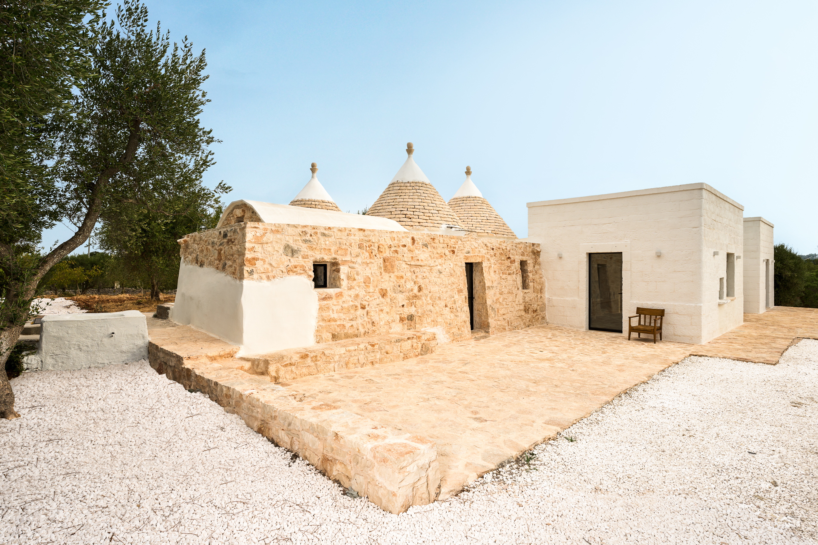
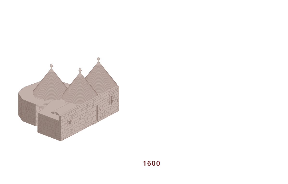
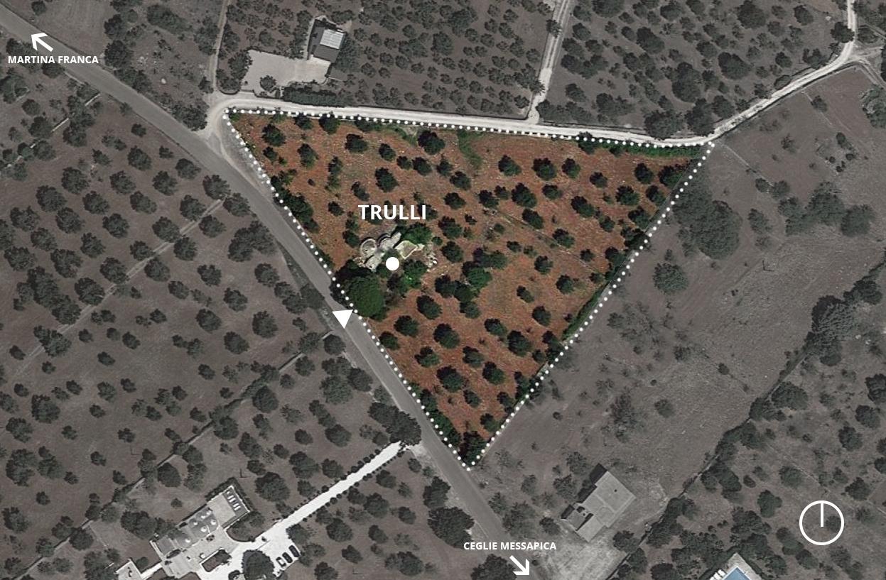
This is our second project in Italy and our first completed in the capital, Rome.
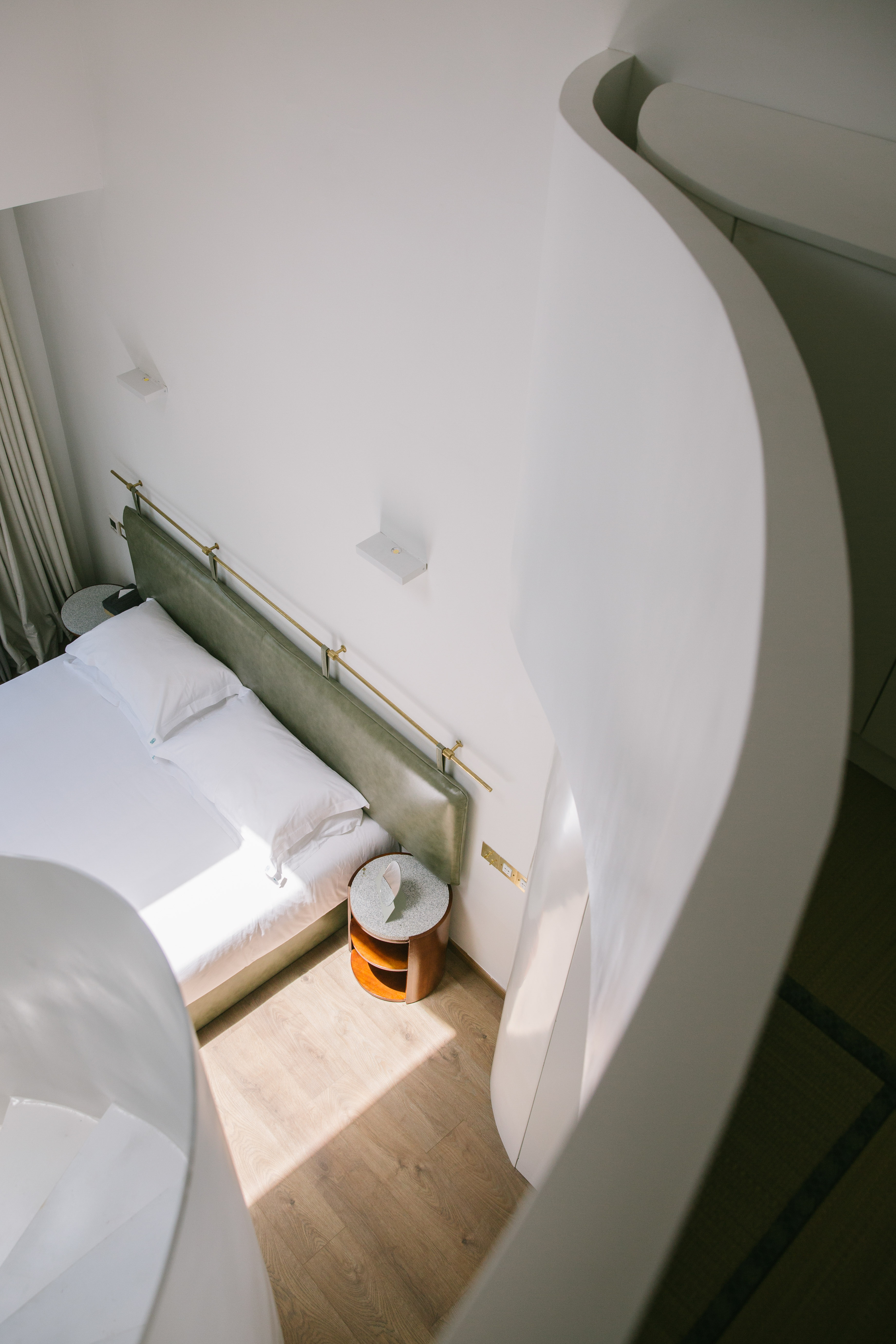
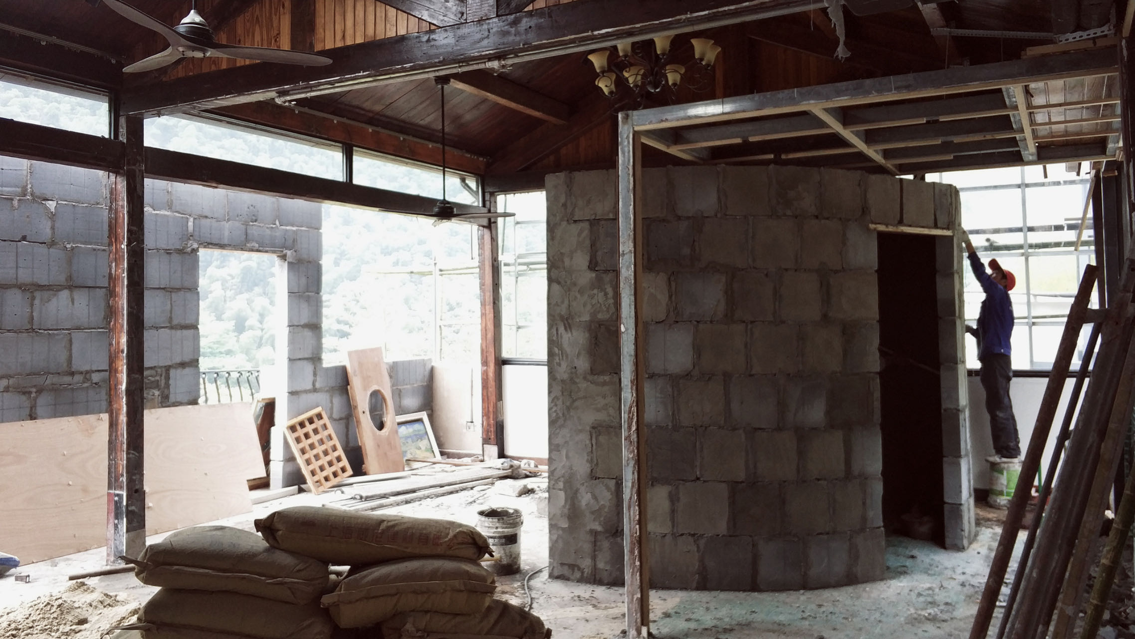
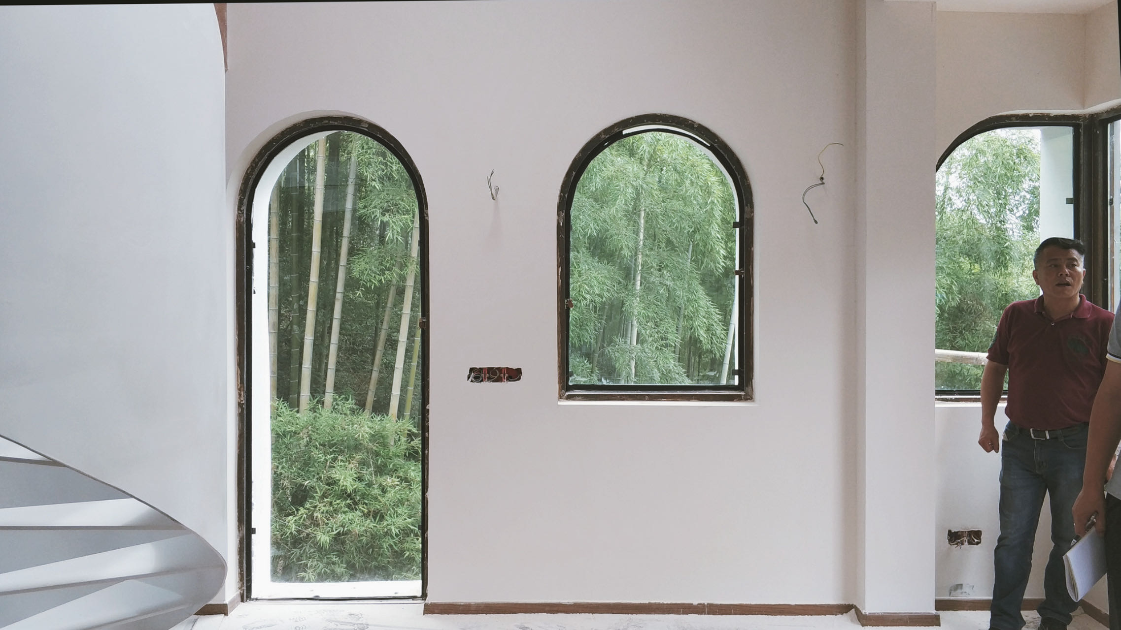
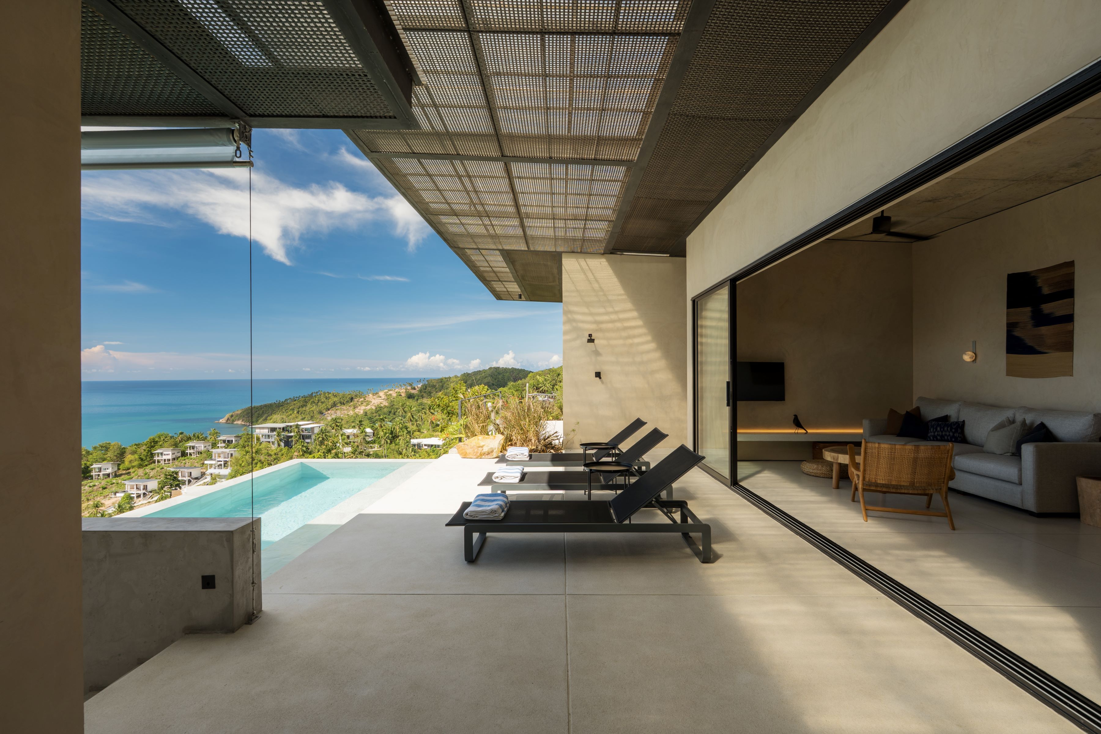
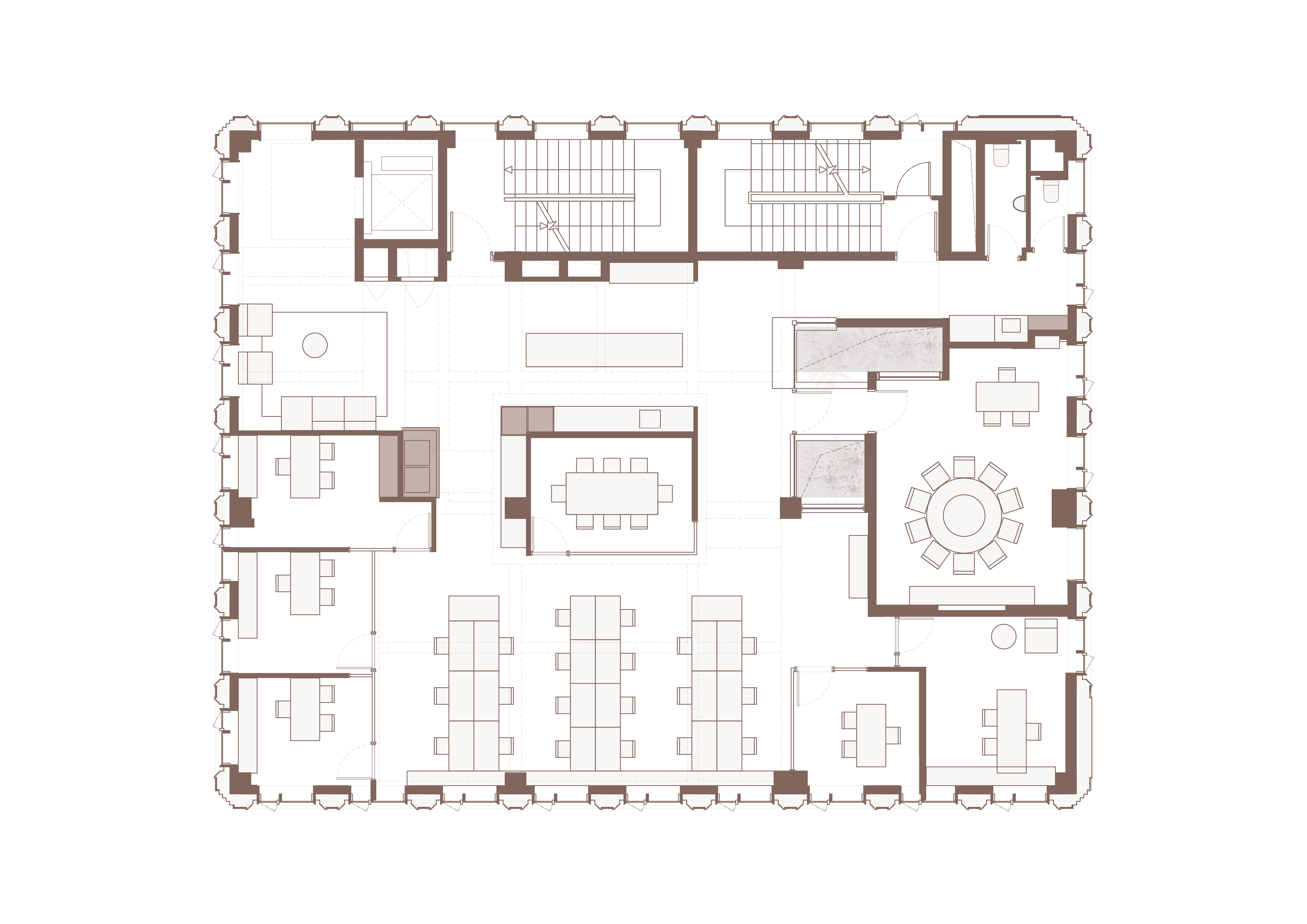
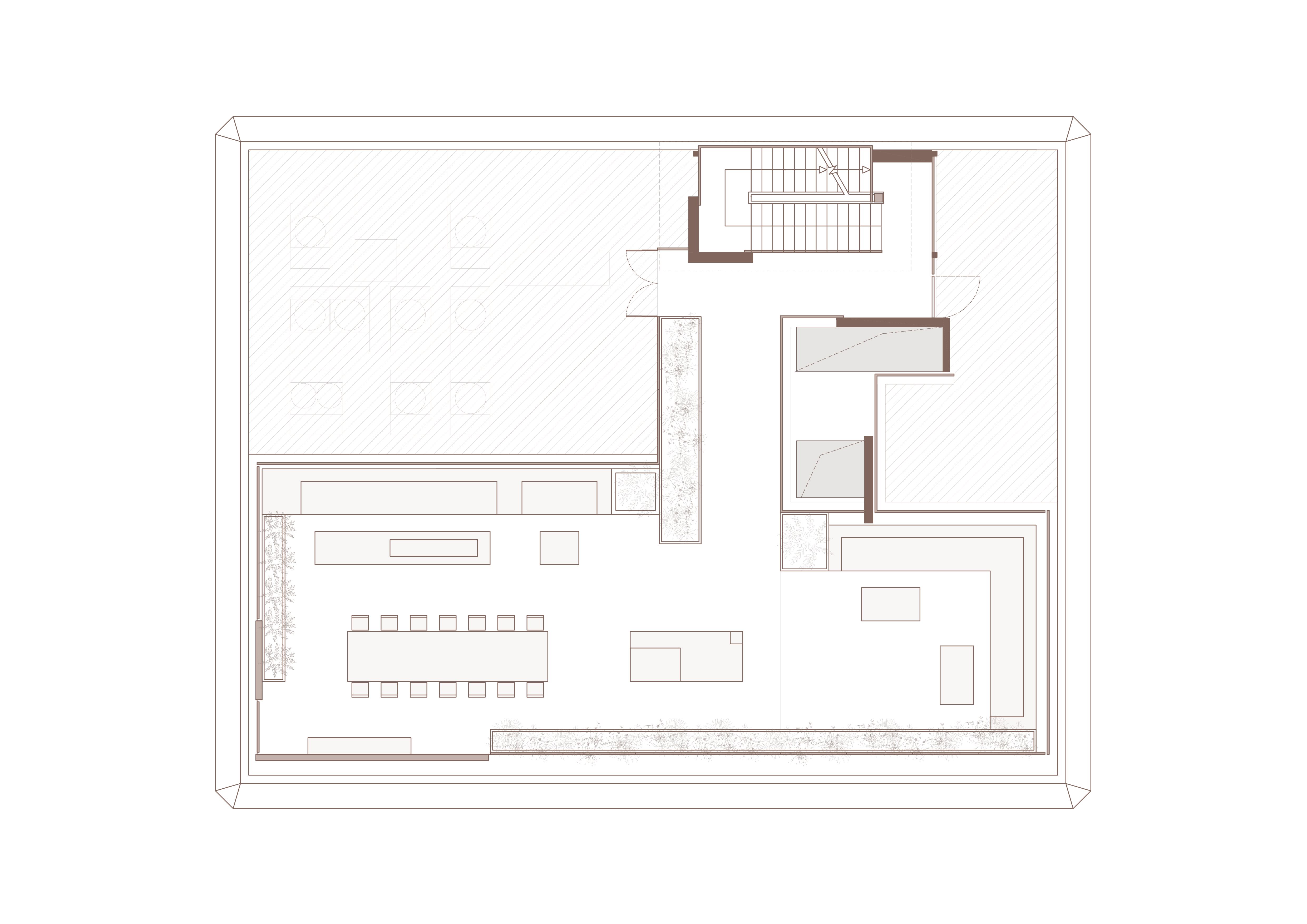
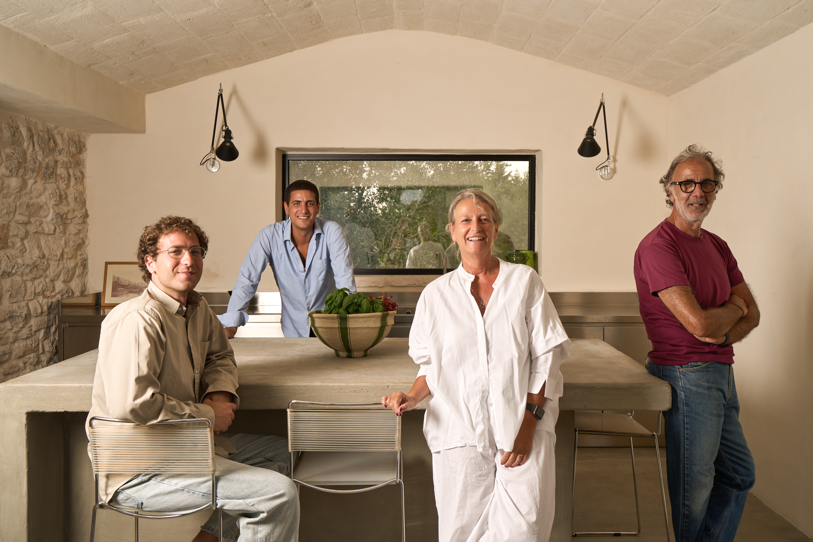
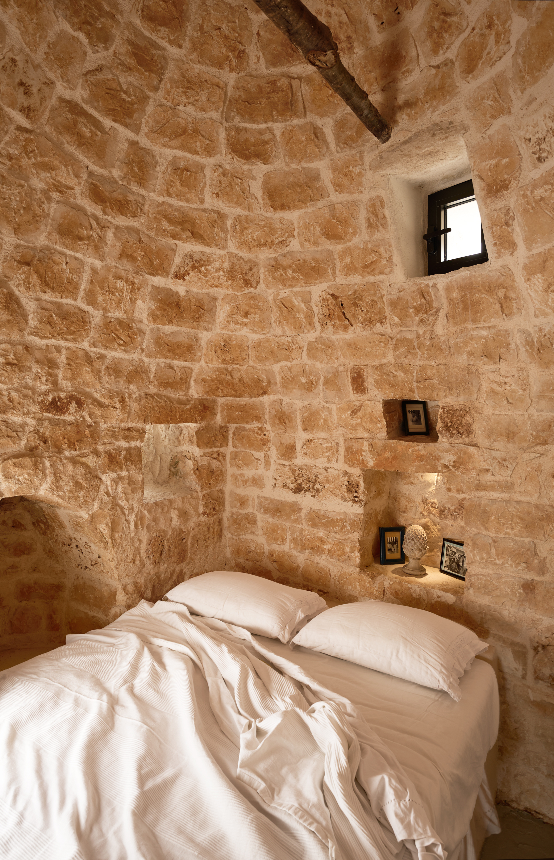
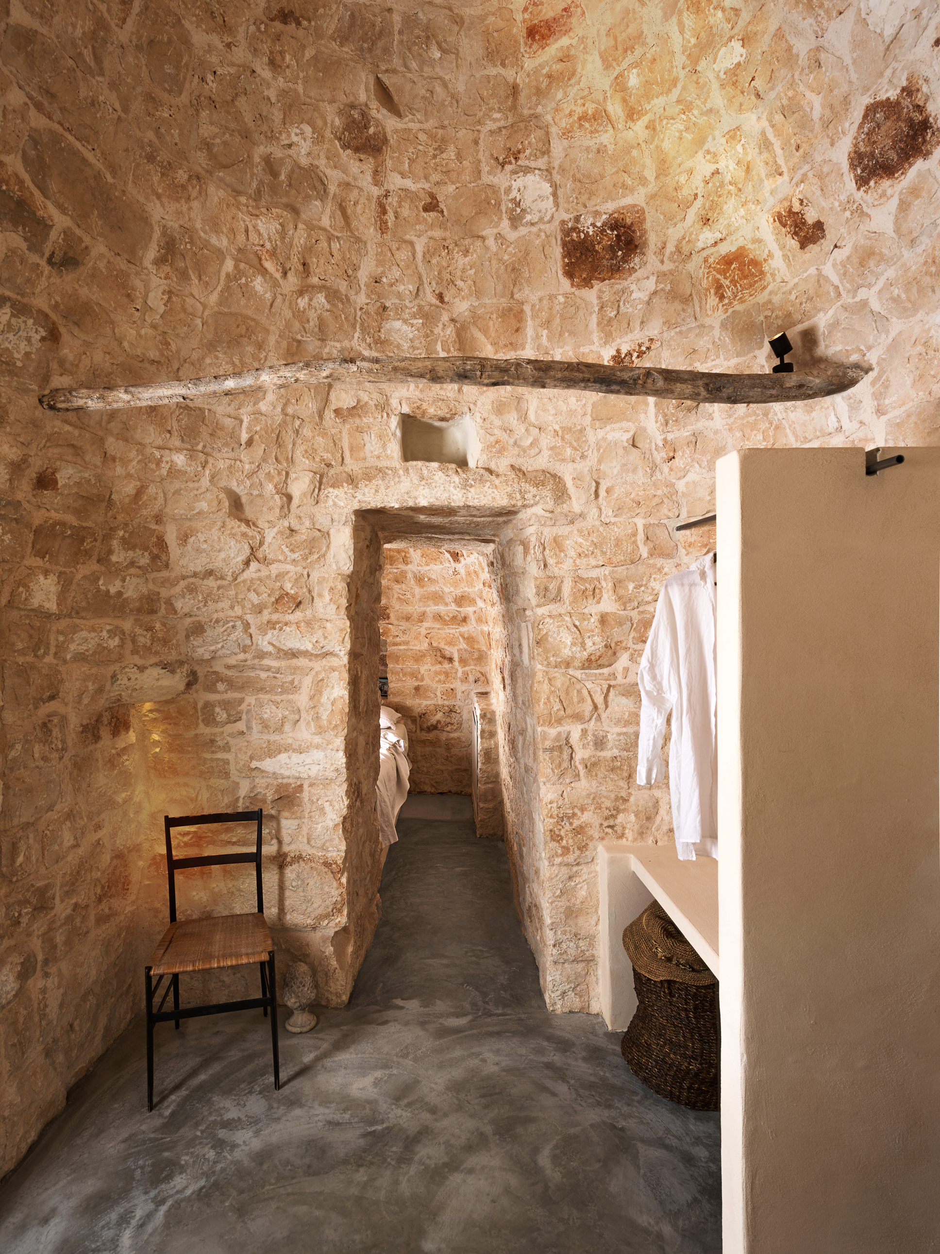
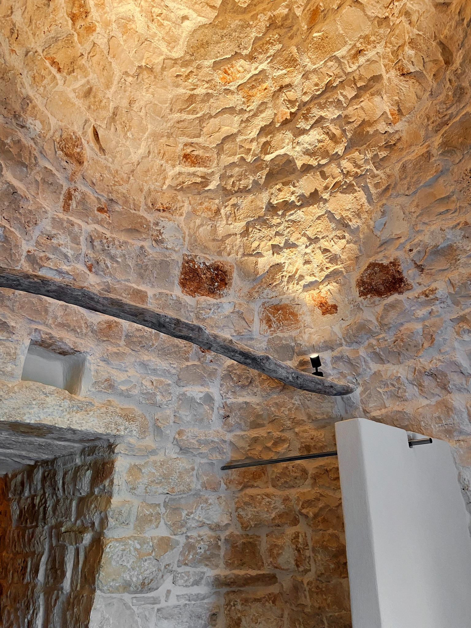
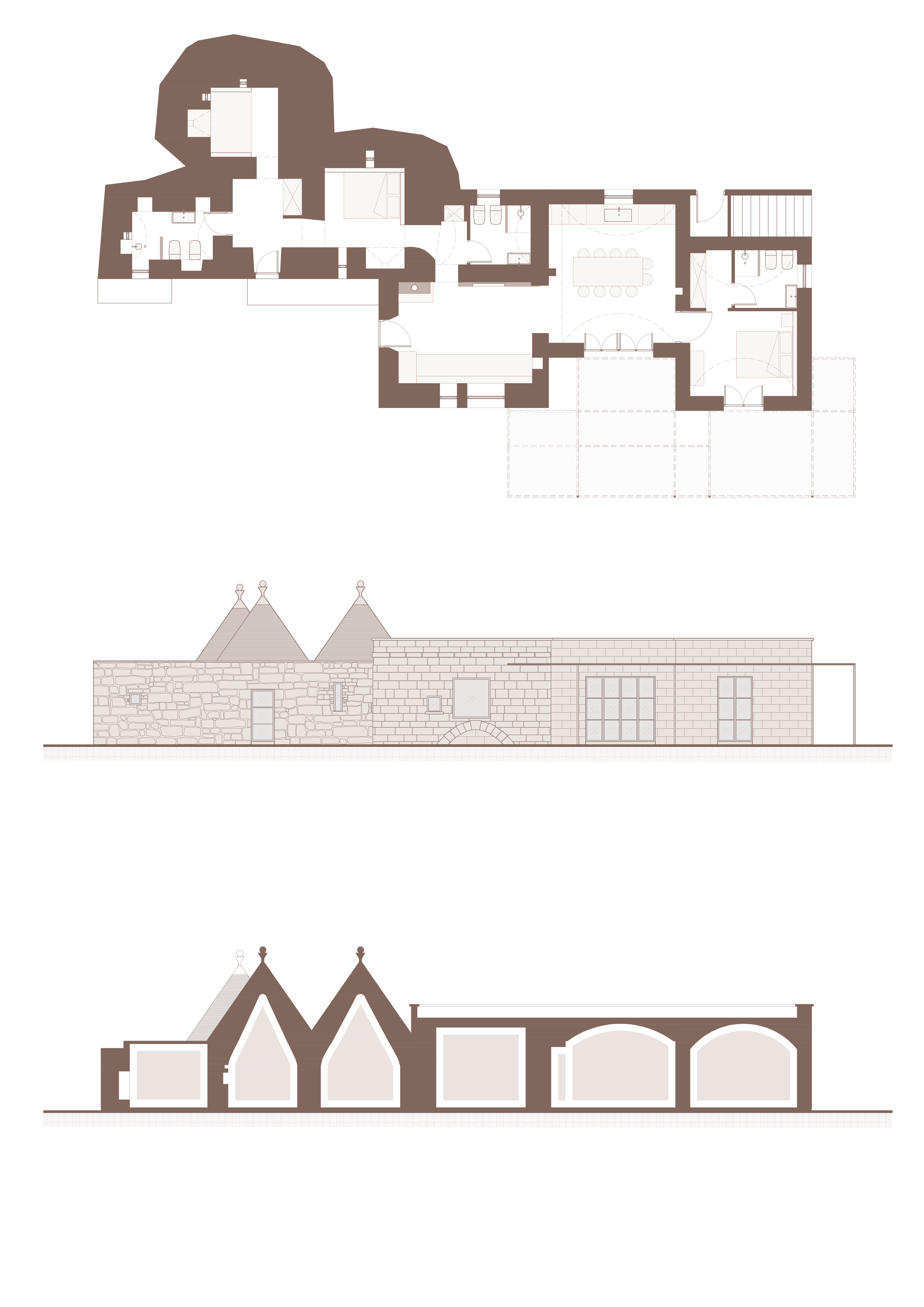
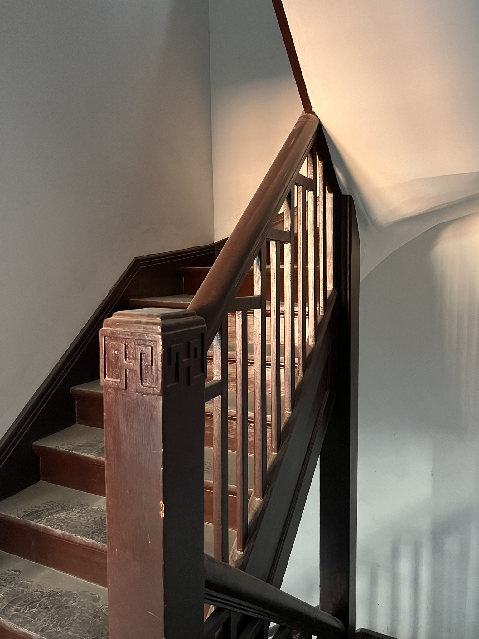
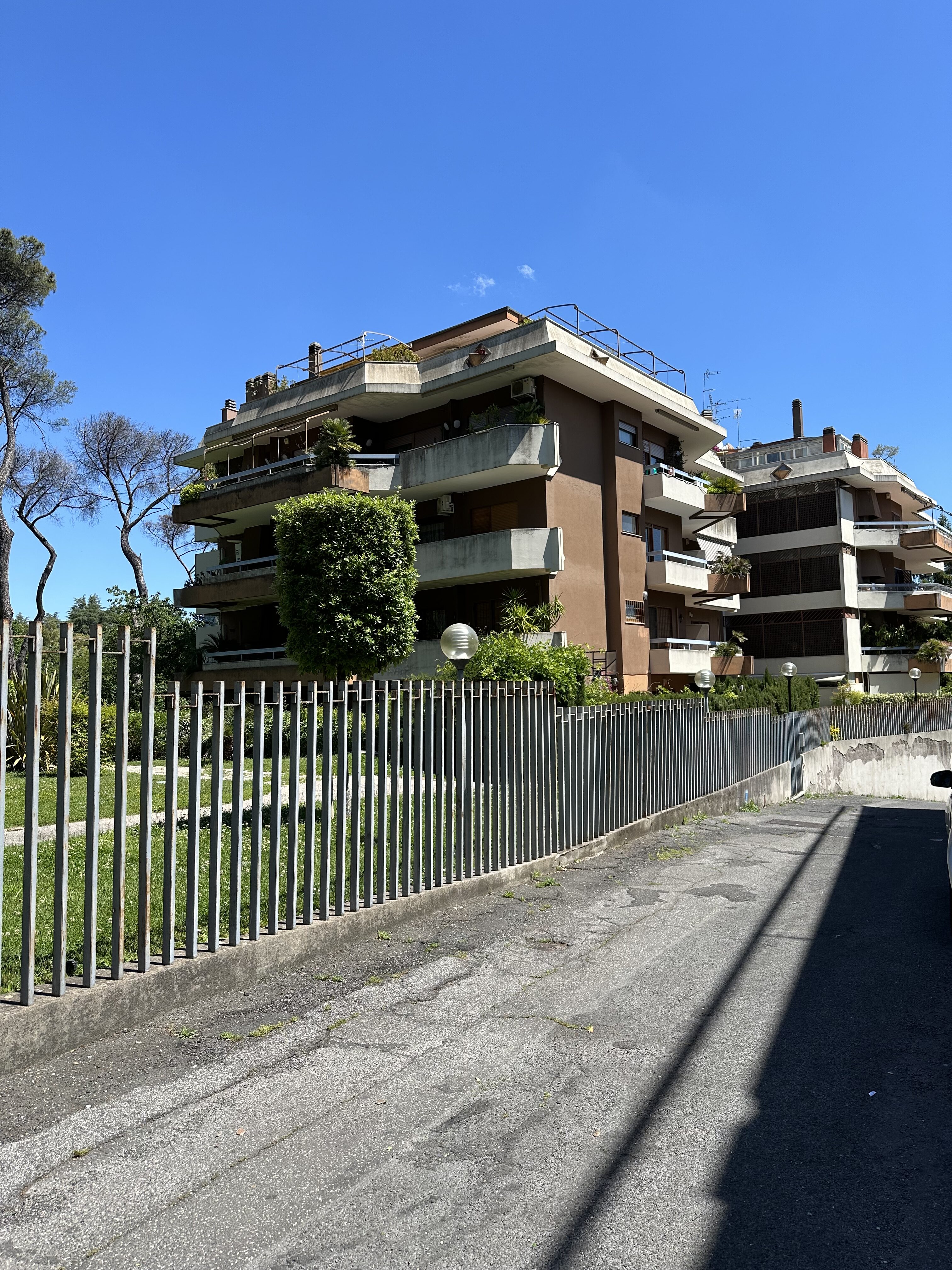
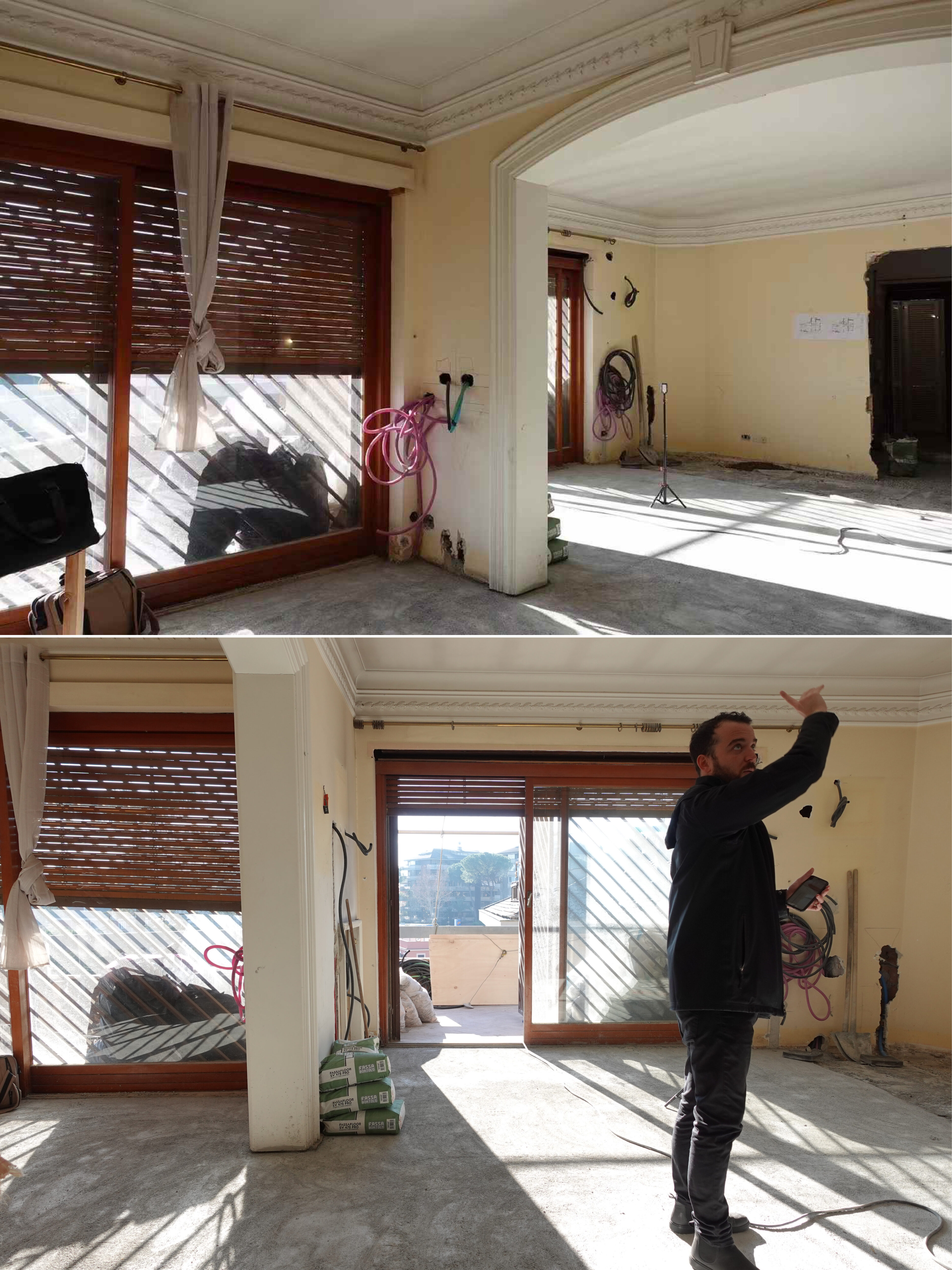
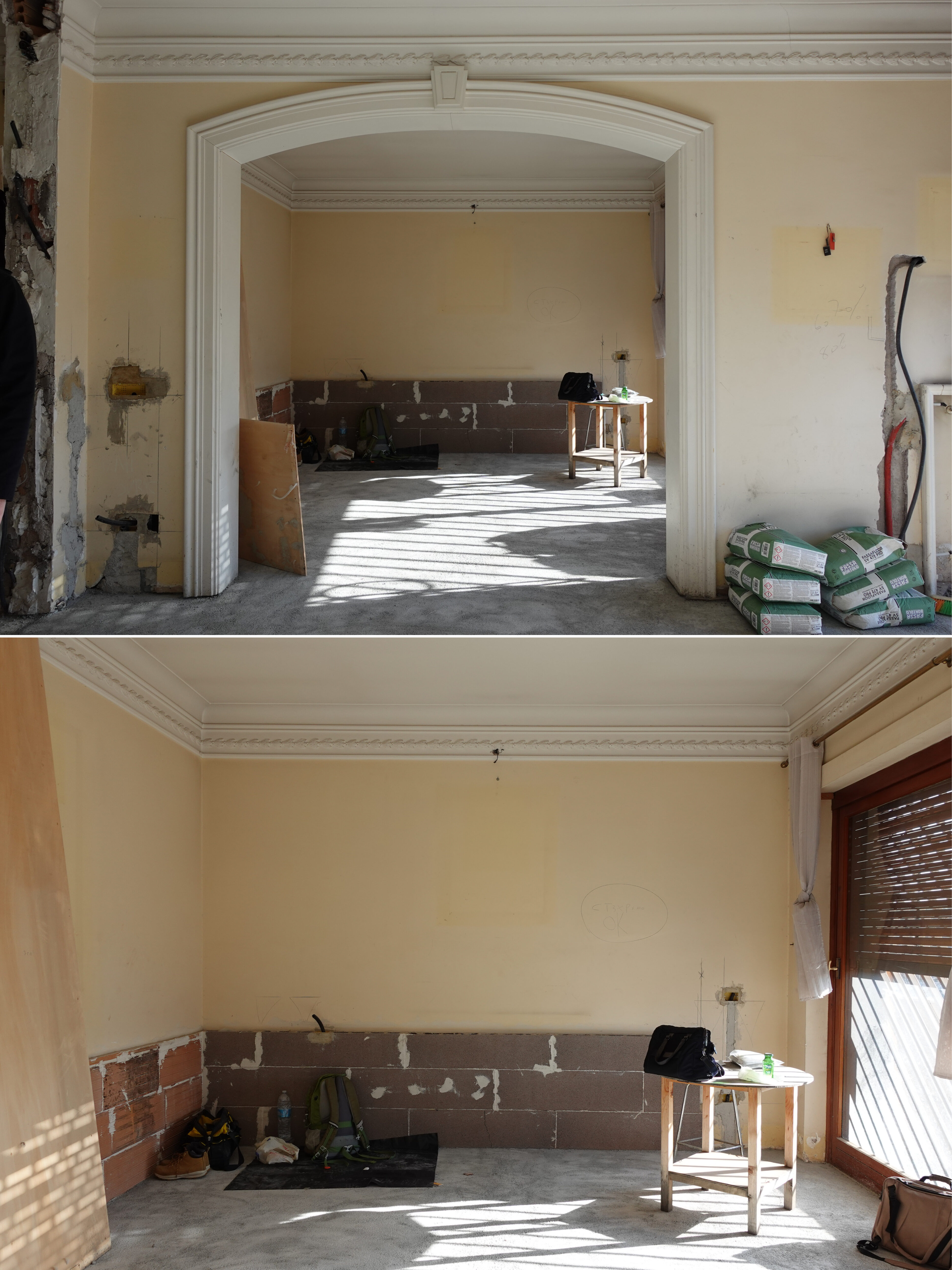
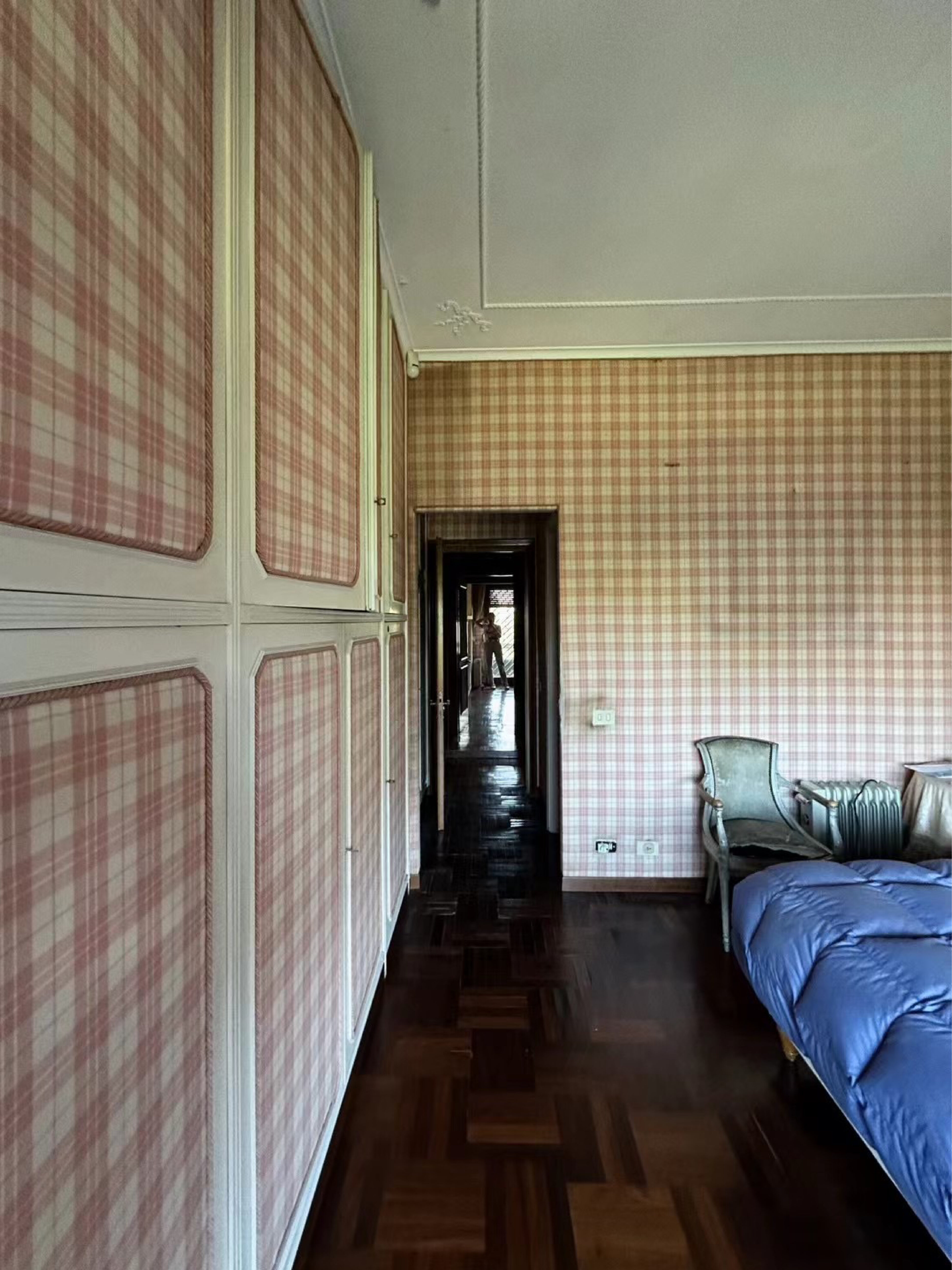
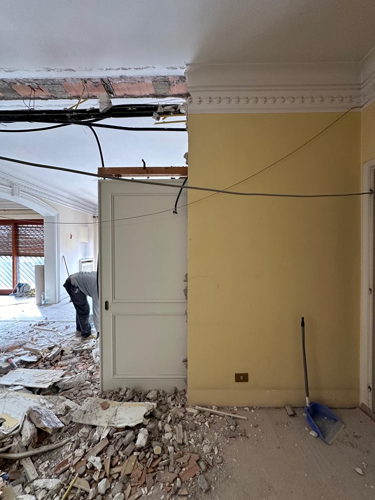
The apartment, built in the 1950s in the northern part of Rome near Via Cassia, is home to a couple and their twin daughters. The original space retained the typical characteristics of Italian residences of the period: stucco-decorated ceilings, ornamental cornices, and dark wooden floors. Most of these historical elements were carefully preserved, with only precise and discreet interventions introduced to adapt the home to the family’s contemporary lifestyle.
Spaces for Living and Sharing
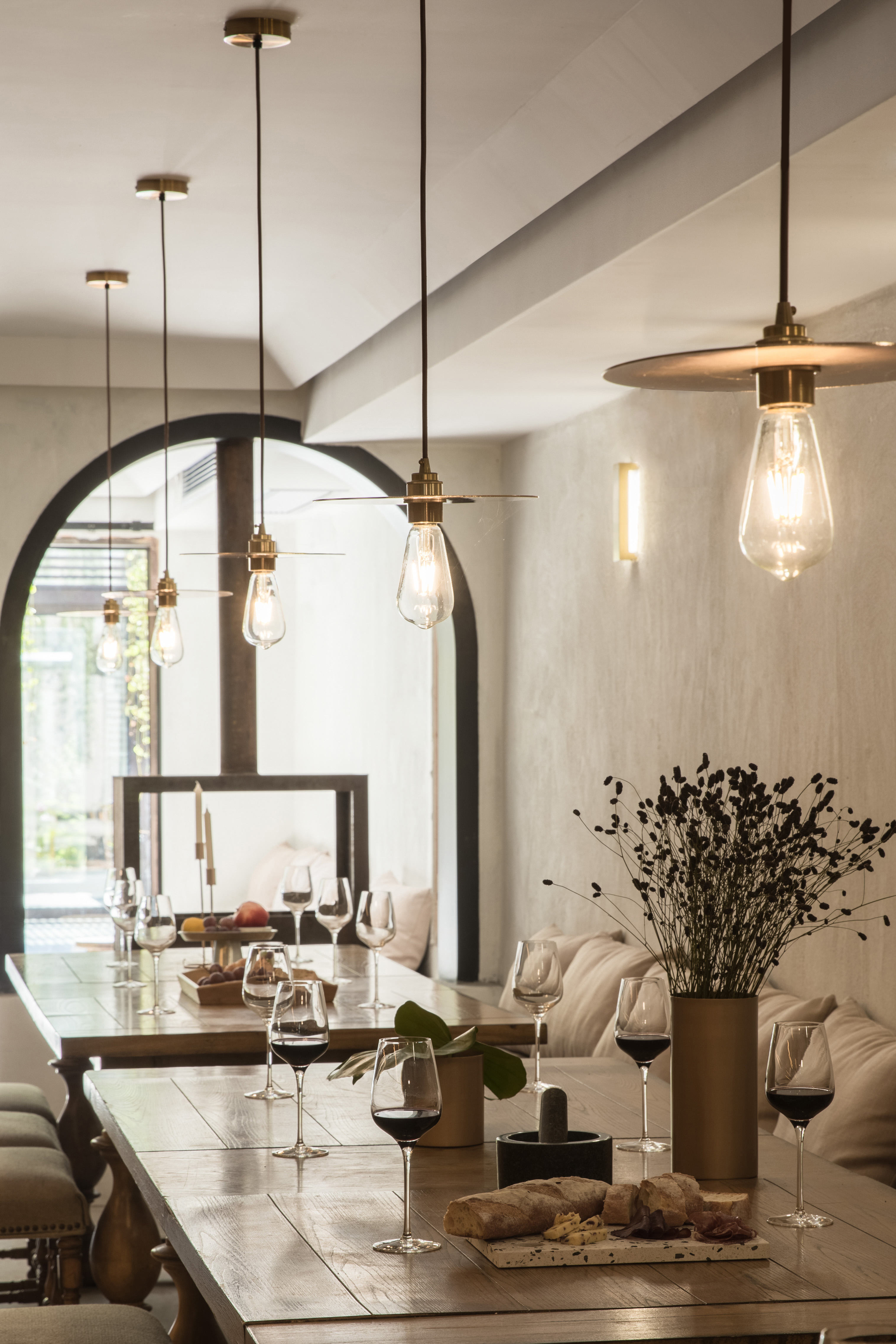
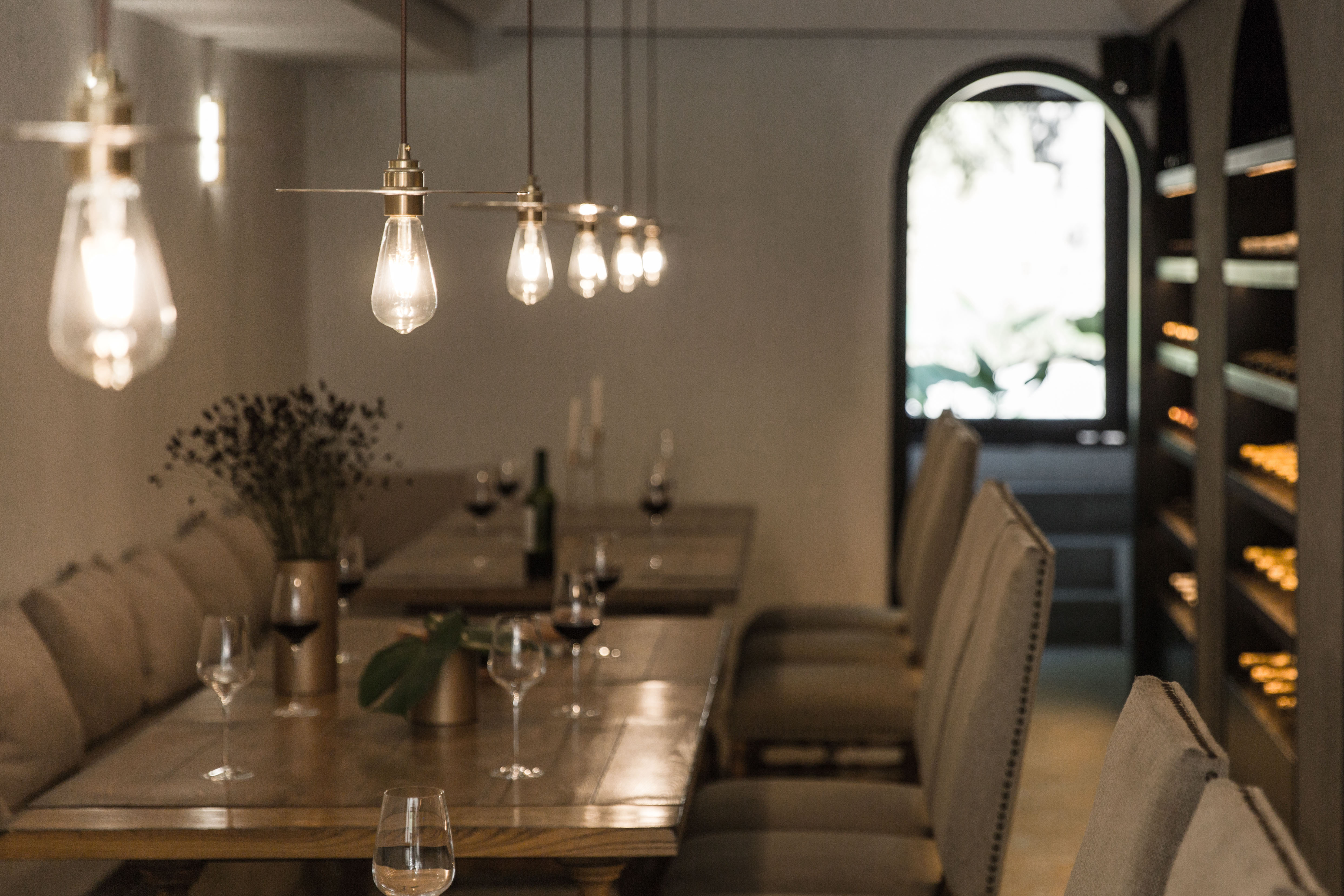
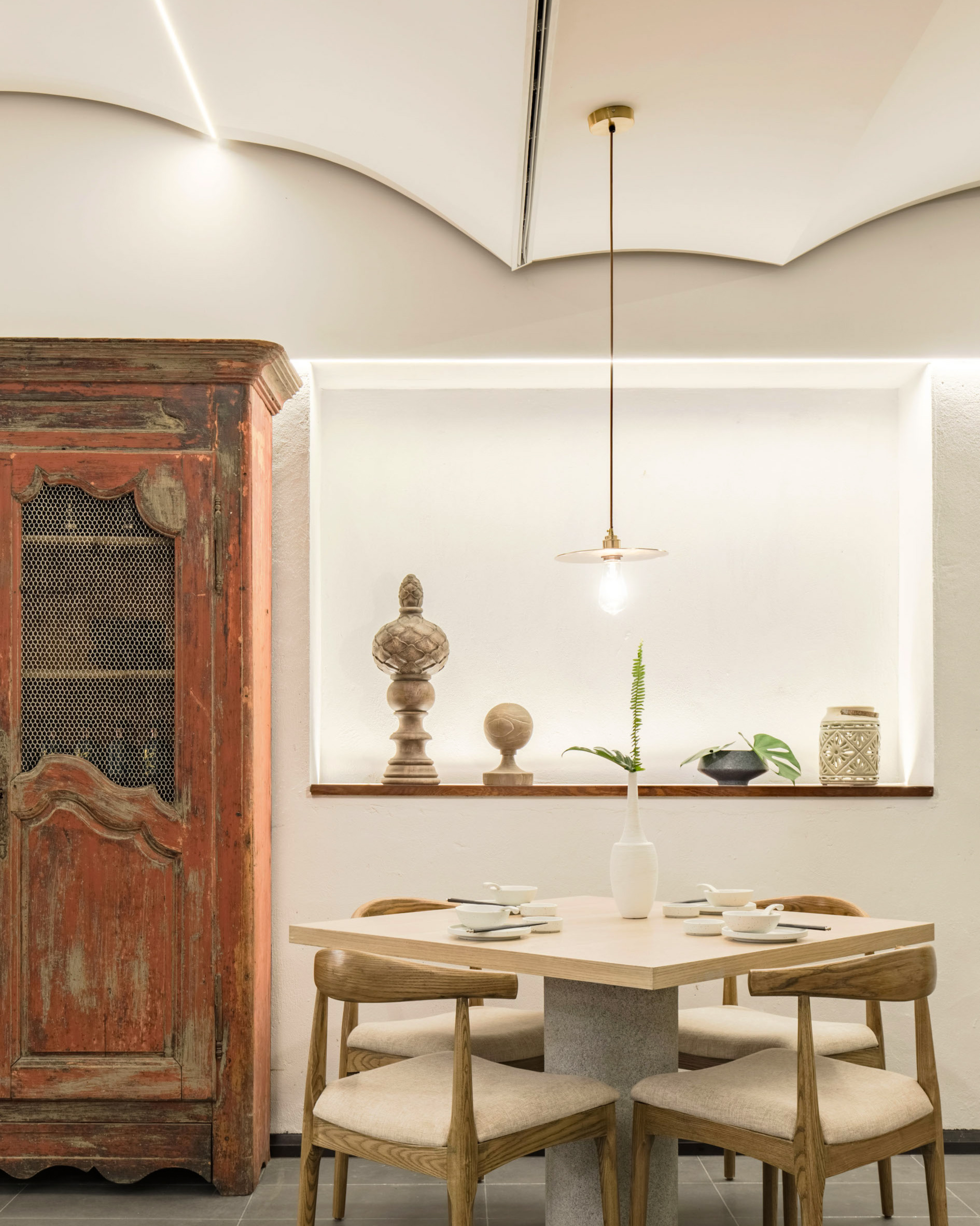
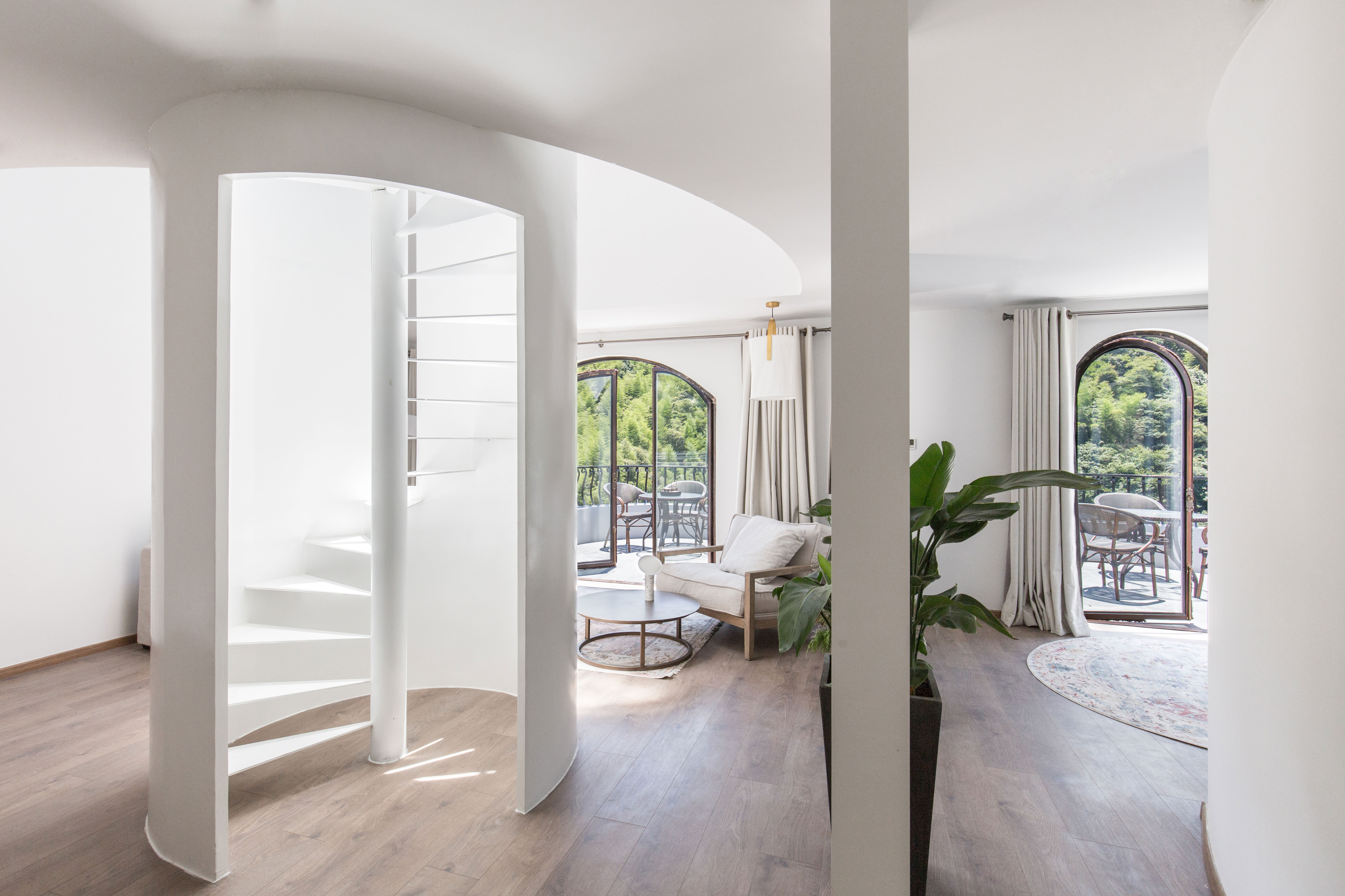
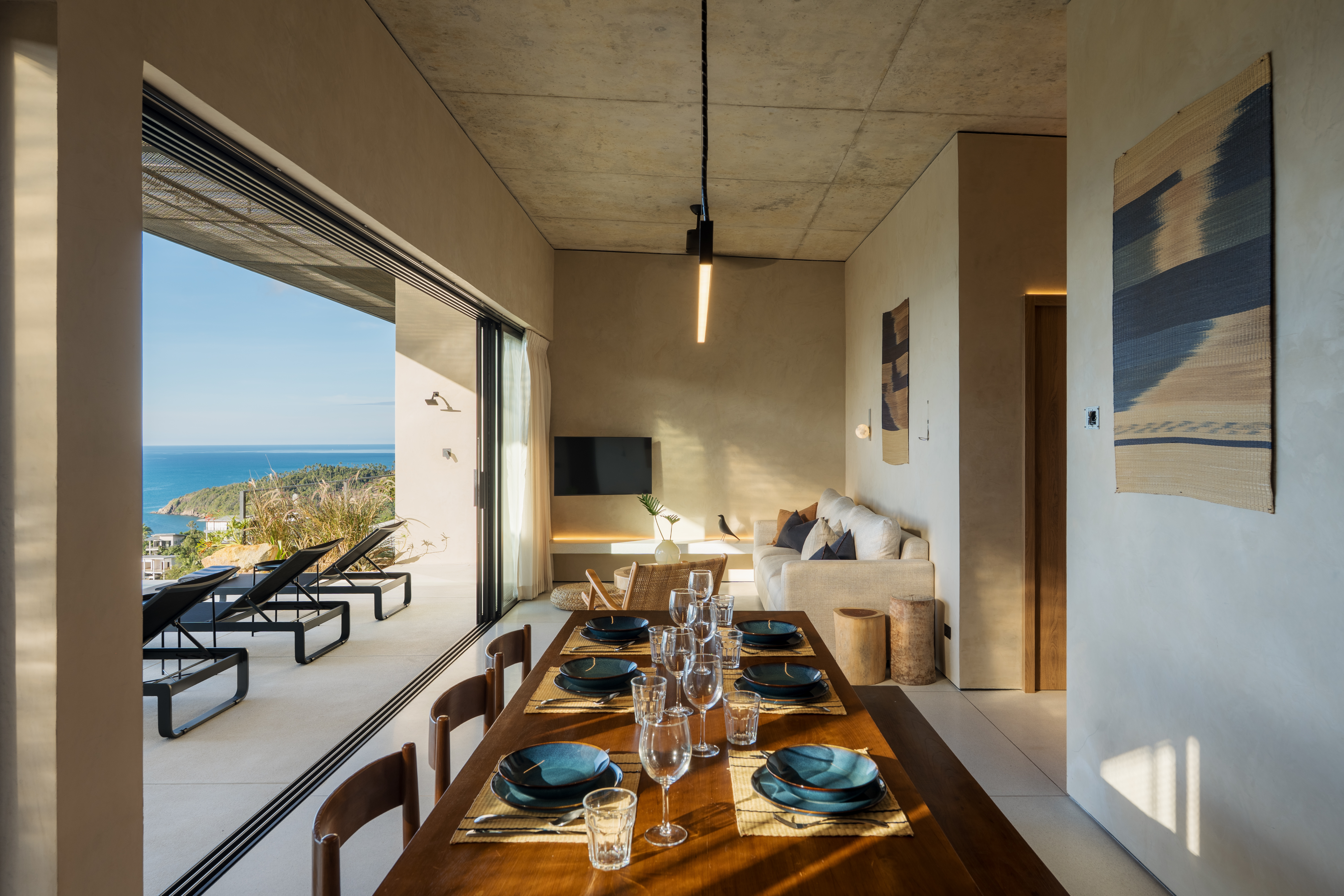
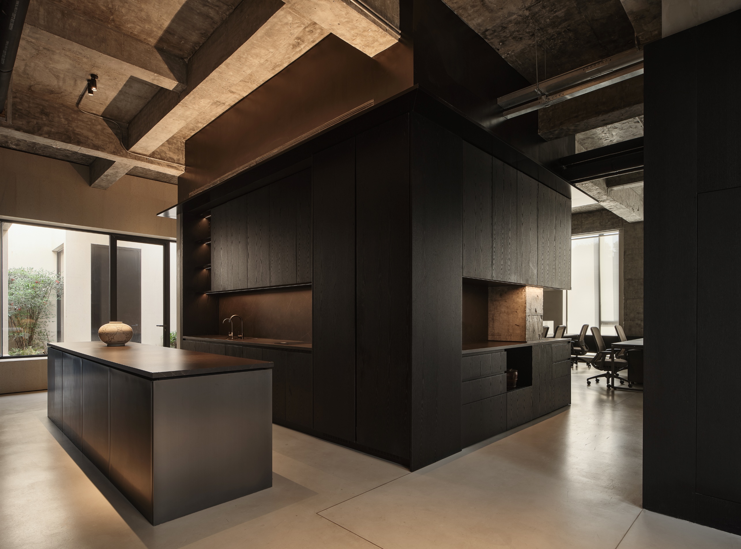
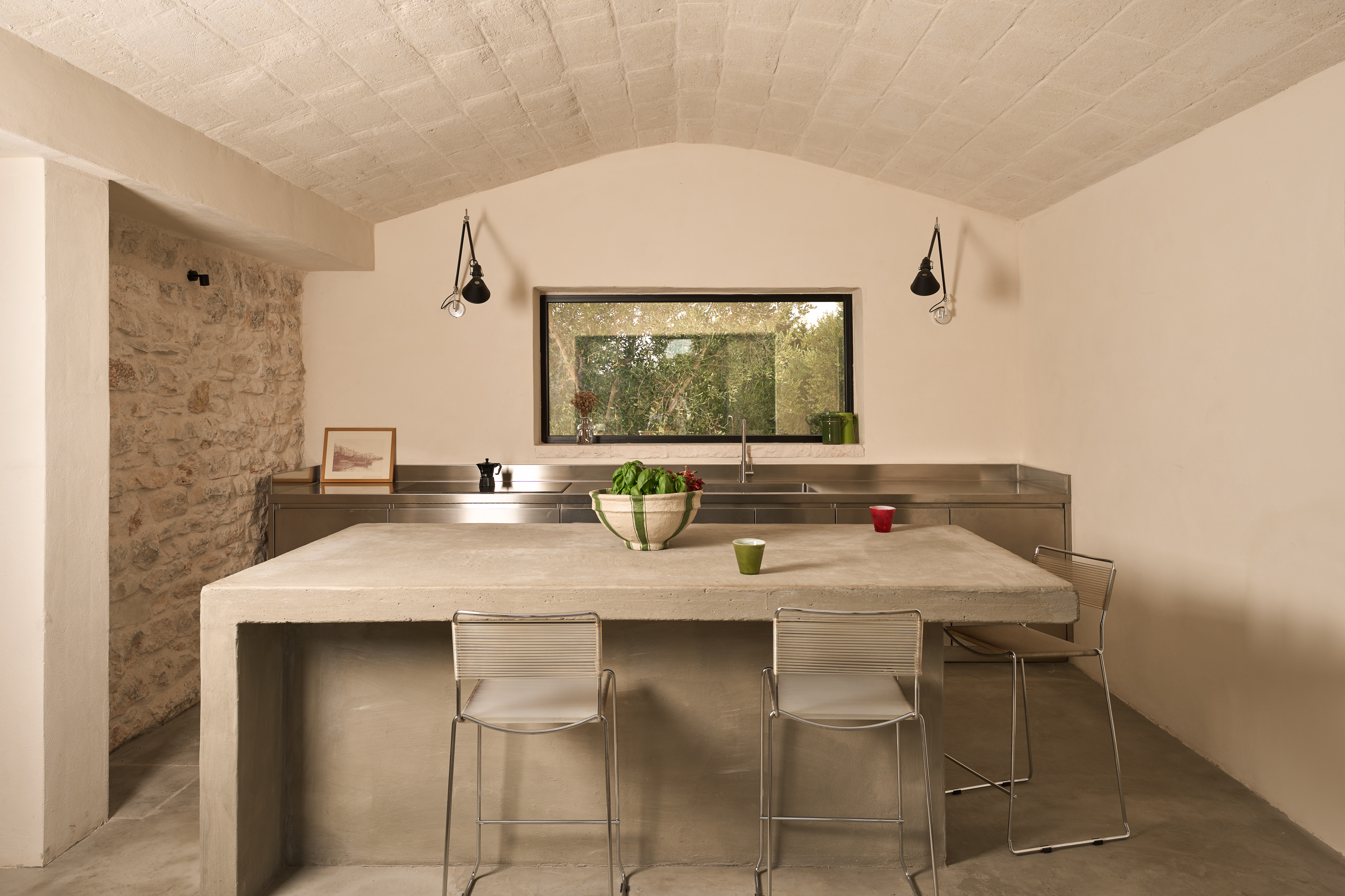
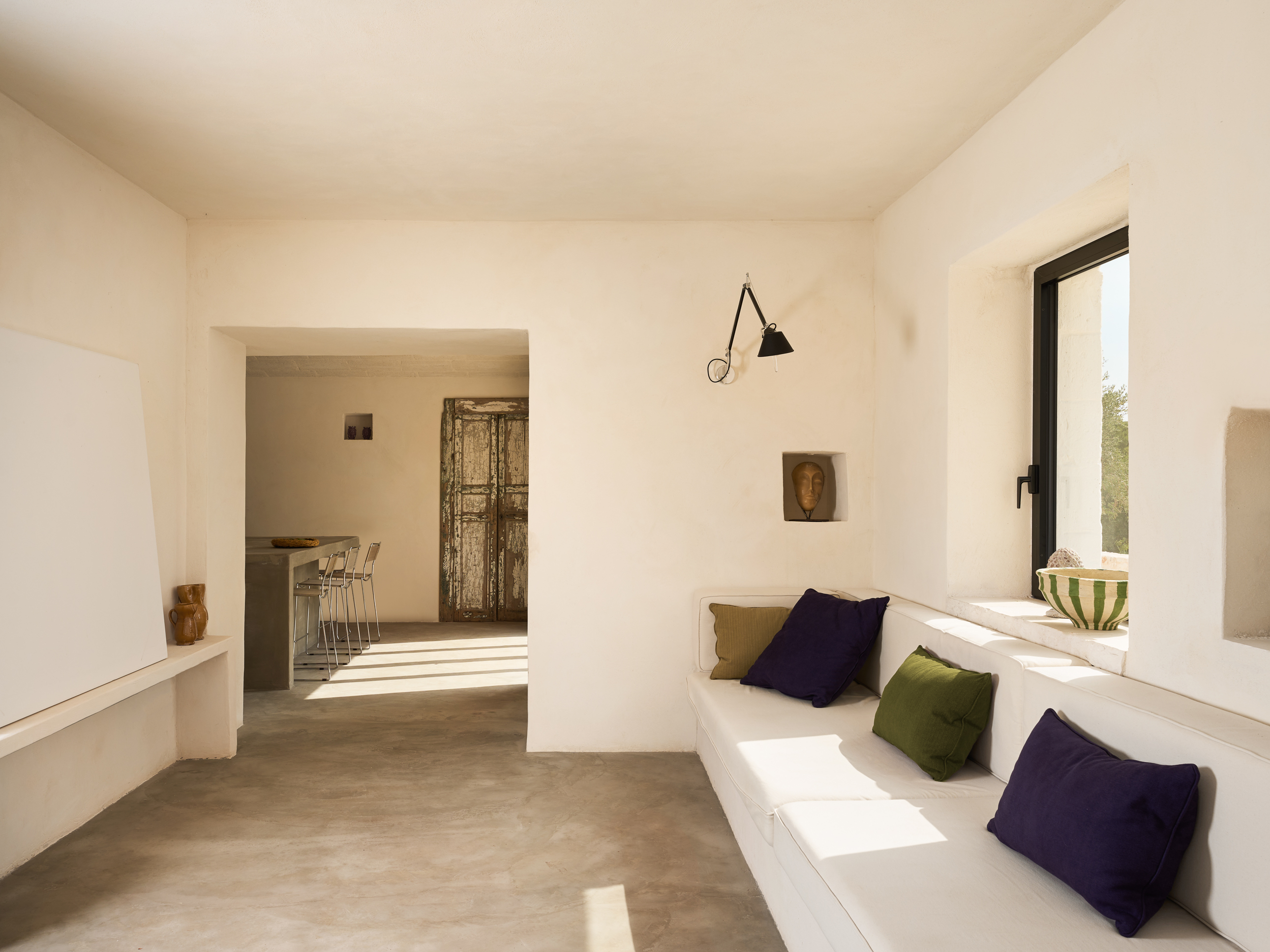
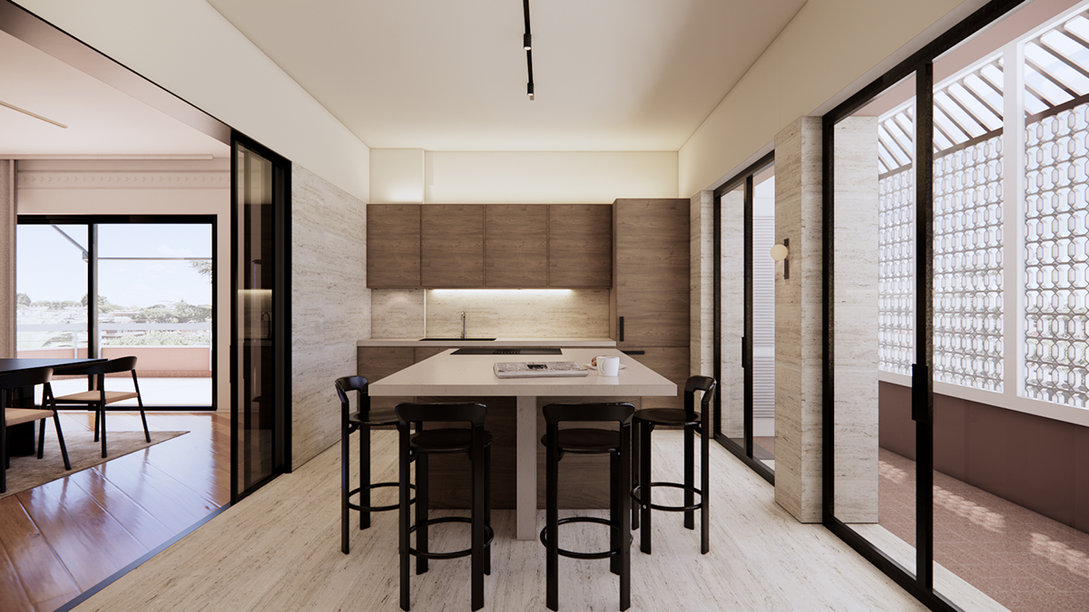
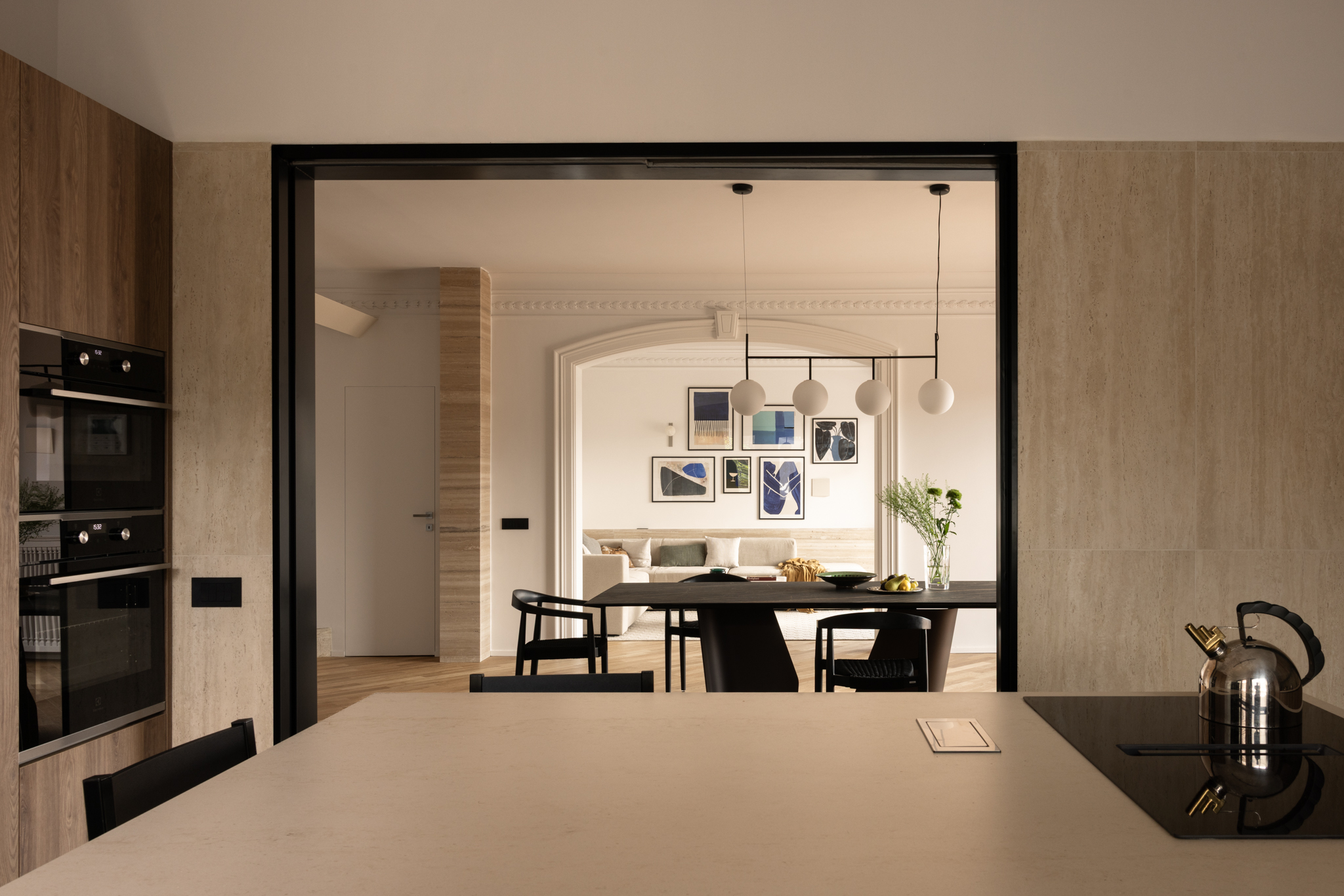
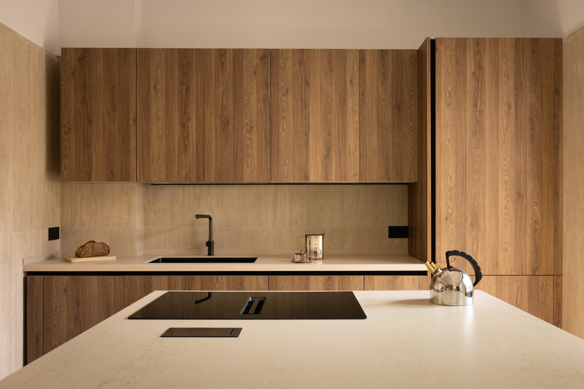
The clients wished for a home that encourages togetherness, with the dining table as the heart of daily life. To achieve this, the wall between the living room and the kitchen was removed, the former service bedroom was transformed into a guest bathroom, and a generous kitchen–dining area was created. A large, fully equipped island reflects the clients’ strong passion for cooking.
On the opposite side of the table, beyond the existing arch, lies the living room with the sofa—a more intimate area where the family gathers to relax. In this configuration, the kitchen and living room unfold on either side of the dining table, both equally important yet serving different functions, achieving a careful balance between conviviality and intimacy.
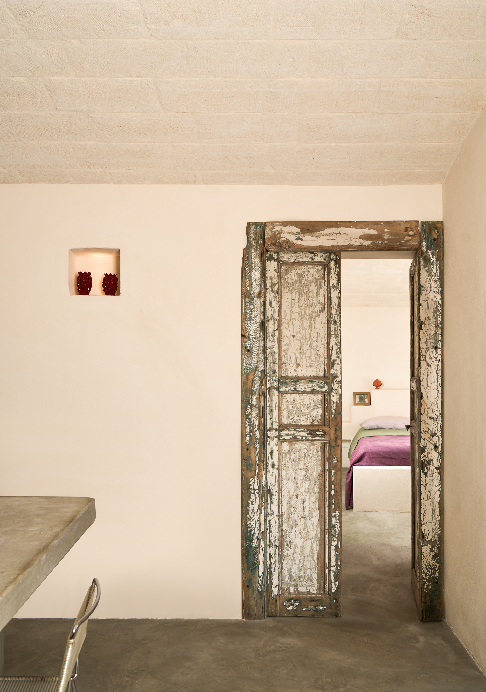
A Dialogue Between Old and New
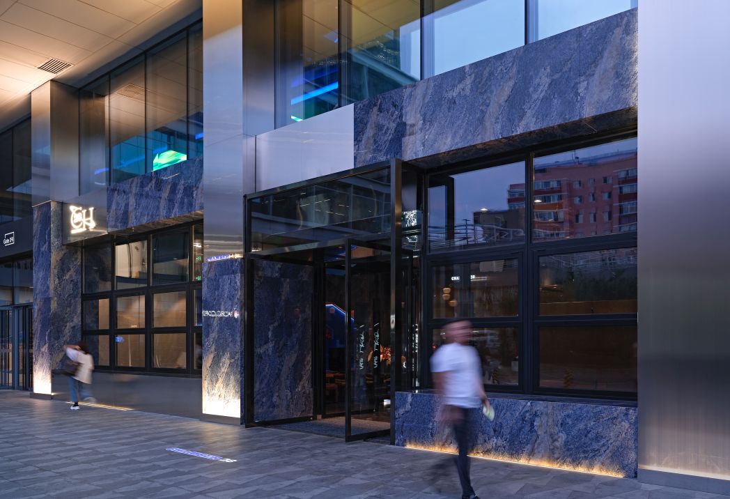
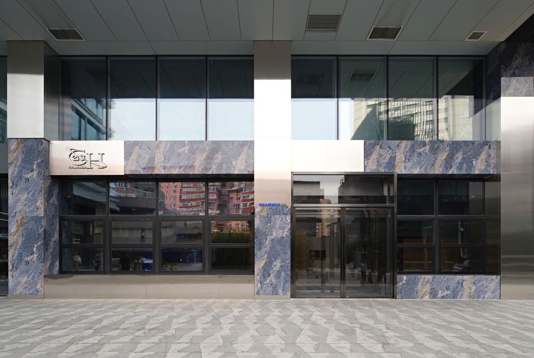
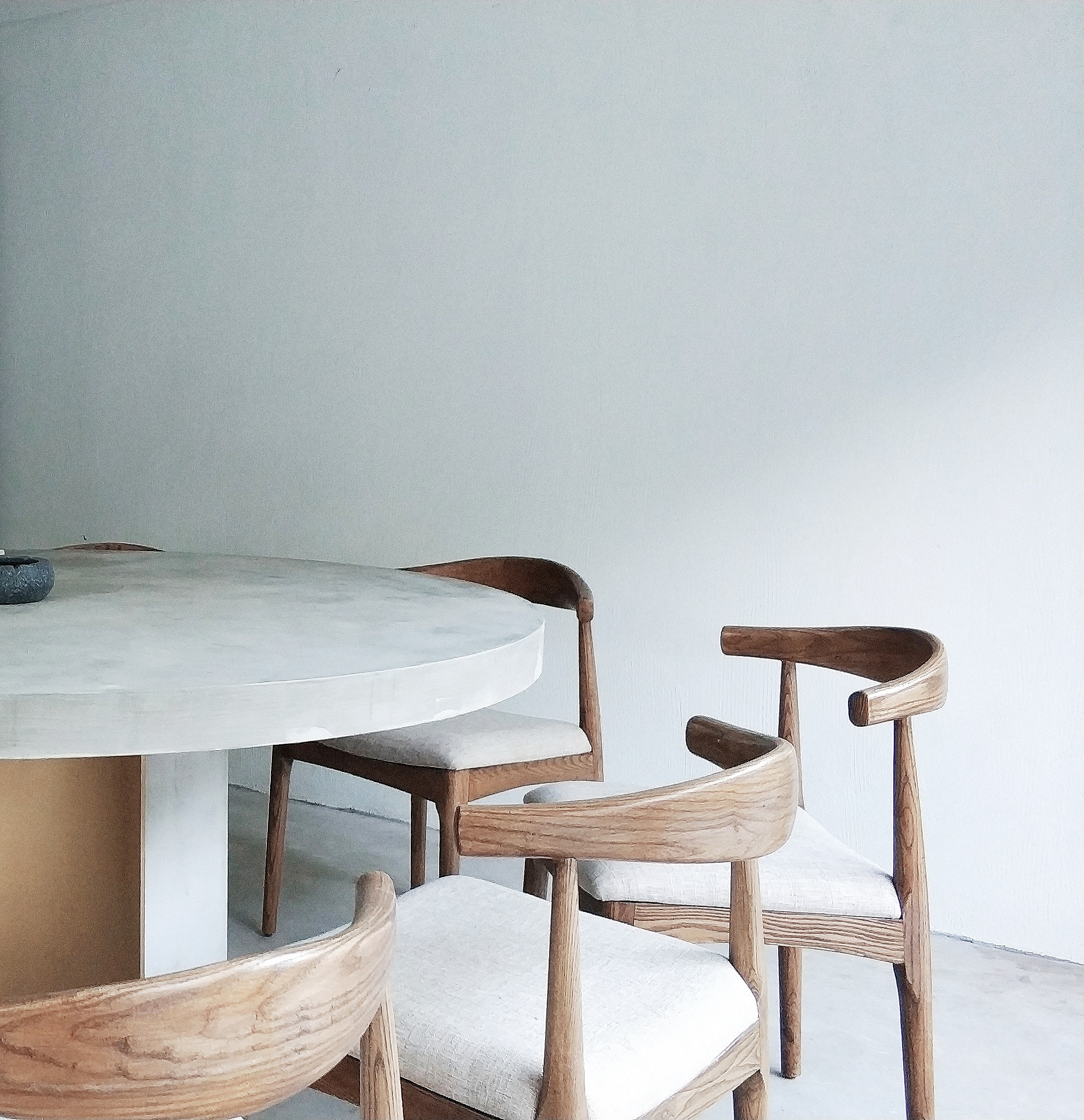
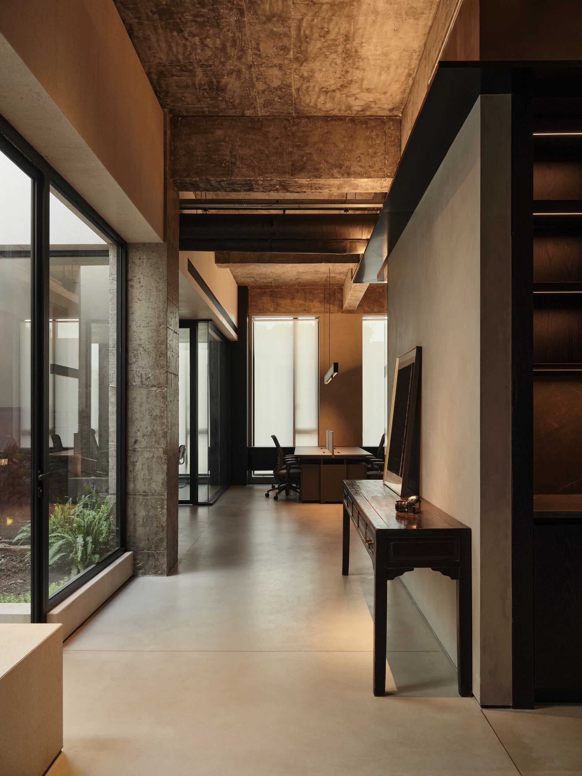
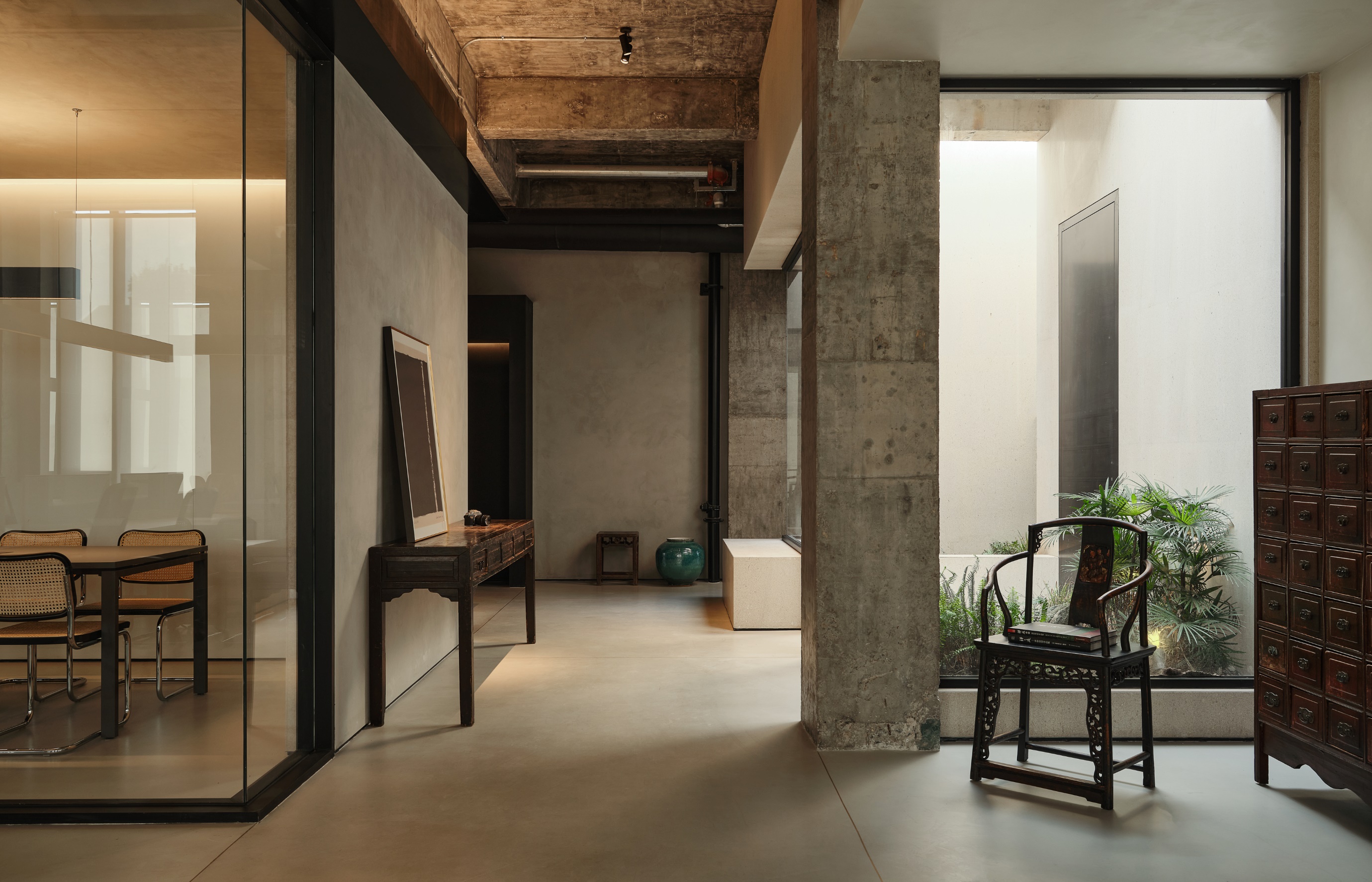
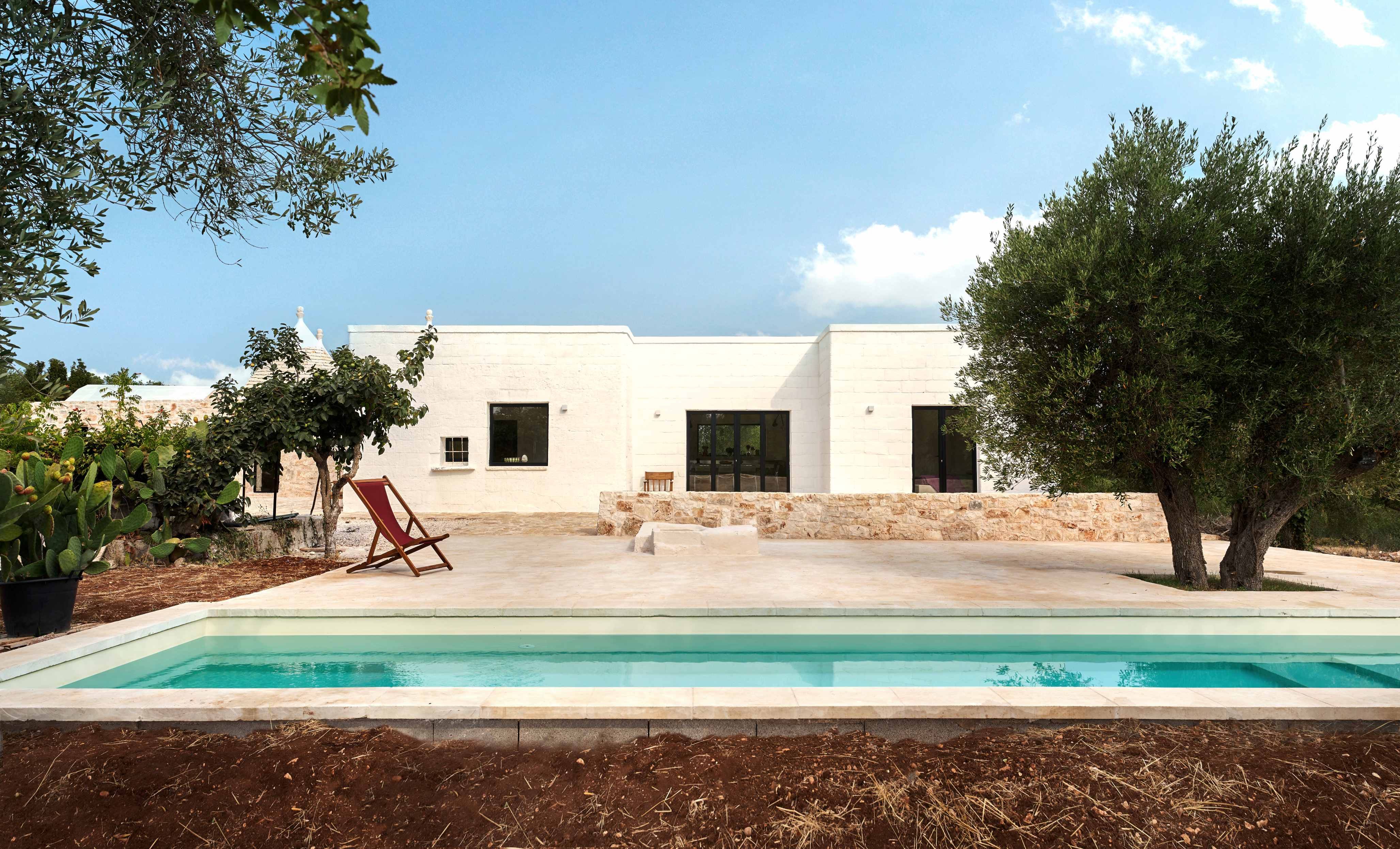
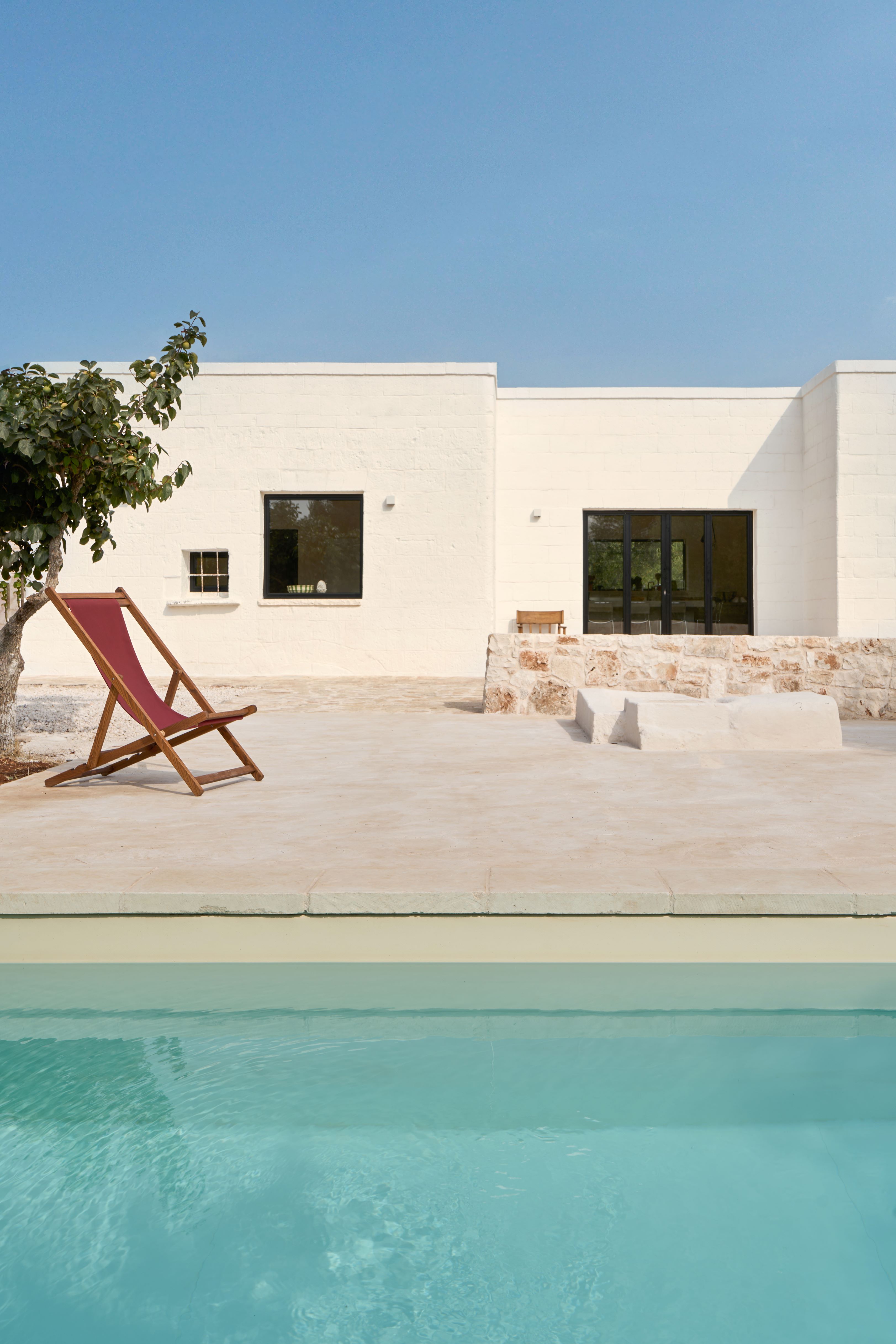
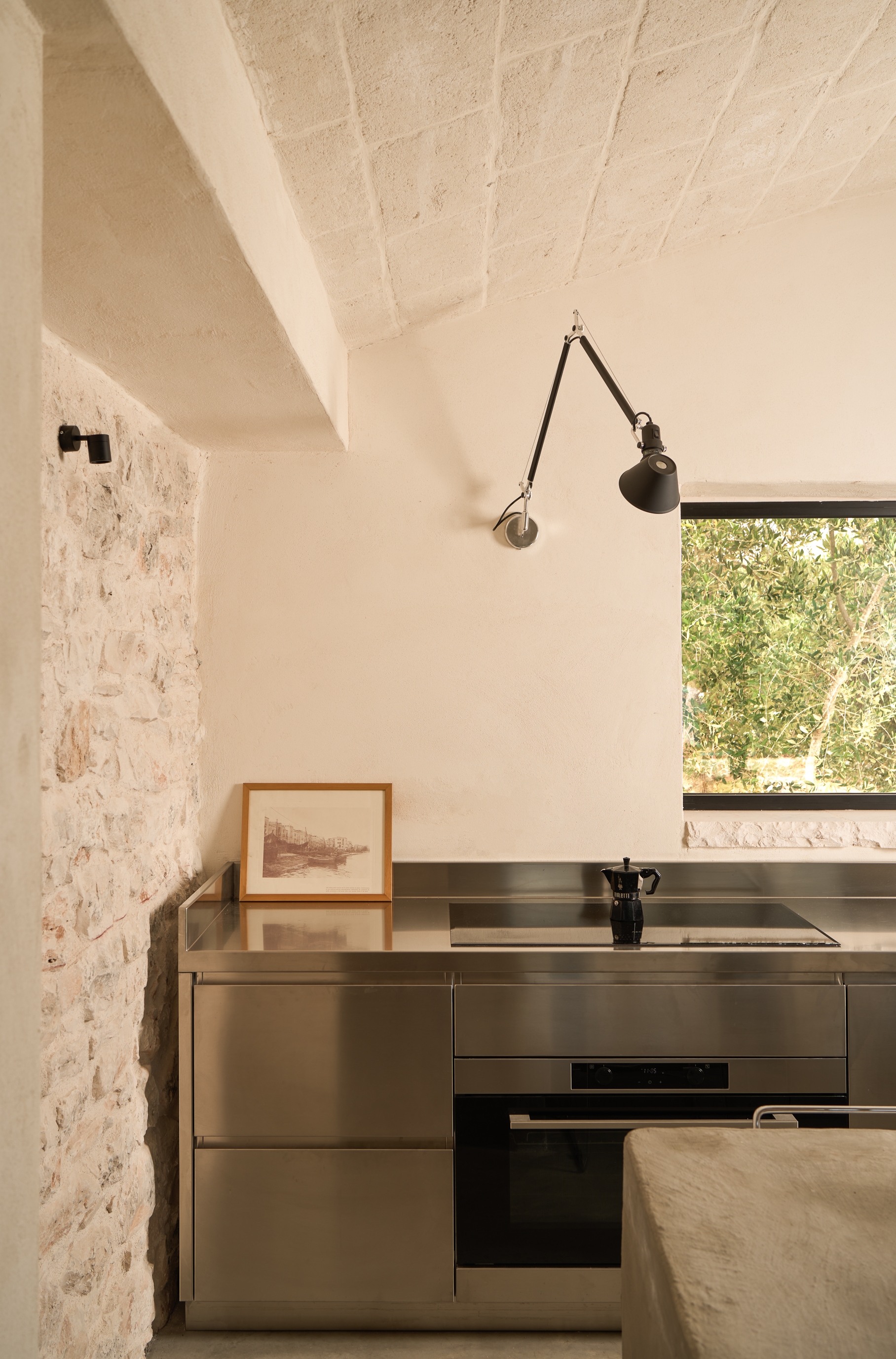
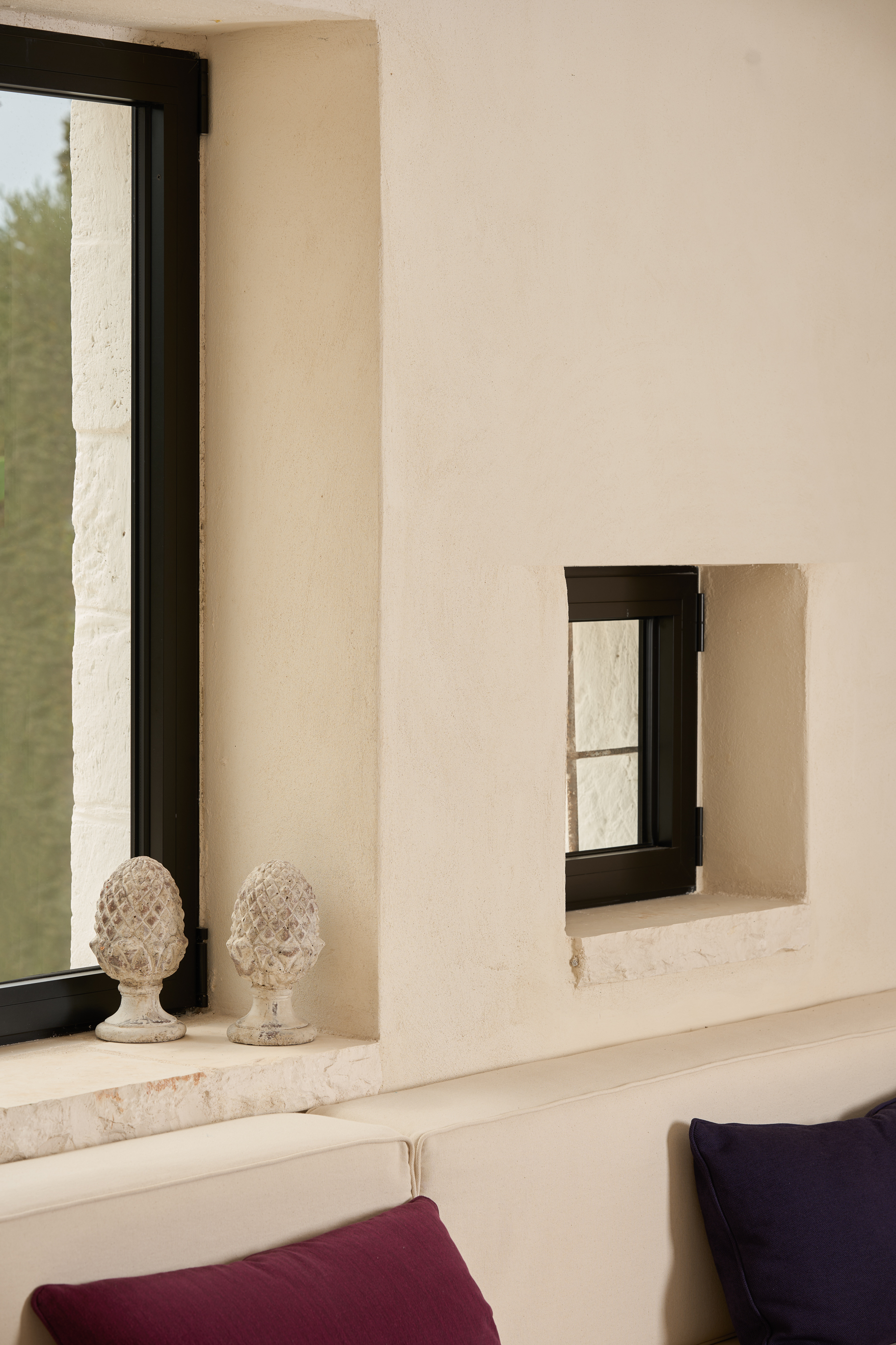
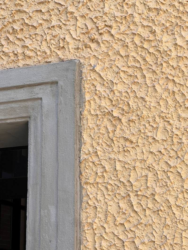
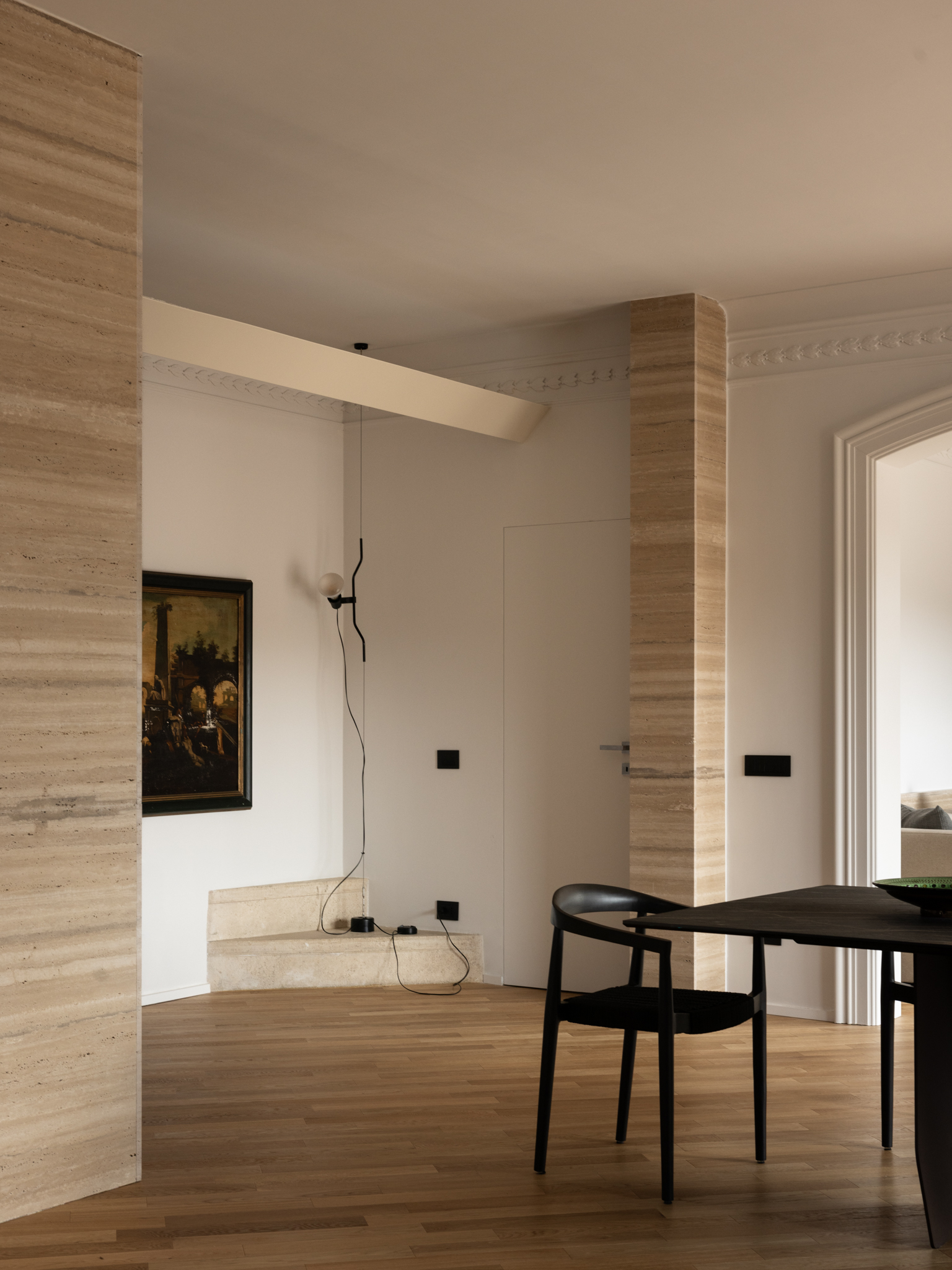
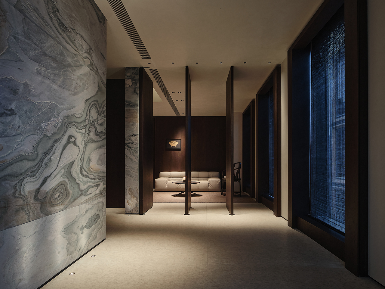
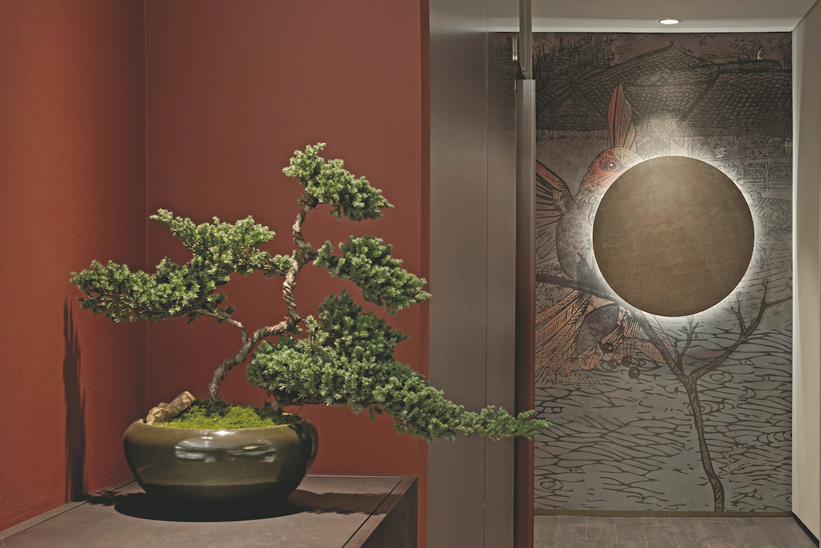
Rome is a city that grows among ancient ruins, where history and modernity coexist. We chose to preserve and highlight selected existing elements while introducing new materials such as metal and travertine, which strongly evoke Roman identity.
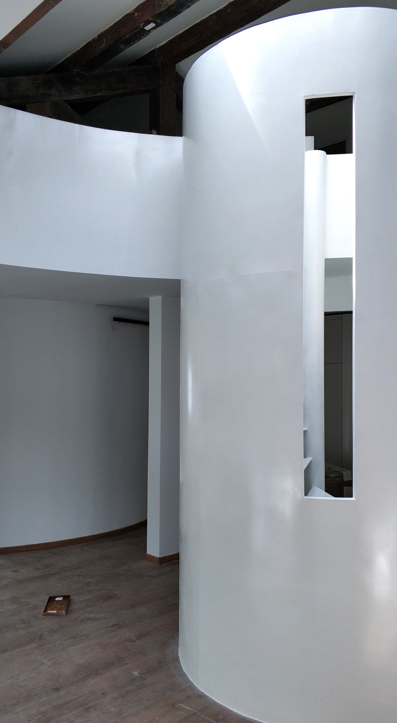
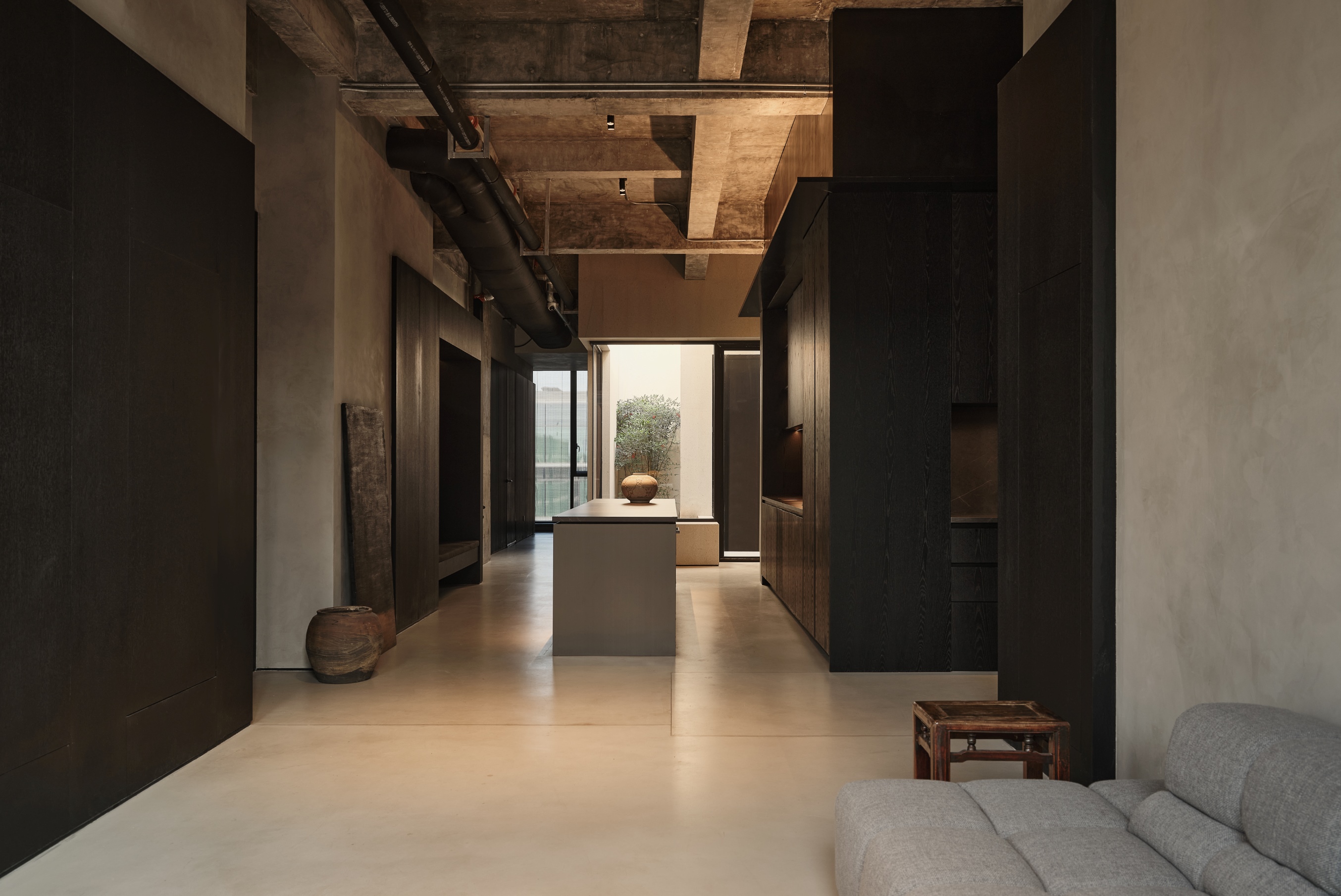
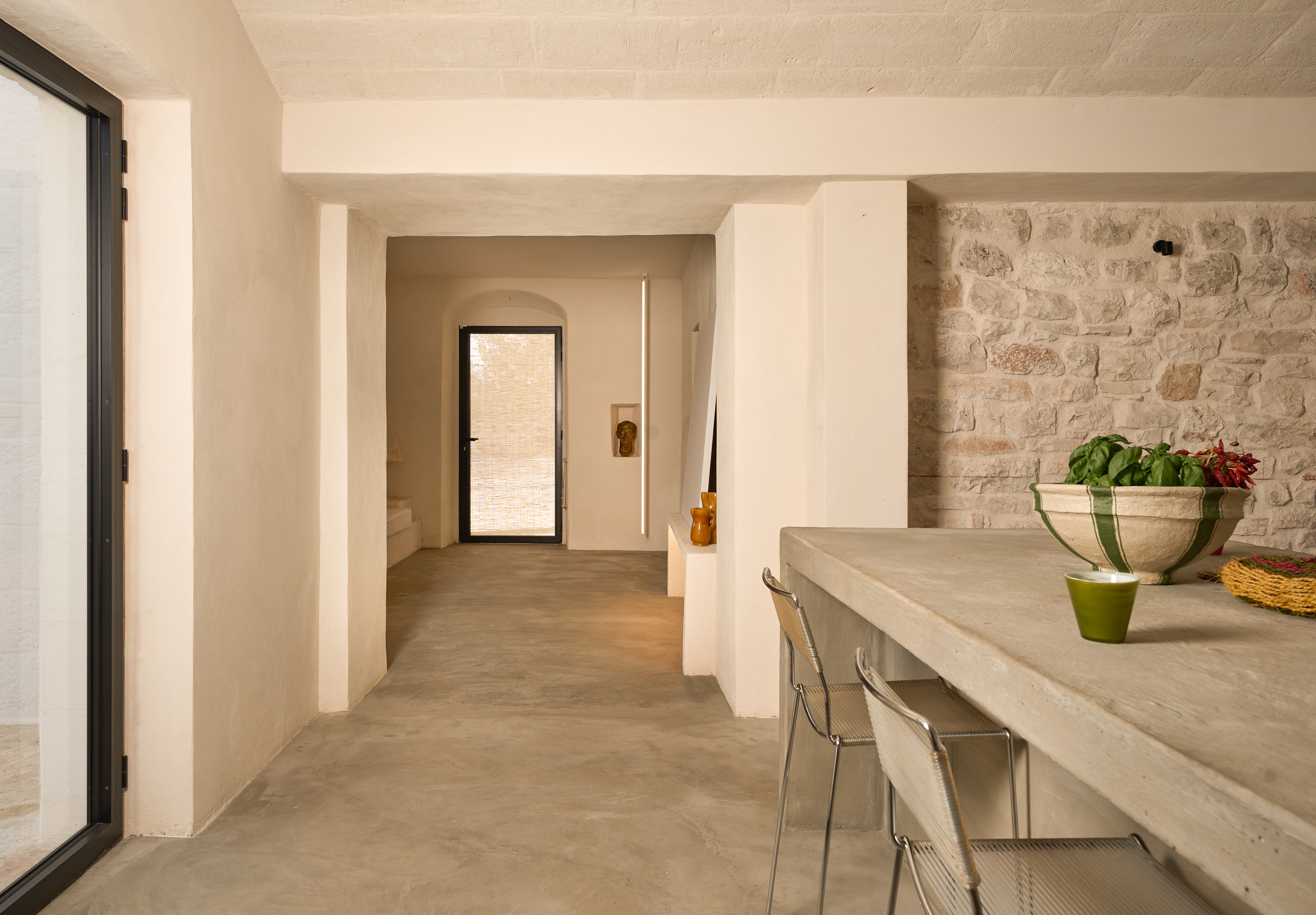
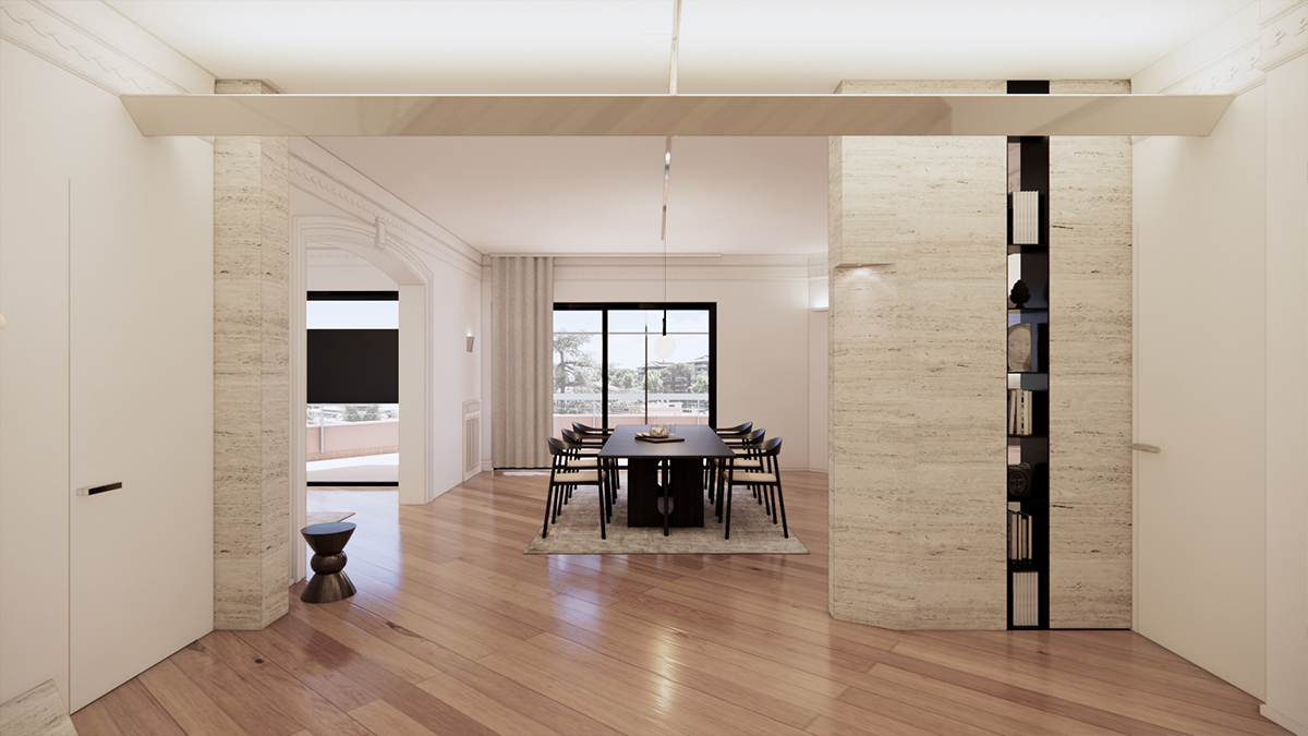
From the entrance, following the diagonally laid wooden flooring—original to the apartment—the decorated arch of the living room engages in dialogue with the minimalist kitchen doorway, creating an encounter between past and present. Fragmented and targeted interventions, inspired by the spatial logic of Roman ruins, articulate and break the space into layers, bringing dynamism to the interior. Travertine acts as the common thread that ties modern volumes to historical elements, establishing a balanced relationship between different eras.
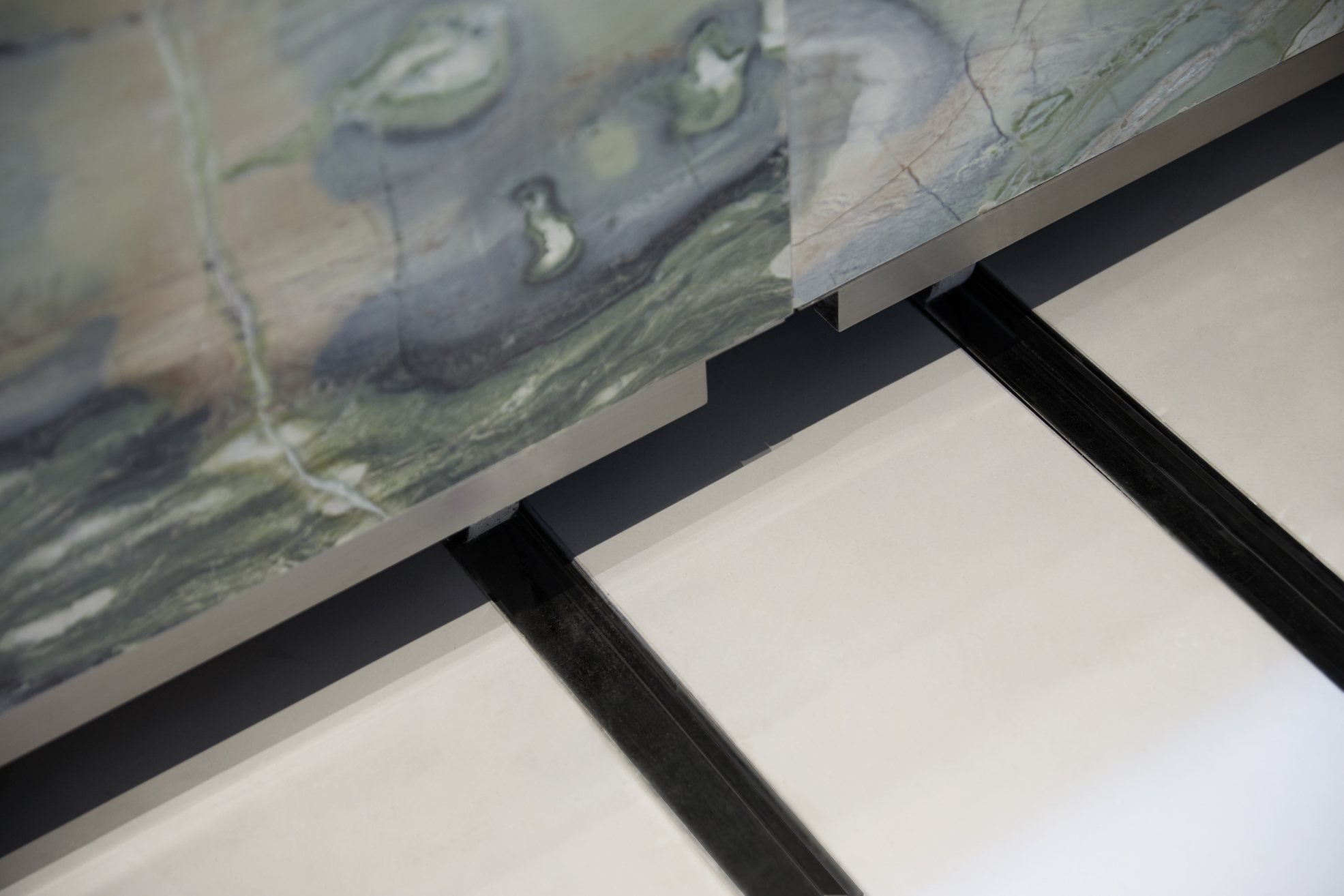
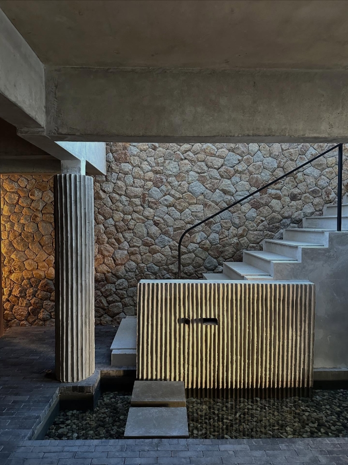
Travertine as the Protagonist
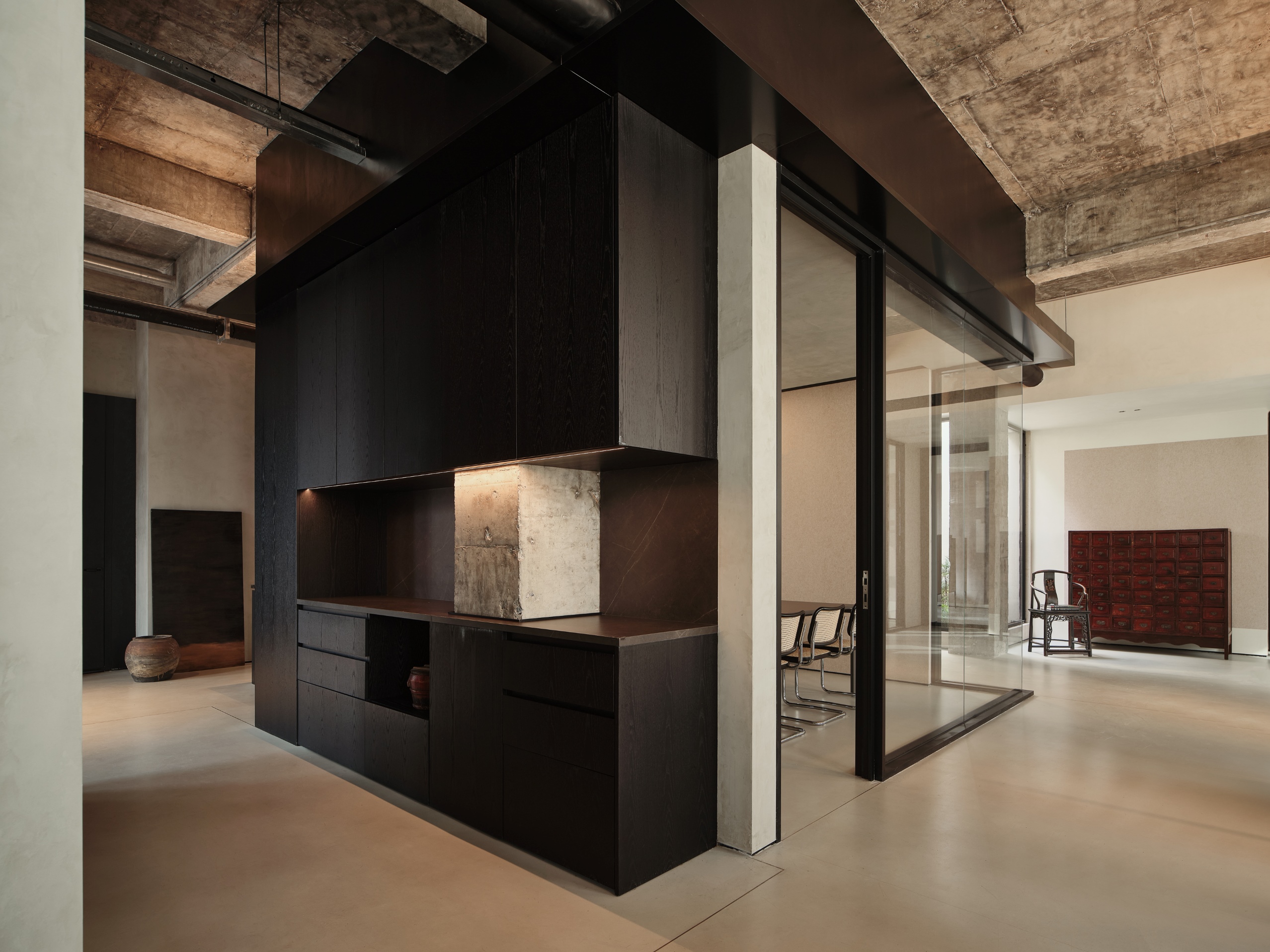
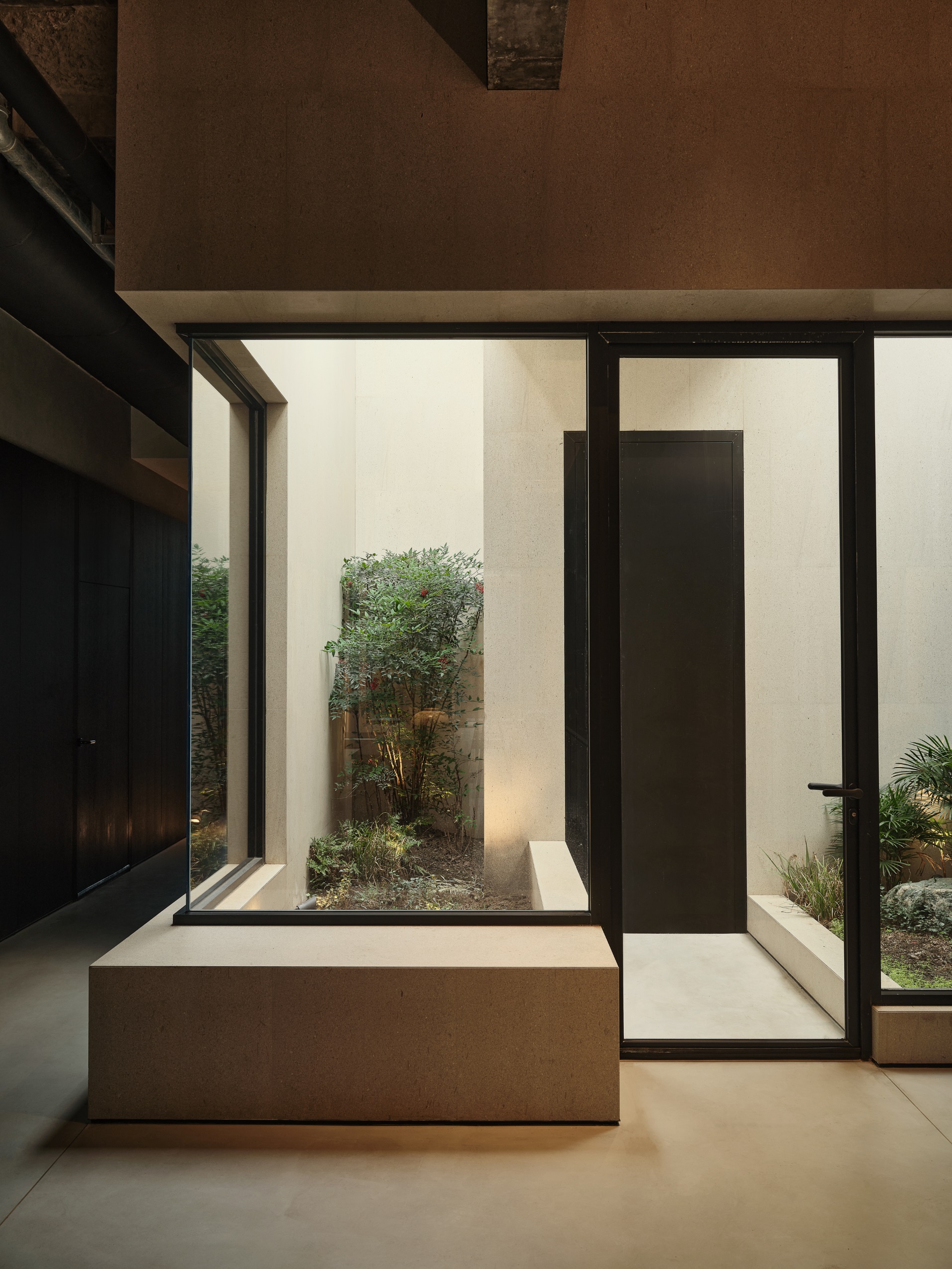
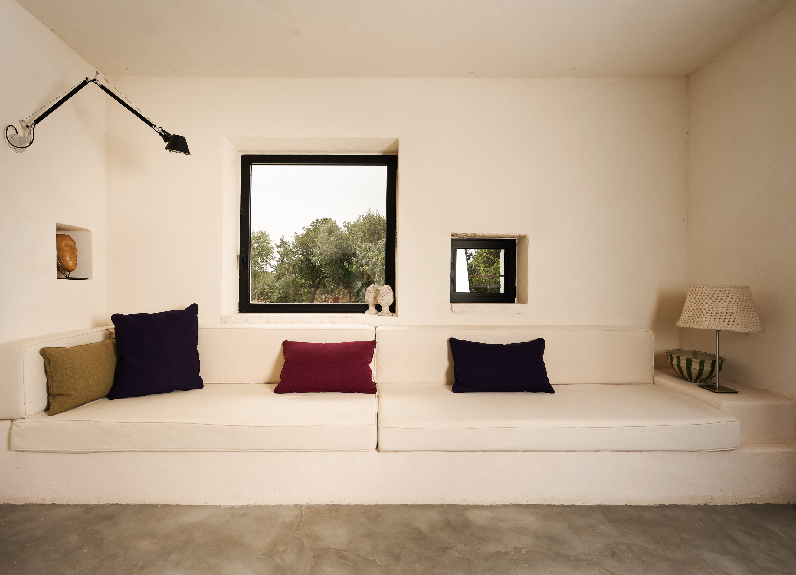
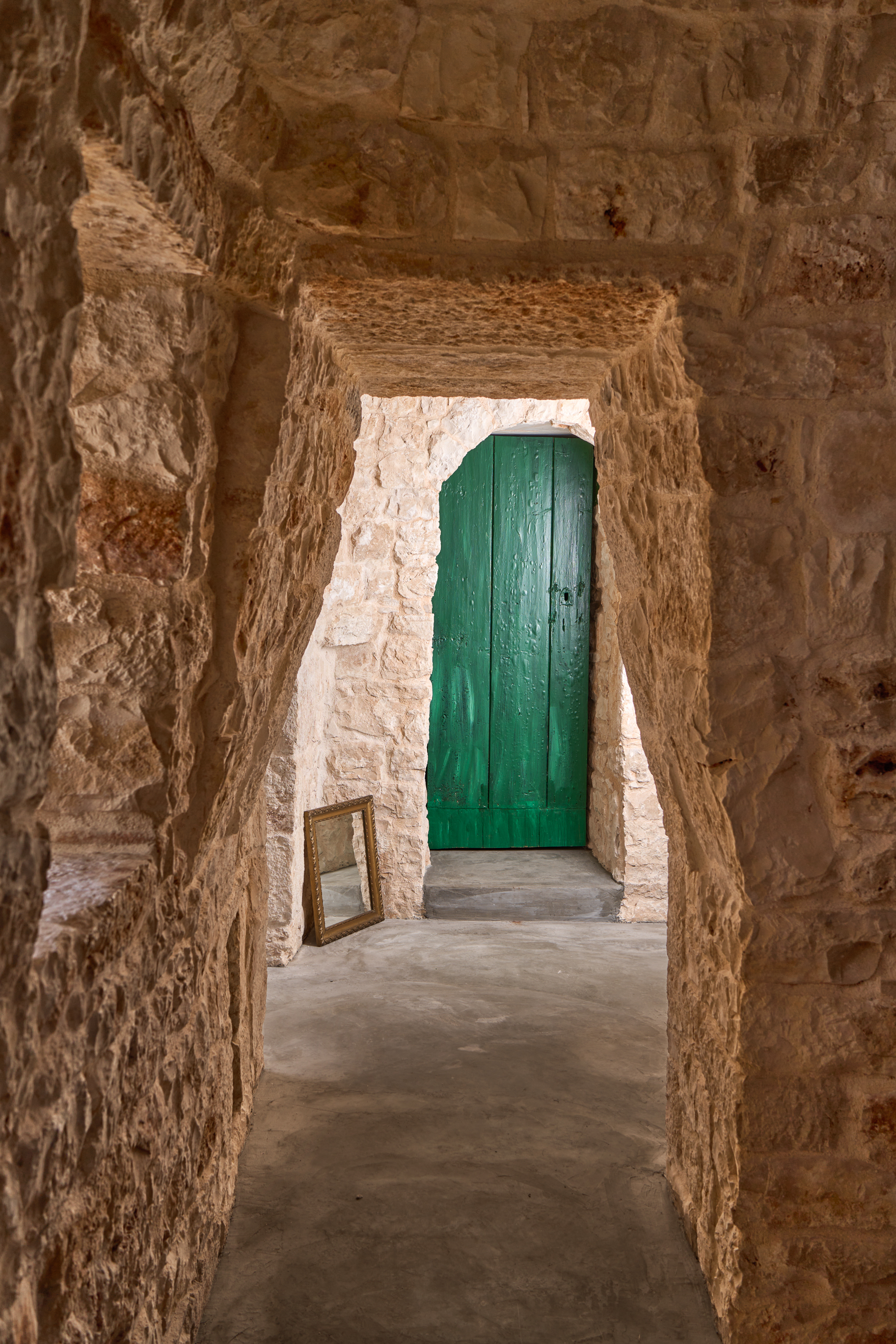
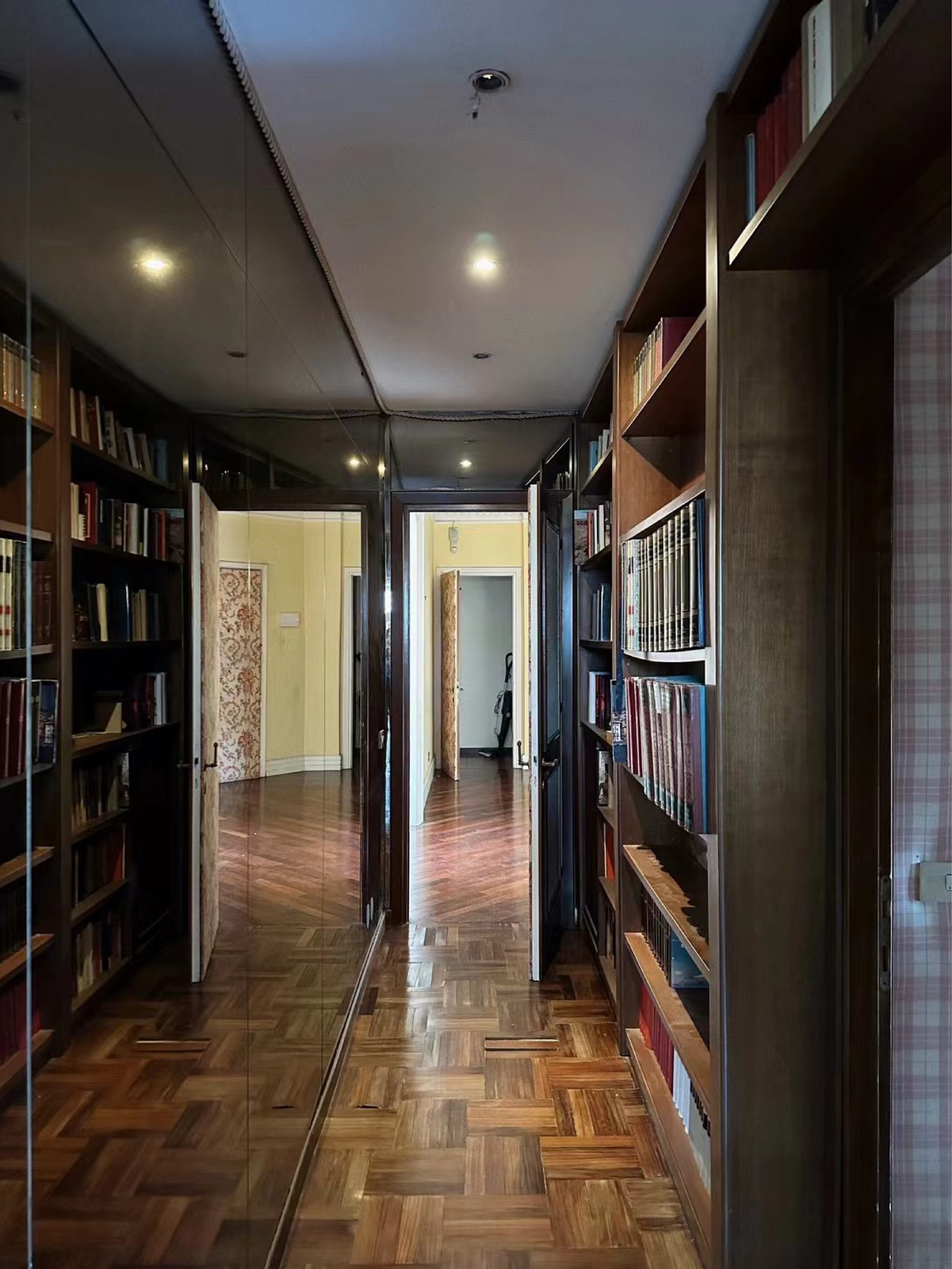
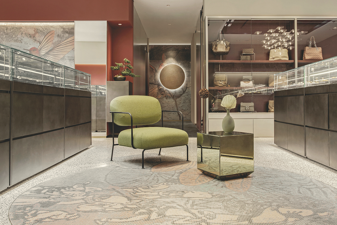
Travertine, a classical material of Roman architecture, was strategically used throughout the entrance, kitchen, living room, and bathrooms. It forms partitions, the sofa backdrop, and wall claddings, reintroducing Rome’s urban character into the interior.
In the entrance, a new travertine wall replaces the former solid partition, functioning as both a visual and functional filter. Chamfered corners soften its mass, while a central metal bookshelf allows views to pass through, lightening the volume. This element merges Eastern feng shui principles with a Western sense of privacy, uniting two cultural logics within a single architectural gesture.
Precise and Targeted Interventions
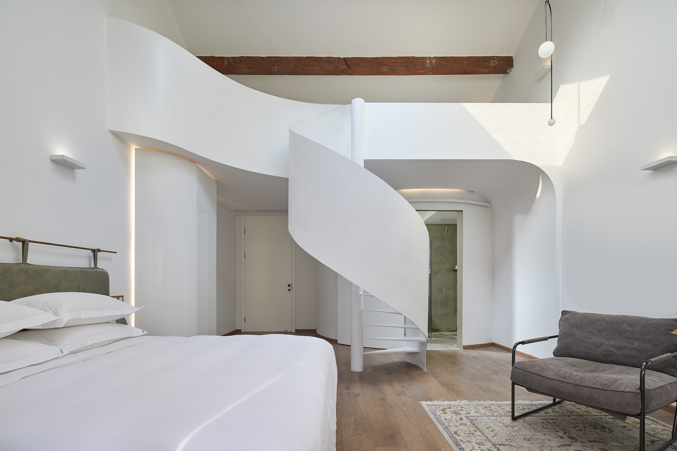
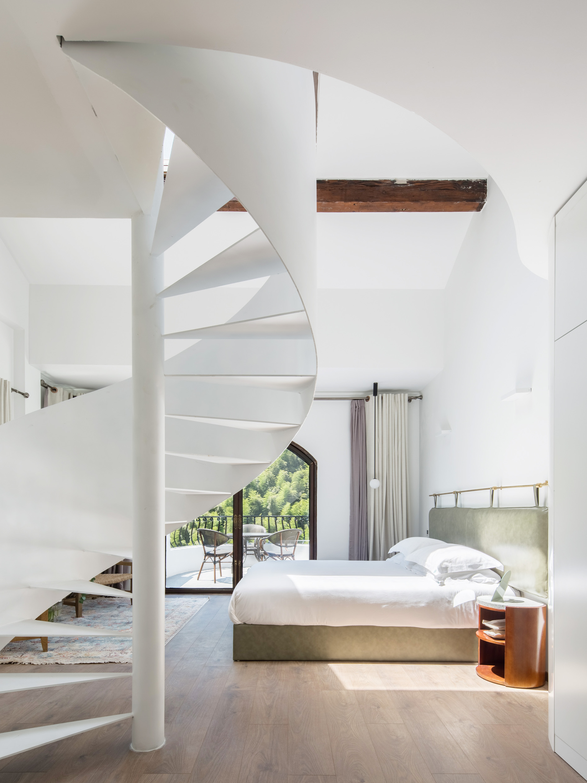
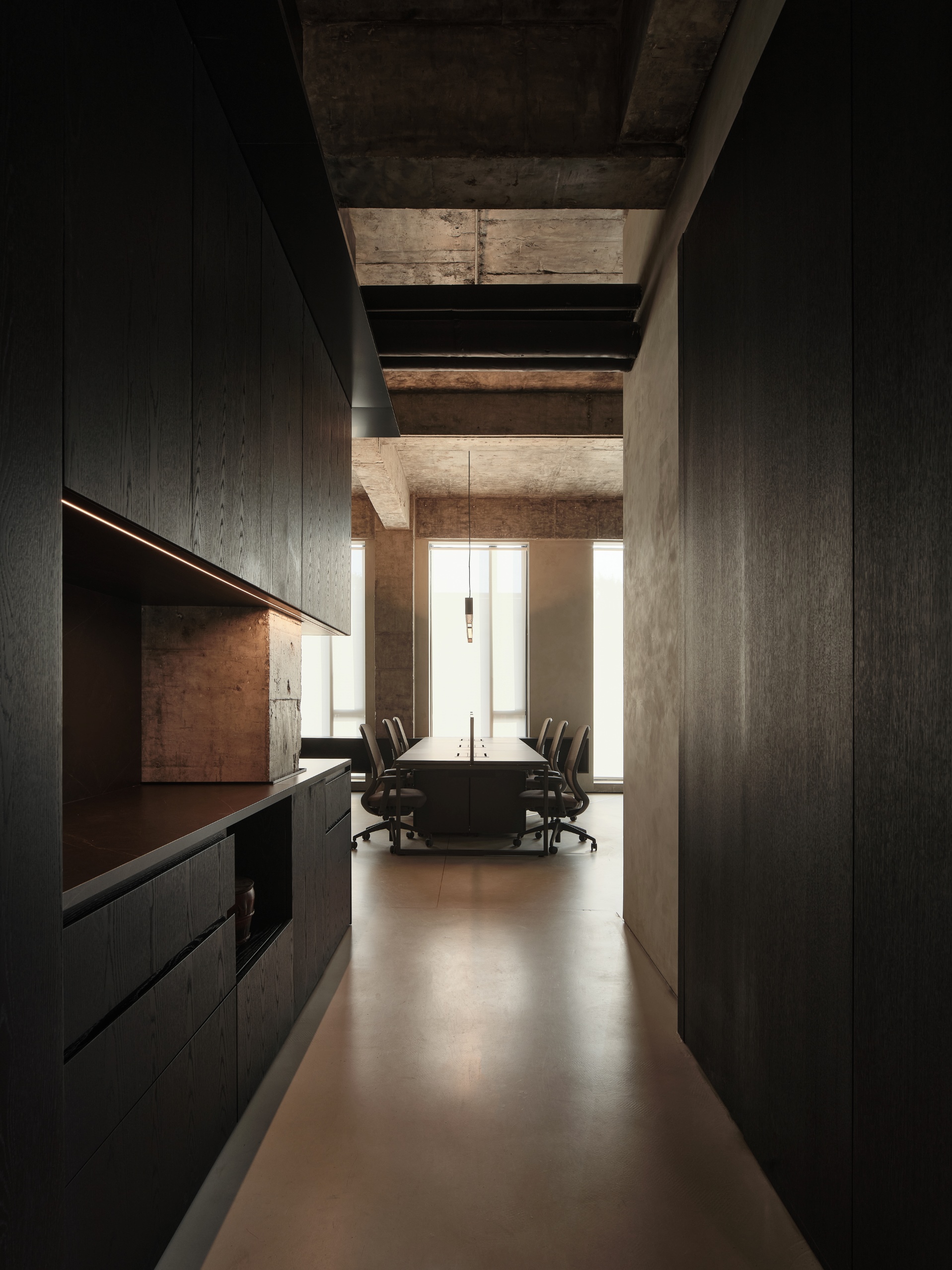
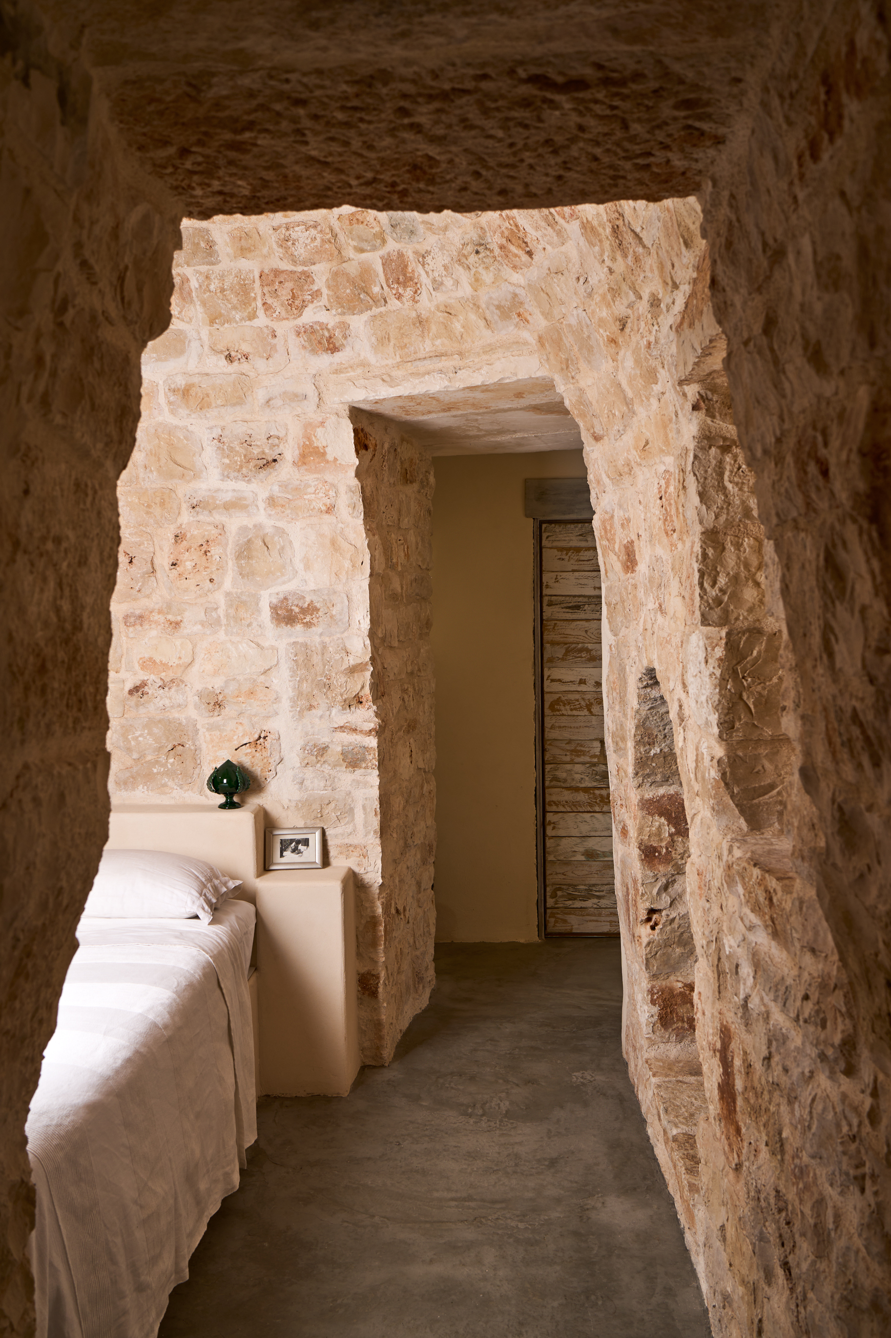
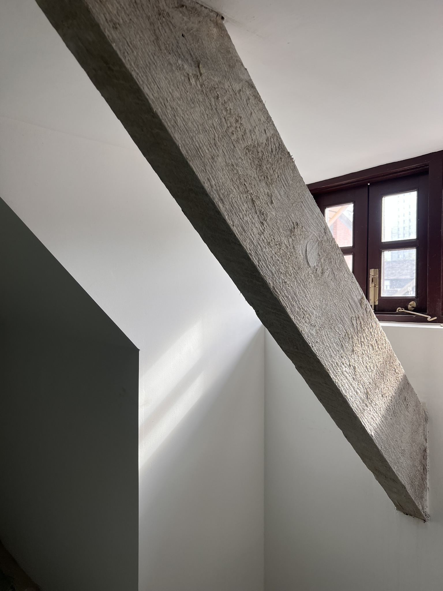
To integrate air-conditioning systems while preserving the original stucco ceilings, suspended ceilings were introduced only in circulation and service spaces within the night area, allowing air vents to be concealed within the walls.
To connect the building systems between the day and night zones, a V-shaped metal element was designed in the entrance. This feature integrates lighting and technical systems, transforming a purely functional requirement into a strong architectural sign.
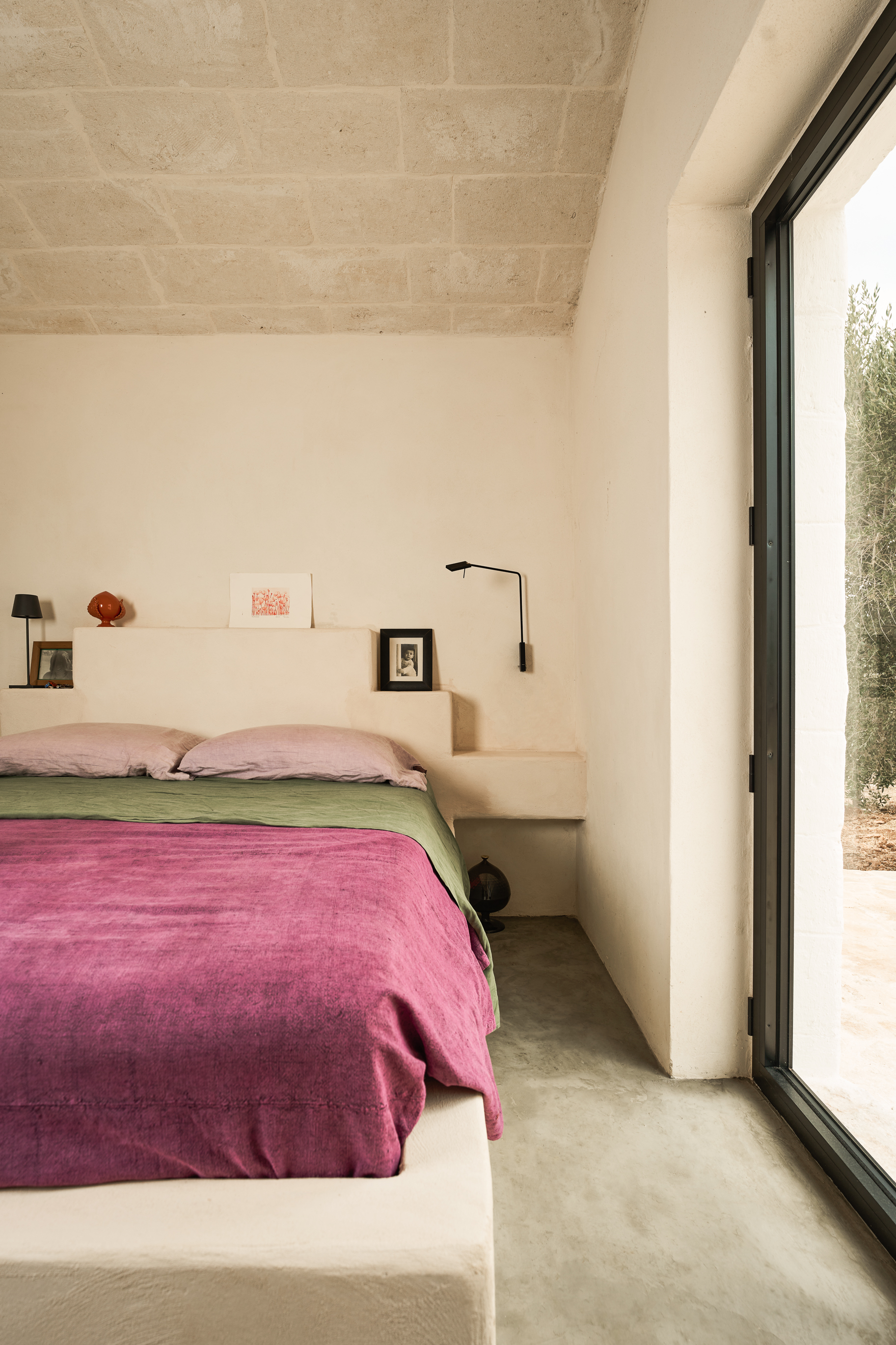
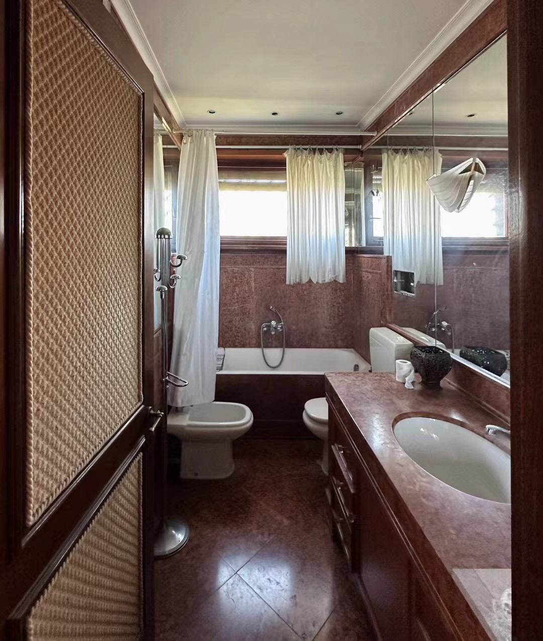
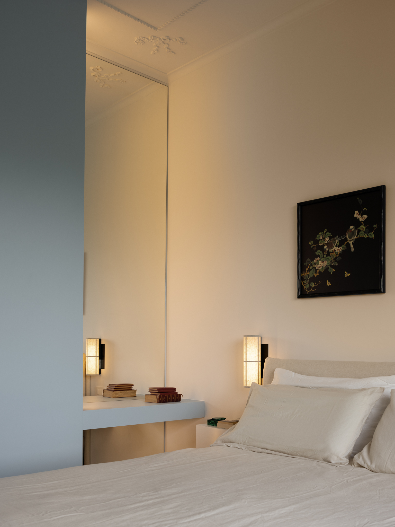
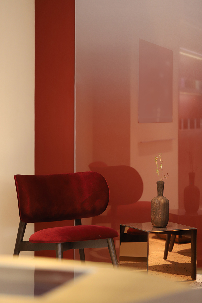
In the master bathroom, the wall was recessed along the line of the original stucco detailing, enlarging the space and creating an elegant vanity area with a mirrored wall. This intervention generated a distinct volume, which was emphasized by painting it blue—the clients’ favorite color—enhancing the contrast with the original ceiling patina and creating a visual connection between the wall and the decorative elements of the master bedroom.
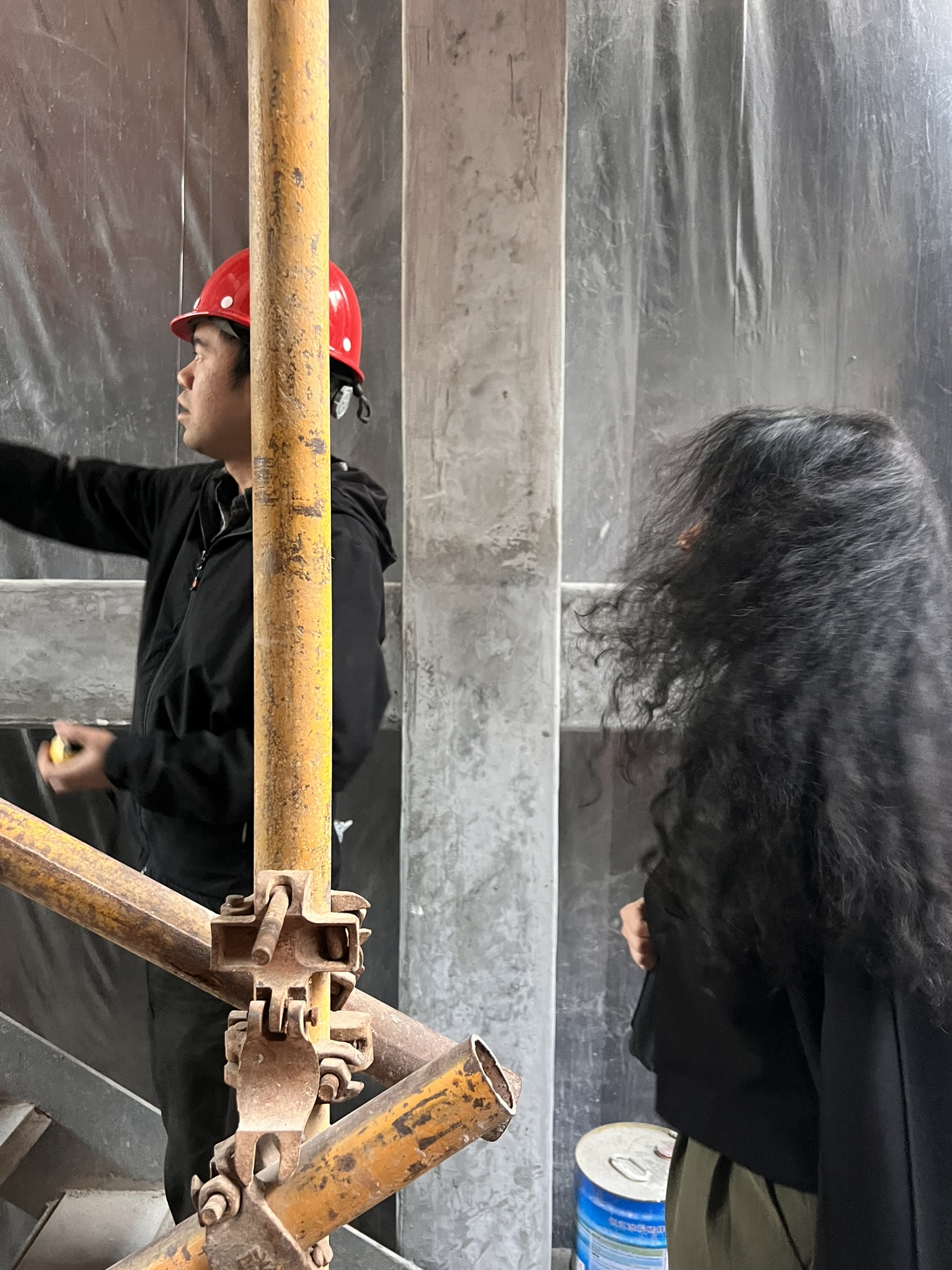
The precision of these interventions was made possible through close collaboration with our Rome-based architect, who directly oversaw all construction phases on site.
A Meeting of Cultures
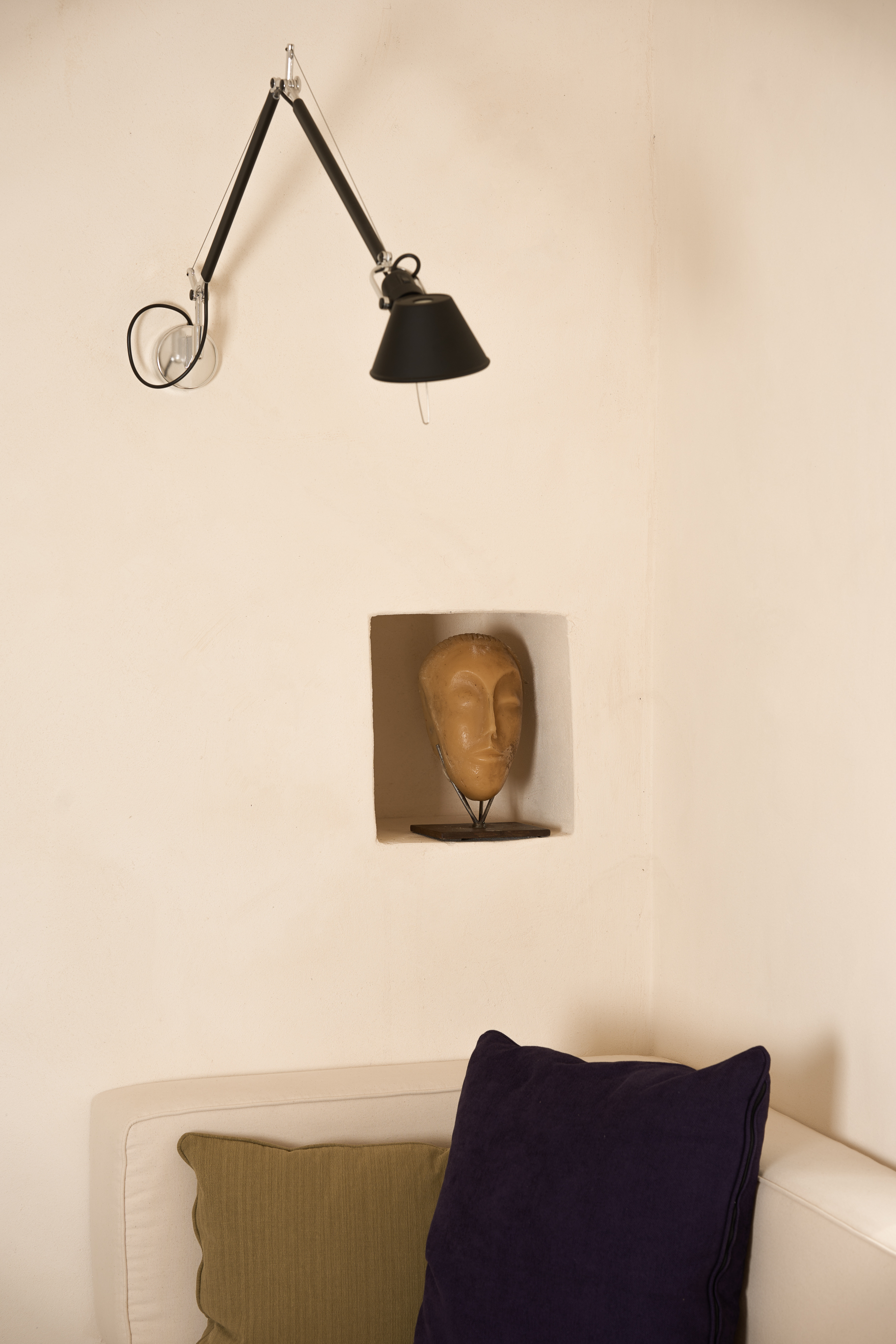
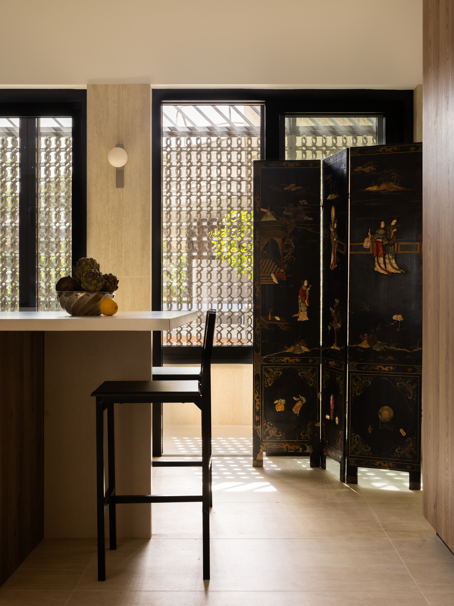
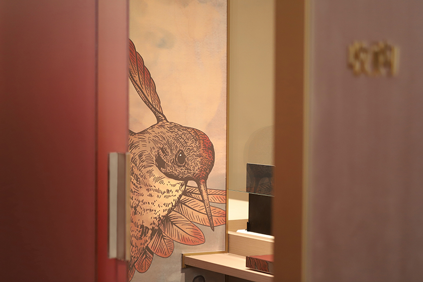
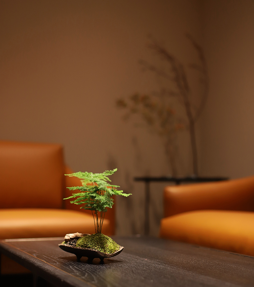
An antique Eastern folding screen inlaid with jade, placed in the kitchen, coexists naturally with family oil paintings in the entrance. Chinese-themed artworks with bamboo frames were introduced in the bedrooms, while a painting depicting the mythological island of Penglai hangs in the living room.
The coexistence of Eastern objects and Roman memories demonstrates that, in this project, cultures do not overlap or compete, but rather complement one another—creating a dialogue shaped by contrasts and harmonies across different eras and traditions.
Light and Atmosphere
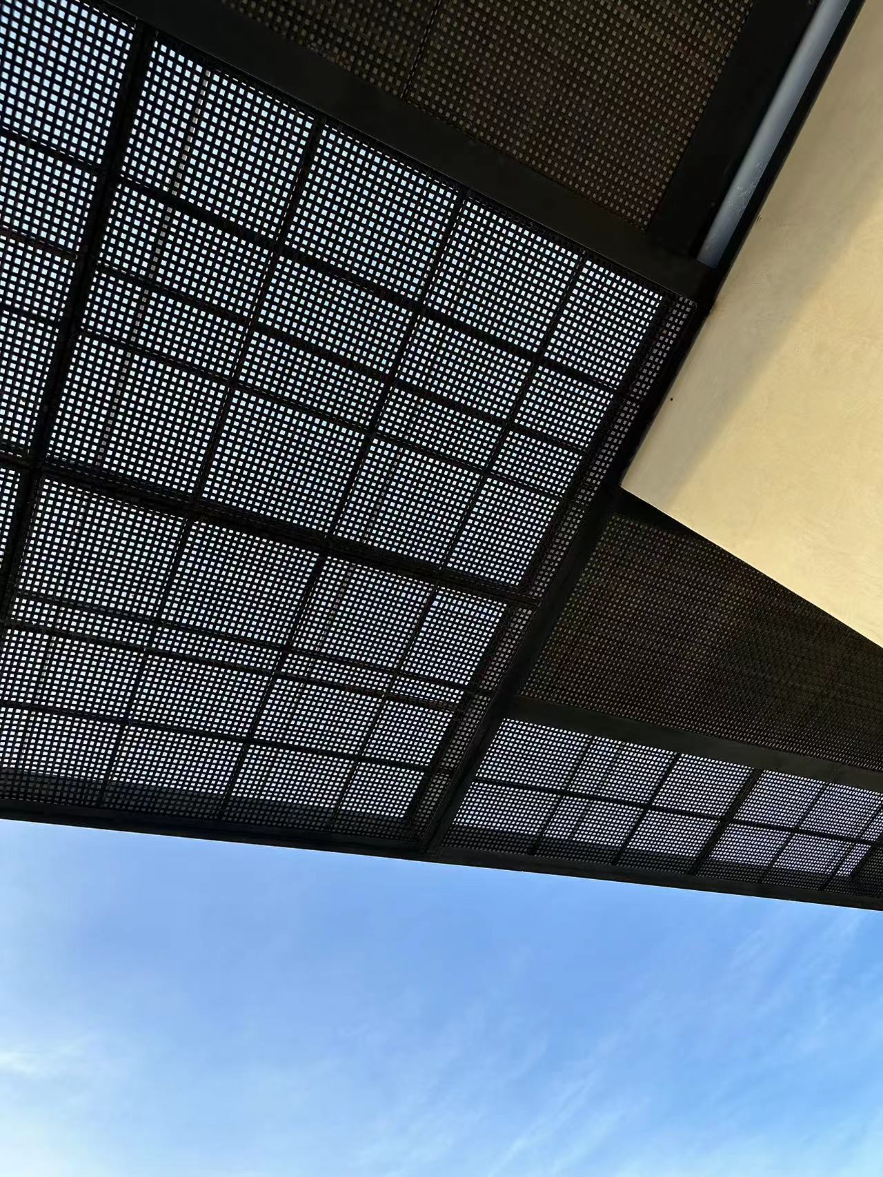
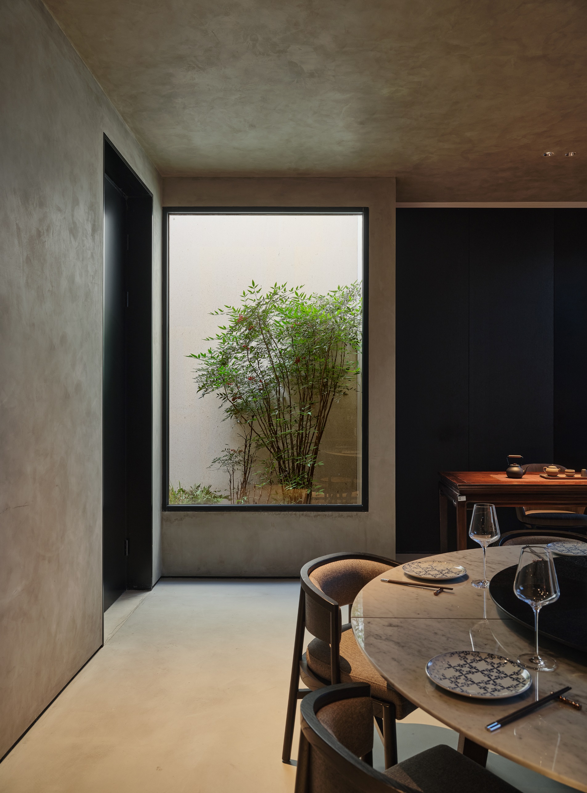
In the kitchen, daylight filters in from the service balcony through original geometric louvers, casting evocative patterns of light during the afternoon. The warm tones of travertine and wood, combined with dark furniture within a predominantly white space, create a welcoming and balanced atmosphere.
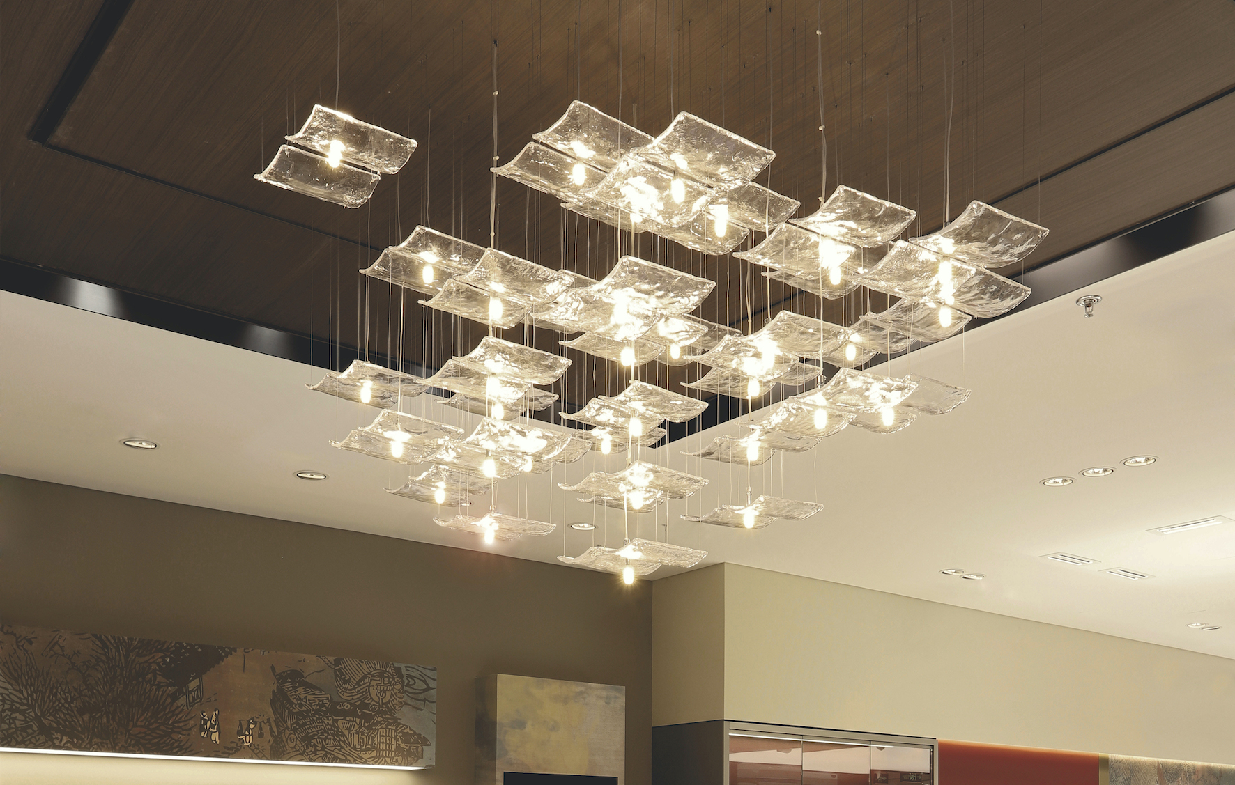
In the living room, artworks in shades of blue—the clients’ preferred color—are illuminated by wall lamps from our own brand, Cao Zi Tou, establishing a delicate equilibrium between East and West.
In this project, Rome is not merely a backdrop but becomes an integral part of the architectural language. Travertine extracted from local quarries engages in dialogue with Eastern jade screens; original stucco coexists with contemporary steel; Roman traditions merge with the philosophy of feng shui.
Rather than imposing a vision, we chose to listen—to the history of the building, to the desires of the family, and to the silent dialogue between two cultures that may seem distant yet resonate deeply with one another. The resulting space belongs neither exclusively to the East nor to the West, but instead naturally inhabits the rich and hybrid territory that emerges when cultures meet with respect and curiosity.
In an era of increasing globalization, this Roman apartment demonstrates that cultural integration in design does not mean uniformity, but rather the ability to create new languages through dialogue.
一套位于罗马、建于20世纪50年代的公寓,成为一场东西方对话的舞台——每一个设计选择,都是一段文化融合的叙事。
作为一家根植于欧洲的国际设计事务所,我们的团队中有多位成员来自意大利,尤其是罗马。多年来,我们始终与这座城市保持着紧密联系,这也得益于我们有一位长期驻扎在罗马的建筑师。
当生活在东方的建筑师回到自己的文化原乡进行设计时,原本清晰的文化边界逐渐消融,项目本身也演变为两个世界之间的对话——我们得以通过跨文化的视角,重新发现传统在当代语境中的价值。
这是我们在意大利完成的第二个项目,也是第一个落地于首都罗马的作品。
这套公寓建于20世纪50年代,位于罗马北部、靠近 Via Cassia 的区域,居住者是一对育有双胞胎的夫妇。原始空间保留了典型的意大利住宅风格:精致的灰泥天花、装饰性线脚以及深色木地板。我们最大限度地保留了这些历史元素,仅通过克制而精准的介入,使空间更好地适应当代家庭的生活方式。
生活与共享的空间
业主希望住宅成为一个鼓励交流与共享的场所,而餐桌正是家的核心。我们拆除了客厅与厨房之间的隔墙,将原本的佣人房改造为客用卫生间,打造出一个宽敞的餐厨一体空间,并设置了一座设备齐全的大型中岛,以回应业主对烹饪的热爱。
餐桌另一侧,穿过原有的拱门,是更为私密的客厅区域,摆放着沙发,成为家人放松相聚的空间。厨房与客厅分别位于餐桌两侧,地位同等却功能不同,在热闹与静谧之间形成恰到好处的平衡。
古与今的对话
罗马是一座在古老遗迹之上不断生长的城市,历史与现代在此并存。我们选择保留并强化部分原有元素,同时引入金属、洞石等新材料,呼应罗马的城市身份。
从入口进入,沿着斜向铺设的木地板(延续原始布局),客厅中装饰性的拱门与厨房极简的门洞彼此对话,构成过去与当下的相遇。点状而碎片化的设计介入,灵感来自罗马遗址的空间语言,打破并重组空间秩序,为室内注入动态感。洞石成为贯穿始终的线索,将现代体量与历史构件串联起来,在不同时代之间取得平衡。
洞石,空间的主角
洞石作为罗马建筑中最具代表性的材料,被策略性地运用于入口、厨房、客厅及卫生间之中,用于分隔墙体、沙发背景以及墙面饰面,将罗马的城市性重新带回室内。
在入口处,全新的洞石隔墙取代了原有实体墙,既作为视觉与功能的过滤层,又重新定义了空间关系。圆角处理减轻了体量感,中部的金属书架则允许视线穿透,使整体更加轻盈,同时巧妙地将东方风水理念与西方对隐私的理解融合在一起。
精准而克制的介入
为了在保留原有灰泥装饰的前提下整合空调系统,我们仅在卧室区域的交通与服务空间设置局部吊顶,将送风口隐藏于墙体之中。
而为了解决日夜功能区之间的机电连接问题,我们在入口处设计了一件 V 形金属构件,将照明与管线整合其中,将技术需求转化为清晰而有力的建筑符号。
在主卧卫生间中,我们沿着原有灰泥线条后退墙体,扩大了空间,并形成一处优雅的洗漱区,搭配整面镜墙。这个新生成的体量被涂成业主偏爱的蓝色,与天花原有的历史肌理形成鲜明对比,同时在视觉上与主卧的装饰细节建立呼应。所有这些精确的改动,都得益于我们驻罗马建筑师对施工全过程的直接参与。
文化的相遇
厨房中,一扇镶嵌着玉石的东方古屏风,与入口处的家族油画自然共存;卧室内陈列着带有中国元素、以竹制画框装裱的艺术作品;客厅中则悬挂着描绘中国神话中蓬莱仙岛的画作。
东方器物与罗马记忆在此并非简单叠加,而是彼此补充,在差异与和谐之间展开对话,跨越时代与文化。
光线与氛围
厨房的光线透过服务阳台的百叶窗进入,原有的几何纹样在午后投射出富有层次的光影。洞石与木材的温暖色调,与深色家具和以白色为主的墙面相互平衡,营造出舒适而克制的氛围。
在客厅,业主偏爱的蓝色调艺术作品由我们自有品牌 「草字头 Cao Zi Tou」 的壁灯照亮,在东方与西方之间形成细腻而安静的平衡。
结语
在这个项目中,罗马不仅是背景,更成为建筑语言本身的一部分。取自本地采石场的洞石与东方玉屏相互对话,原有灰泥与当代钢材并置,罗马传统与风水哲学相互交融。
我们并未试图强加某种立场,而是选择倾听——倾听建筑本身的历史、家庭的生活需求,以及两种看似遥远却彼此回应的文化之间的无声对话。最终呈现的空间,既不完全属于东方,也不完全属于西方,而是自然栖居于一个由尊重与好奇所孕育的、丰盈而开放的文化交汇之地。
在全球化日益加深的今天,这套罗马公寓证明:设计中的文化融合并非走向同质化,而是通过对话,创造新的语言。


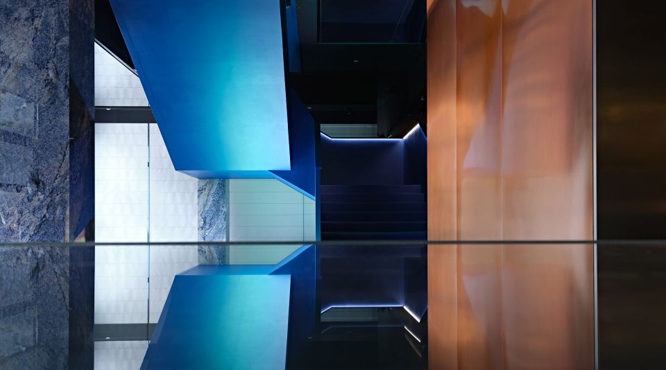
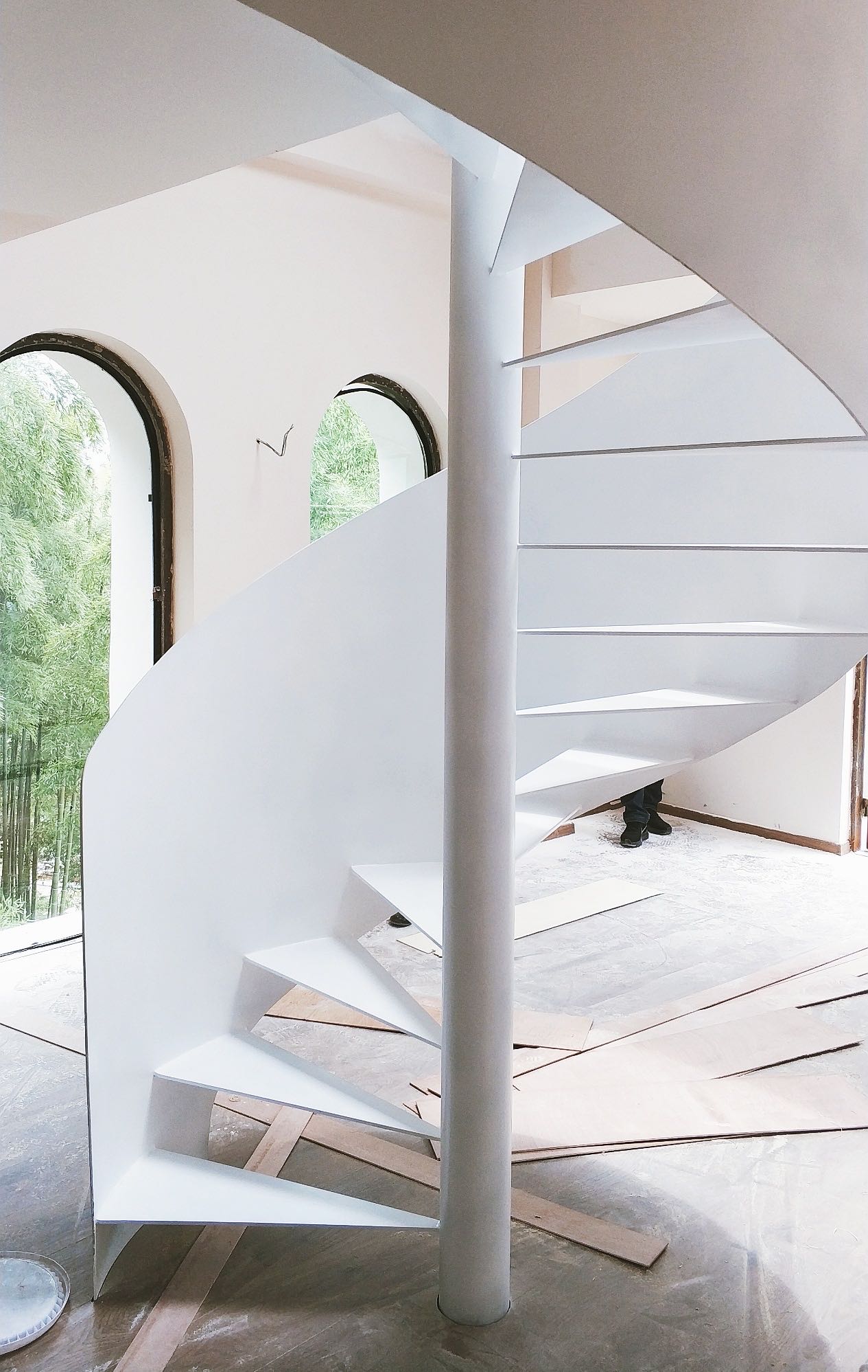
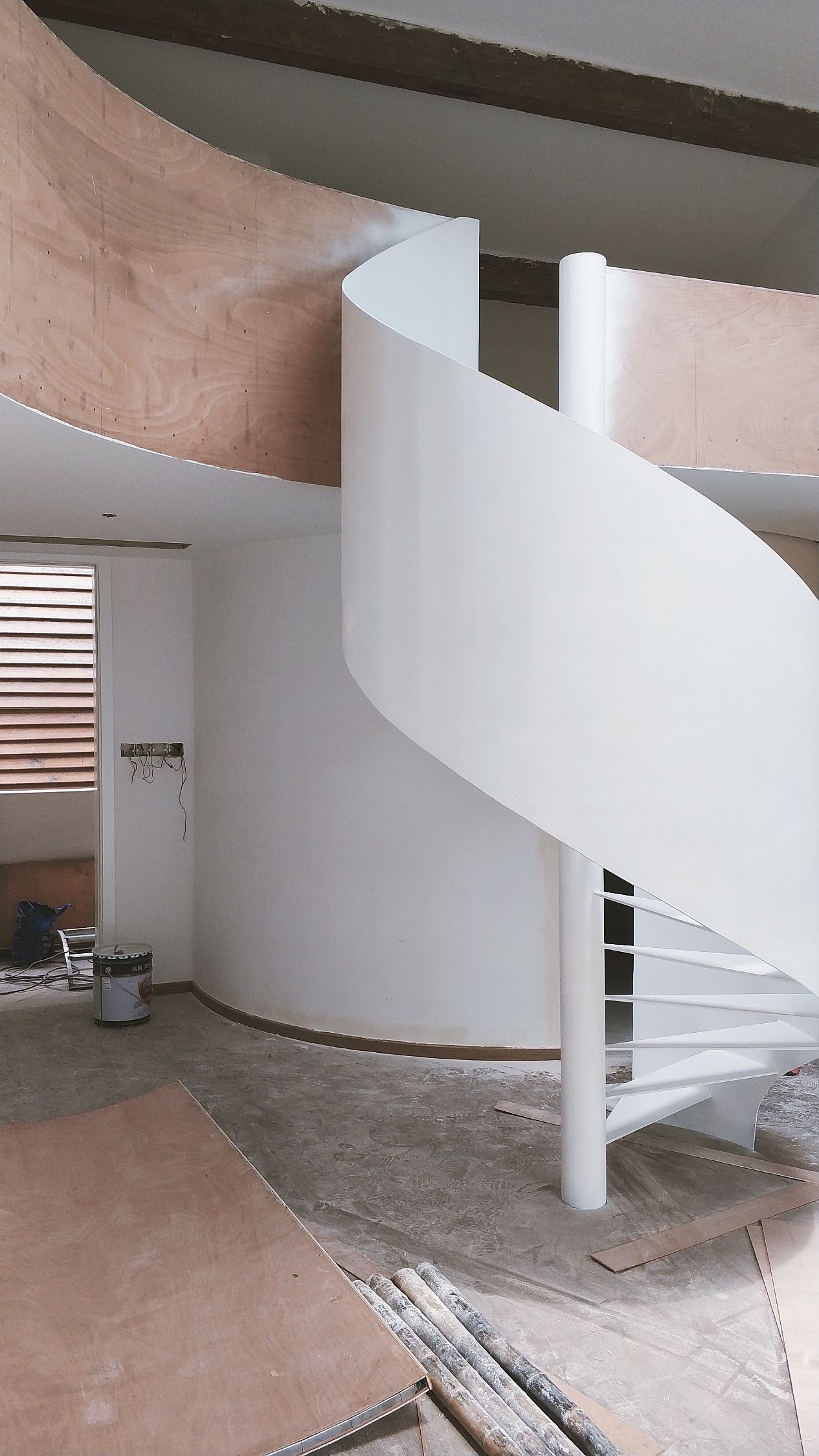
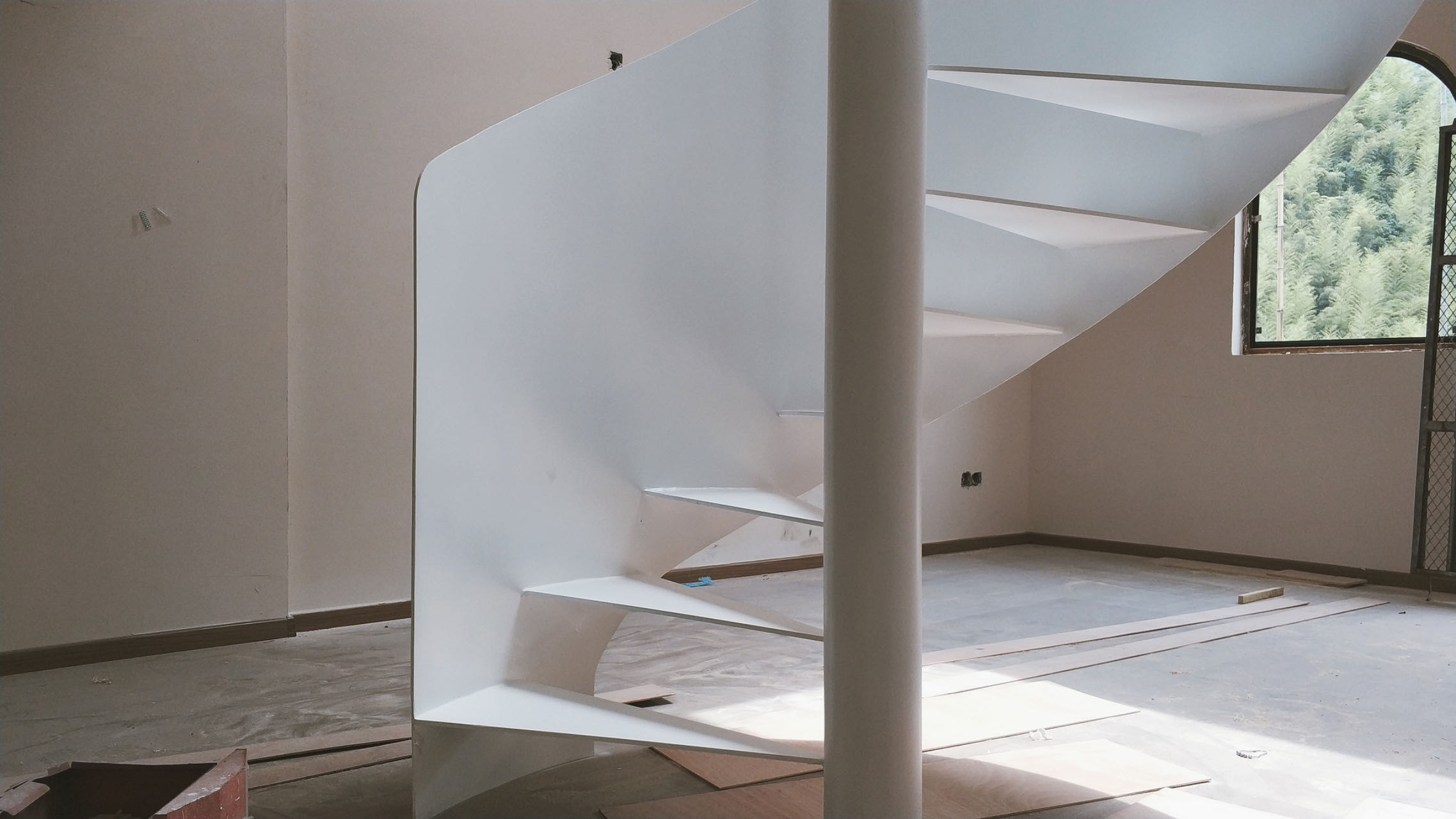
1F stairs floating above phenomenon video 一楼自然现象画面上的悬浮楼梯-1")