


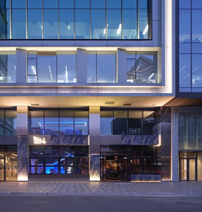
LOCATION 地址 | BEIJING 北京
CATEGORY 类型 | RETAIL 零售
INTERIOR 室内设计
FEE 软装设计
AREA 400 m²
READ MORE 更多
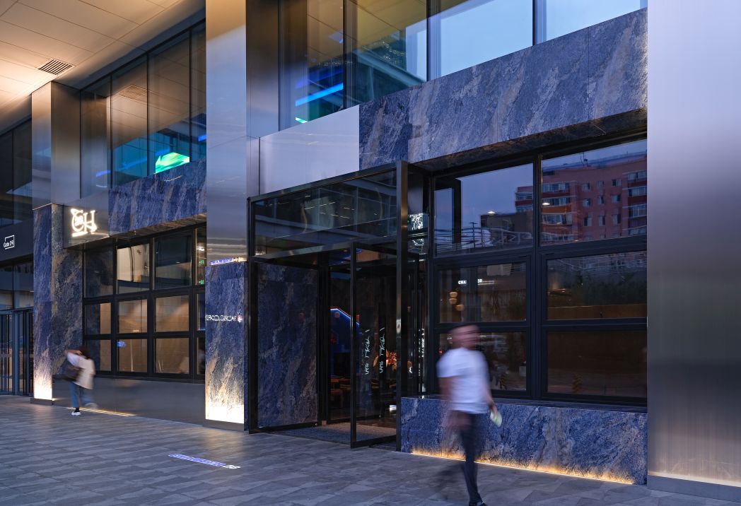
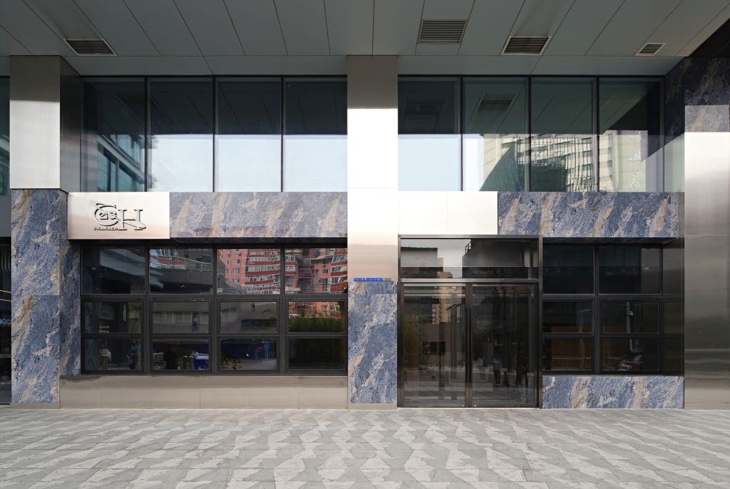
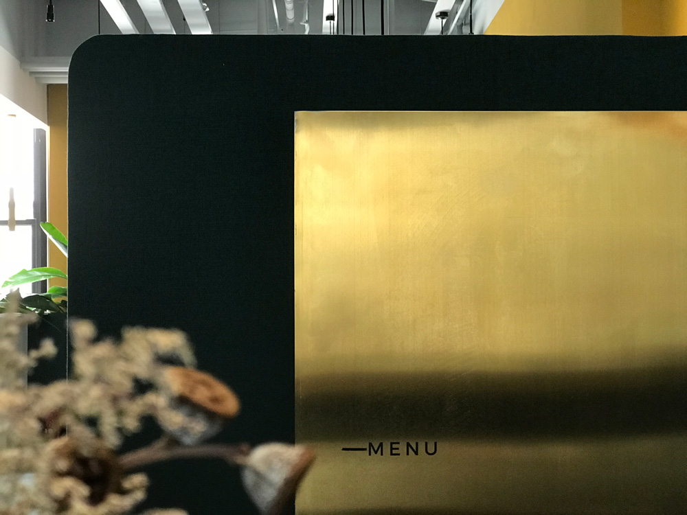
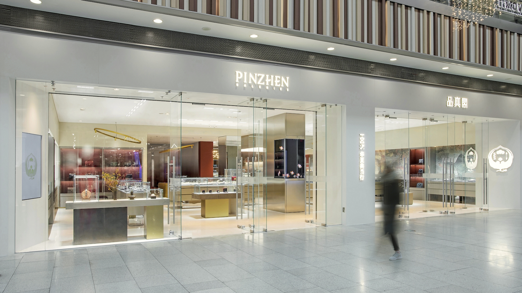
PINZHEN GALERIES Flagship Store in Beijing
——A poetic interpretation of East and West integration
PINZHEN GALERIES, formerly known as Huaxia Pawnshop, is a jewellery, and luxury goods distribution and service platform with a history of 25 years and a wide range of businesses including pawning, retail, appraisal, maintenance and other services. It is a new retail form advocating a more sustainable product circulation lifestyle. The original brand image resembled a pure Chinese style and was familiar to and well-received by many consumers. Through the brand upgrade, the biggest challenge was to inherit the traditional elements from the brand’s past, and combine them with a new contemporary and international image.
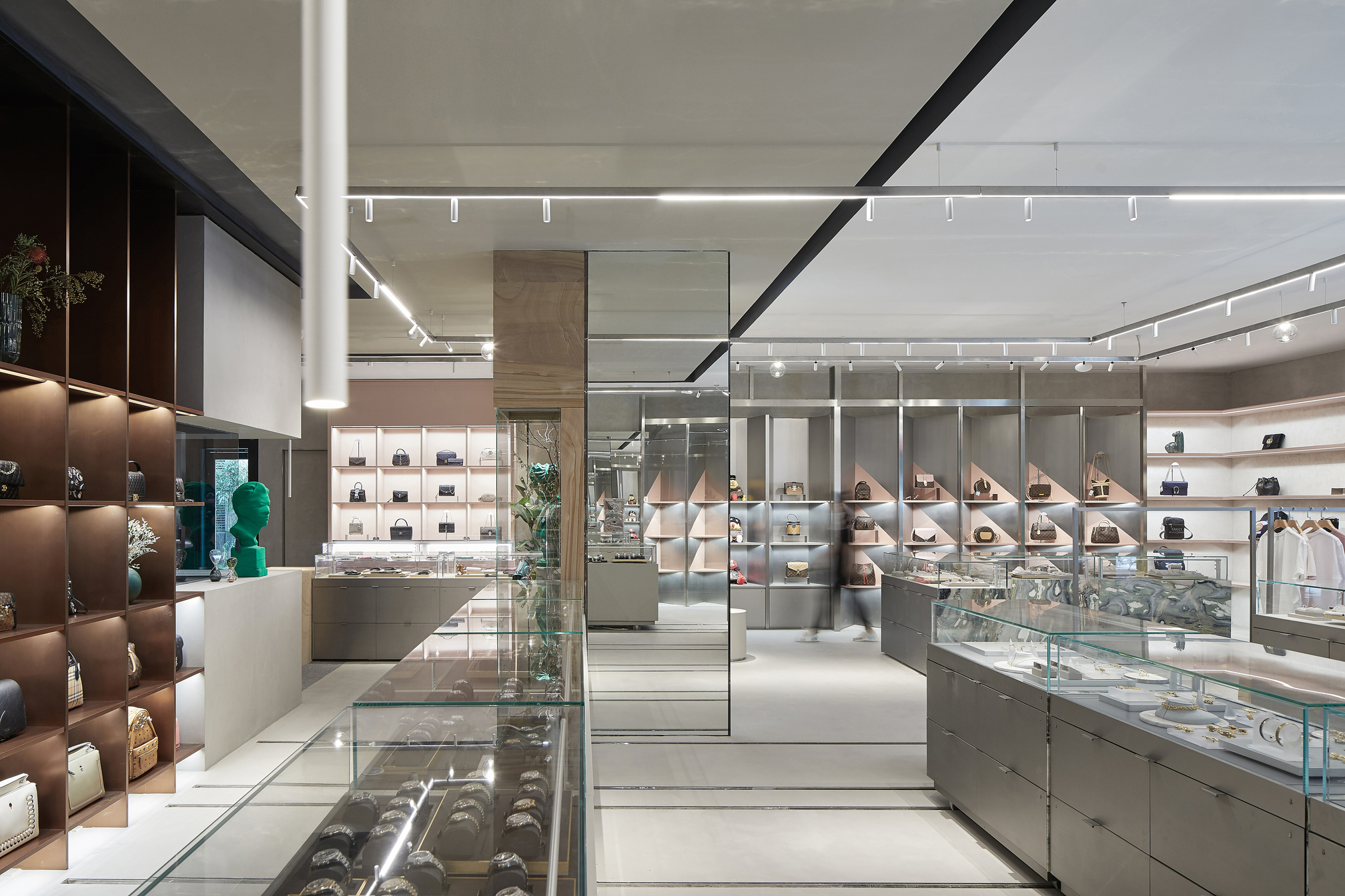
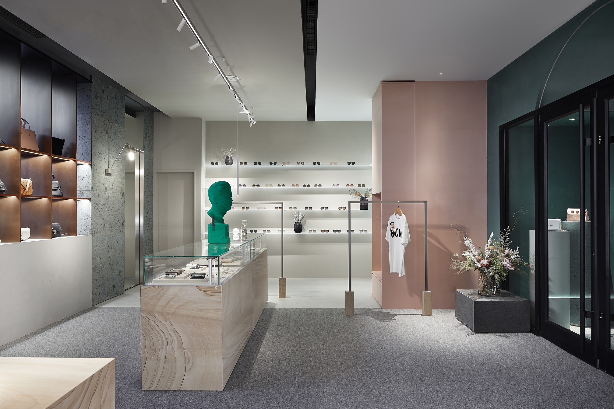
STUDIO8 believes that the boundaries between cultures are becoming more and more blurred in the contemporary era; however, this does not mean that traditions will be forgotten. Instead it is more likely to see diverse and inclusive cultures and styles harmoniously mixed together. STUDIO8 is a multi-cultural and multi-disciplinary design team established in Shanghai. The practice has always adhered to contemporary design philosophy with respect to traditional local culture and brand culture. Therefore, in the design process, how to integrate traditional and modern, eastern and western cultures has become the focus of the design. STUDIO8 also noticed that PINZHEN’s products range from gold, amber and jade to precious stones, diamonds and platinum, as well as watches, purses and suitcases, which are from many categories, are comprised of many materials and styles, and target different customers. In order to organise and sort them out in the space, the team analysed the tonalities and textures of the all products and arranged them from light to dark, cold to warm, contemporary to traditional, and youthful to mature.
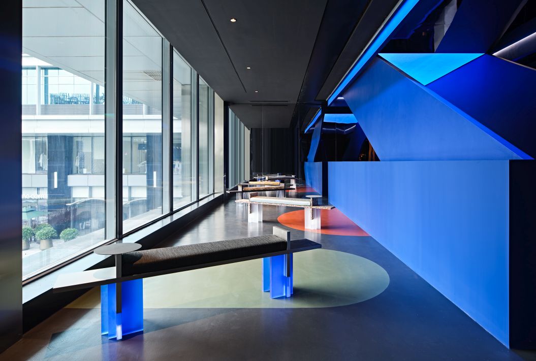
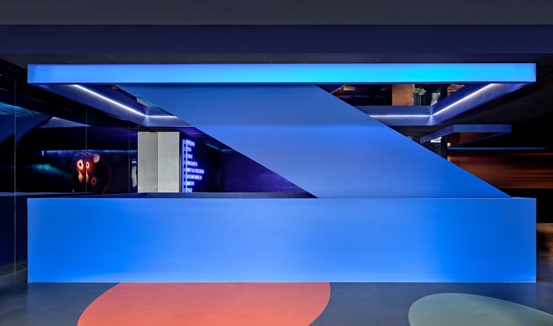
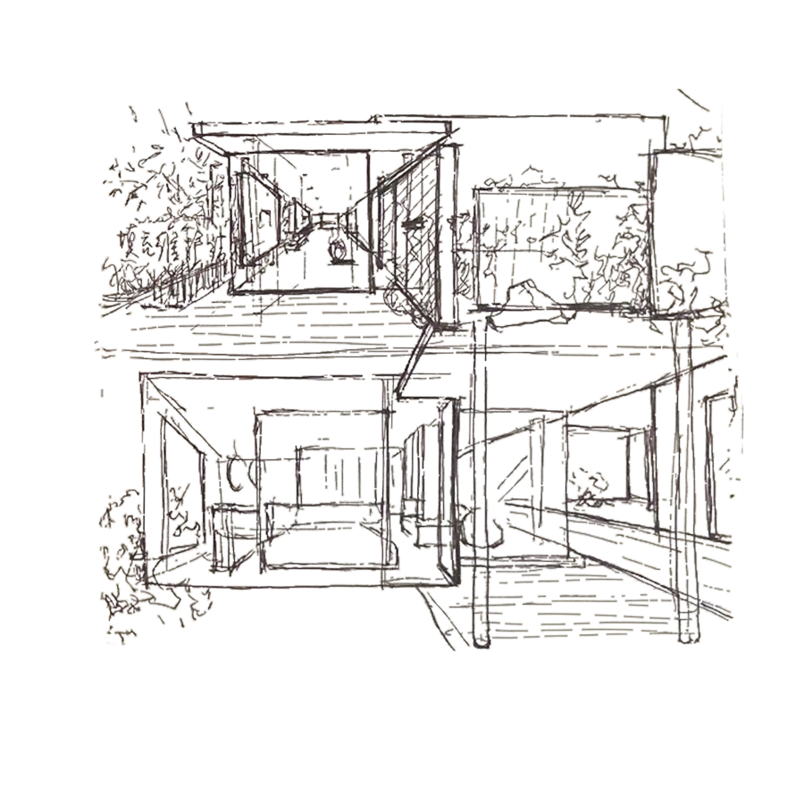
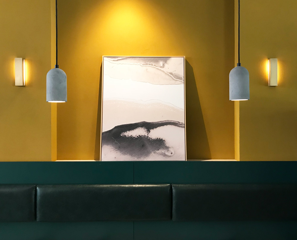
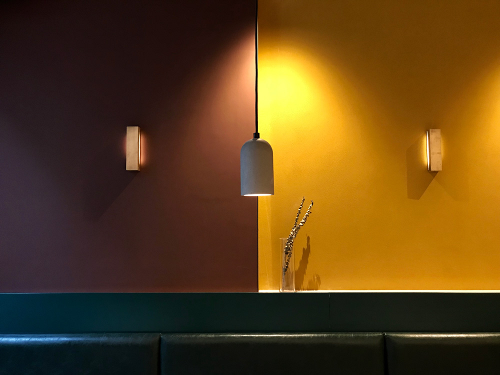
In the new design, Studio8 did not simply divide the shop into different areas, created a linear gradient change from the entrance to the back of the shop, which also became the core design concept of the space; the colour of the spaces and the material of the props change from light to dark, from cold to warm, from contemporary to traditional, with products displayed in corresponding tones. The gradual change of style was formed to stimulate the deep subconscious aesthetic preferences of consumers. The overall layout of the store follows the simple and traditional counter display format of PINZHEN, keeping the shopping environment familiar while subtly guiding consumers to areas that are most in line with their own tastes.
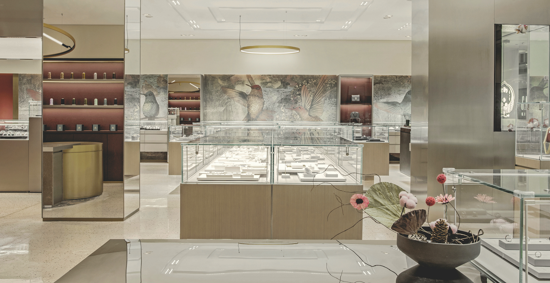
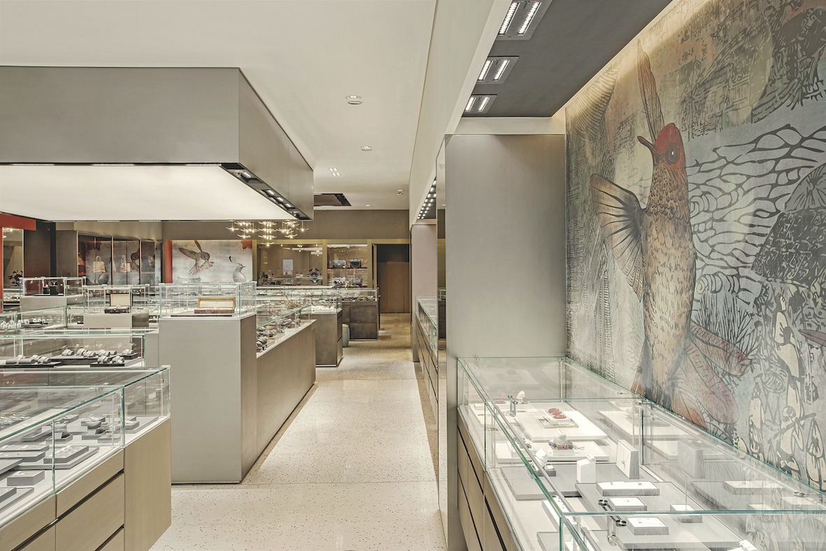
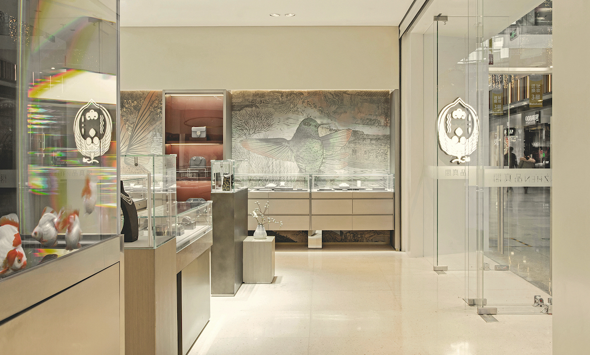
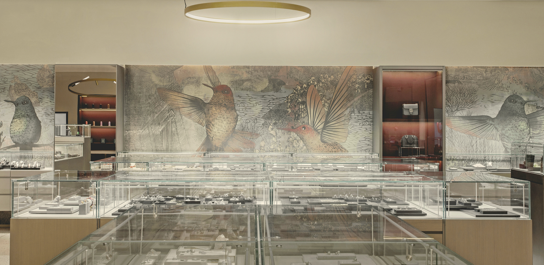
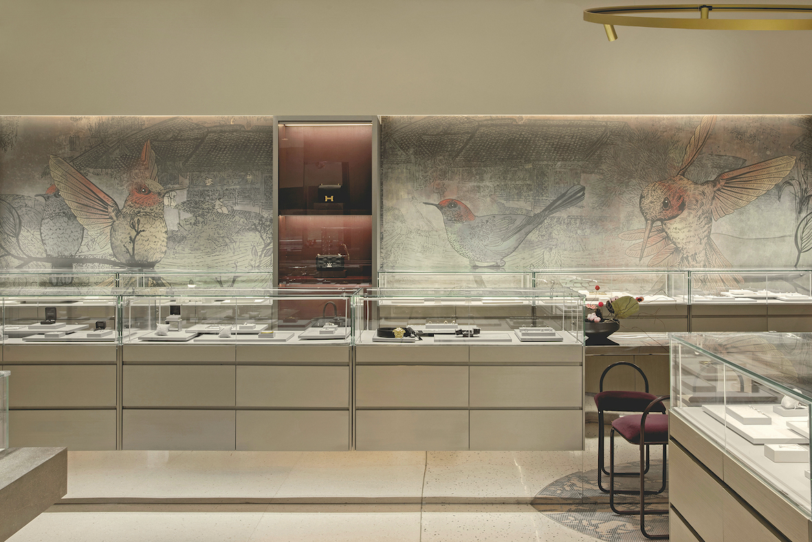
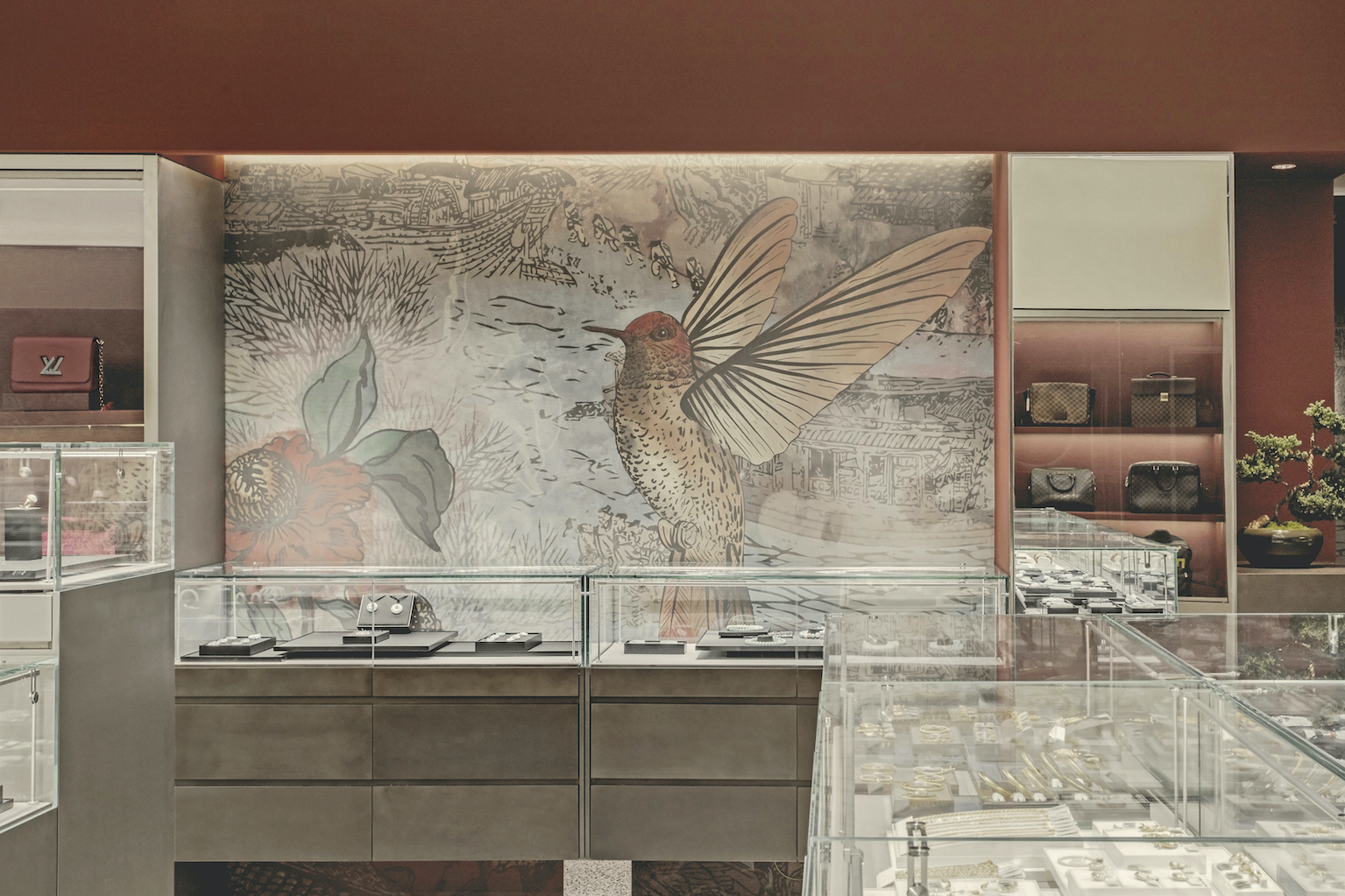
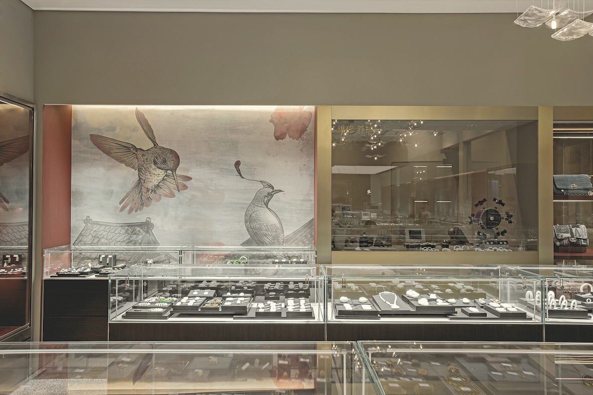
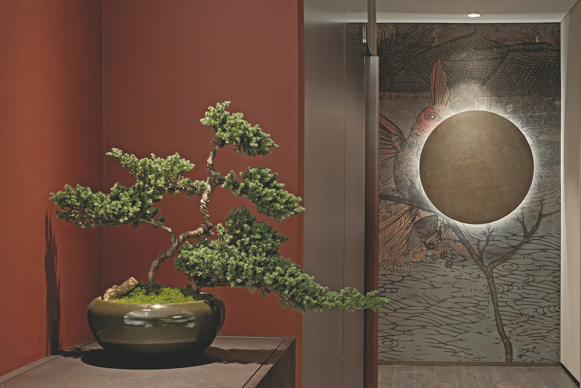
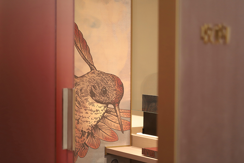
As the flagship location for the brand, the store takes the phoenix as the logo for the new brand image, in reference to “The Immortal Riding a Phoenix”, a Chinese imperial roof decoration that “overlooks all beings” and symbolises the luxuriousness of the brand. In order to integrate the original brand image inspired by “Along the River During the Qingming Festival” (清明上河图), STUDIO8 also decided to adopt representative sections of the famous Chinese painting as a background, overlaying imagery of birds in different poses from the story of “All Birds Paying Homage to the Phoenix” (百鸟朝凤). Created as a poetic visual graphic for the brand, the custom-made wallpaper runs through and connects the entire shop like an unfolded Chinese scroll with both contemporary and traditional motifs, telling the story of the brand and paying tribute to traditional Chinese culture.
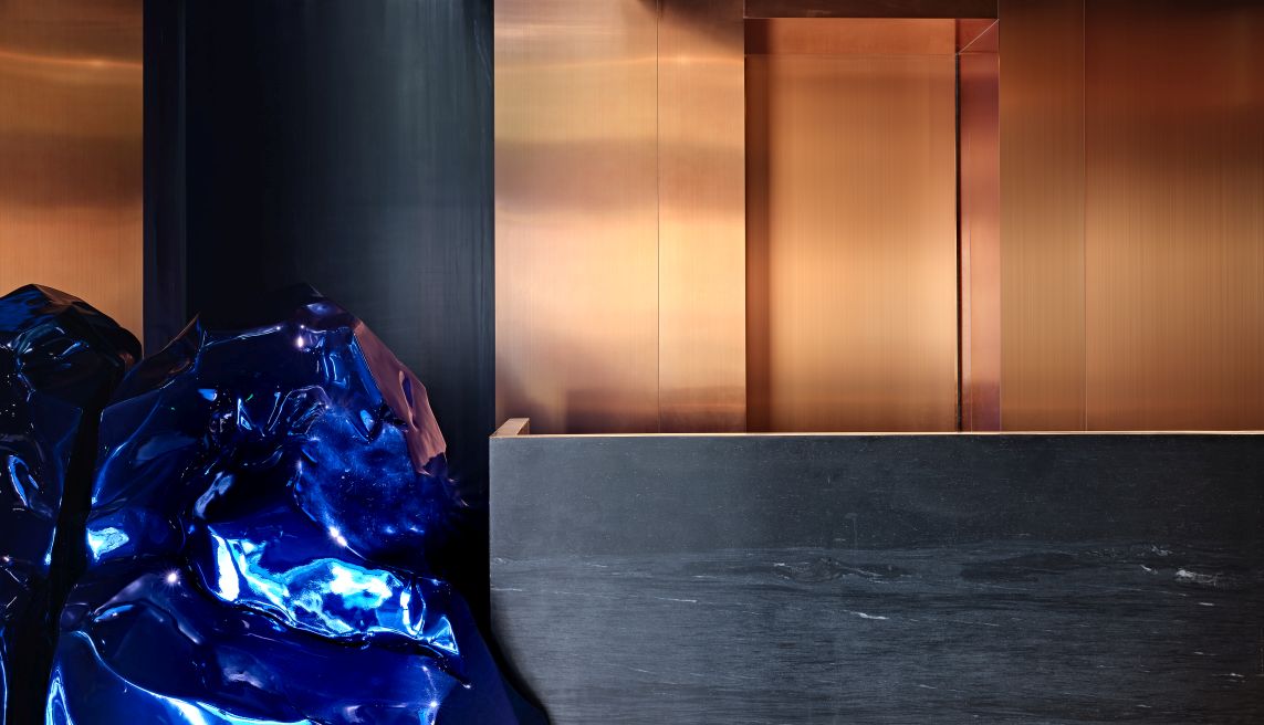
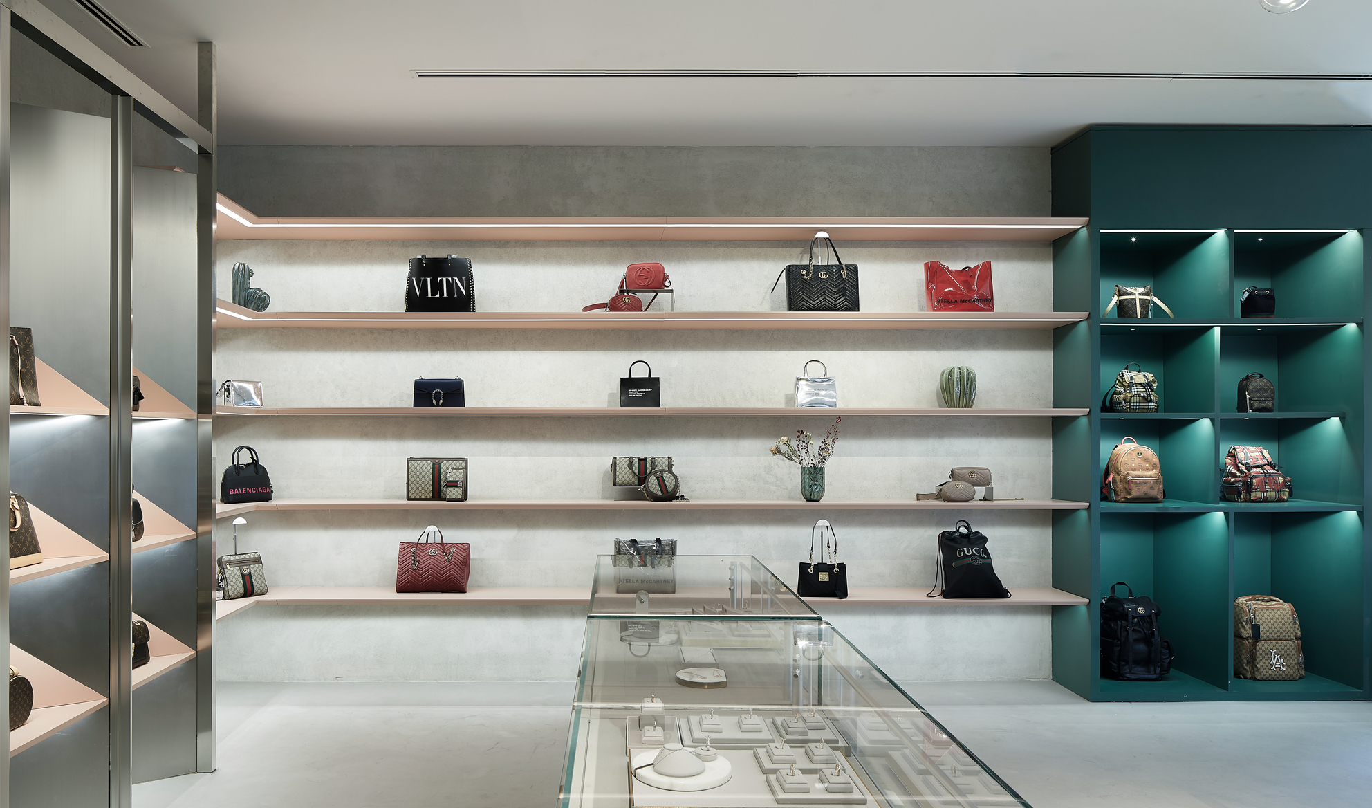
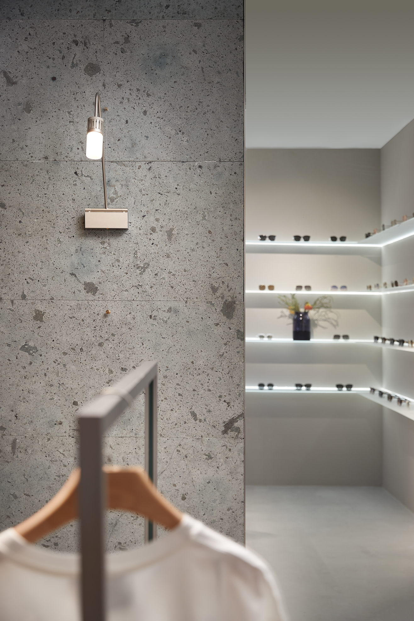
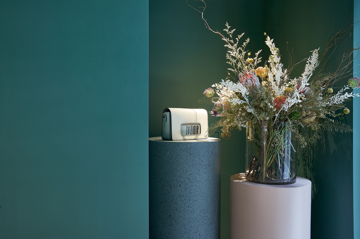
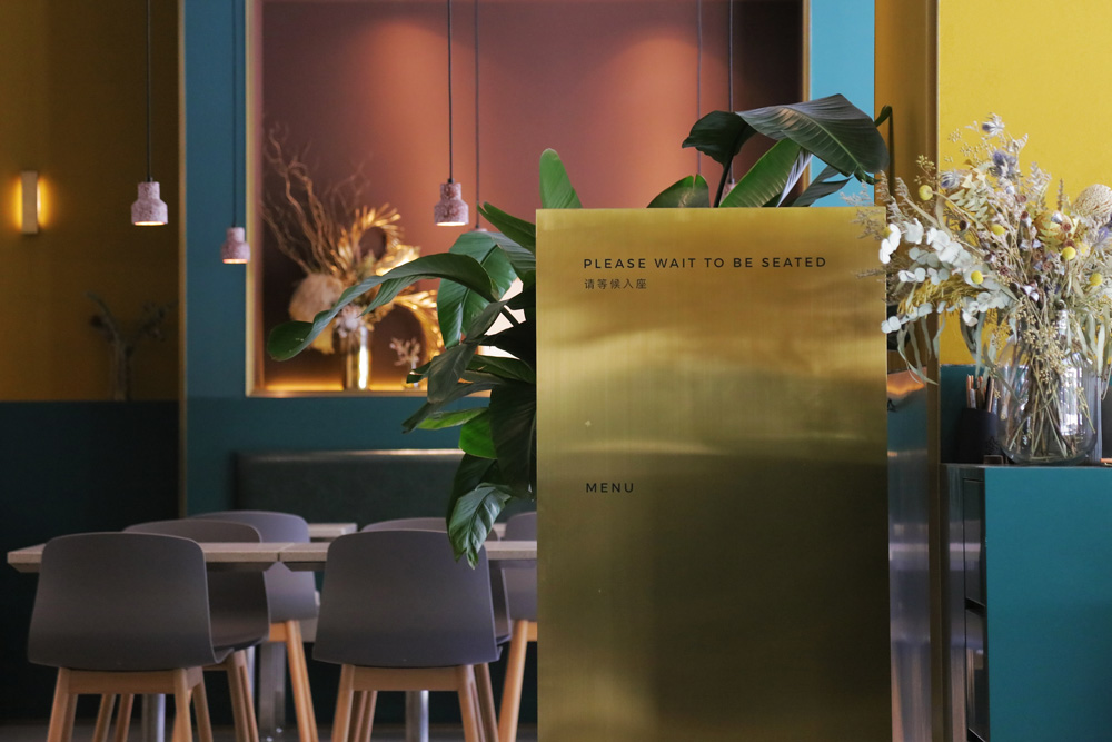
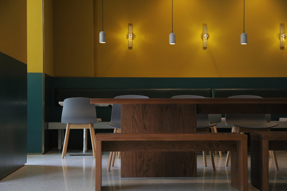
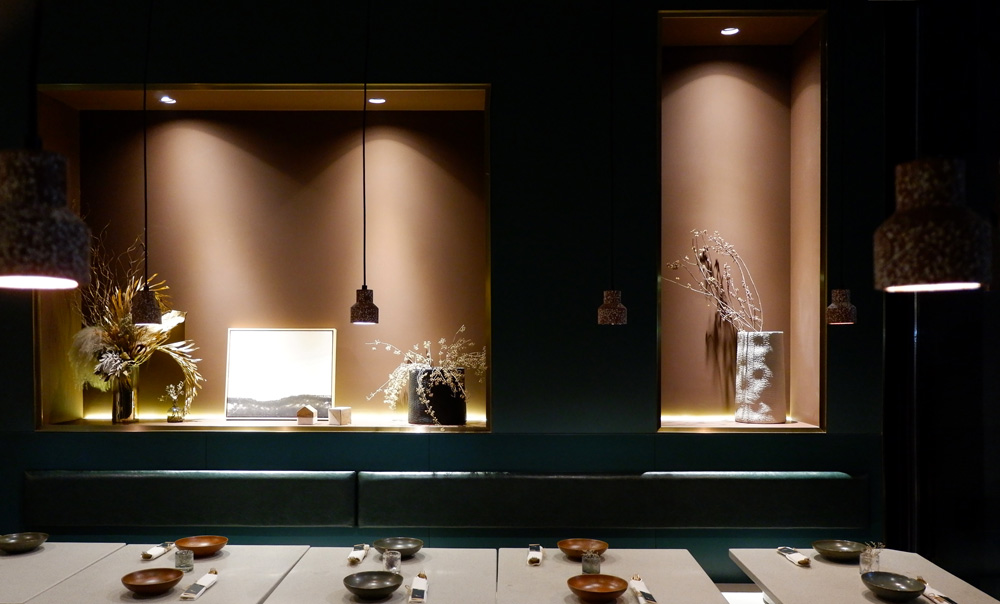
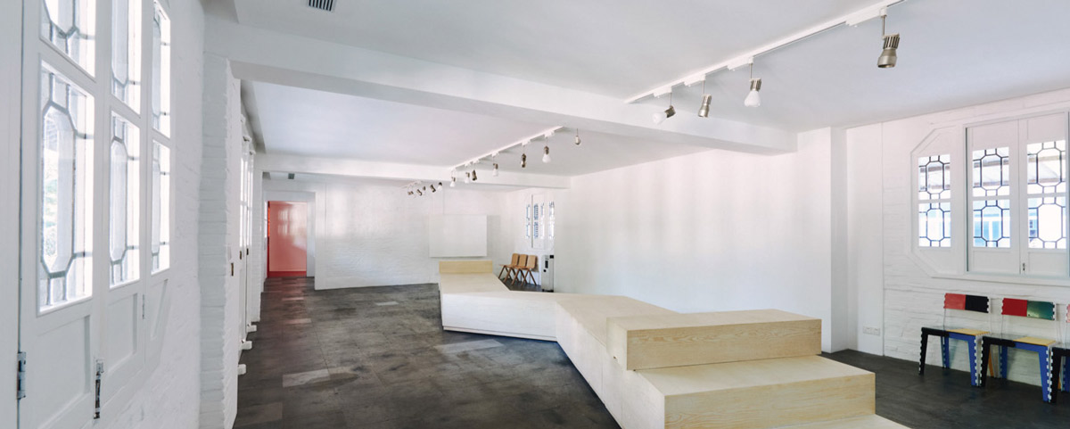
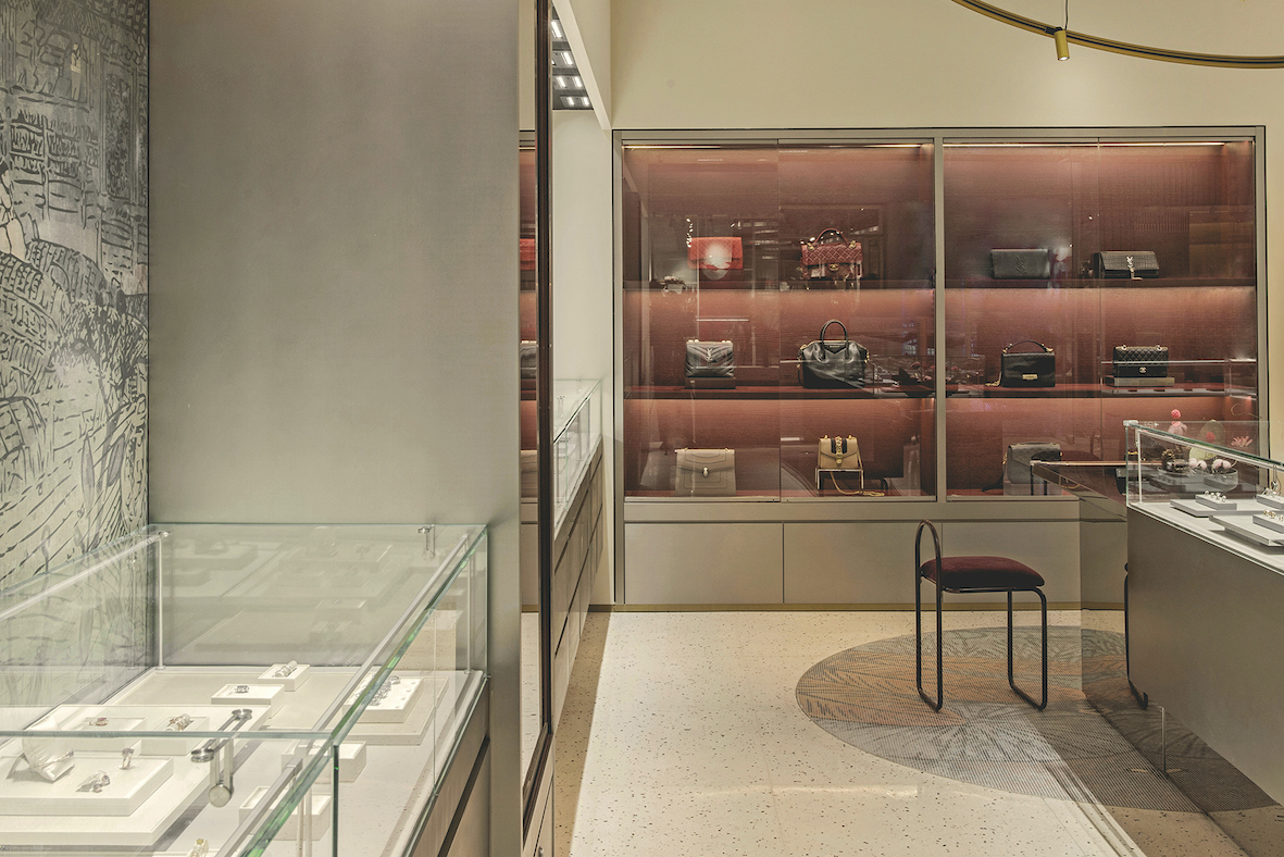
Following the gradual change from light and contemporary, to dark and traditional in the whole shop, the Entrance is a light coloured area with counters made of stainless steel and light wood grain. In the middle of the Front Area, STUDIO8 designed a stainless steel column with a fish tank, which is one of the elements used in older PINZHEN shops to welcome customers. There is also a comprehensive service counter in the Front Area to provide customers with packaging and consulting services. Three golden ring-shaped modern pendant lamps, combined with a customised floor mosaic, not only add dynamism and movement to the space, but also help in highlighting the key areas.
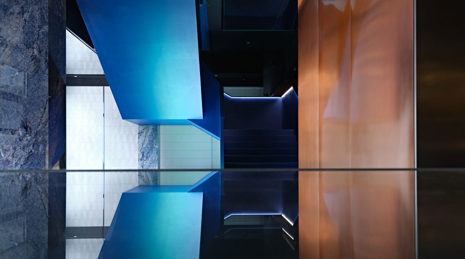
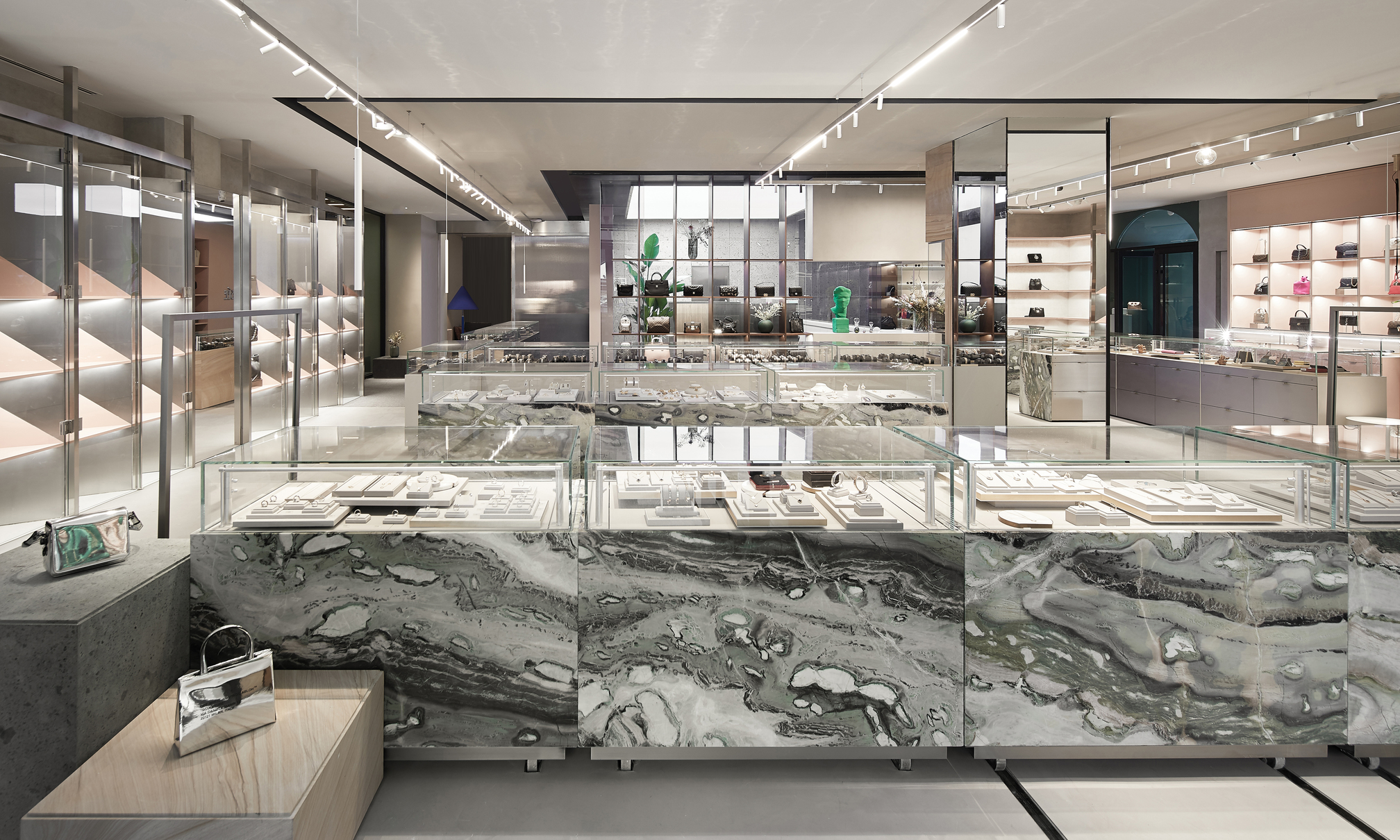
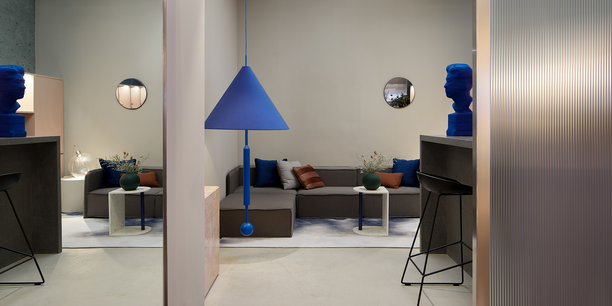
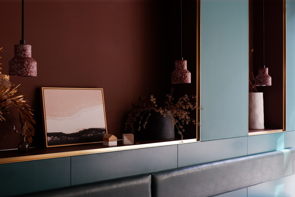
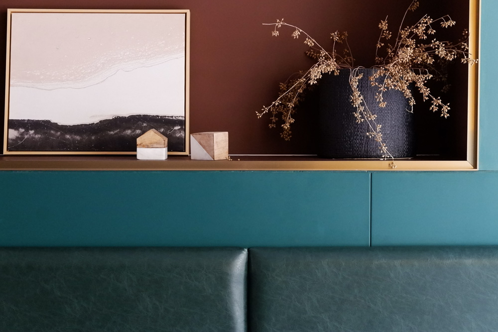
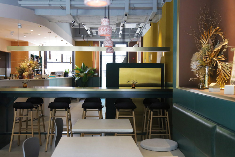
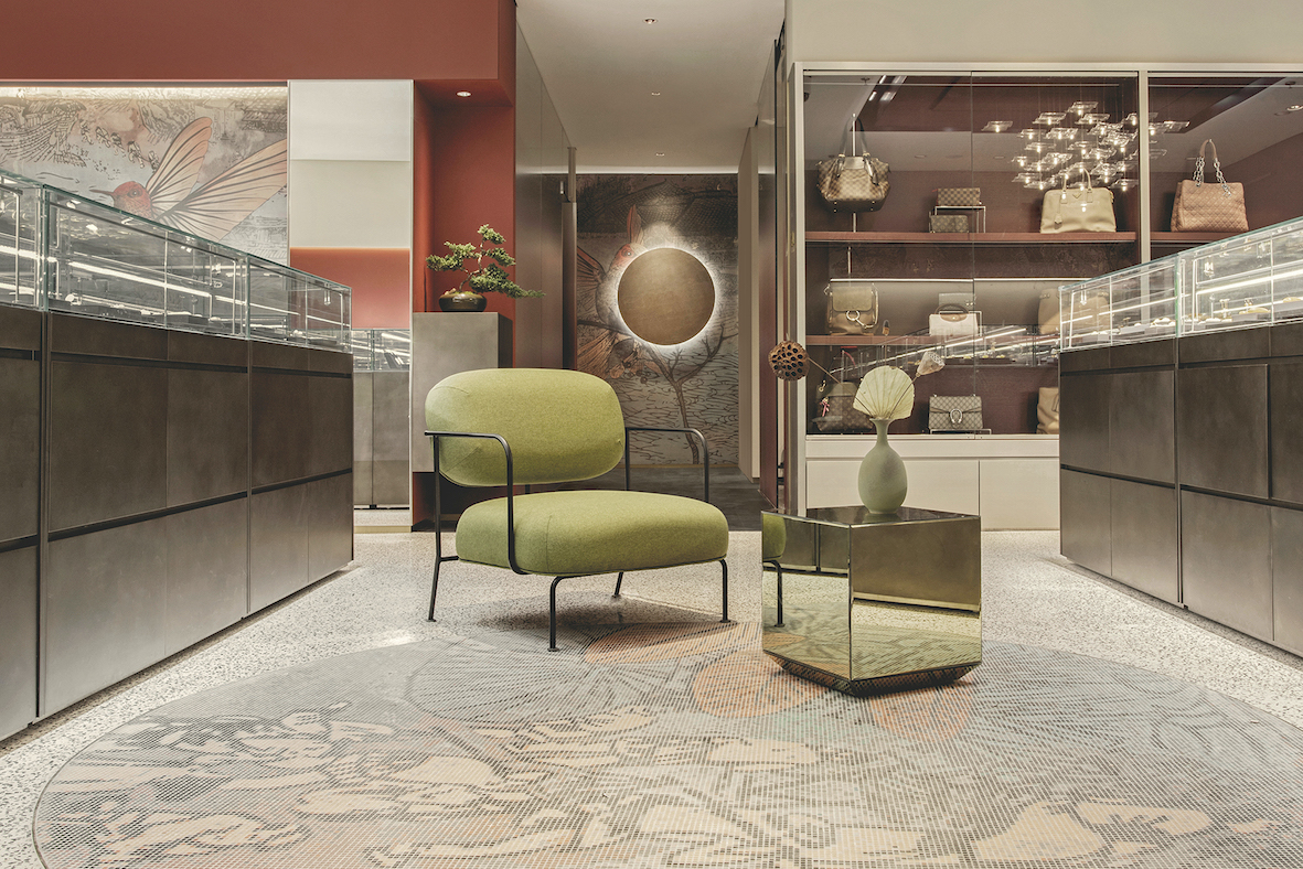
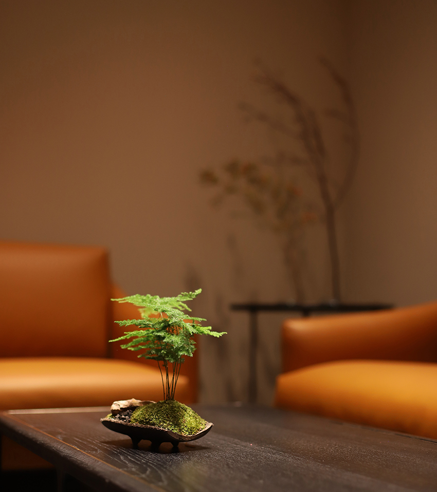
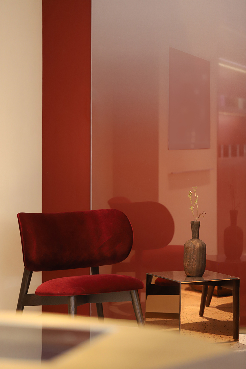
The Middle Area is mainly composed of watch counters, as well as Purchasing and Pawning areas. From this point, the colour gradually darkens on the floor, walls and counters. The watch area is designed as the central platform, matched with the Barrisol light box above to create a visual focus of the Middle Area of the store. The corridor leading to the consignment and VIP rooms is decorated with traditional bonsai and a custom-made rounded stone light fixture; in front of which is an open area defined by a round custom-made mosaic floor, with an armchair and poufs for customers.
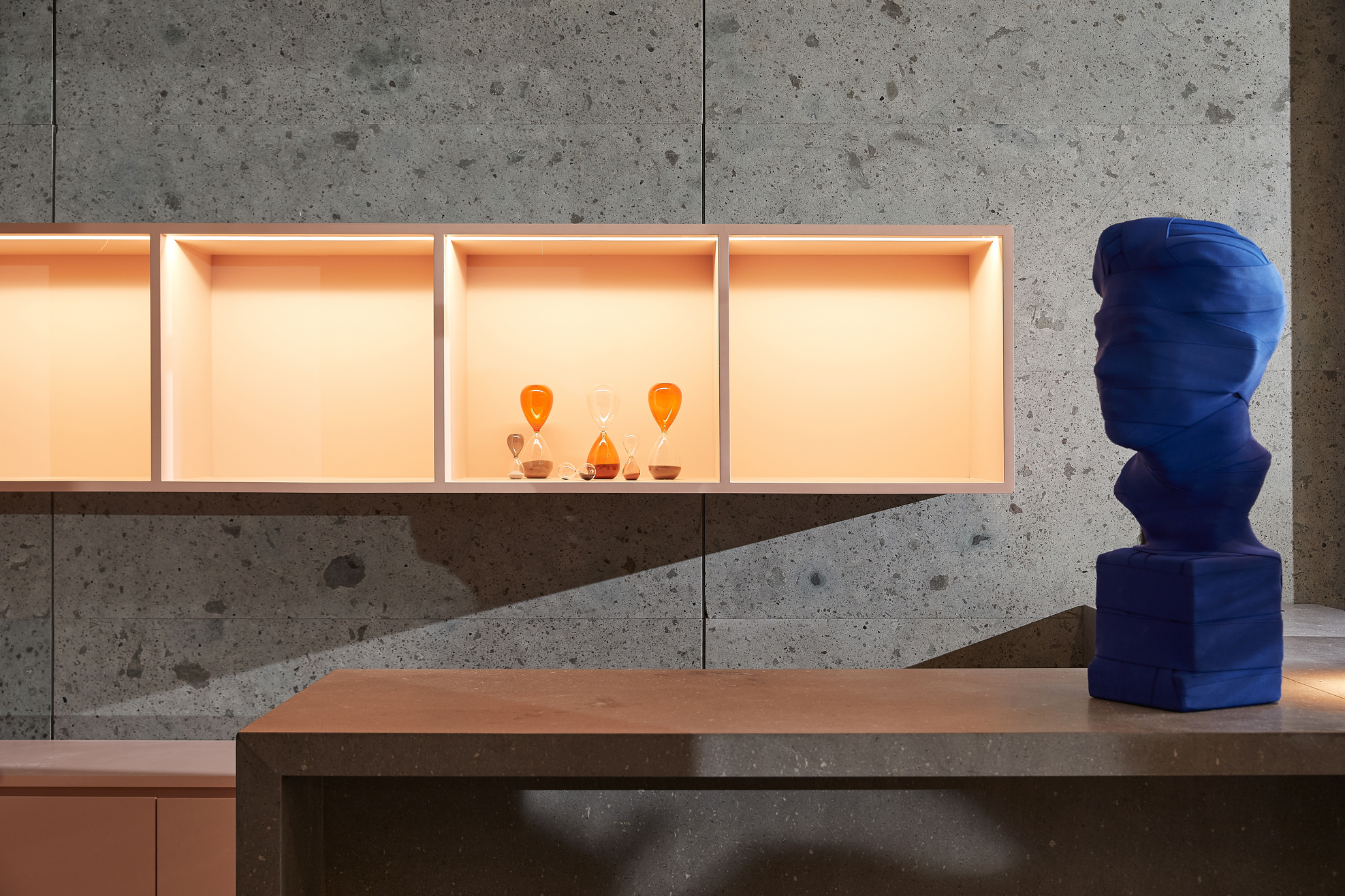
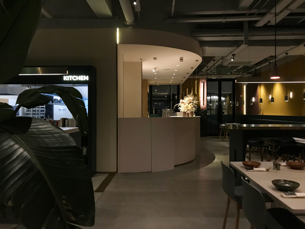
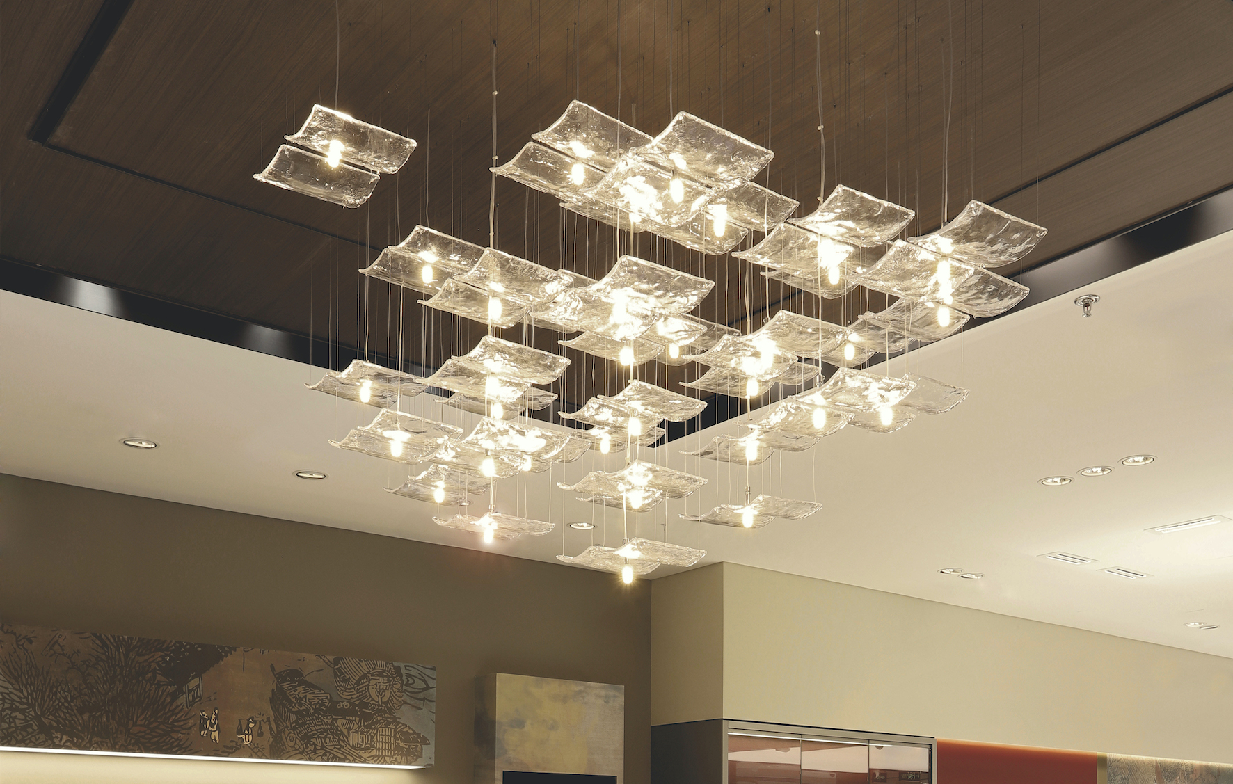
At the end of the shop, the colours of the floor and walls deepen one more shade. Customers can find additional services at the repair and maintenance window in this area. A custom-made chandelier of glass roof tiles hangs under a square dark wood ceiling, inspired by traditional Chinese city life, just like the painting “Along the River During the Qingming Festival” (清明上河图). As another iconic element in the new store, it carries PINZHEN’s wish to continue servicing the community and enriching people’s lives.
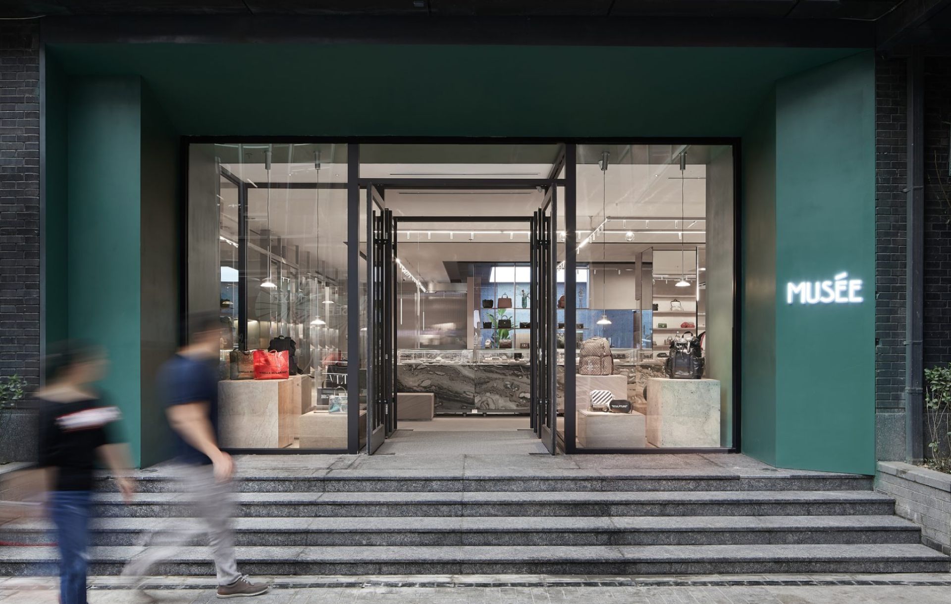
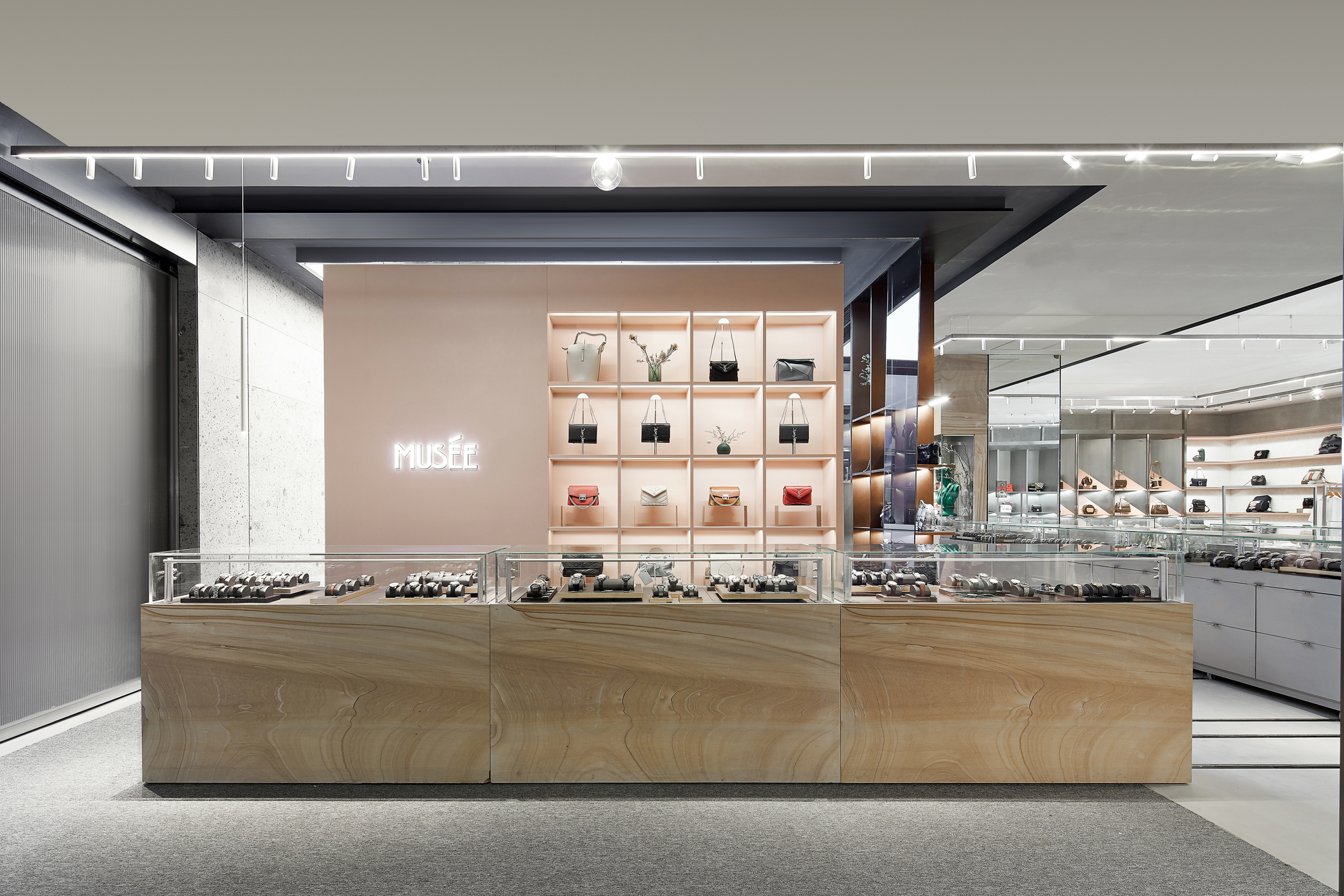
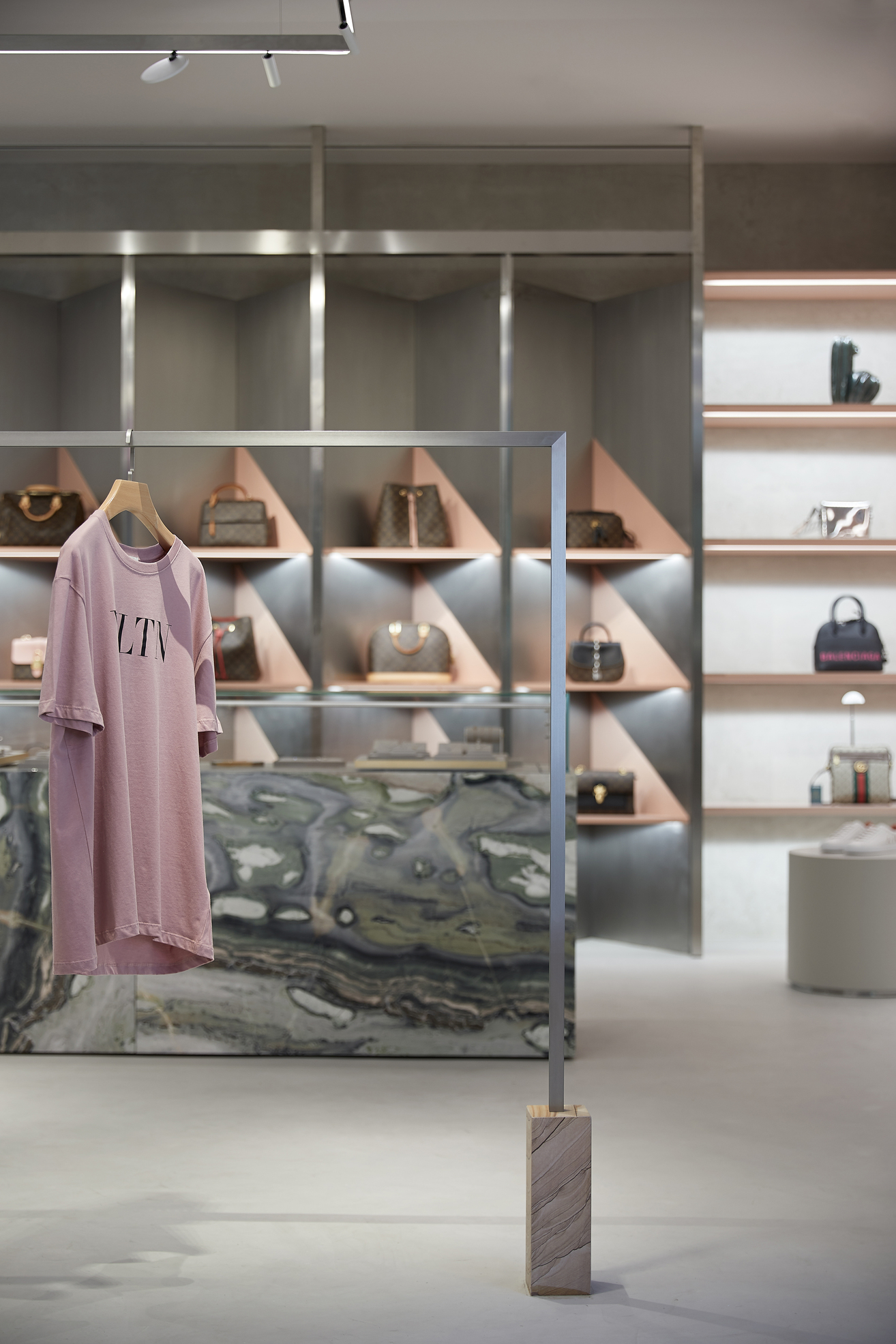
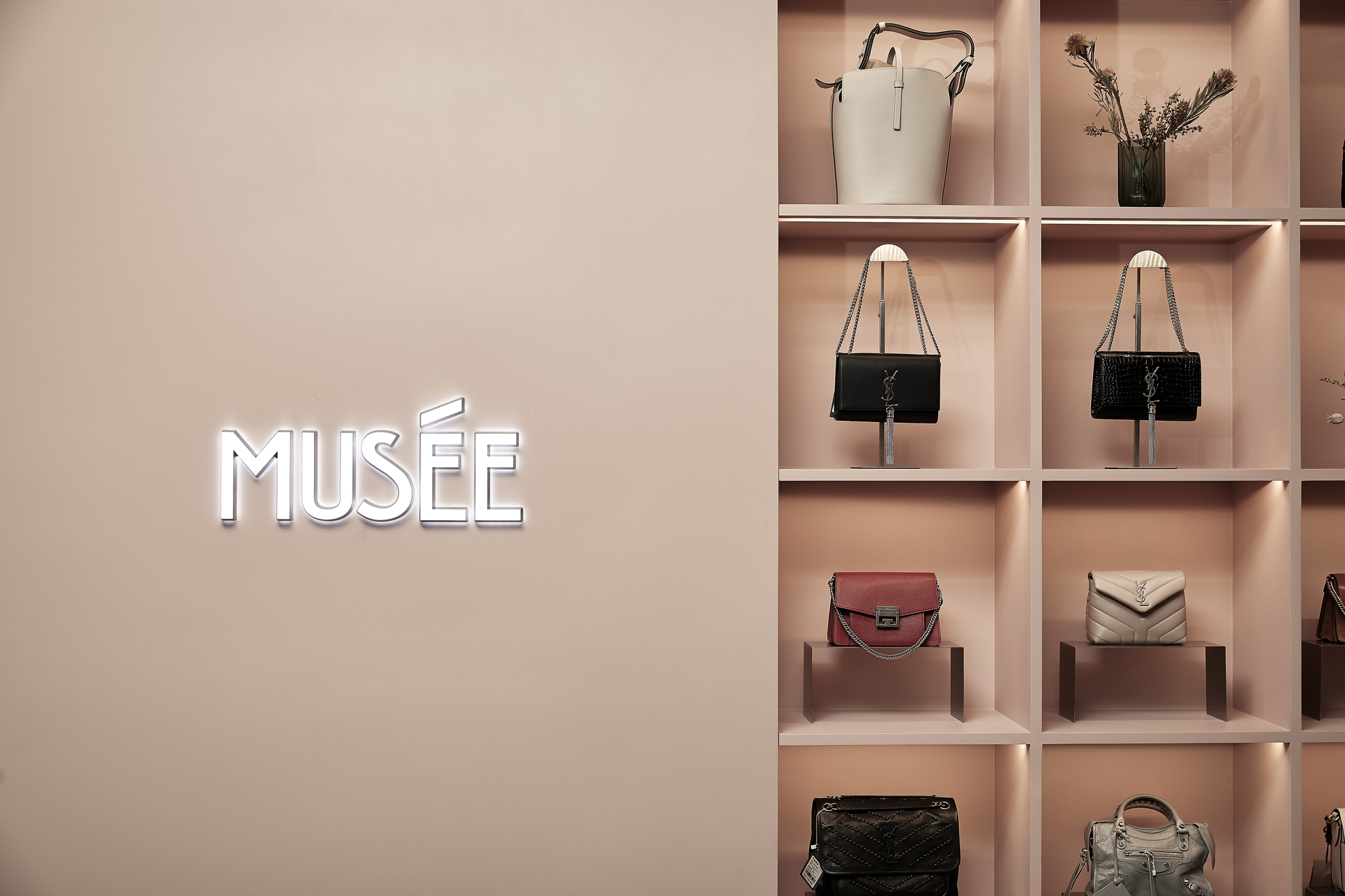
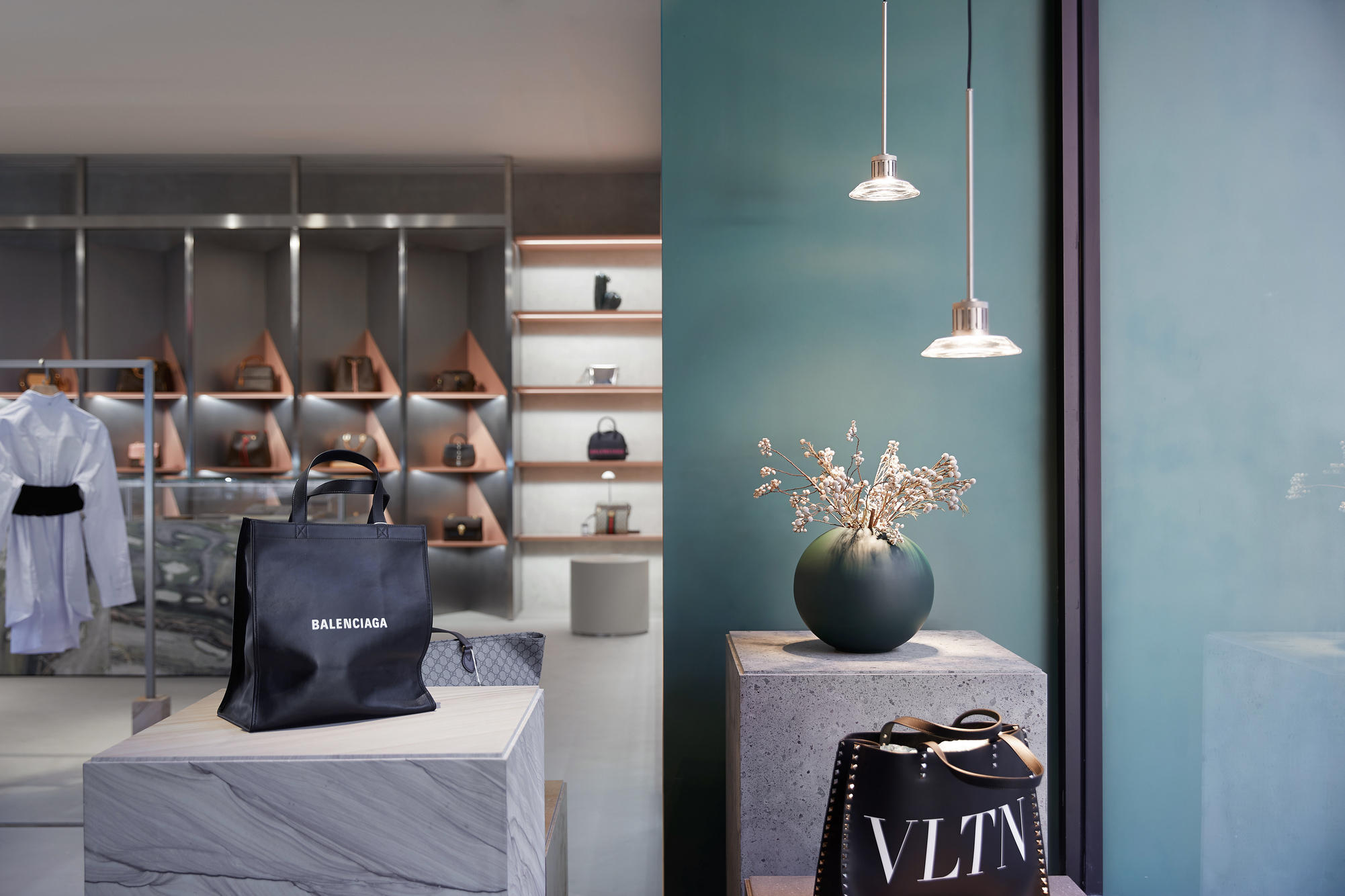
PINZHEN GALERIES is the second retail and luxury pawn platform that STUDIO8 designed for Huaxia Pawnshop Group. This more sustainable way of shopping has become a popular retail and lifestyle concept. In the design of MUSÉE Beijing flagship store, opened in June 2019, STUDIO8 boldly used flexible movable counters and sliding hangers to create a shopping experience that can adapt to various scenarios and events that take place in the shop.
品真阁北京概念旗舰店
——阐释东西融合的诗意之美
品真阁前身为华夏典当行,是一家有着二十五年历史的集典当、零售、鉴定、维修养护等多项业务为一体的珠宝、奢侈品的流通与服务平台,是一个倡导绿色流通生活方式的新零售形式。原来的品牌形象是非常纯粹的中式风格,已被许多消费者熟悉和接受。在本次品牌形象整体升级中,最大的挑战是如何在传承品牌传统文化的同时,设计出能够结合时代、接轨未来和国际的品牌空间新形象,同时突出源自于中国传统文化与当代生活方式交融的品牌调性。
八荒设计认为,在当代,地域、文化的界线越来越模糊,但这并不代表摒弃传统,越是属于当代的事物,越有可能看到多元、包容的文化和风格。八荒设计是一个成立于上海,多文化、多学科的设计团队,他们一直坚持立足当代,尊重传统在地文化和品牌文化的设计理念。因此在设计过程中,如何融合传统与现代、东西文化成了设计的重点。八荒设计还注意到,品真阁的产品分类从黄金、琥珀、玉石, 到宝石、钻石、铂金,还有腕表、箱包等,无论是品类、材质,还是风格、受众人群,跨度都很大。于是八荒设计从产品与零售空间的融合入手,将品真阁品的所有产品按照色调、调性、风格和受众人群, 从浅至深、从冷至暖、从当代到传统、从年轻到成熟进行了梳理。
八荒设计没有将空间简单地分割为不同的产品陈列区,而是将整个店面设计成了一个从入口至后场线性渐变的空间,这也成为了项目的核心设计概念——通过色彩和道具材质表现从浅至深、从冷至暖、从当代到传统的变化,配合相应调性的产品品类的陈列,形成渐变的风格转换,来激发不同消费者内心深层次的潜意识审美喜好。店铺整体格局沿用品真阁一贯的简单传统的柜台陈列形式,让消费者能够在熟悉的购物环境和模式中,被潜意识地引导至最符合自己审美品味的空间,找到最属于自己审美品味的产品。
品真阁的这家店作为品牌新形象的旗舰店,以源自中国屋脊装饰最高级别的骑凤仙人之凤凰为店标,象征俯瞰众生、鉴定真伪、流通万物。八荒设计为了传承品牌原形象中的标志性装饰“清明上河图”,截取了其中的代表性片段作为背景;再以“百鸟朝凤”点题,叠加不同姿态的鸟的形象,为品牌设计了旗舰店专有的定制墙布,贯穿整个空间,仿佛一幅当代与传统融合的画卷在整个店铺中展开,述说品牌故事的同时致敬中国传统文化。
依据从入口至后场由浅至深、由现代至传统的渐变逻辑,入口区域为浅色区域,柜台为不锈钢和浅色木纹。前场中间,八荒设计沿用品真阁原店铺形象中的鱼缸,设计了不锈钢立柱鱼缸,迎接顾客光顾。前场还设有综合服务区,为顾客提供编绳、包装和咨询服务。三个金色环状的现代吊灯,结合截取定制画面的圆形马赛克地面,既增添空间的动感和变化,又帮助指引顾客关注到几个重点区域。中场主要为手表柜台,以及民品收购区和典当区。空间到了这里,无论地面、墙面还是柜台,色彩已经逐渐加重。手表柜台形成环形岛台,配合上方发光的软膜灯箱,形成店铺中场的视觉焦点。通往民品室和贵宾室的走道,点缀有传统的盆栽和走道尽头的原型石板灯饰。正对走廊的中场后场之间有一片开阔区域,搭配活泼的沙发和圆形定制马赛克地面,供顾客休息。到了后场,地面和墙面的颜色又加深了一层。末端是维修与养护窗口,向顾客提供更多服务。深色木纹的回字形吊顶下悬挂着定制琉璃瓦片吊灯,是新店形象的识别元素之一,同清明上河图一样,来自传统街道形象,寓意品真阁将继续伴随和服务顾客,为大众生活创造更多的价值和情趣。
品真阁是八荒设计的第二家华夏典当集团旗下的新零售流通典当平台,绿色流通已然成为一种全新的零售和生活方式。在2019年6月开张的MUSÉE名见北京坊旗舰店的设计中,八荒设计大胆运用了灵活多变的移动柜台和挂杆,营造了可根据使用情景不断变化的购物体验。
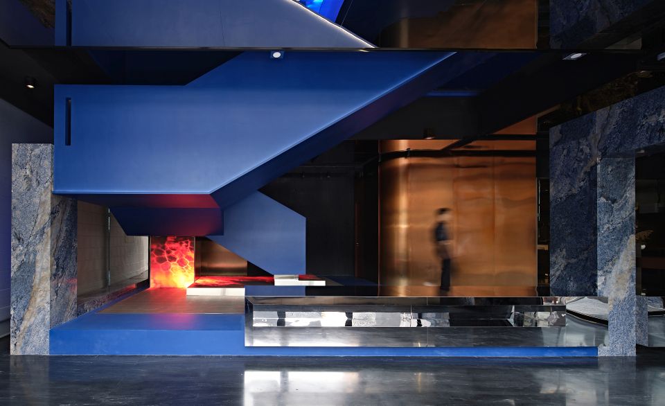
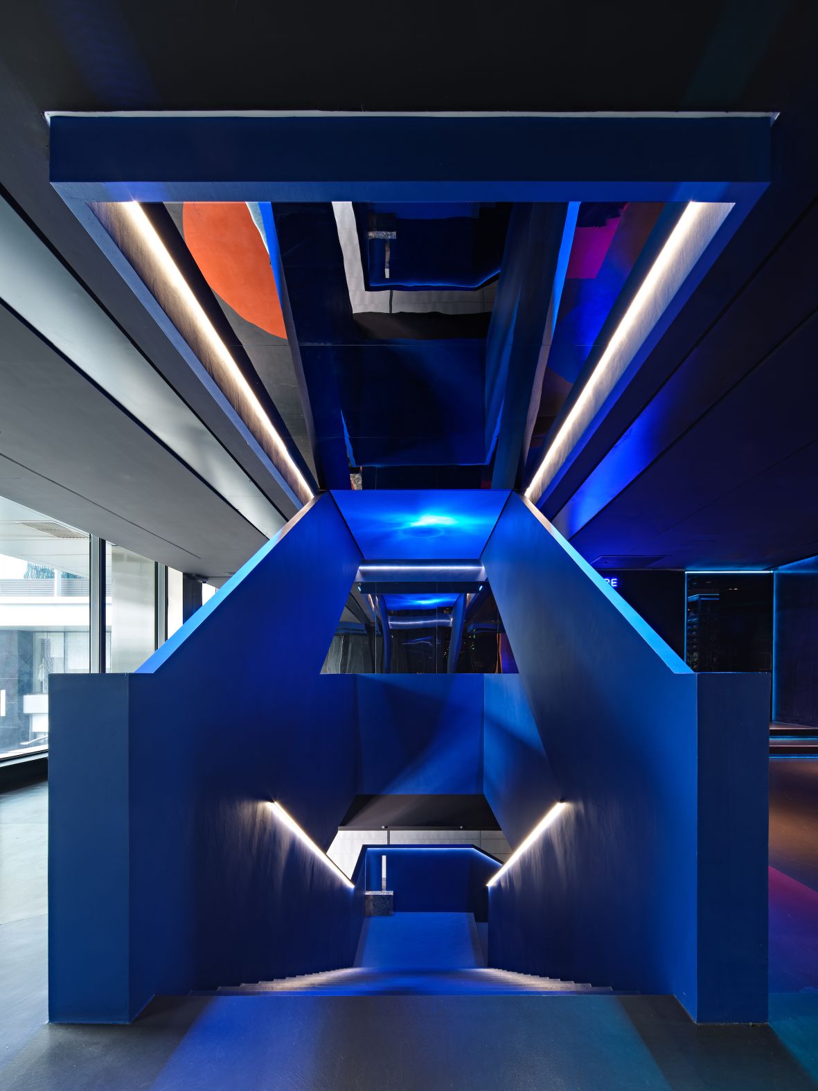
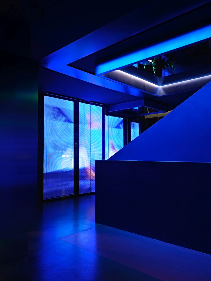
1F stairs floating above phenomenon video 一楼自然现象画面上的悬浮楼梯-1")